Vertical Slice – Week 6 – 7

During week 6-7 of the vertical slice project, we made some strong rules within the group to keep our work concise, my teammates made progress with the UE blockout, continuing to produce models, and working to properly adjust our work to an art style.


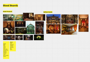
In our meeting on Tuesday, we agreed on making our workflow a lot more controlled and collaborative as we acknowledged our team progress was falling out of place. I set up a google drive for each modeller to upload their finished model asset, so we can all take a look at them, and see what needs adjusting – considering the topology, geometry, and any UV mistakes. Simas will be completely in charge of art direction, and wants each modeller to contact him first before making a model, so it can stay concise to the art style we are going for. In addition, Simas is creating a style sheet for us to look over while we work on our respective asset progress. These decisions will hopefully get us back on track and communicative again and as a result make a consistent visual look to our game.

This week I continued both my roles of environment layout and texturing. This Monday we had our studies advice, though next Monday we are able to present our updates again.

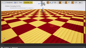
For my environment layout, I started making a clear view and structure of the maze room so that it is easy to replicate into UE. I used Patrick’s map design concept of the maze room to block out the layout first of all.


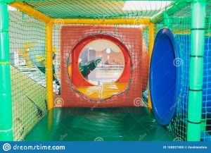
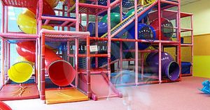
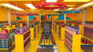
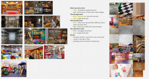
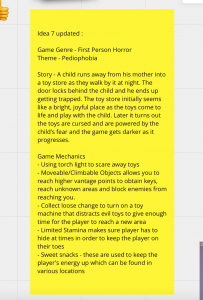
In one of our discussions on discord, we agreed we would like to capture this type of ‘play area tunnel’ for the maze. I used these references to plan out the maze In a clear layout. I made two references for the group to use. One is for where the toys inside will be placed, and another is the directions of where the player will get around the maze.


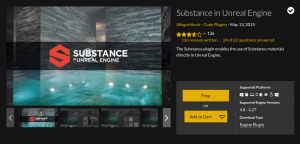
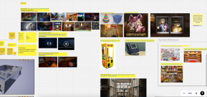
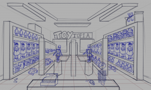
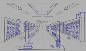
From here we were able to present our work again. We included all our work from the previous weeks we missed but summarised our progress the best we could. The group added in their work consisting of blockout, UI design, modelling and concepts for toys. I added in my environment layout progress, and my texturing progress. I mostly talked about how the layouts will help to picture where props can be placed for visual design and interactions, and how to navigate around these rooms. I mentioned for the textures how I will be organising which textures will pair with each other for each room, and how I made use of the substance UE plugin to add my work into the engine.


Our main feedback from our presentation this week is that the modelling process needs to be more organised, and to be producing quicker. After the presentation we started remaking our asset list into groups of models to be made by one person, so that for each room/each toy asset etc. can be made in a similar style. We encouraged the whole team, who are modellers, to assign themselves to a group of models and to make them in a faster pace.

We also made an animation list and scripting list in the same table format for those in the scripting and animation roles to organise their tasks easily too.


When this was done, I got to work with making additional textures for rooms I have missed, such as the walls for the Toy store, floor for bathroom and more.

This time I wanted my workflow to be more organised, instead of producing many textures that may not be used. I sorted on Miro Board a layout for what textures are going to be for which rooms floor and wall. This week I had finished up the Toy store rooms textures, the bathroom, and the warehouse.


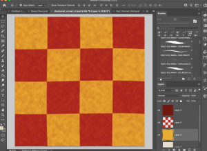
I changed up most of my textures that will help fit into the art direction style sheets, for the themes of some rooms. I Started with the toy store, which is going for a marble tiled floor and a yellow wall, with cyan coloured accents all around.

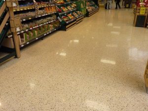
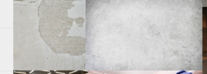
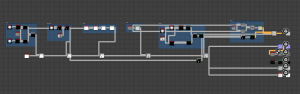
The art director was looking for a floor design much like these references. So I got to work recreating the style on Substance Designer. I used the tile sampler to get the tiles and plugged them into the suitable places, then tried out masking the same tile sampler to block out a different colour tile in the middle of the pattern.


Again this was one of my own designs, just with help from tutorials of how to do mask tiling.

I am getting more confident and experimental with this program which is great for making better quality textures, and using this as a skill for the future.

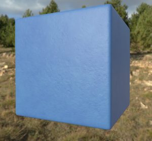
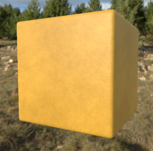
Next I changed up the blue solid wall texture I made before but changed the colour to cyan to fit with the toy store theme. This could possibly be used for upstairs, or for a minor wall detail. I also updated the yellow wall around this time.

I redid the bathroom tiles with a different node for a better looking effect. I made use of a node called brick generator, and adjusted the settings so it could replicate the bevelled design of the tile.

I remade the warehouse floor as last time when I uploaded it into UE, it looked too glossy, and the detail could not be seen. I added a tile node, some grunge maps to add to albedo detail. I also turned up the roughness settings so the glossiness should be less prominent.

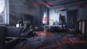
I did try out a wood material from one video, but I did not like my outcome, so I tried again with help from a different wood material tutorial. This tutorial helped to grasp the idea of the brick generator, and the technique to capturing the knots and detail on wood with directional warp, and many noise textures. I used my own settings in some parts and referenced back to pictures of rooms with dark wood for the colour.


Source:


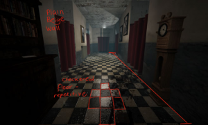
Lastly, I updated the tiled stone floor as I thought the smaller tiles were too repetitive and did not look well. I made the tile as big as each plane so the tile would repeat in a bigger scale, and is able to show more of the detail.

From discussions with the art director and looking at the new style sheets, I have been designing painted murals for a couple rooms of the game. These included the swamp/forest themed ball pit room, and the castle themed accent on the toy store walls. I will try using these as decals inside UE to place on the walls.


Simas suggested I could create a mural of a an illustrated swamp from this reference photo. So I collected some illustrated paintings of swamps to get inspiration, and got to work.


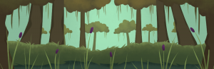
I started off with painting a landscape, some trees and foliage in greyscale so I can see what the foreground/background can look like. Though later on I noticed the landscape goes upwards the further back it gets, I would like the background assets to be more visible.

My next draft of the greyscale looked much better. I can now see a good proportion of the trees from the front and back, and can see the sky a lot better too.

I continued on with this painting and added colour. I stuck to a muted green colour scheme with hints of greenish-brown, and a dark purple for the foliage to stand out.

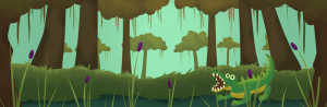
Next I wanted to add the crocodile to the painting, as the crocodile enemy will be present where this painting will be placed. Here it looked quite off from the background, so I will change up the look.

Now I have illustrated the crocodile swimming in the water, and added a bird flying across the sky. I like how this is looking, and decided to add a few more animals.

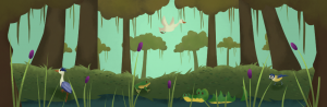
This is my finished painting, with a few more animals. I made sure they were positioned well, and they had a consistent visual look that fit well in the background.

Next I took on the toytopia castle mural. I collected some references to help me out. I used the image of the leaves to help with my colour scheme, and the murals to help capture inspiration for a castle mural.

In my first draft I was experimenting with the blockout of the buildings, and the different shapes it could have. Also shaping out a good structure of the castle for the middle.


Here I finished the blocking out, and painted the buildings in a nice gradient look. I added the windows and doors as well, following my colour scheme image.


Lastly I added clouds to the background, and fixed up any other details I missed along the way.


This Monday coming is our first play testing of the class’ games. We will be fixing up our game, ready to be presented and take time to look at everyone else’s games too.

Vertical Slice – Week 5

During this week I took on a new task to build on our environment visuals and layout for the game. The team worked on lots of more assets, and AI mechanics within the game engine. On Tuesday we had a call meeting to discuss what we will be doing next and what other parts of the tasks needed discussing. I let them know I would take on the environment layout role and help bring our design ideas and assets into one visual for us to replicate on UE.

I used 1-point perspective to plan out the layout of each room. I started with the toy store main room, as it is the first room we will be introduced to. It will display many toys and look very vibrant, playful and engaging for a child protagonist. Though I will add misplaced toys, essential equipment (for starting gameplay) and clear routes to add to the puzzle and level play though end.


Toy store main room

My first draft was most of all blocking out the main shape of the store and the biggest asset in there, the shelves. I wanted to make sure they were in a suitable scale before adding any toys into them. I did come up with a few props when starting such as the lollipop stand and the teddybear handing out of a cardboard box.


Here I did small alterations to the shelves and ceiling for lights and possibly an upstairs section, but I also blocked out the marketable boxes inside the shelves and some toys that do not include boxes, like the teddy bear and robot. I also designed a concept for the toy store sign at the very back for filled space and knowledge of our whereabouts.


In draft 3 I added in the toys that others in the group have wrote down or designed for the game, like the porcelain doll and the jack in the box. The scene looks quite busy now which is good – like the toys on the floor indicate that children in there beforehand had played with them, or the idea that they had moved on their own in the main characters mind.

 I sent this draft to the group to let them know what position I was at, and if they had any ideas to make anything stand out more.


In discussion with my teammates we concluded that we can make the toy store a lot bigger, and also when we decided on making an upstairs addition. I spread out the room in a neat way, and redrew any lines that needed adjusting. I changed about some of the toys for more variation and added a fence up around the exposed ceiling.


In my last draft I worked with a team-mate to brainstorm where the access to upstairs would be best placed, and decided on stairs on the our left hand side of the store. I adjusted the perspective where needed and finished off the positions of the props.

Toy store upstairs

We decided to go for an upstairs section for the toy store for more exploration aspects and more detail to the game. I designed how the place would look. I incorporated a drop down view of downstairs and path around it for more access to toys. I also made sure there was some kind of fence around the edge.

In this draft I had added some toys to the shelves, the porcelain doll to the ‘toy of the year’ section, and a preview of the shelves from downstairs looking through the open area.


After presenting my current work and discussing with teammates we decided to make the toy store a bigger environment, which meant the upstairs would be made bigger too. I adjusted the positions and perspective of the shelves first of all, making space for the stairs to travel up to this floor. I then worked on the toys to let them fit into the shelves again.


In my last draft I made additions to the props around the scene, making it seem more like a toy store. I added wall paintings of familiar toy faces that would excite young children, toys around the floor, and stacks of boxes on the side to give the idea that stock is being placed in. I may come back to this later to play around with the props.

Bathroom

Next I designed the layout for the bathroom and the stalls inside the bathroom. I followed the map design my teammate created and added in three stalls – mens, womens, and disabled toilets. I added the essential types of props needed for a bathroom, such as the mop to clean up, the toilet, sink, tissue holder and more. This room connects with both the toy store and the play area for better accessibility.

Apart from the environment layout progress, I continued my progress with textures in Substance designer. I made some variations of already created materials, and made some of my own from my learning experience.


First of all I made a new variation of the toy store carpet with colours green and blue. Again this was made using a tutorial on how to make a fabric material, for when I started learning Substance designer. In this version I modified my noise settings to get a new pattern. This could possibly be used for the upstairs part of the toy store.

I made 4 variations of solid concrete coloured walls for different areas in this game. These are to give more vibrance to the area as it is a toy store and play area. I hope to use the plain wall for possibly the warehouse, the yellow for the toy store, and the blue and red for the play area.

For this texture I used a grunge texture and a cloudy noise texture to get this rough but flat look that some walls have in public spaces or houses.


I created a bathroom wall texture based on this picture I took of this bathroom wall that inspired me (lol). I used the tile sampler node to create tiling, then duplicated it and shrunk its size to make it seem the bigger part was a bevelled part of the tile.

I made an alternate version of the concrete wall that did not include the large divots within the material. This could be used for a more scruffy room like the storage room.


I created my own texture, based on collected reference pictures, for a warehouse floor. I made sure the hard floor looked slightly glossy with the roughness output. I added a noise texture, along with a gradient map and collected some colours from the reference, then added subtle scratches within the metallic output.


Lastly I had been working on the vent walls inside the toy store. This particular
texture is quite difficult to try replicate into a vent slot, though I have been experimenting with my knowledge as best as I can. I may place this to the side for now to move onto more textures.


Again we did not have the option to present a weekly presentation due to studies advice, though our game design teammates presented their part of their work to their own class for some advice and feedback.

Vertical Slice – Week 4

During this week we did not need to prepare a presentation, but we all took more time to take on tasks and build our game. During the afternoon of this Monday I communicated with the rest of my group online to catch up on the tasks they were working on. I continued my practice and progress with creating modular textures, and the group have started a list of assets of models to make, any more game design elements that need work, and level design progress.


I spent lots of time on Substance Designer this week and continuously learning from the range of videos I collected. On YouTube, I had found interesting ways people had created different materials like tiled floors, fabric and basic techniques. These were good to watch to see how these type of materials are constructed.

The LinkedIn Learning course on Substance Designer, made by Joel Bradley, helped me mostly with displaying my file, exporting my work, and altering the options of nodes. During this week I created a lot more from my list of modular nodes that we can use for the floors and walls of our game.

Sources:

https://www.linkedin.com/learning/substance-designer-2020-essential-training/menus-and-preference-settings?autoAdvance=true&autoSkip=false&autoplay=true&resume=false&u=35574164


Here are some of the textures I made this week:

I recreated a checkered carpet design with the help of a fabric design tutorial, and some help with another tutorial on how to make a checkered design.


I created the stone tile design for back rooms or bathrooms, with help from a tutorial but using my own set of options to create a different pattern.


I made the concrete material based from a YouTube tutorial, though modified it throughout to give it a more cream colour, and with less holes and chips.

Eventually, I was able to start this basement floor design from scratch and make the node system with my new knowledge. I worked on this with references a teammate collected on the side. I made use of levels nodes, grunge and crack textures, and the gradient map to pick the colours.


To make sure these textures were working okay, I tested them in an Unreal Engine project. First I was recommended by the linked in Learning course to download the plugin ‘Substance Designer for Unreal Engine’ which will help in importing my substance files and organise the parts them into the engine with ease.

I tried this out with my checkered carpet design. I exported the texture as a .sbar file, and opened up my UE project. I dragged in my .sbar file into a suitable file, and the system worked well. I have the texture file in green, the instance of the material in red, each of the texture maps e.g. base colour, metallic, normal, then I got my texture material node at the end, where I could drag this onto a surface. As a result the texture looks really nice in UE.


I have more textures that I plan on making from next week onwards. These are the warehouse floor, the vent metal wall, and solid bright colours for any other walls.

This week we had a meeting on blackboard and us animation teammates discussed our tasks with our tutors. They gave feedback when needed, and encouraged us to keep going. My tutor recommended me alternatives to substance designer if I wish to move and create more simple made textures if needed. This is good to know if I have any trouble with Substance Designer in the future.

Vertical Slice – Week 3

During this week we presented our second game update, and got lots of feedback that has encouraged us to discuss further into our research, our original ideas, and our narrative. I also got recommended to start using Substance Designer to help produce our modular textures.


It was essential for our group and the game idea to properly research the elements, like puzzle, Level and narrative design. We looked into gameplay and information of current horror games such as Poppy Playtime, and analysed their elements, and why they are effective. I focused on researching modular textures and design within horror games, and what feeling/emotion that they can show.


Source:

https://80.lv/articles/relapse-how-to-build-content-for-horror-games/

To make a horror video game scary, the floors and walls of a room tend to be dark, gloomy, and worn out. They can also appear broken, covered in substances e.g. blood, trashed with mess.

The most common kind of flooring would be wood planks as they create length to a room – etc. long wood planks can make a corridor look longer/more stretched out – gives a sense you’ve been there too long, needing to escape, but seeming endless.

Most common kind of wall would be rough white concrete, or chipped painted walls. They give a sense of wear and tear and make it seem a place has been left not taken care of/abandoned for some time. Making it seem spookier that no one is around/or has been around for a long time – makes you feel alone and almost responsible for the damage.


Within toy/arcade horror themed games, floors and walls consist of:

1. Checkered / tiled floors – gives a continuous pattern throughout the room/s which could be a nice visual to look at, but also so repetitive it could make you feel nauseous – especially if you were a kid running about a play area for so long and got tired.

2. Solid bright coloured walls – give a sense of playfulness and life – children are always associated with bright colours – but the colour alone could feel isolating to be surrounded by


Next, I took some time to learn about Substance Designer, as this my first time using it. I followed a few tutorials and practice videos from YouTube, and LinkedIn Learning tutorials.

Sources:

https://www.linkedin.com/learning/substance-designer-2020-essential-training/menus-and-preference-settings?autoAdvance=true&autoSkip=false&autoplay=true&resume=false&u=35574164


With a tutorial on the side, I followed their steps and learned about the interface of Substance Designer, setting up a file, what the nodes do, and what can be connected together, and much more. I played about with shapes tile samplers, levels, histogram scans, gradient maps etc.

Eventually the node view will come to something like this. I made use of straight lines and frames to keep each section of texture together, so I know where to look if I wanted something adjusted.

This week I was able to produce a wood texture, and a concrete texture. I do want to experiment more with these textures once I get a better understanding on how to create my own node combinations.


Due to strikes being held this week, our presentations were put on hold just for this Monday, so we did not prepare a new presentation. Since I was in campus I met with the animation teammates in my group to discuss what tasks we were doing and the progress we had made.

Vertical Slice – Week 2

During this week we presented our first game update, got some feedback and had a change of teammates within our group. Katie had to leave our group, and Simas joined our group to take her place. We got a few days to introduce Simas to our idea and produce some art style concepts for the game/narrative.


From our week 2 presentation, we were given feedback. The tutors were interested in our idea and liked where the narrative was going. The class gave feedback on our progress for mechanics, talking about what will give the player stamina, or if its better to hide and rest to gain stamina. They also gave us an idea to add multiple torches to collect throughout the game such as a wind up torch, a flashlight, a glow stick etc.

Later on as we were gathering some more concepts for the gameplay, the tutors came over and we asked questions about how to end the gameplay, and how to effectively portray the childs phobia of dolls. The tutors showed some examples of horror/psychedelic media, such as the clip of Fight Club where a figure flashes between frames. The game students have taken the role to build the narrative and gameplay progression taking inspiration from the references they have found already.


This week we made to-do lists on Miro Board for everyone to fill out each week what they will be working on. I filled out mine talking about what textures I will be making. I am focusing on creating floors and walls of the toy store building. I gathered my reference and listed out the type of design or material for each room in the toy store I can make. e.g. Carpet checkered floor for the main room, rough white painted wall for the storage room, and more.


I started designing these textures on Photoshop mostly using brushes and filters to create the same look as my reference. I also gathered a few tutorial videos to help me start out with filter techniques.

First I made a carpet checkered floor. Since this was my first design It took me multiple tries to get it right. The first few attempts looked too flat and regular, but on my third attempt I tried a different approach that looked more like carpet.

Next I made a tiled floor design. I placed a grey background down, placed in grain, and added motion blur to create a lined grain look. I added multiple roughness brushes across the page. I added the lines to make four tiles, and added some slight brush strokes for texture.


Next was the rough white wall texture. I made a grey background with grain, and experimented with my brushes to create roughness. I used the filter-offset tool to alter the position of the brush texture layer, so I could create a seamless pattern. I used the stamp tool to block up the seams and brought it back to the original position.

After this, I worked on the wooden floor texture. This took some tries to create but eventually it looked well. I used a wood floor template from the internet, and altered the look with a filter for it to fit in with my other textures visuals. With reference beside me, I added darker edges to the corners of the wood planks, then picked a colour and textured brush to paint dirt/moss bits in these edges. I used a brush shaped as hair and painted on light scratches as if the wood is worn. I used the filter-offset tool to alter the position of the brush texture layer, so I could create a seamless pattern.


In addition to the main toy store room, I wanted to make a store wall display, made to hang toys and shelves up. I used a grey colour and grain for the background. I made a dark line, duplicated it and distributed even space across the page.


For now, my last major texture made was a vent wall tile. I added a 5-point gradient of a light grey and dark grey colour to give a shiny metal look. I used brushes again to add roughness to the metal. I followed the same process as the lines for the display wall lines, with the screws of this vent wall.


I made a few smaller, less detailed textures if they are needed for paths, smaller room walls etc.


By the end of the week in preparation for Mondays (week 3) class, we produced our second update presentation. The group added in the details of the game idea, and their progress from this week. The group added their necessary elements for this game, such as enemy/puzzle research, narrative development, 3D modelling, level design and AI mechanics. I added my work in the presentation as our texturing progress. Our teammate Turlough made a video of the game room showcasing the new mechanics he was testing.


Source:

Vertical Slice – Week 1

During this semester, we are to team up with the Game Design students and work to create a game prototype – more specifically the ‘Vertical Slice’ stage. During this assignment I will be tasked to create a story driven vertical slice, that focuses on developing artistic elements of a game. The project should demonstrate the use of art and animation assets informed by a pre-production plan. The development should be undertaken within a games engine. As animation students, we should focus on the art direction, art assets and animation of the project. The games design students will focus on the narrative design, game mechanics and level design. Within this project I will achieve to work together with my chosen group of animation students and games design students, fit into and experiment with my chosen role – hard surface modelling / texturing, and collaborate ideas to eventually produce a game prototype.

On the first week I met up with my new team members. They consist of Daniel, John, James, Katie, Matthew, Patrick, Turlough, Filip and Adam. Once we got to know each other and showcase our work – we started to brainstorm ideas for creating a game prototype. we first of all thought about the perspective within a game etc. first person, third person, side scroller, 2.5D and more. We were all fond of creating a first person game so we focused on this as we made more ideas. We all preferred to create this game in 3D. We speculated different game types/genres and we really liked the idea of combining horror and puzzle. We thought about a setting that this horror/puzzle game would work in, like a hotel, or a morgue. We listed our favourite, and similar looking existing games for inspiration. These included Outlast, Little nightmares, and Cry of Fear.

Our first initial concept was about waking up on a train, and trying to escape – each carriage was a different style in a different era, and you would complete puzzles to escape each one. Though there would be an evil conductor trying to keep you inside – the further you get through the carriages, the more disheveled and zombie-like he becomes.

We all were interested in the idea, and decided to continue our brainstorming within Miro Board.

We brought in most of the ideas made on the whiteboard during class, but added a few more points to develop our concepts.

We started up a server, and communicated within Discord to think of some solid ideas to choose from, and how they may look. To capture a solid vision of our ideas, we wrote them down on sticky notes what theme, game mechanics and style they would be in, and gathered images and art to convey a starting visual.


Our train horror puzzle idea consisted of the same description as above but we tried to focus on what kind of mechanics would work well with the theme. We also thought about the challenges of the game eg. the evil conductor, and becoming frozen in the wintery conditions. We later developed this idea to start inside the train station, and navigating around the area to use the train to escape, by finding supplies and fuel.

Our mood board included images of different eras of carriage designs, inside a train station, vintage art style, and character designs.


Another idea came about with a similar first person horror/puzzle genre. It was set in a Belfast hotel, where you are a detective investigating a case, taking a night stay at a hotel secretly run by a cult. Investigating further into the hotel and how it could be related to her cases, she would solve puzzles within the area, and protecting herself from the cult. To win you have to escape the hotel. We thought this was a good solid idea, and we could have conceptualised an interesting narrative connecting missing person cases, to a cult that took over a hotel.

Our mood board included images of dark, spooky hotel rooms/halls, and a collection of existing Belfast hotels.


One more idea we developed on was quite different from the others, but had the same first person horror/puzzle genre. This time it is about a boy with a phobia of dolls/toys, he runs from his mother, runs into a toy store, but gets locked inside. There are toys inside that look friendly, but the further he goes into the store, the more scary and horrifying they look. We developed many mechanics for this idea such as using a torch to navigate around, movable objects to complete puzzles, having limited stamina, and hiding from moving dolls.

Our mood board included images of toy stores, illustrated and real, dolls and creepy designs, and structures of toy stores/storage rooms.


We made a vote within discord of these couple of ideas to move forward with and develop, and the toy store idea won! We continued with its development and broadened the narrative.

( Four people voted for idea 4 – train station, and 5 voted for idea 7 – toy store)


Before I start my role as texturing / hard-surface modeller, I wanted to research each part of the role and how they take on the job in an industry video game project.

Typically a texture artist’s job is to produce surfaces for settings, environments, objects and characters with the use of artistic elements. They may require knowledge in particular textures of real life such as organic features / skin, textiles, geographical features and building features. For a video game, a texture artist would work with modellers and technical directors to provide and effective way to showcase textured elements into a game. Texture artists start by finding reference of materials from existing media, or from life sources. Texture artists use software such as 3D Substance, and painting software to enhance and bring assets to life, and stick to consistent look/visual for each project.

Source: https://polycount.com/discussion/218529/2d-texture-artist

A hard-surface modeller’s job is to produce hard surface assets such as weapons, vehicles, machinery, hand-held objects and more, using 3D modelling tools. They may require knowledge of all sorts of hard surface assets and how they are constructed to accurately capture their shape and function. They would usually work with the art directors and technical directors to ensure the models are following the game’s visual style, and keeping at top quality. Hard-surface modellers use software such as Maya or Blender to produce effective props and objects for the environment or setting of a video game.

Source: https://www.skillshare.com/classes/Hard-Surface-Modelling-in-Maya-2022/554432905

Sources:

https://opmjobs.com/job/hard-surface-artist-console-games-derby/

https://www.cgspectrum.com/career-pathways/texture-artist

https://www.foundry.com/insights/film-tv/texturing-video-games


Now that I have knowledge of both roles, I can prepare myself for this project to take on the necessary tasks for these roles, starting with brainstorming.


During this week, we also set up our first update presentation about what our idea is, and what we are all doing to work on it. I started off with brainstorming ideas for how the floor and wall designs would look within this toy store we imagine.

With the reference images and game references we collected, I studied what kind of floors are included in them, and what kind of design resembles a toy store. I made four concepts, and illustrated two of them so we could add them into the sample game room for Monday to present.


I also took the role of designing the Logo for our group. Since we decided our group name would be ‘Shock Studios’, I took inspiration from the word shock and researched a few images to help me illustrate some logo designs. I made three concepts below.

My group liked the first design so I developed it more. As I was designing I made sure to ask my teammates for feedback which helped my design process. We discussed the colour scheme, and symmetry visuals. As a result, I designed our group logo of a shocked emotion, within a comic bubble style frame.


By the end of the week in preparation for Mondays (week 2) class, we produced our first update presentation. The group added in the details of the game idea, and their progress from this week. They worked on elements such as level blocking out, 3D modelling, art style, and narrative research. I added my work in the presentation as our texturing progress. Our teammate Patrick made a video of our game room/build in unreal engine so far.

Back To Top
Skip to toolbar