Business Card Designs
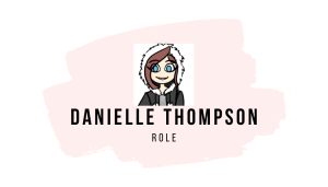
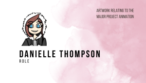
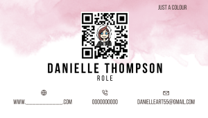
I started by researching business cards that were designed by animators and character designers as this is the field I would like to peruse in the future. When researching I looked for cards that I found eye catching and colourful. I love the look of both a small character logo and a fully illustrated business card as it shows off the artist’s work and helps them to stand out. I think both could work for my business card designs.

When designing my own business cards, I used Canva to block out my ideas, all of the images are place holders as I wanted to get the layout of my card right before worrying about colour or illustrations. I tried both vertical and horizontal designs to see which would look better. I like the idea of sketchy artwork fading onto the top of my business card as it will show off some of the initial concepts of the characters. My business card will be themed around my major project, so I plan to draw myself in the style of the animation, as a robot to use as my logo. While designing my card I thought about what information to add to the card as well as in what order. I wanted a qr code that would lead to a linktree which would have my social media, portfolio, website and contact details, qr codes make the most sense to me as it is easy to scan and quick for anyone to look through my work, adding all social media, website, portfolio and contact information to the card directly would crowd the design, overwhelm the viewer. The information I am putting on my card is who I am, what I do, and how to contact me, this information is vital to have as an industry contact can pick up the card and immediately know who I am and if my role fits what they need.
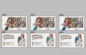
Business Card Block Outs
Front Back


After blocking out my designs on Canva I quickly illustrated them to get a better idea of what my illustrations and ideas would look like.


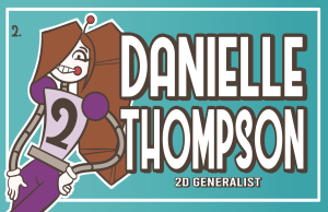
Out of all the designs I liked these two the best.

Since I could not decide which I liked better, I added some colour to get a better feel for what they could look like. This helped me to decide on the horizontal designs as it had more room to display my full avatar, so it was more obvious, she was drawn in the style of the animation.

I made a lot of colour pallets for the horizontal as I was unsure of what might look best, I wanted my avatar to look like me, so I knew I wanted it to have brown hair, but the outfit was going to be whatever looked best.
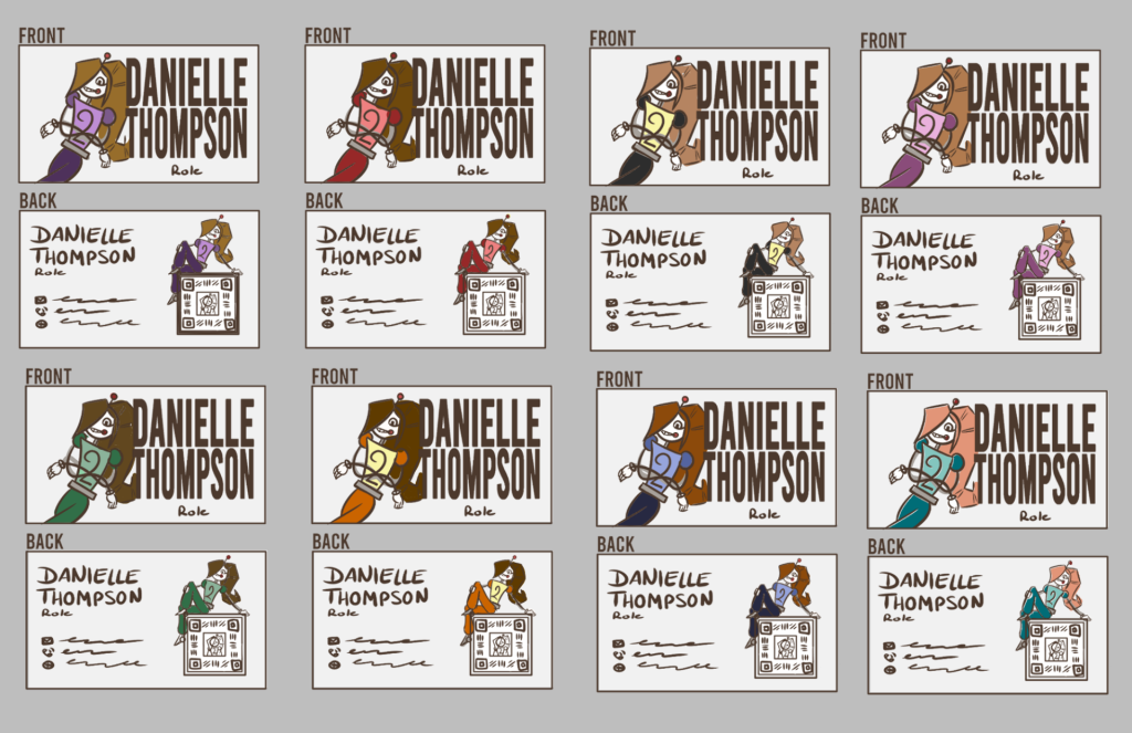

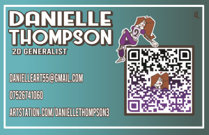
After deciding on the purple, green and teal designs I created some more colour pallets, rearranging and changing the tone and saturation of the colours.


I decided to go with the fourth purple design. I then fully illustrated all my assets and added them to the card.


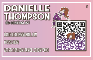
Finally, I tried a variety of background colours to see what made the design pop, I decided on the fifth design as it was bright and would pop on the EoYS display. I plan to use Vista Print to manufacture them and have them in time for the showcase.
Final Business Card Design


I love the way my business card turned out; it is bright and colourful and has all my information without looking cluttered.
CV Designs
Like I did for my business cards I looked at CV’s designed by 2D animators and character designers. Aspects I like are the use of soft colours, they are bright and appealing to the eye. I also like the look of boxes framing the text, which helps its readability. Most of these CV’s have a column on the right containing their icon or logo, name, role and contact information. I like this feature as you know who they are and how to contact them. I will add it to my CV.

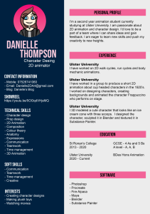
For my CV, I plan to match it to my business card as this will make a clear visual link between my work. This is my old CV, I dislike the amount of information on it as it looks cluttered and boring, the right column is too full and the choice of colours is not great. To improve the design, I blocked out a new layout in Canva, I wanted to focus on the layout and amount of information on the page, I will also target the information more towards the role I wish to pursue.
Old CV Design
New CV Layouts


I decided to go with the layout of the pastel one, I liked the flow and amount of the information. I designed my CV to follow the same design as my business card, I used the same colour, my avatar and fronts to show a visual link throughout my work.
Final CV Design
I like my new CV a lot more than my previous one as the information has been condensed too only what is necessary and the layout has improved the readability.
Showreel
This is my old showreel, to revamp it I will add my new branding and have updated clips of my work.
I used my business card design as a base for the intro and outro, I removed my phone number and ArtStation link. I only used my email and made the avatar and name bigger. For the outro I had the same information as the intro as well as my qr code to my Linktree which has all my social media linked. This way allows the viewer to quickly get my email and name to start with and then if they like my work, they can scan my qr code and find the rest of my work at the end of the video. I also updated the video clips to better highlight my improved skills and more recent work.
Career Direction
To advertise myself to potential employers I created a Facebook, Twitter, and Instagram page, I will be trying to keep them up to date with current projects as it makes me more accessible and easier to contact, there are also a lot of professionals that use social media to advertise themselves, so I will do the same. I also set up an ArtStation account as it looks professional and is another way people can find and view my work. To make all these platforms easier to access I found that making a Linktree would put all my links into one place. I referenced these Linktrees for the types of social media I should link that will help with advertising myself.


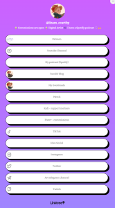

I created a Linktree and then made a qr code to add to my business card and showreel. I did not complete adding all my social media to my Linktree as the deadline was coming up, I will continue to add links before the showcase. Another great place for animators to be seen in on YouTube and YouTube shorts as you can add process videos of work as well as finished videos. All these platforms will allow me to be accessible to all future employers. I have created an account however I have nothing on it, I will update it before the End of Year Show.
Overall, I like the idea of having a Linktree as everything is in one place, however it is very limiting in the design aspect as the more customisable aspects are blocked behind a pay wall.
Posters
When gathering references for my poster I looked at films that had enemies to friends as this is the main theme of my project, most posters about enemies have two characters back-to-back or interacting in some way. The typeface on most of these references use bold, blocky and one colour, this helps the text to stand out from the characters and background.

I started blocking out the rough layouts by using rectangles to represent character and the title, this helped me to see the readability of the poster. Next, I added stick figures to represent the characters, this helped me better visualise how the poster would look with more details, overall, I liked the designs of the last three, they look the most dynamic and fun.

Using my favorite block outs, I drew the characters to look more like their final designs, the more bulked out designs helped me to see what I like about the designs and some issues. I added the colours that were used in the animation and then put a greyscale filter over them. The colours work in the animation, however in the poster there is a lack of contrast. For the typeface I chose a thick font with some curves as it matches the rubber hose style of the animation while still being readable and clear, I chose Westmeath from DaFont.com.

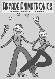
I like the idea of this design as it is dynamic and shows what the main characters do in the animation, but the design is too busy with the characters crossing is a weird way at the bottom and the title is too close to the top of the page. The layout overall looks weird, Lollipop is too close to the left and gumball takes up too much room.

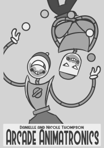
The second design is more visually appealing as the characters are space out more and the poses look fun, they are also better centered taking up around the same amount of space however, the placement of the title is too low and the balls crossing in front of Lollipop blend in too much, also having one character be cut off by the border and the other being whole looks weird.


The third design is the best but still needs some work, I like the two characters being closer and interacting more, I also like the splatter as this illudes to what happens in the animation without telling too much. I will make more thumbnail studies of this design to help finalise the layout.
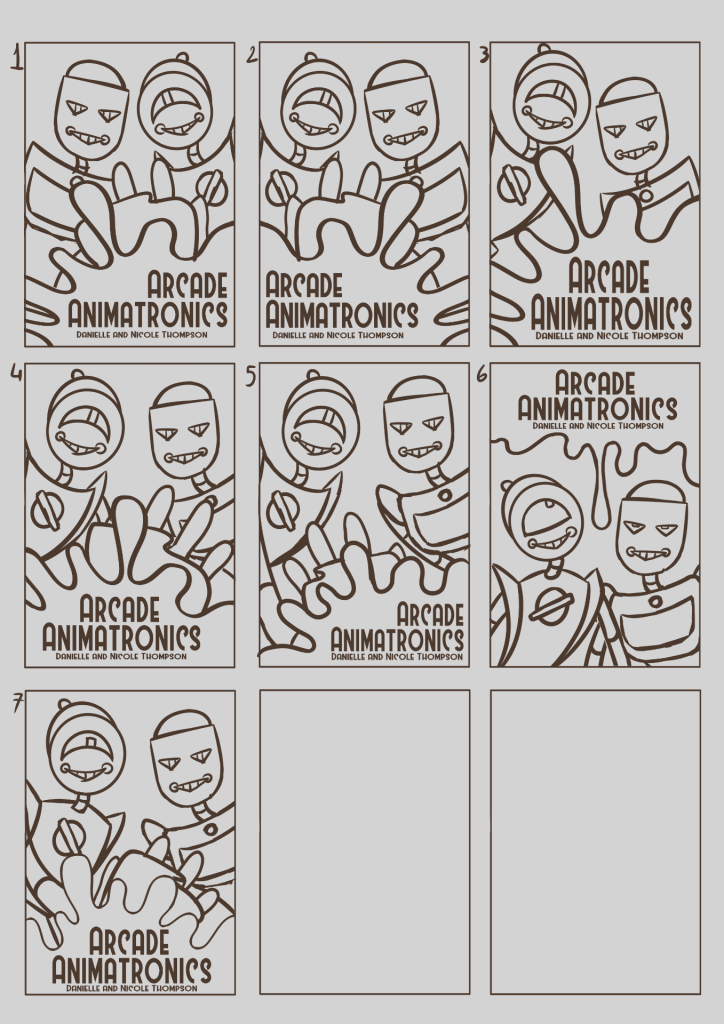
I made some more developed layout thumbnails for my favorite poster design, I experimented with the direction of the characters, the placement of the splatter and the alignment of the text. Overall, I like the look of the sixth and seventh design, the drip being at the top looks fun however I do prefer the characters interacting with the splatter as it looks more dynamic and adds more visual interest.

Since I am in a group with Nicole Thompson, we had to agree on a design we liked from both of our poster designs. We initially liked the look of my splatter design best, so I started to colour the design experimenting with tone and what the background could be.

After this we stopped working on the poster and shifted our focus to the major project. Once we came back to the poster, we decided we wanted to peruse a different design which was created by Nicole and illustrated by me. We liked designs 5 and 7 as these best illustrated the dynamic of the characters.

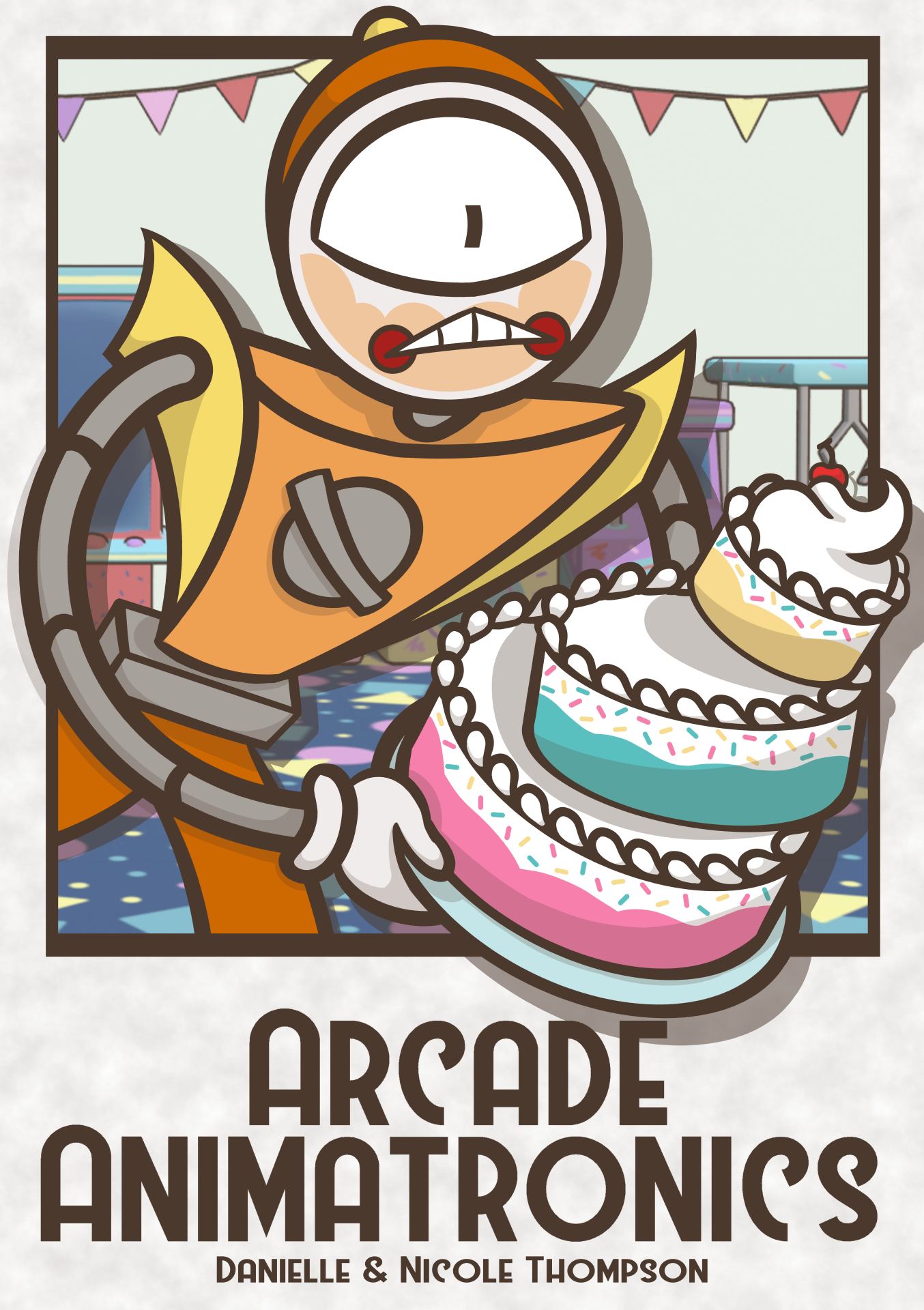
We decided to go for Gumball falling as the pose looked more dynamic and was less generic as most films with similar themes to ours use this pose. I tried adding a polaroid around Gumball as these play a huge part in our animation. We liked the idea, so I made a few more variants, one with a push pin and others trying different colours and background patterns. We decided to go with design 8.

Finally, I illustrated the full poster and colored it. Nicole added her rendered background, shadows, and text to the poster.
Final Poster Design
Artbook
Initially I was going to make a design deck of my work, however after talking with Nicole, we decided an artbook would better suit our project as it would have both of our work in one place rather than two. While I illustrated the poster Nicole took the lead on the artbook, I told her what designs I had in mind, and she illustrated them. I described two themes for the layouts, one to look like a corkboard with polaroid’s and the other to look like an iced cake. These are the designs she created.

(Nicole’s Work)
I decided to go with the corkboard theme and Nicole chose the party theme. She then created some variants of the designs
 (Nicole’s Work)
Finally, she added colour, I liked the pin colours in ‘theme 2 colour 1’ and the gradient title in ‘theme 2 colour 2’.
 (Nicole’s Work)
I started to add my work onto the pages while Nicole worked on the vector images of the polaroid frames and pins.


These pages are currently a work in progress as there are no frames and the layout needs to be finalised. I like the look of the book so far and we will have it finished and printed for the End of Year Show.
End of Year Show Display
For the End of Year Show Display, I discussed what we wanted the display to look like, we both agreed on making it look like a kid’s birthday. Things we wanted to include are bunting banners across the top, a colourful tablecloth, and a fake cake based on the bigger cake at the end of the animation. For the layout I would like to have business cards near the front of the table for easy grabbing as well as some buttons and stickers for guests to grab, the cake over to one side and the two computer monitors will be in the middle back of the table. The board will have printed polaroid’s as well as rendered frames from the animation. I want the table to look bright and fun to draw people over.

This drawing is not based on any measurements, I estimated the sizes of the table compared to the board and all the props.

The First Day
Before Nicole and I got to campus we printed off all the work we had completed at that point and knew we wanted to add to the display, we planned to come in for two days to set up as this would allow us to add anything we felt was missing on the second day as well as confirming if our methods of securing our display was stable. On the first day we started by adding the bunting across the back wall and the corner, this allowed it to hang in front of our pictures, adding depth. Next, we added the poster to the middle of the of the wall and some renders down the left. We then added some polaroids around it to see if we liked the scale and how may we would need. Lastly, we added two tablecloths to add some contrast and lead the eye down the middle of the table and up the wall to the poster. We added a cake that we made based on the design in the animation as well as Nicole’s business cards, I did not have mine printed yet, some party hats that would go on the corners of the monitors and some placeholders for products and an artbook.

Overall, we were happy with the progress so far and now knew what was missing. The wall section was too high as the bunting was starting to block some of the pictures as well as needing more polaroids. We wanted to add some qr codes leading guests to our Linktree in case our business cards ran out during the showcase. Some character turnarounds as well as replacing the object placeholders with real placeholders to better illustrate what we want the display to look like.
The Second Day
On the second day we took everything down to lower the wall display, so it was not blocked. We then replaced the polaroids with laminated ones to make them look more like real polaroids. We then added the character turnarounds and qr codes to the wall. Finally, we added the placeholders for the stickers, buttons, artbook and I added my business cards.
Final Display layout 


Conclusion
Overall, I am incredibly happy with how the display turned out and what we were able to achieve within the deadline. The display is bright and eye catching with easy access to our promotional materials. However, there are still a few things we will do to improve the display for the showcase.
- The spelling mistake on the poster need to be fixed
- The sizing of my business cards is too narrow and the colours need to be lightened
- The artbook need to be completed
- The poster, business cards, artbook and stickers need to be sent to be printed by manufactures
- The wall qr codes need to be bigger or have a boarded as they blend into the display
- And we would like to add frames to the poster and maybe the renders