Sketching is something every designer should be able to conduct, we don’t have to be good drawers, however, we have to be good a visually explaining ourselves on paper. Unlike any digital means of visual ideation, sketching proves us with a quick, low-cost, and discardable method of visual expression. Additionally, it is the most engaging way to conduct collaborative work. For me, while I have lost my magic artistic touch from the secondary school years but it helps me practice allowing me to get back into the rhythm as visuals are processed 60,000 times faster than text and allows us to better convey the understanding of our ideas to others.
“ The effectiveness of the communication matters more than the neatness of the artwork.”
—Jared Spool
One of the habits I get into when sketching ideas, drawing wireframes, etc. Is trying to ‘perfect’ everything, however, this perfectional only makes me more stressed to actually make the drawings neat thus creating a low-quality iteration, however, if something is too neat (especially in the initial stages) we are limiting ourselves to the endless opportunities and possibilities of how we can take our drawings. Sometimes these little quotes are helpful to change our perspectives on how we view things.
Miller’s Law
Miller’s law states that the number of objects an average person can hold within their memory is averaged at seven, however, we must not use this average to justify unnecessary design limitations. Additionally, we can help elevate some of these challenges by organising content into smaller chunks, allowing the user to understand and memorise the information they are presented. An example, of these, would be chunking in mobile numbers, we usually say our phone numbers in three-digit sequences as it helps us remember them and verbally inform others. Additionally, as UX designers, we must understand how content will be presented to the user, chunking is often useful for visually separating a large portion of content.
Task
For this collaborative task, we got into groups to create a ‘plant wellness app’ in which we were given the brief and had to design around that.

We started with a user flow to create an architecture of the site, allowing us to better understand the features and how they can be navigated. Additionally, these allowed us to see how our users may achieve their goals.

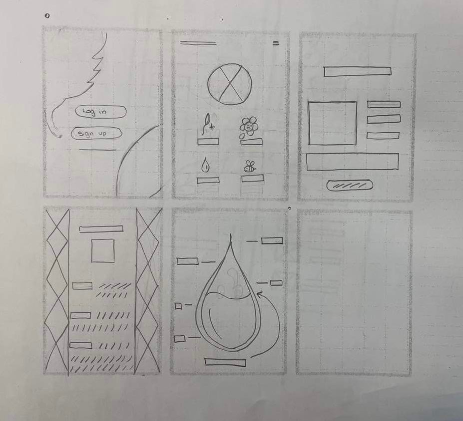
Next, we all began wireframing the app in a set of 6 boxes, allowing us to iterate and develop unique and interesting features independently. This was an extremely engaging and informative activity as it made us look at how other people are progressing allowing us to share our individual ideas of how certain features can be displayed/implemented to the user.

After sharing our individual ideas & concepts, we began to group vote on who has the most unique and efficient wireframe concepts. We then took each of the desired wireframes and redrew them into a new wireframe. Not only does this activity help us practice employing a UX strategy in our work, it allows us to better cooperate with each other and handle critical feedback more.