This week’s critique session was conducted by Kyle & a guest. This is good as it gives me a widened view of my work. I am always looking forward to these sessions as it gives us a chance to look at others to see how their progressing and ultimately confirm strengths and weaknesses posed in my work.
Self-Reflection
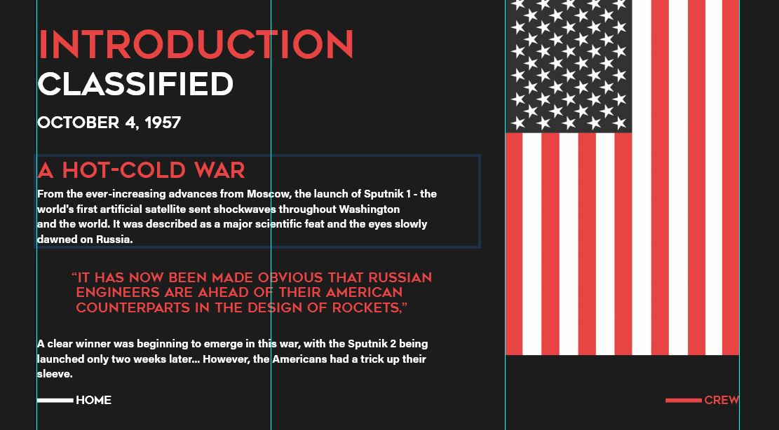
Home screen

Menu Screen

Content screen


Before I go to these critiques and to avoid bias, I look at my own work after working on it and try to spot flaws. This can help me focus more on any errors that there are and allows me to see errors that I haven’t seen before. Additionally, it can help confirm anything that is bothering me especially if it is pointed out in the critique session by others.
Strengths
- Overall design
- Strong art direction
- Strong colours & branding
- Visuals
- Narration
Weaknesses
- It feels too much like a PowerPoint
- While typography is scaled it feels non-directional
- The content feels too crammed
- Animation narration feels like too much
- Too much red
The Critique

Overall, the critique was mixed with mainly positive comments. I actually love constructive comments more as I want to know my areas of improvement. Many people commented positively on my colours, micro-interactions with buttons, menu navigation, etc. I will list out what was pointed out by classmates below:
Critique from Classmates
Strengths
- Starting screen animations
- Starting screen buttons
- Consistent colour scheme and overall look
- Transitions
Weaknesses
- Font weight
- Too much information
- No nav
- Animations can be too much
- Typesetting
Critique from Tutor
Kyle talked about the issue of not having a navigational bar as users may not want to go the route you intend and it’s better to let them freely move whilst guiding them through the experience. Another important area Kyle talked about is the weight of the font being too heavy and the animation load of content being equally heavy.
Refinements
![]()
I decided to add a navbar and reduce the animations. The navbar gives people full control over where they want to direct the journey.
Conclusion
Overall, I am really pleased with the constructive feedback from both Kyle and fellow classmates. It has shown me many of my strengths but equally many of the problems that are found in my prototype. My plan now is to use this week to rethink and remodel the direction of my prototype before I start even touching web flow. I will continue to make adjustments to my work.