My next step in developing my Apollo project further is finding and pairing the right typography to create a compelling and contrasting design. As there is a large emphasis on typography in this project I must select my typography very carefully. For me selecting typography is a simple process on the outside, however, when it comes to doing it and having to choose from hundreds of different typefaces, it can get confusing and complicated really fast.
However, one way I tried to fix this problem this time is to create a mood board of the typography I feel will compliment the intended visual style of my project.
Type Moodboard
For my intended heading typeface, I want to have something that adheres to my visual values; bold, eye-catching and a sense of technological progress, aka – modern, and of course the decision was to look at large, eye-catching sans serifs.
I decided to get snippets from different books, magazines, newspapers, album covers, etc from that era.

During that time period, serifs were the most popular choice of typefaces, however, the occasional use of sans serifs that were all in capital letters with long cap-height was prominent in grabbing the reader’s attention, An example of this is from the newspaper above which says “KENNEDY WINS!”.
Narrowing it down
One of my favorites that grabbed my attention was the headline used in a magazine cover for “Apollo 11 flown magazine “N” fragment”. Its skinny, long and close-quarter lettering is exactly what I want to compliment my project and gain the attention of the user.

Another font that instantly grabbed my attention was from Call Of Duty: Cold War. It’s been a font that ever since I saw it, I’ve been instantly in love with it and it just so happens that it is perfect for my upcoming project.


The bold, modern and minimalistic typeface is perfect for titles and captivating the audience’s attention. It is also reminiscent of old newspaper titles and Bauhaus typefaces which can represent the weight of technological advancement and the modern era. Additionally, the use of thinner weighted text pairs extremely well with larger titles.
Outcome
While the original Call of Duty: Cold War text was hidden behind a massive paywall. I decided to opt for a free alternative called: Geometos which prescribes a near-identical visual experience. Its extended cap height, all capital alphabet and geometric lettering were perfect for a bold and engaging typeface title. However, if there was one thing I could change in this typeface I would make it have a little bit more weight.

Pairing Typefaces
One thing that I struggle with, especially in previous projects is pairing typefaces. However, this time I have gone through an extensive natural selection process to achieve what is in my opinion a perfect match to go with my Geometos font.
Using some of Kyle’s apollo content and the help of Adobe illustrator I began to layout different typefaces to see what looks the best:
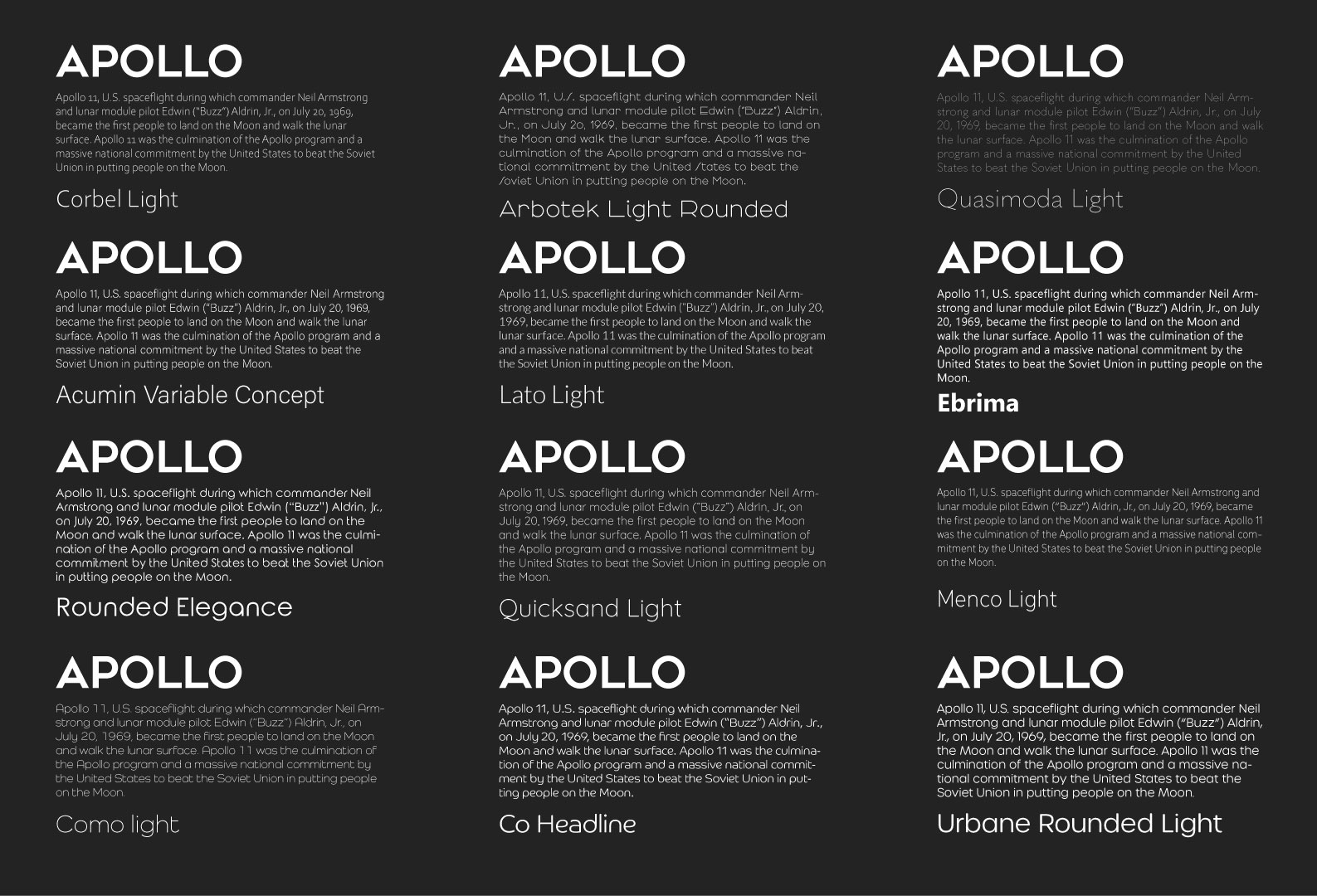

After, eliminating 7 typefaces, I kept four that I thought looked and read the best. Although I wanted the light text, many of the thin fonts didn’t hold up against the strong black background. .
Outcome

I decided to pick “Acumin Variable Concept” as the readability is the best out of all the remaining fonts.
*Update*
After careful consideration and feedback from Kyle, I have now decided to change the body copy of my font from ‘Acumin Variable Concept’ to ‘Lato Light’ as I have slowly changed my mind on the font as it is too static, lacking any character and overall doesn’t match the visual essence of my project. Overall, I think Lato is a better option as it is longer (consistent with the title), thinner and has larger lettering.

Conclusion
I am extremely happy with my typography selection. I feel like it is consistent, eye-catching and matches the visual essence of my project. I also feel by doing some of the techniques in this blog with the addition of independent studying and looking at how others pair typography such as newspapers, websites, etc, has made me more informed and knowledgeable in pairing and choosing typography for future projects.