For this blog, I will be looking at different media sources of art direction that have and could potentially inspire me for my Apollo project. I will be dissecting their products and how they evoke emotion and communication through 4 elements: Colour, typography, composition, and concept. Additionally, this will ultimately make me more aware of how art direction is implemented and spark new ideas of my own.
VOX – YouTube
Vox is an American news website and YouTube channel that was founded in April 2014, they produce high-quality and informative explanatory journalism media. In their videos, they both use visual and typographical sequences through motion graphics and photographic immersion to create a compelling and narrative experience.
The topics that Vox covers are broad, however, Dion Lee, the senior art director at Vox often follows a similar linear and aesthetic structure that makes their content so unique and executable. I will be looking at their “Linoleum flooring is cool, actually”
Colour
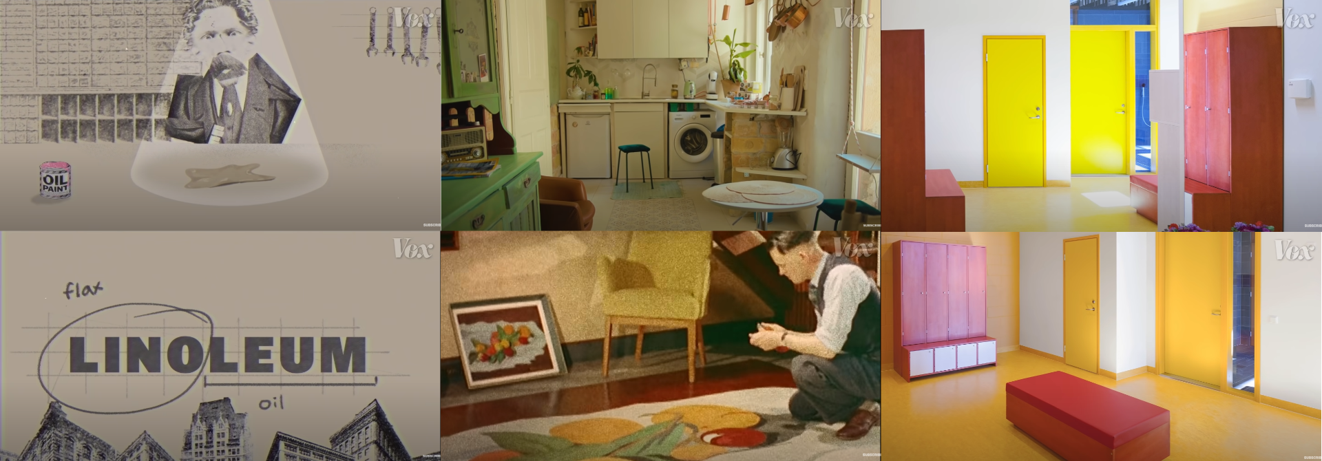
Vox is great at capturing the era and setting of their discussed topic through their choice of colours. In this video, Vox is trying to bring awareness back of the benefits of Linoleum flooring. However, to do this they give a backstory, the era it was most commonly tied to and how it can be used in the modern-day. For each of these eras, they are representing different tones to evoke different nostalgic reactions. For example, the invention of linoleum is often shown with minimal and dampened colours representing the industrial era. Evoking a sense of being trapped in time. When talking about the mid 20th century, they employ a goldish and washed out tint onto the scene, making the audiences reminisce about that period of time and capturing the nostalgia. However, when it shows it in modern-day use it shows a clean and brighter mixture of colours representing the technological advancement. The result is that Vox employs symbolic colouring representational of that era to envoke and trap viewers into that time.
Typography
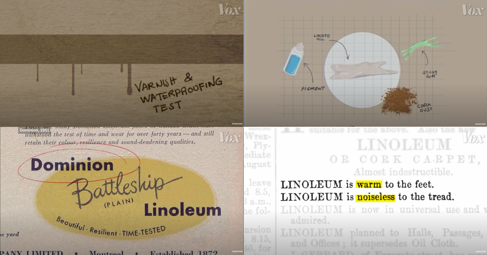
Similar to colour, the typography changes depending on sequential events are being unfolded, for example, when displaying the history of Linoleum they use script typefaces to create the sense of ‘work shop’ or ‘drawing board’. This creates a fabricated sense of progression and iteration, allowing to subsequently build the story. Additionally, Vox usually doesn’t employ its own typography (minus titles and animation) for its videos, instead uses snippets of documentation. This is an attempt to create trust between their context and the audience. By showing the audience snippets of historical text, it allows for a more trustworthy and engaging experience.
Composition

Vox often show a range of unbalanced compositions throughout their videos, this case is the same. This is done so the audience can visually experience what is happening and allow them to decode the visual information before actually providing the contextual message. It also allows elements to create more tension thus providing a substantial build-up in the audience. This creates a more engaging and immersive experience as the audience are wanting to know why they are being shown it.
Concept

Throughout their videos we can see textured surfaces, the use of employe ‘fabric’ masks over elements in the videos or animations creates a more rustic and gritty feel for the audience. It makes the audience feel like they are living in that time by using patterns significant to that time period. While these design changes are subtle, it has a big effect on changing the emotion of the audience and conveying a sense of realism.
Overall
Overall, combing all elements together. It enforces a sense of nostalgia, trust and engagement with the audience. These feelings are exactly what I want my Apollo project to convey.
Conclusion
I found this analysis a great and inspiring piece of research to partake in. It has been extremely helpful to analyse in real-time the motives and communicative approach Dion Lee has employed in her work as an art director. It has allowed me to study the meaning behind many of the choices made and how it affects the audience. I want to employ some of the techniques used from them in my project to create an engaging, trustworthy and nostalgic product.