Today’s class is about Art Direction for our immersive prototypes. This allows us to define a set of artistic expressions for our work. For the past two weeks, we look at typography and mood boards this has pathed multiple ways I can take my artistic directions, a few examples will be below:
Simulation
- Mimicking early computer modules, using pixelated green or white typography filled with pixeled visual imagery and sounds.
Nasa
- Using modern Bauhaus typography/Nasa-Esque san serifs with black & white visuals creates a strong and coherent essence that was visible in that era.
Newspaper
- A digital representation of a newspaper using serif typography and grainy visuals to create a sense of historic realism.
As time goes on, the art direction has become extremely important in conveying a sense of value and experience in digital and physical products. It is extremely important for companies to convey uniqueness and information on what their brand is. For example, Kyle showed us the website of the European train service named the Orient Express. This is a high-value and prestigious passager train service that delivers extreme comfort and luxury for the passengers. They want you to know this, so they have sculped their website into these values. For example, they use neutral low saturated colours that are seen as royalty (often seen in Gucci & similar adverts). They have a considered structure that is well laid out and purposeful (with plenty of negative space). The typography is small, compact and conveys a sense of luxury. Additionally, they show exotic and well-prepared photographs of meals. The Orient Express is trying to convey the same feeling you get when in a high-end restaurant by visually expressing their values of comfort and luxury.

On the other hand, there is Ryanair – a low-budget airliner. Their website is big and bulky with “DEALS” plastered at every corner you look at. The extreme colour scheme, unconventional and sporadic layout combined with thick and abrupt typography is a visually expressive way to implement their cheap and low-standards values. Normally companies don’t do this as they want to gain the user’s trust to show their services are good, however, Ryanair has such negative notoriety yet at the same time they are constantly sought after for their deals. They want to capture people’s attention.

Overall, both companies are artistically defined by their traveling experience, Orient Express creates a vast, luxurious & structured design that reflects their large cabins, prestigious architecture and professional employees. While Ryanair’s sporadic, bulky and chaotic confined nature of their digital products represent their low value, limited space and tacky colours.
Similarly, we can apply this to our Apollo project by creating and looking at various historic pictures, media, mood boards, etc. A possible way I could take this is using the ‘simulation’ concept and creating a tight & bulky feel and limited colour scheme to be representative of early computers that Nasa would use.
“Use design techniques to intentionally evoke an emotional response from someone when they read an article, use a product, or visit a website.” – Andy Clarke
“Art direction brings clarity and definition to our work; it helps our work convey a specific message to a particular group of people. Art direction combines are and design to evoke a cultural and emotional reaction… Without art direction, we’re left dry, sterile experiences that are easily forgotten.”
This is a small yet prominent part that art direction plays, it aids the story, it conveys emotion and value to a product and connects with the interests of the intended user. Without using art direction our products simply become stagnant and forgettable. Through the simple use of effective typography, colours and visual images art direction can become more than just an artistic embodiment; it can become a means of communication.
“Good art direction… is good storytellling. Throughout its long history, what we’ve valued most in the practice of art direction is this: the ability to control the myriad elements of design in such a way as to produce sustained, cohesive, and distinctive narrative experience.” – Koi Vinh
Bad art direction for a story is like having a children’s cartoon series without any audio. Both are equal and benefit each other (and quite often they are the same). Art directions can help influence narrative and vice versa. They are a crucial part of communicating to the user.
Panzera, an Australian watch company, although not seen as prestige as Rolex, they want to strive for it. Throughout their website, they use modern typography, a defined structure and enlarged spacing to create this set of high-end values. However, their quest just doesn’t stop here as by using an estimate of probability, the company takes stories of potential sceneries of users and merges it into their story through the use of social media.
Tutorial Task
For today’s tutorial session we were tasked with creating a visual interpretation of our suggested prototype by starting with type. Although I was on the border with which one I would like to choose I went ahead with my second option ‘Nasa’ as it was the one I’ve done the most extensive research towards and most fitting.
When designing projects like this, I must ensure every section of my art direction compliments each other e.g. bold typography, bold colours and bold imagery. Luckily, I had a typeface in mind through the previous week’s research.
Typography
For my typography, I wanted a sans serif but not a generic sans serif, something that is clean, visually striking (wide) and structured to create an eye-catching and heavy look. Almost representational of Nasa’s brand guidelines, representing a systematic and precise (scientific terms) approach.

Visual Imagery
For my visual imagery, I want my art direction to consist of collages of rustic photographs to add a sense of jaggedness to contrast against the clean interface (VOX on Youtube does this) – almost like cardboard cut-outs. This makes it feel more historically representative of the Apollo mission and feels like a secret government file. Additionally, I want the images to be highly saturated as if you are viewing this on an early TV that has colour (see below).

Colour
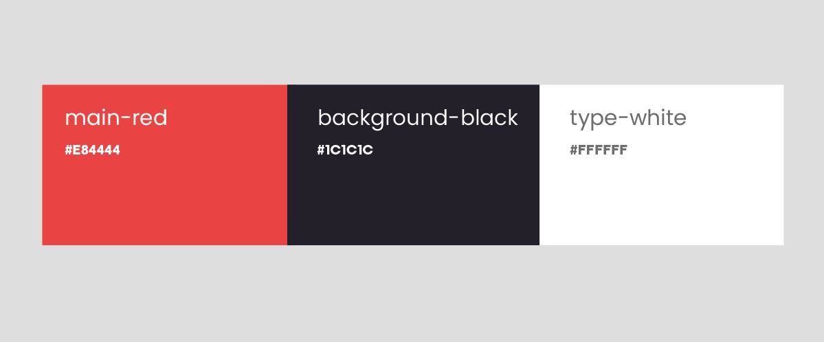
In order for my colour to compliment my typography and visual imagery, I have to include a limited palette. I want to use extreme dark colours for the background to mimic space while letting the typography and images standout. Additionally, I will have white to contrast with black to mimick stars/astronaut suits and red to represent pride and American identity.
Finished Task
