To begin researching Travel apps I must start with a brief analysation and recognition of already established apps on the app store and their characteristics to gain more knowledge and also to pick out characteristics from individual apps.
For this I will pick five slightly unique apps from the app store all localized to travel.
Waze


Points of Recognition & Analysis:
- General walkthrough of each of their options for beginners.
- Uses a mascot which creates a more engaging and fun experience. (FG.1 & FG.2)
- Humorous and vibrant Illustrations
- On the start up screen it begins tips, engaging messages, etc along with different illustrations (FG.2)
- Interactive map showing different obstacles throughout the city such as checkpoints, roadblocks etc. (FG.3)
- Does more than just take you from point A – B such as linking Spotify, favourites, best route, schedules, calendars, etc. gives a more engaging and interactive focus. (FG.4 & FG.5)
- Contains your own profile which you can build and earn rewards creating a more personalized experience (FG.5)
- Uses both filled and glyph icons (FG.5 & FG.6)
- Bold & vibrant Illustrations creates importance and character. (FG.6)
- Also, native light blue/White combined with the vibrant illustrations (obstacles) allows the illustrations to become more eye catching and dominant.
- Glyph icons match the native blue
- Levelling systems depending on how far you drive
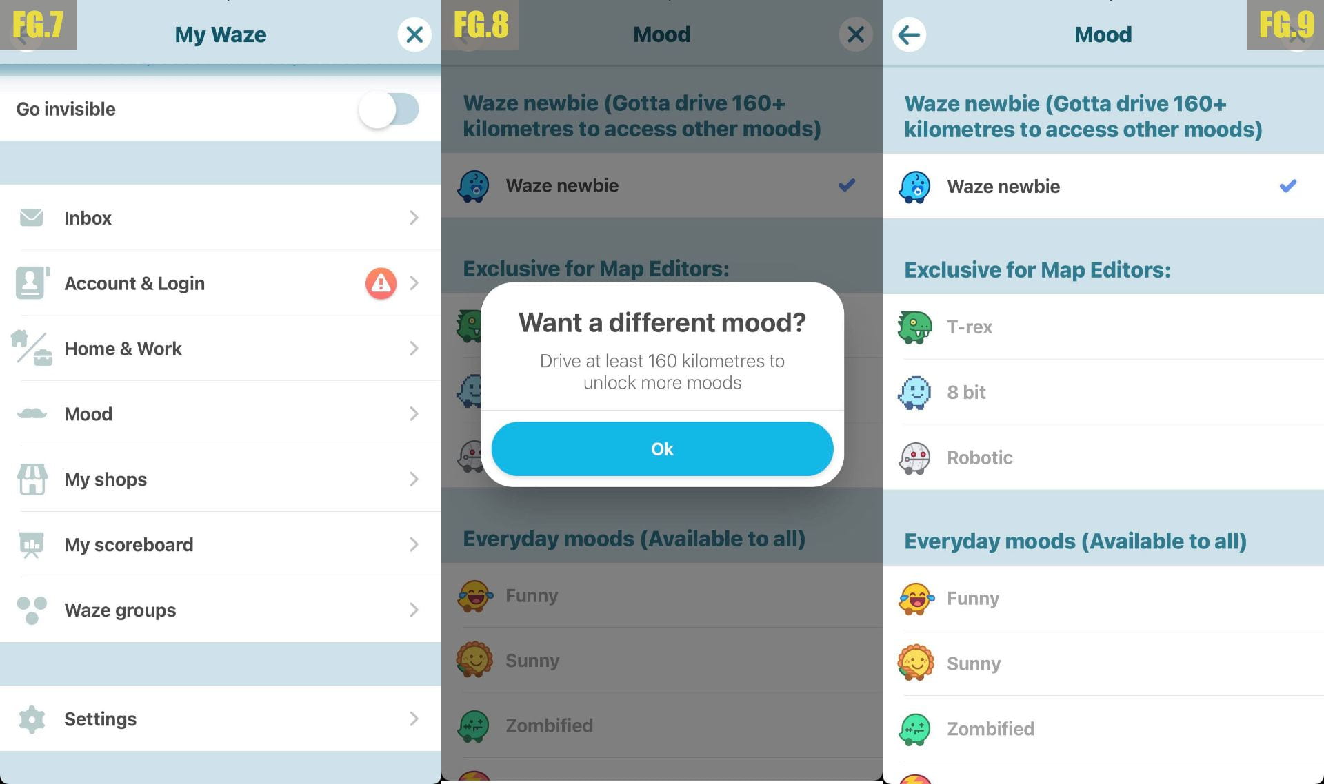
- To stay in line with the apps more playful and less serious approach it uses satirical humour such as the “mood” page where you can select, unlock and earn different moods for your profile. (F.G 7 – F.G 9)
Skyscanner


Points of Recognition & Analysis:
- Light and friendly colour palate with a white secondary colour
- Brightly coloured and entertaining Illustrations
- Universal navigational icons
- Displays helpful tip section during start-up (top half illustrations/bottom written) (FG.1)
- Clean and unobtrusive layout, lots of negative spaced used
- Global brand uses universal icons which stick with the colour palate. (FG.2)
- Use of humorous illustrations (FG.5)
- Profile creation (FG.4)
- Bookings neatly arranged in a column (FG. 6)
Booking.com

Points of Recognition & Analysis:
- Dark blue them contrasted with the secondary white
- Lack of illustrations and more photographic imagery
- Uses outline icons
- Layout is more compact than Sky scanners, but use a lot of negative space and deliver the most important information
- “Welcome back, Cormac!” – Creates a sense of familiarity and personalisation (FG.1)
- Profile creation (FG.2)
- Wallet – virtual booking currency (FG.2)
- Unique rewards “Genius” program with deals highlighted in blue (FG.2 & FG.3)
- Use of alternative colours (Not blue & white) to give a greater impact on their discounts (FG.3)
Wild Atlantic Way
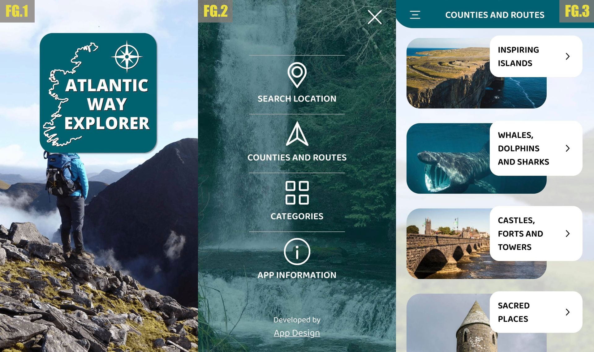

Points of Recognition & Analysis:
- Uses both Icons and photographic pictures
- Prominent turquoise colour palate with white secondary (represents Atlantic ocean)
- Uses simplistic and universal and outlined icons. (FG.2)
- Icons are centred in page (FG.2)
- Turquoise Bar at the top to display general page information + options.
- Images are masked in boxes with information on the right. (FG.3 – FG.4)
- Different categories and representation for each place (FG.4)
- Interactive map with unique icons to display each landmark (FG.5)
- Information box half way up the page displaying both images and information (FG.6)
Criticism :
- Amateur layout
- The photographic background images don’t go well on both icons and other photographic images (FG.2 – FG.4)
- Some Images looked distorted
- Map is too cluttered with no sense of scale (E.g. All pins look the same and are present no matter how far you’re zoomed in) (FG.5)
Game Of Thrones Locations

Points of Recognition & Analysis:
- Dark medieval theme
- Home screen entices the user through pictorial images and luring typography. (FG.1)
- Uses culturally familiar typography relevant to its category.
- Uses a white map making it easier to highlight (FG.1)
- Interactive map with 3D animations such as shifting mountains when zoomed in (FG.2)
- Select points on the map to reveal a description, directions & video. (FG.2 – FG. 3)
- Uses a variety of information and illustrations to display information.
I found this very helpful to me as it gave me a chance to deconstruct app interfaces and functions. This has made me more informed of what travel apps consist of and how they are presented. I also noted some criticism for some a few apps.