CV Examples:
Example 1: Albert Tella Ùbeda’s CV
I found it difficult to find that many animator’s CVs to use as example. I managed to find Albert, a 3D/Concept Artist, who has a really clean and professional looking CV. The first thing that catches your eyes, is the banner with pictures of some of his 3D models, taking up about the top quarter of the page. This is a clear example of what he is capable of before you even begin reading. Then, he has divided the text into 3 clear columns. The left side covers his name, profile, and interests. The middle his education and skill set and level of those skills, shown through little meter bars. And finally, the right side covers his Languages, experience, contact details and location. He uses a clear and legible font with consistent sizing. I think the addition of the language section bumps up his CV to a higher and more professional level as he is showcasing his accessibility. The layout of the page is also landscape rather than portrait, which is uncommon, but he lays it out efficiently. The use of simple graphics/icons beside each section also adds to the flow of his CV, making it easy to read/understand – also cutting down on any walls of text. Then the little skill meters and percentages in his language section are unique and visually showcase his capabilities. He also includes a modest grayscale portrait of himself above his profile. The photo identifies what Albert looks like but not in a distracting way that takes away or disturbs the colour scheme of the CV. Lastly, the white font over black is a popular but efficient choice of colour palette – very professional and sleek. I really like this CV; however, I think it lacks a bit of personality.
Example 2: Binyang Liu

I chose this CV as well because it’s also someone who works in the industry. Overall, this CV isn’t the best example but there are certain things that I do like about it. Like the overall colour scheme, however, it lacks consistency and doesn’t have good flow when it comes to reading. The font sizes don’t match, and the fluctuation of font colours makes it harder to read as well. Aside from the font inconsistencies, the layout does have potential. I like the vertical banner on the left and the contrast between the pink and blue. Then the faded illustrations look good with the colours, but the education section at the bottom doesn’t really work with the text as it’s very distracting.
From both Albert and Binyang, I could take some inspiration. From Albert’s CV, I really like the look of the portfolio banner at the top, it looks professional and adds visual interest. Then from Binyang, I think I’ll use a similar layout for my own CV, with a banner on the left and text on the right.
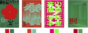
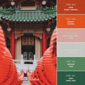
Colour Palettes:
I want my CV’s colour palette to be a reflection of me. I really like green and orange/red together, the contrast of warm and cool tone stands out but isn’t too bold. Although, I need to be careful that the text is legible – depending on the way I layout my own CV, it could be hard to make out with this palette. I found some colour scripts/palettes online that I thought
stood out while not causing any eye strain.

I normally sign my work with my water mark (my Chinese name) and have an illustrated self portrait of myself that I can use – to hopefully add some personality to my CV.

