I started my portfolio journey with making my wireframes, and digital prototypes, this came is very handy when designing my website. It gave me a good guide and helped me stay consistent throughout. When I thought about making my portfolio I debated wether to use my old portfolio from first semester or to try something new. Daniel said that we could add to our first portfolio attempts to try and make them better but I don’t feel Github is for me. So, I wanted to try something new.
I bought my domain name – caragreene.design and with it I decided to use the WordPress website builder. Why did I chose this one over sites like Webflow, or just code my own? I chose WordPress for the following reasons:
- Wordpress is considered one of the best for website building right now, the reviews were amazing. It was recommended by so many designers.
- It is an easy platform to work from, giving me all the tools I need for information input, widgets, interactive elements and so much more. I found it very easy to get the hang of and found it really fun to build a website.
- It looks great, the end result was really professional looking and I was able to achieve what I wanted to – a slick, modern website that portrays my creative work.
- My coding skills are pretty basic, therefore I would have not been able to make such a high quality functional website that I want clients to see or use .
Below are some snapshots of how my portfolio is looking.
Home page

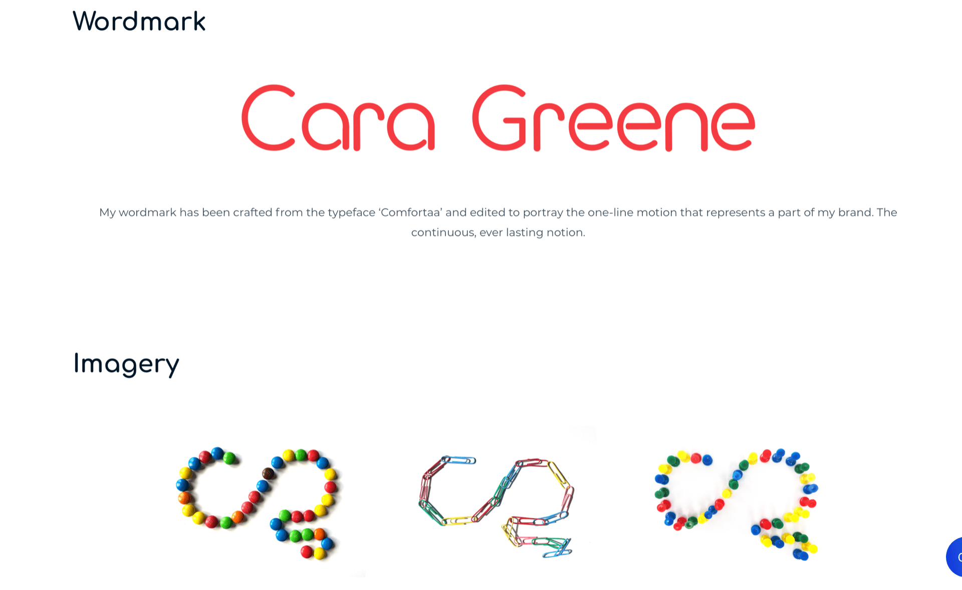
I went for my design that I planned for in my portfolio digital prototype. A plain white background with red accents throughout. I went for red navigation that changes a slightly darker tone of red on hover once it’s selected and also underlines. I made my monogram slightly bigger. In my discussion with Daniel about this, he advised that I made my monogrm bigger and take the yellow out of the navigation so that is what I did.
I added an animation and it plays when the play button is selected. I still feel I want to adjust this and make it so that the animation bar does not come up but I am still working on that.
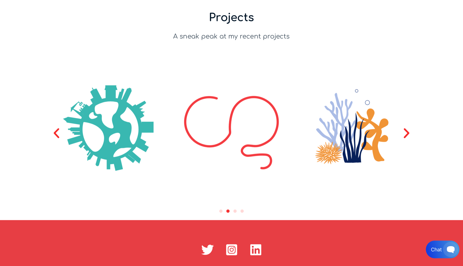
I also added a short sentence to the homepage opposite my logo animation to welcome the audience but not blabber on because I want to get straight to the work. The image below is the bottom half of the home page, this part displays sneak peaks of my projects. I chose a few favourite elements from each project I had worked on this semester and set them up on an image carousel. I thought this was a fun feature and makes my homepage that little bit more interactive.
I also included a set of icons that links to all of my social media and in the bottom right hand corner I have set up a chat box, this is interactive with anyone who comes to my website and they can ask a question. I am unsure if I am going to keep this feature, since I have a contact me page but I though it was a nice touch, even though I think I would like to change the colour from blue to something more fitting with my website.
About Me Page
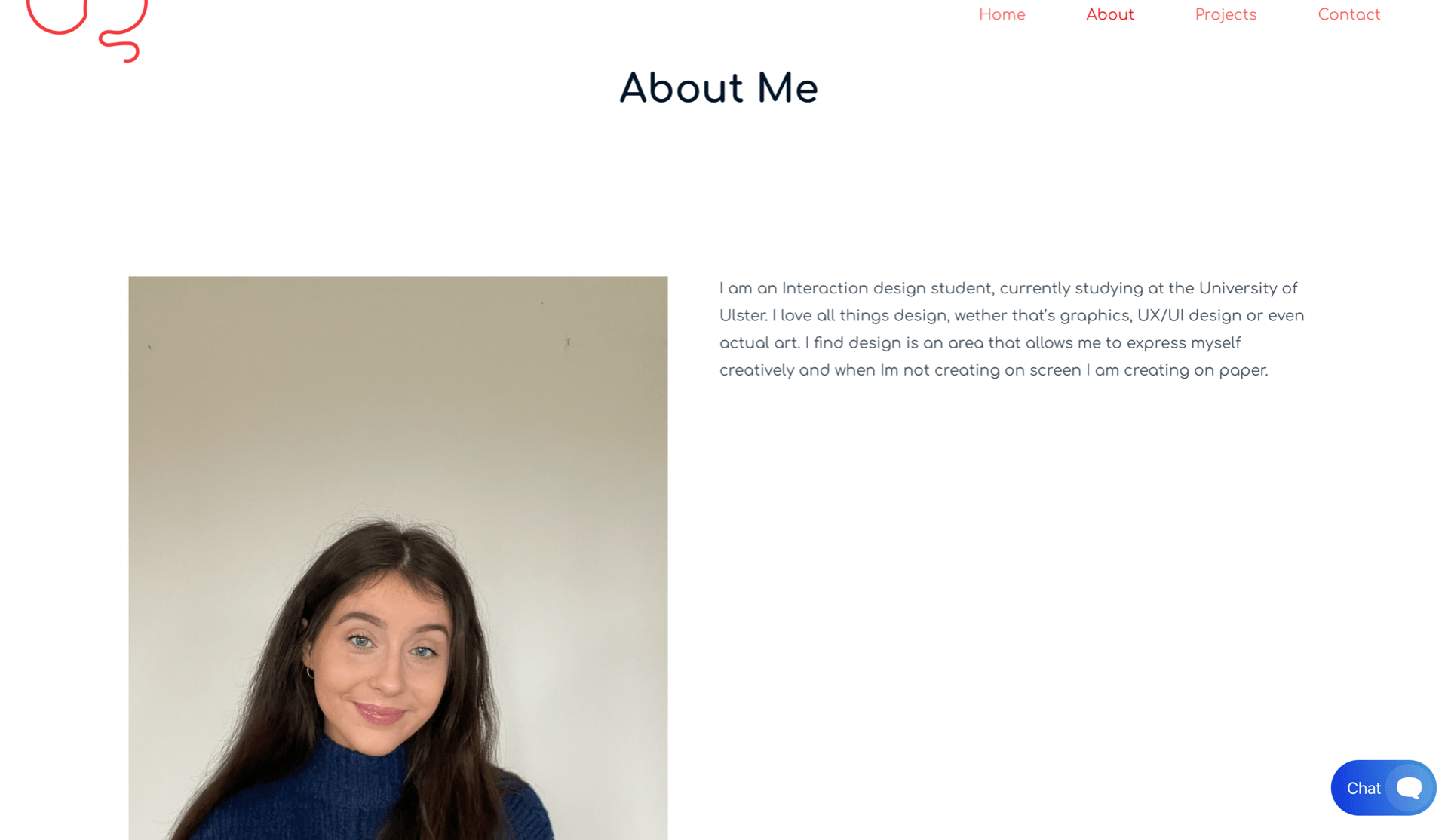
This page was simple to make because all I had to do was import an image of myself and write a small paragraph about myself, my work and my aims for this portfolio. I think it looks nice with the black text, the font is Comfortaa and is easily read. The only thing I think I may change is the placement of this page, I think I might put they page after my projects page but I am still unsure.
Projects Page
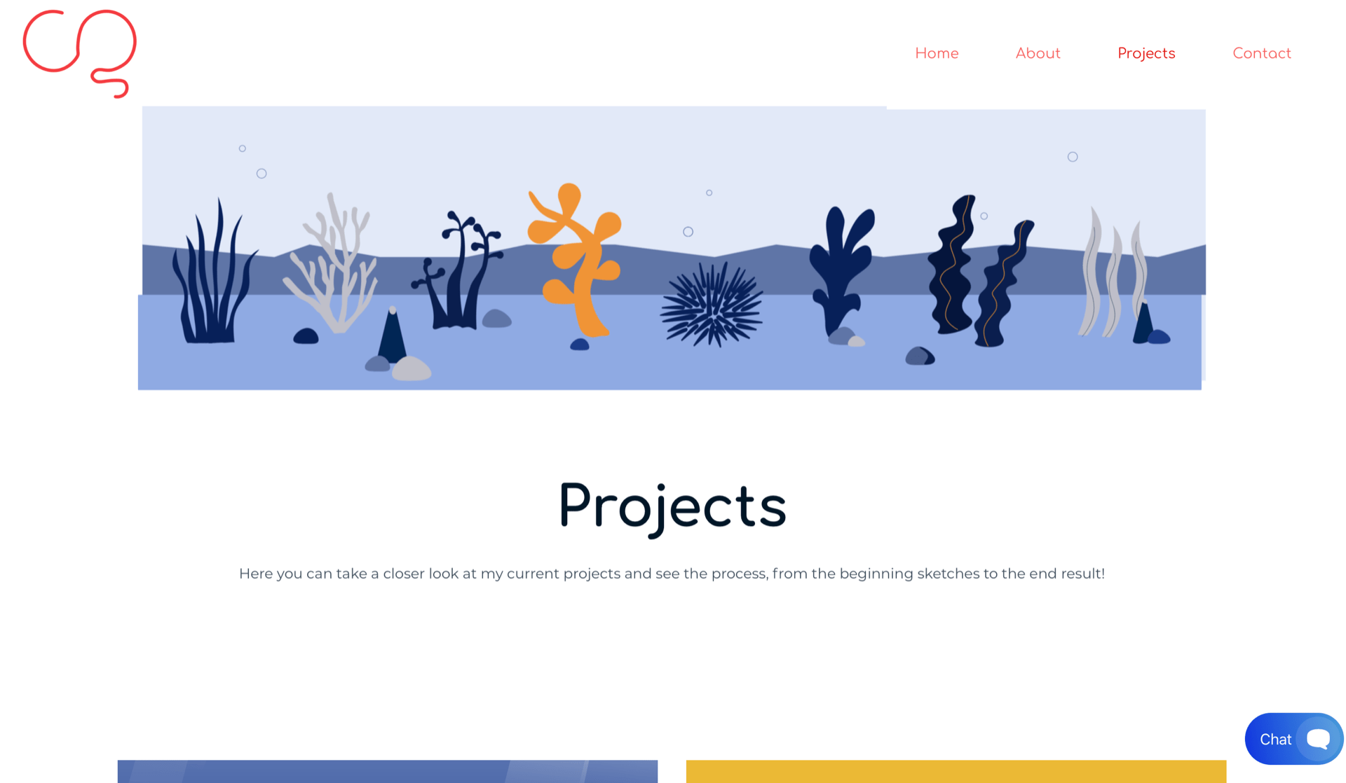
The image above is the top of the projects page, I included a banner across the top of a part of my travel app that I liked and thought I could include as another insight into my work. This needs altering because I would like to try to get it go the whole way across the scree, it also looks slightly tilted in parts so I need to look into that aswell. I then get straight into the projects, I think this is better than including to much tech because people just want to see the work
The images below is my project section, I split it into four because those are the four projects I worked on this semester and for area I want to talk about. I then linked each project to a new page, this page then will have all the information and process on the project itself. I kept all four boxes the same size and the images inside of them too, this made for a consistent table almost and one that clients can naviaged through easily.

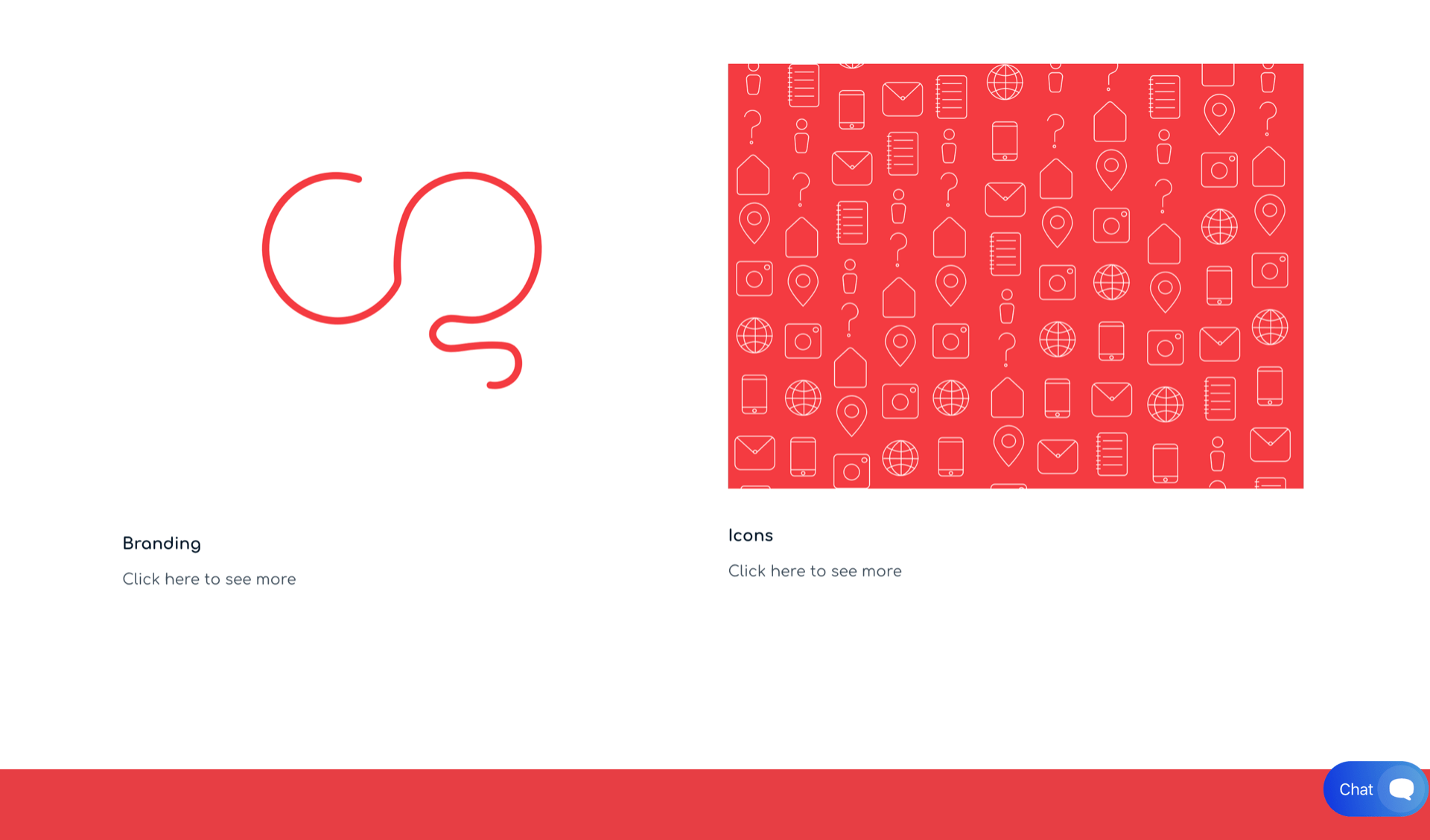
Each project page
Travel App


Infographic
My Brand

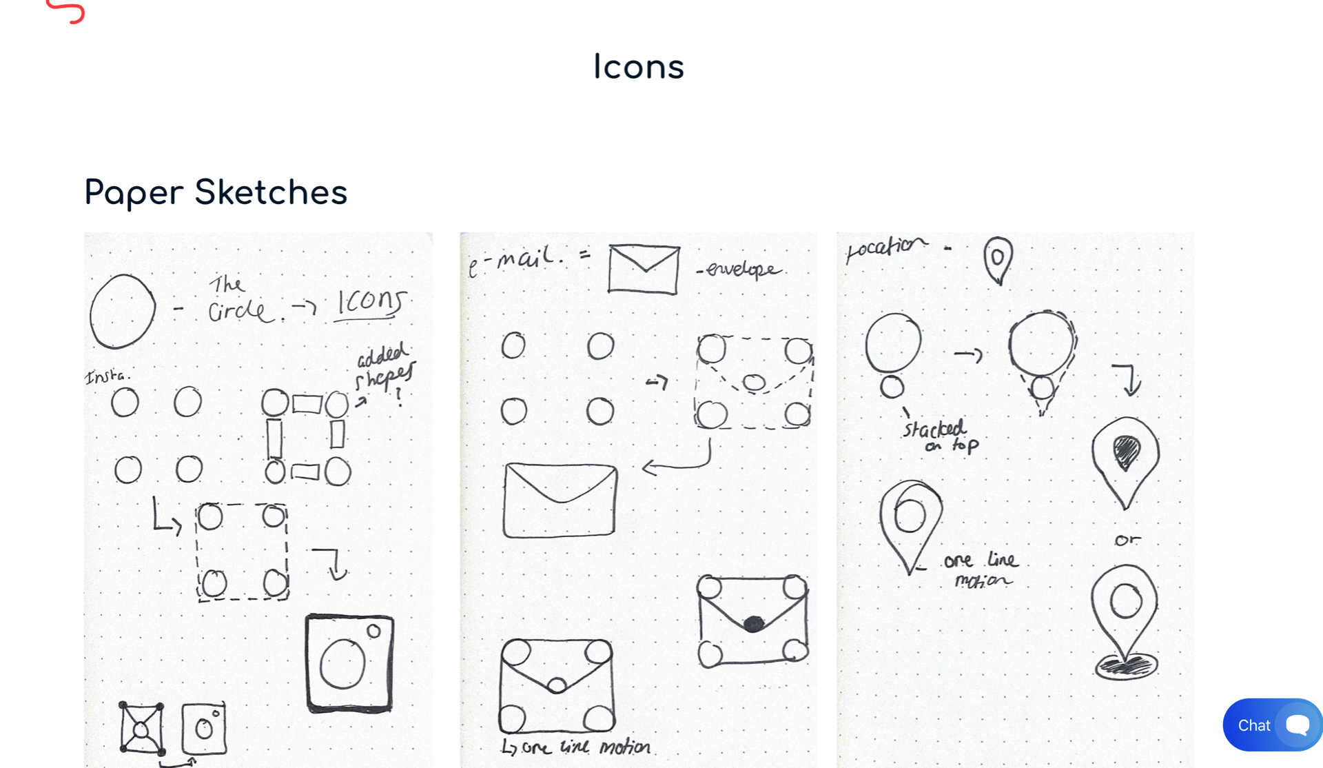
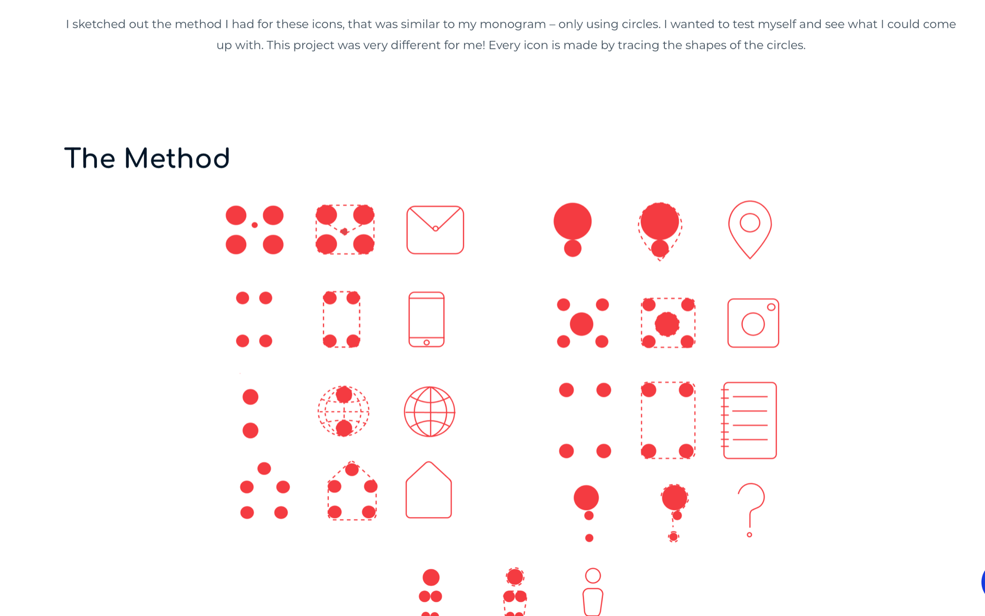
Icons

As you can see in the snapshots above, I have set up a page for each project and then went though the entire process, I tried keeping my words to a minimum for now because I don’t want to fill the page with text. This portfolio is to display my work, however I feel like I could have wrote more for certain things but I can fix that over time. I am happy with the progress so far and will continue to work on placement and sizing etc.
Contact Me Page
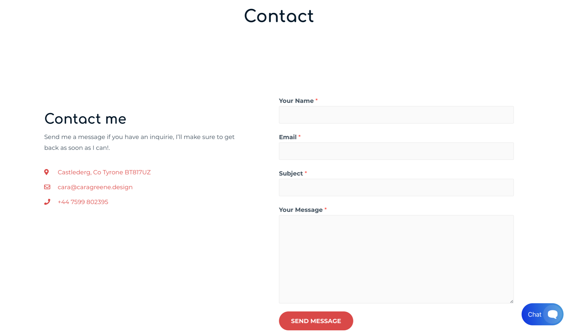
The final part of my portfolio is the contact me page, I have set up this contact form so it is easy for clients to ask me something or send in an inquiry etc. I thought the red button was a nice touch and really goes with the feel of the website. I also think that the boxes are set up in a nice and legible way and is easy for anyone to follow. I like the contact sentence I wrote to the left just informing people what this page is. I also used icons to represent the information beside it for example my location, number etc.
I think there isn’t anything to fix on this page because it is just a standard contact page with all the information someone needs to contact me.
Thoughts
- I really enjoyed making this portfolio and feel like this website builder was a great way of letting me make the best website I could. I think there are still things to fix and make better but that can come with time and it is something for me to continue working on through my designing career.
- The main thing I want to work on is placement of titles and text, I think that I could find a more fitting position for both to make my project pages more exciting and easier to read.
- I am really happy with how my progress through this journey of making my portfolio, from sketches to wireframes and the final product. I am really proud of myself that I was able to make a website at standard like this and can’t wait to see what else I add to it.