Building an accessible portfolio
Following my talk with Reginé Gilbert and MT McCann I wanted to take another look at my portfolio and revisit my design layouts and thinking. I wrote about that talk in a previous blog post. I don’t know who is going to be viewing my portfolio, and that is ignorant of me to assume the people that will be reading it and looking at my work are fully able regarding disabilities. Perhaps there could be people viewing my work with dyslexia or eye issues. After the inspiring talk I attended I was made aware that this is my duty as a designer to build interfaces that are accessible to everyone! I want my portfolio to be accessible to everyone, ever since this talk I have been very passionate about this topic.
So how can I make my portfolio more accessible?
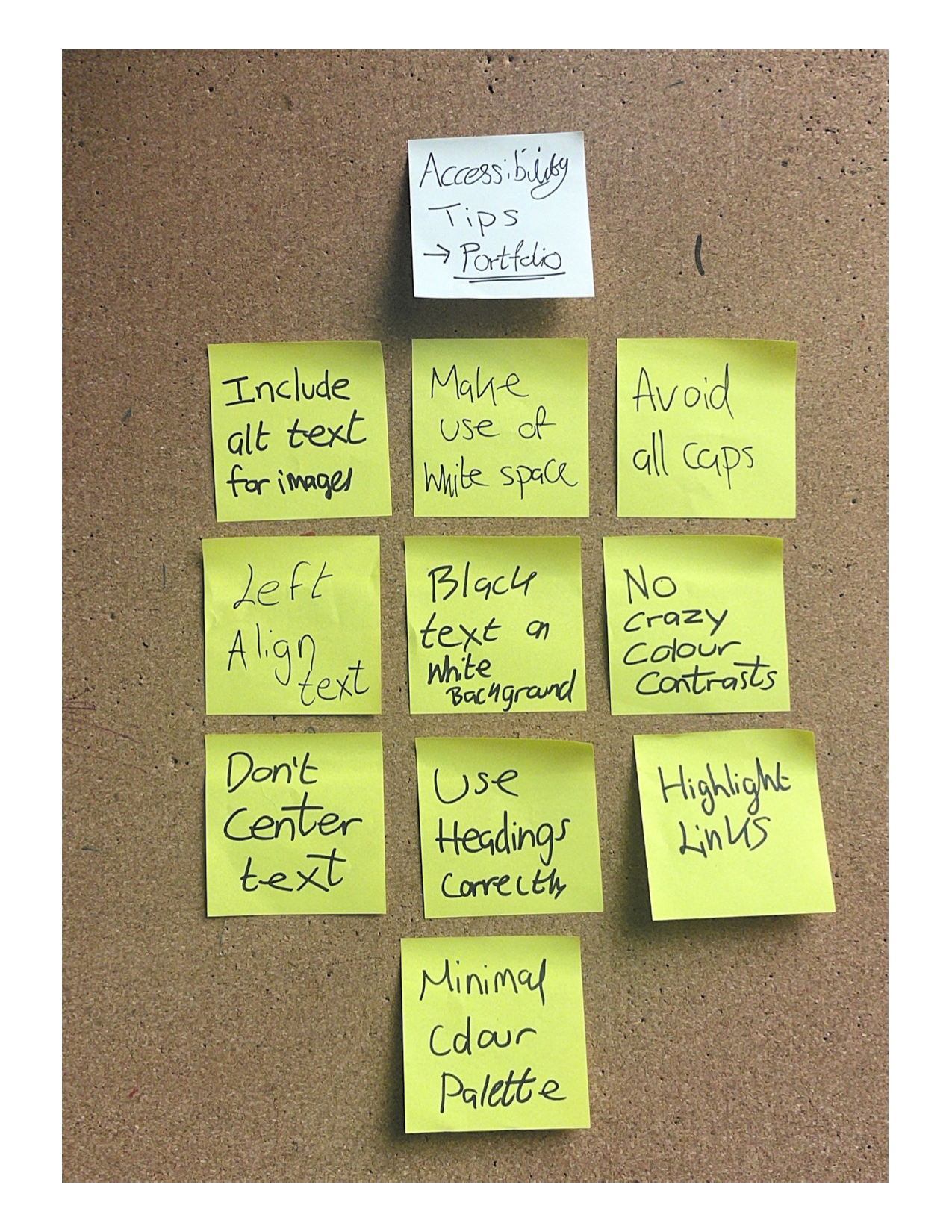
Tips from the talk
I made a diagram highlighting some of the accessible points that I learned from the talk below-

The changes I made
I made some notes of the things that I have changed about my portfolio site in order to make it more accessible-
Screenshots of some of the changes-

I left aligned the titles below my case studies.

I used white font on a dark colour for my footer and I also left aligned the text which used to be centred.

I decided to go for black text on all of my case studies to make it more readable and easier to read and observe.
What did I learn?
I learned that I should think about everyone when I am designing- this is a human right! I think that the changes I have made to my portfolio has actually made the design better as well as more inclusive! Looking at accessibly is really important to me and I enjoyed the research I did and this has definitely made me a better designer!