Detailed digital portfolio wireframes
I want to get a better idea of how I should design my website before I begin the physical process so I have decided to make detailed digital portfolios that include the colours I want and some of the information that I will include in my actual website. I did this exercise so I am more prepared before I start the actual website and also so that I visualise how my website will look and feel like before it is actually made.
Home page wireframe
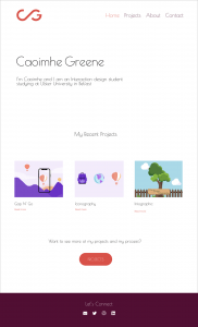
The below is my first in detail wireframe that I made, I chose to place my monogram at the top left hadn’t corner and my Wordmark in the main text area however I did feel like I was missing some colour here but I will show Daniel and get his feedback. I want to make sure that I get the home page right as this is the first thing that people viewing my website see so I need to get the design right. I have added a button under my ‘recent work’ section to allow users to quickly access my other work on my projects section. I haven’t added anything else to this homepage as I want it to focus on the work and I don’t want to add stuff just to add it and take up space, it needs a purpose.
Other portfolio pages
Project page
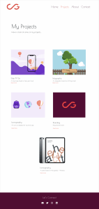
A portfolio site is all about the work so I really want to make sure I design this page well and efficiently. I have decided to go with simple square shapes to showcase a sample of each of my projects. Underneath each image is that projects title and a short description. I have also added a read me that would either become a link or a button, I am not sure which to go for so I need to get Daniels opinion on which would be more user friendly. I have designed this so that there is room for me to add my upcoming projects into in the future which is something that is very important to me, I am passionate about using this website a lot and keeping it as up to date as I can.
An example of a project page
The below image is an example of how I would lay out an individual project page, I have decided to go for an alternating text style with one paragraph and the right and another on the left, I am not sure how I feel about this so I think I will see how it looks digitally. I would have the project brief under the title of the project and below that I want to include sketches, wireframes and then the final product. This would be the same layout that I would use for each project I have on my portfolio site.
About me page
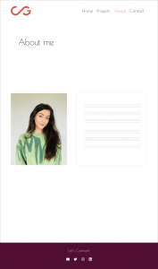
For the ‘About me’ planning I have decided to go with a picture of me and beside it I have highlighted where I would put the text. The text would include a couple of paragraphs summing me up as a designer and where I want to go within this career and industry. I want to keep this page very minimal and simply tell the user about myself.
Contact page
As for the contacts page I want to add a contact form, I feel like this adds a very professional touch and everyone knows how to use one so it is an easy and accessible feature to have on a portfolio site. I have also decided to add in the icons I have made using my visual marque, I haven’t made all of the social media icons that I want but I will continue develop them and hopefully be able to insert them into my real website.
Preparing for my digital website
Buying a domain
I decided to buy a domain for my website as Daniel advised this step and to do it sooner rather than later and the domain name I have chosen – caoimhegreene.com
Email address
In preparation for my working website I wanted to purchase a work email, I felt like this would add to my professionalism and credibility. The options that I thought of were:
- cgreene@caoimhegreene.com
- cg@caoimhegreene.com
- caoimhe@caoimhegreene.com
- caoimheg@caoimhegreene.com
I wasn’t sure what option to chose but after discussions with Daniel I chose: caoimhe@caoimhegreene.com
Reflection
I think that this planning will help me greatly to construct a strong well organised website. I decided to chose the designs that I did as I wanted to keep the focus on my work, I have kept the website mainly white and I have chosen to go for a very minimal design. I am very happy with the above wireframes, I think I have captured the essence of my brand well, I want it to be professional but also show my creative and fun side. I hope that I can reflect the above designs when I begin to build my website.
What is next?
Moving forward I will take these wireframes and try my best to replicate these into my actual working website. I think that this planning has given me a lot more confidence and I am ready now to begin building my portfolio site. I want to get feedback from Daniel and my peers and hear their thoughts on my portfolio design to see if I should add more colour or take out certain pages etc. Overall I am pleased with the work that I have completed so far and with how my portfolio could potentially look. I am excited to get started on the coding!


