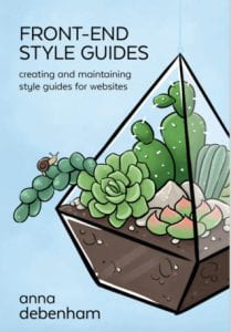
Front End- Style Guides by Anna Debenham
When it comes to style guides and brand guidelines i found it difficult to get my head around all of the terminology and the elements that I need to include and things that I should and should’t add in as well as the language I needed to use, it was a lot to take in. So I decided to give this book by Anna Debenham a read to see if it would be help me create a better style guide for my own brand.
How to create one
Within this book she highlighted the process of creating a good style guide, I have took these notes and created a diagram in Miro for future reference I have included them below.
I found this flow chart helpful and clear to understand, the steps are easy to follow and have really simplified the process for me and I now feel much more confident with this process.
Why a style guide ?
Another chapter that was discussed was the benefits of a style guide and I wasn’t aware that there were so many! Preparing a style guide improves standards, you are more likely to be more thorough in making decisions.
The benefits of making a style guide:
1.Track performance
2.Catch assessibility issues
3. Boost quality assurance testing
4.Educate your team and clients
5.Encourage maintainability
6.Increase intregability
7.Accurate prototyping
Debenham also highlighted some negatives about style guides that I found were interesting points to consider.
Examples
I found the chapter highlighting the tools as well as some good examples of style guides very helpful. Anna Debenham mentioned BBC GEL website within this chapter, as one of her good examples so I decided to take a look at it myself for further research.
BBC GEL
While scrolling through this website I found it very easy to use and understand, there was multiple sections highlighting the areas of design that are the foundations on which the BBC online is built. There is a ‘How To’ with sections dedicated to different principles of design for example there are tips for designing for the web, were they show how they use responsive web design principles to make great browser-based products. I especially enjoyed the section about spacing units as I think this is one of my weaknesses when it comes to layout.
I got some great information about spacing images and titles as well as buttons! I want to improve my components for my style guide and ensure that the spacing is correct, so my brand and its style comes across as accurate and well organised. This is a simple step but it is the simple things that make the biggest differences in design.
This was a good research point for me and the BBC GEL website is definitely one I will refer back to for future projects, but for now I will use this knowledge for the design layout fo my style guide and the components I want it to include.
What did I learn?
Key points that I gathered from this book:
- A good style needs-
- Good practise
- Care
- Attention
- It is important that it is kept up to date
- Start small and simple and build on it when you can
I enjoyed this quick read and the simple layout of the chapters and information. It gave me a good background to style guides and how I should go about creating one. I was quite unsure of how to begin this process as I have never created a style guide before but this book has given me more confidence in how to create one and the multiple benefits of doing so. I feel more knowledgable on this particular subject and I am ready to focus on this important aspect of my personal brand and create the best guide I can.


