Week 9- Portfolios
In Week 8 we looked at portfolios and Daniel discussed, what makes a good portfolio site, what is important to include and what isn’t as important. Within this lecture we looked at a range of examples and sources and Daniel also set us some tasks to complete to help us with the development of our own portfolio sites.
Class tasks
SWOT task
The first task was titled The SWOT task and this task was to help me highlight and understand what my strengths are and what things do I need to work on for my portfolio site.
S- Strengths
W- Weaknesses
O- Opportunities
T- Threats
I found this task quite difficult to start as I had to make sure that I kept my portfolio task in mind, when I got going I found it easier to pick out the opportunities that my weaknesses presented me with. I now know I have a lot to work and if I want to create the best portfolio page that I can and I can’t let my weakness hold me back, with practice and hard work I can turn my weaknesses and threat into more strengths.
The Goals
The second task was each student had to write on a note on Miro what they hope to achieve from creating a portfolio site, what is the purpose of the project or what problem are we trying to solve? I took a screen grab of all of our answers and there was a great range but most of my peers wanted to achieve the same goal with the creation of a portfolio site.
Hierarchy
Next we individually, took our goals and arranged them into what we thought was the most important goal beginning with primary and moving out towards tertiary and then as a group we then decided which ones were actually the most important and Daniel helped explain why certain things weren’t as vital.
What was the most important?
1.Display your work (strengths)
2. Contact more easily
3. Online profile PROMOTING your work
I found this task beneficial as I am now aware of what is the most important things to keep in mind when designing my own portfolio and what things I shouldn’t worry as much about.
Portfolio Research
Inspiring portfolios
Within Daniels lecture he presented a few inspiring portfolios so I decided to surf the internet and find some portfolios that I have found influential as research.
Karen Song
Karen Song is a visual and a user experience designer who’s worked with many impressive companies, including Microsoft and Ford. Her website portfolio features a minimal design that shows off her projects and I love her opening line, it isn’t the standard Hi there…It gives of a unique playful feel and with the scored out word is quite quirky.
Stephen Calvillo
Stephen Calvillo is an experienced designer who’s working at LinkedIn and Stephen’s website features a minimal design with a dark colour theme. He begins with an introductory line and mentions himself in the third person, this is a common feature within most UX portfolios as it appears very professional. The homepage highlights many different types of work Stephen has done with a simple grid like layout which is easy to read and follow.
Zara Drei
Zara Drei is a London-based UX designer, Zara uses colour and imagery to evoke a sense of luxury throughout her portfolio and she decided to begin her portfolio with text. Again I love her opening line as it isn’t the usual hello, it gets straight to the point and quick and tells the user everything they need to know about her and what she does. The colour scheme here is lovely and it isn’t too over crowded with images or illustrations which I like.
Megan Fisher
I have included this portfolio as I found it very unique, I love how she added a rhyming couplet at the beginning of her portfolio I think this shows of her personality and I haven’t seen this is many portfolios that I have looked at previously. I also like the symmetry of the design in the background it’s subtle and calming. The overall portfolio conveys a striking balance between personality and professionality.
Michaella Twersky’s
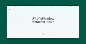
Michaella is a product designer and her portfolio has a classic look, while still presenting her unique personality. She has also decided to go with text first and she has kept the background plain and simple, the spacious design and large, introductory text is often seen on UX portfolios. I really like her opening line its very unique and eye catching and makes you think what does she master in and is it worth looking at? I know personally, it made me want to read through and take a look at her work.
Priyanka Goyal
Priyanka Goyal is a a product designer and illustrator and I have included her portfolio in my research as it really stood out to me, it is was bright and striking. She’s included a heart-warming sentence – ‘Make yourself at home, there’s some lemonade in the fridge’ – that gives me an insight into her personality and reflects her personal brand well, showing she is warm and inviting.
Extra tasks
Gantt chart
Daniel explained how creating a Gantt chart would be beneficial to get organised and prepared for final submission in 5 weeks, so I completed one and I have included an image of it below.
SCAMPER board task
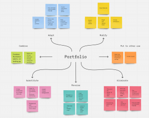
Another task we had was to create a SCAMPER task on Miro, this increases idea generation and organises ideas. I have completed my board and I found it very helpful, this exercise got me to think about what I don’t need in my portfolio, what aspects could I include or modify and how could I use my skills and combine them to make my overall portfolio better?
Design tips for my portfolio
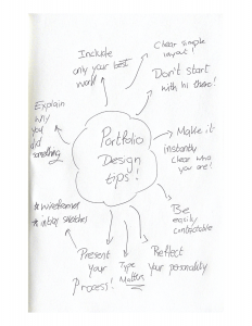
I have created a quick spider diagram of design tips for my portfolio that I have gathered through research-
What did I learn?
I have learned a lot about portfolios this week and essential what a good one looks like and what a ‘not so good one’ looks like. the class exercises were helpful and I now have a good idea of what kind of style I want to go for and the things that I want to include, it was beneficial looking at other successful portfiplos for inspfritaoin, I have gained some good tips and advice. the overall aesthetic of your portfolio should tell a story about who you are as a designer so it is important that I get the overall design and feel for my portfolio right!


