Emil Ruder
I came across Emil Ruder’s work and I knew he would be a perfect influence and artist to research further for my type specimen screen project. Emil Ruder was a Swiss typographer and graphic designer, he was born in Switzerland. He was known for his work as part of the Swiss Design movement, were he created numerous poster designs that were influenced by Swiss style and his use of the grid system. Ruder is also well known for famously writing the book, Typographie, which is a detailed reflection of his teachings and practice.
The image above is the cover for his well known book, ‘Typographie’.
Ruder taught at the Basel’s Swiss School in 1942 and here he taught a number of students about typography. He taught that,
‘Typography’s purpose was to communicate ideas through writing.’
My Type specimen Screen project
When creating my sketches for my type specimen poster I had Ruder’s work in mind. I particularly loved his piece (shown below) with the obscure lettering and I like how it appears as if the letters are falling. I thought that my chosen font – Helvetica, would look really affective with this ‘falling’ technique.
Sketches
I took Ruder’s inspiration and drew up some sketches of this particular technique, I wanted to get a feel for what it would look like and what sort of atmosphere it would give to my poster. I sketched out a few different layout ideas and compositions.
Digital
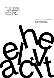
After choosing one of my previous layouts inspired by Ruder I took it digital and created this design in Adobe XD.
Reflection
Researching Ruders work, I feel, as helped me with the design process of my poster, giving me more knowledge to create and design it. Ruder is a typography expert and was a great profile for me to look deeper into for this particular project. From looking at my sketches and this particular technique, I have decided it works really well with Helvetica and with my own spin on it. I really like how it turned out and I am excited to take this project further.


