My type specimen screen designs for “Helvetica”
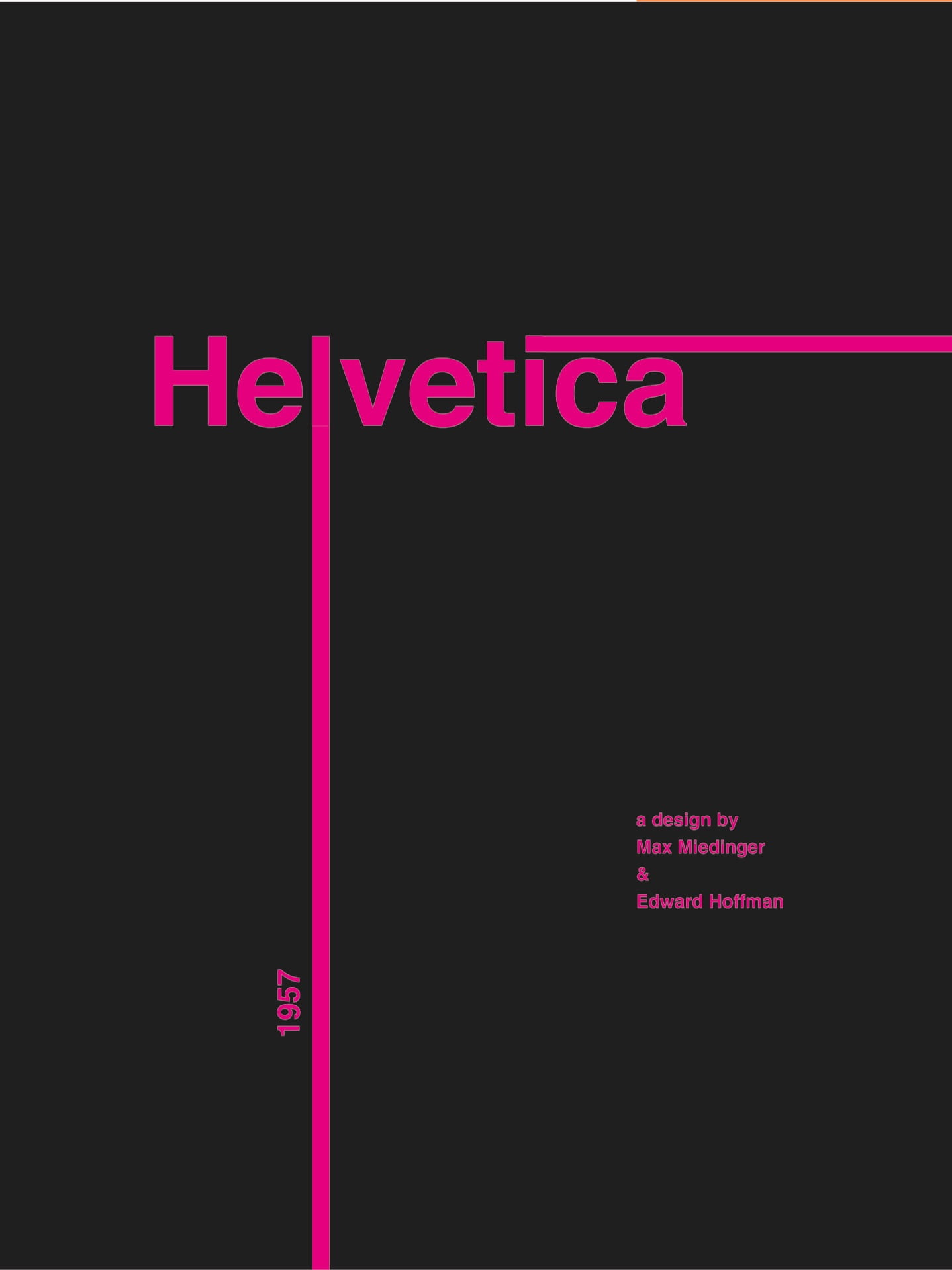
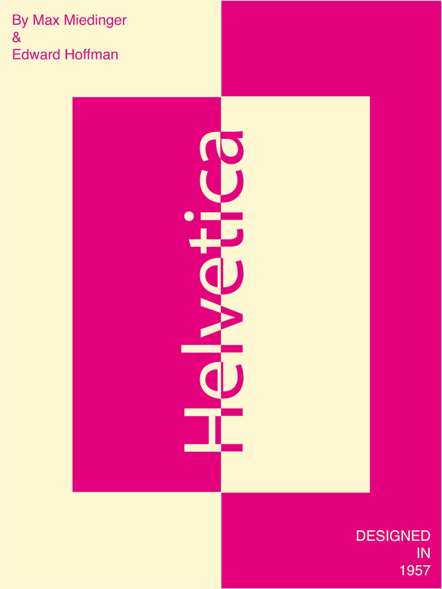
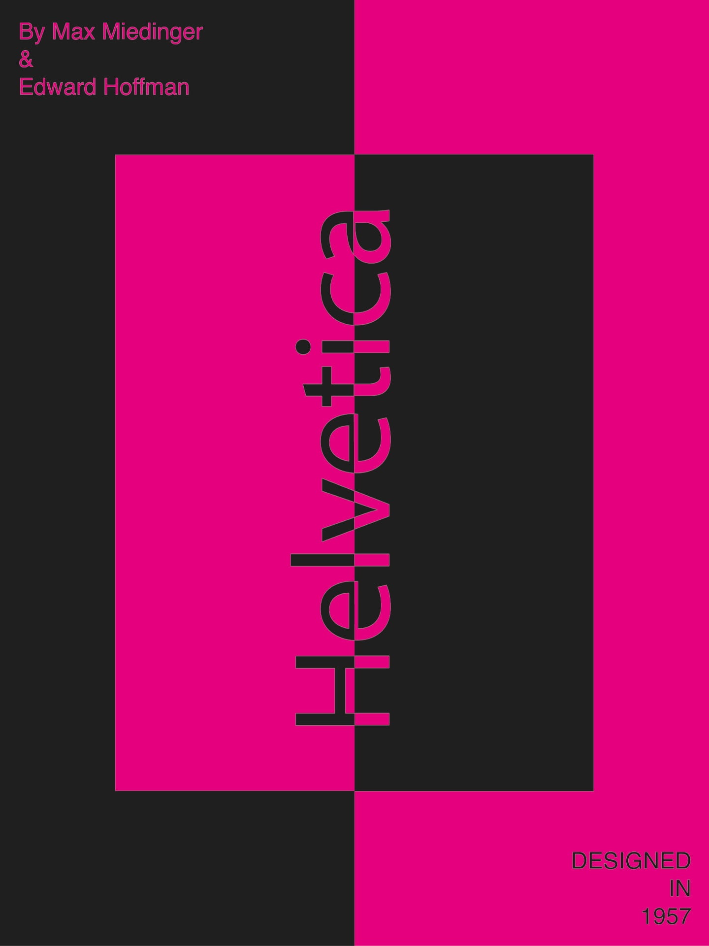
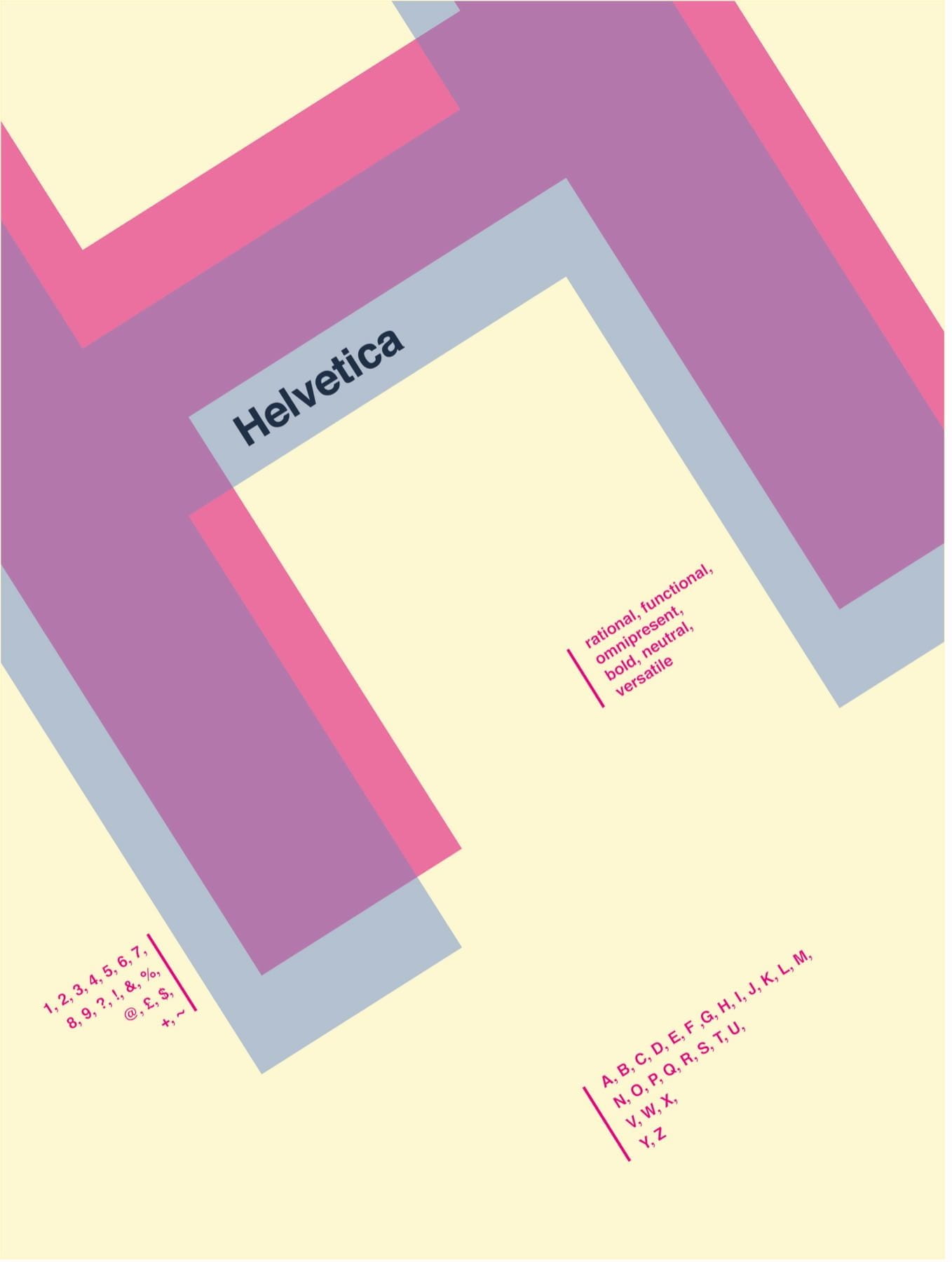
This poster was to be created for an iPad display of 768×1024 pixels. After looking into the different font options we were given I decided to use Helvetica. I began by looking into the history of Helvetica and how it’d been used in the past. I found that its an extremely versatile and neutral font and so is used for a plethora of different companies and even urban settings. My ideas consisted of 4 different wallpaper designs. The first idea I had was to make use of the rule of thirds and extend the letter L and the dot on top of the I. The second idea I had was to look at the form of the letter H in more detail/ more up close; I wanted it to appear as more of a shape than a letter and make use of the sharp 90° angles that this font provides. One of the things I was looking to do when creating this design was to try and make shapes using the letters. There was a point when they got to such a big scale that they weren’t seen as letters and were looked at as a shape. After drawing this H out in coloured pen I decided I would add a second layer to it in a lower opacity- therefore causing a shadowing effect. I was originally going to type the word “Helvetica” horizontally underneath the H however I realised that it looked better when slanted and made parallel with the H. I wanted to demonstrate what the rest of the alphanumeric characters looked like too, and so I listed the alphabet, numbers, and punctuation, and currency symbols underneath and aligned them to be both right and left for variety. For my third design I wanted to create an inverted colour effect; I split the word Helvetica down the centre horizontally and then flipped it so it read vertically. I decided to keep the rest of this design understated and minimal as I felt the inverted colour split was dramatic in itself. As a result I only added who and when it was designed by in the top left and bottom right corners and aligned them to fit with the side they were on.
My final outcomes:


My 3 favourite designs:
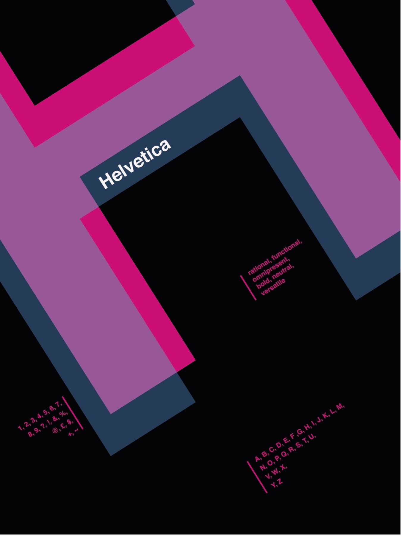
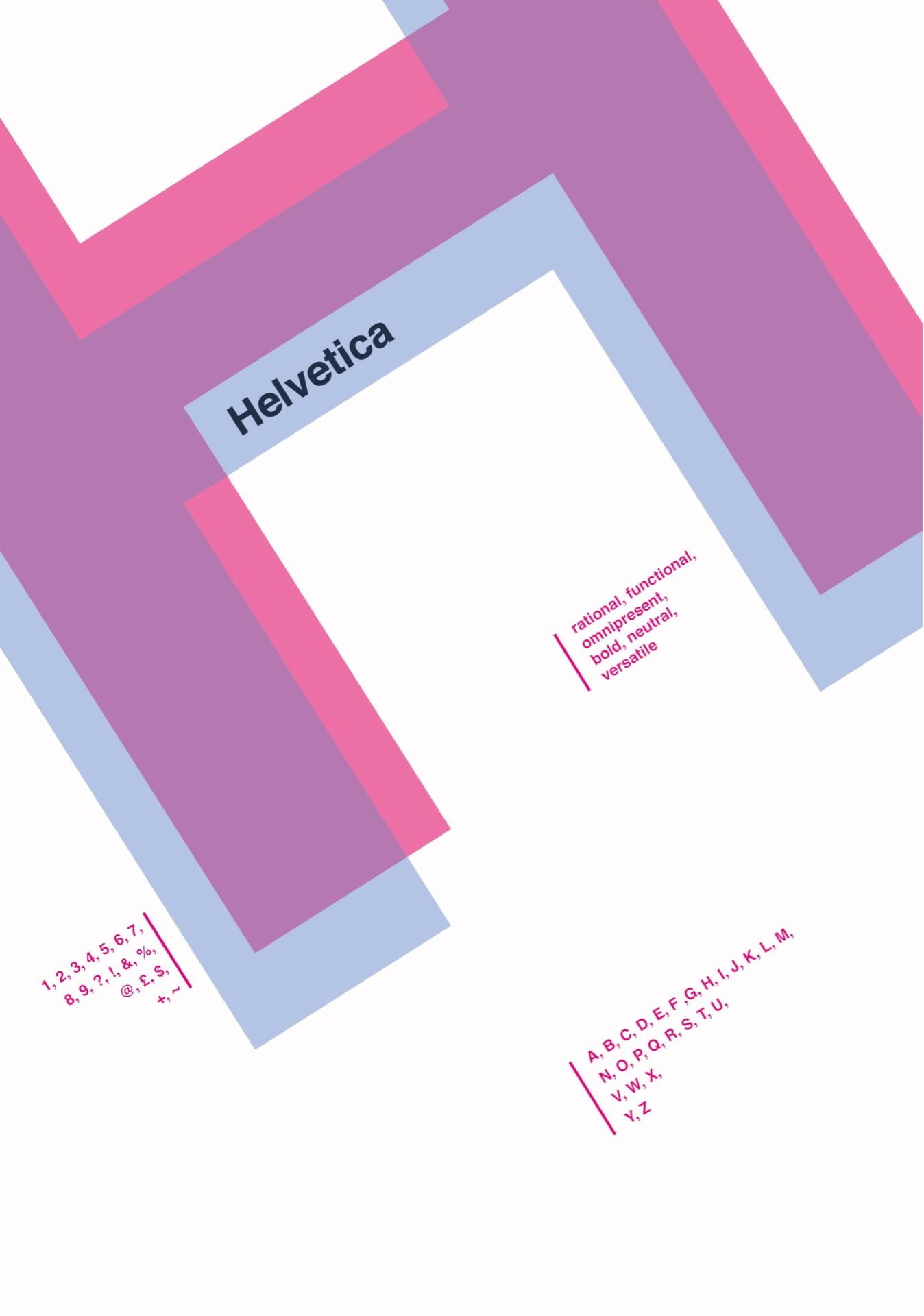
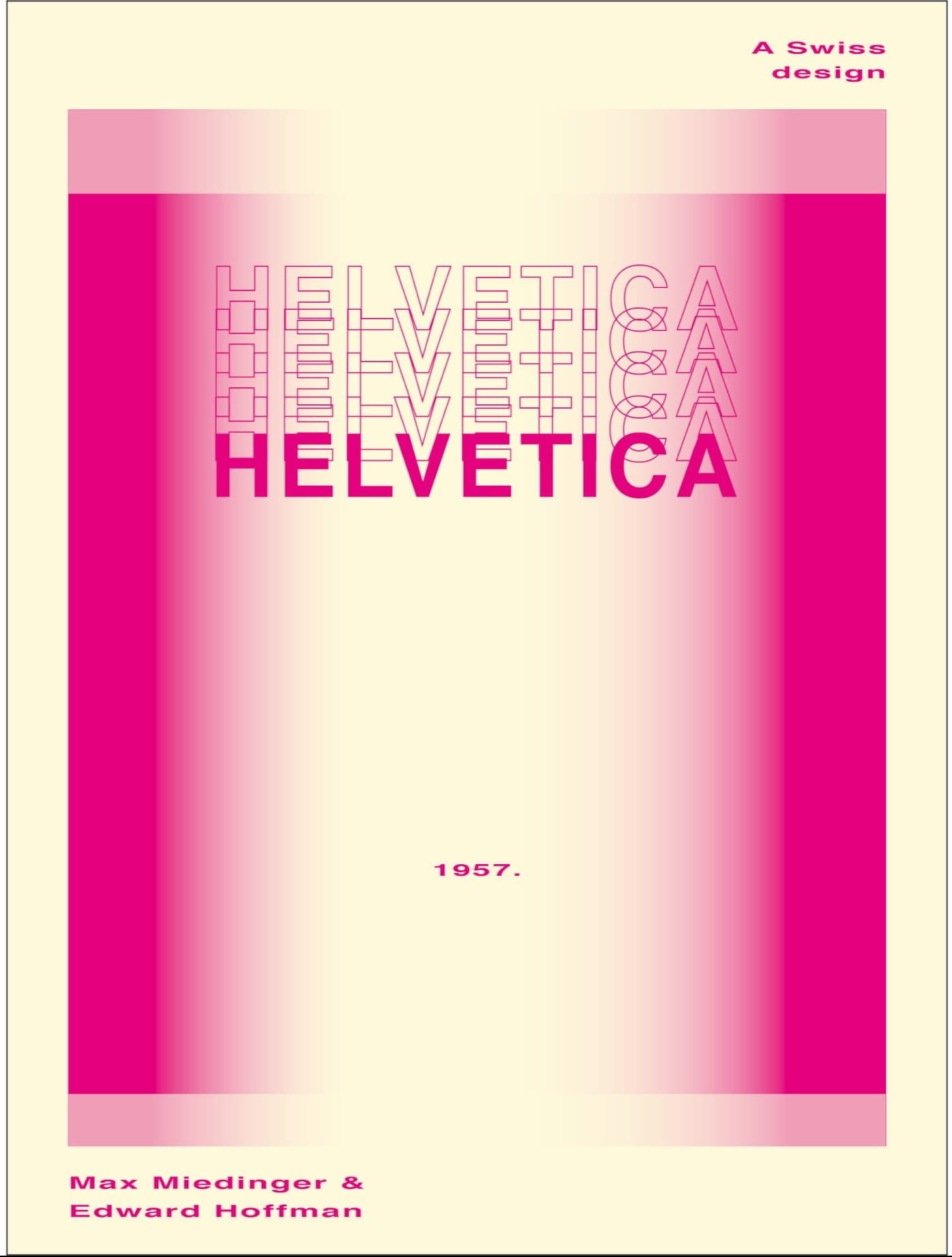
I felt these were my 3 strongest designs. I like the simplicity of the first and third however while I feel the second is more experimental in appearance due to the layered outlined text and the gradients there is still enough negative space in it for me to also consider it. I tried to consider the rule of thirds as much as possible when designing these and I felt this really helped in my third design here. I lined the L and the I up with the lines in the thirds and I found this worked well when I was framing the information in the bottom right. I like the top design a lot due to how the blue and magenta work together when layered. I also flipped the text and aligned it in the same direction as the H and I feel this adds even further to this design.
After Kyles feedback session:
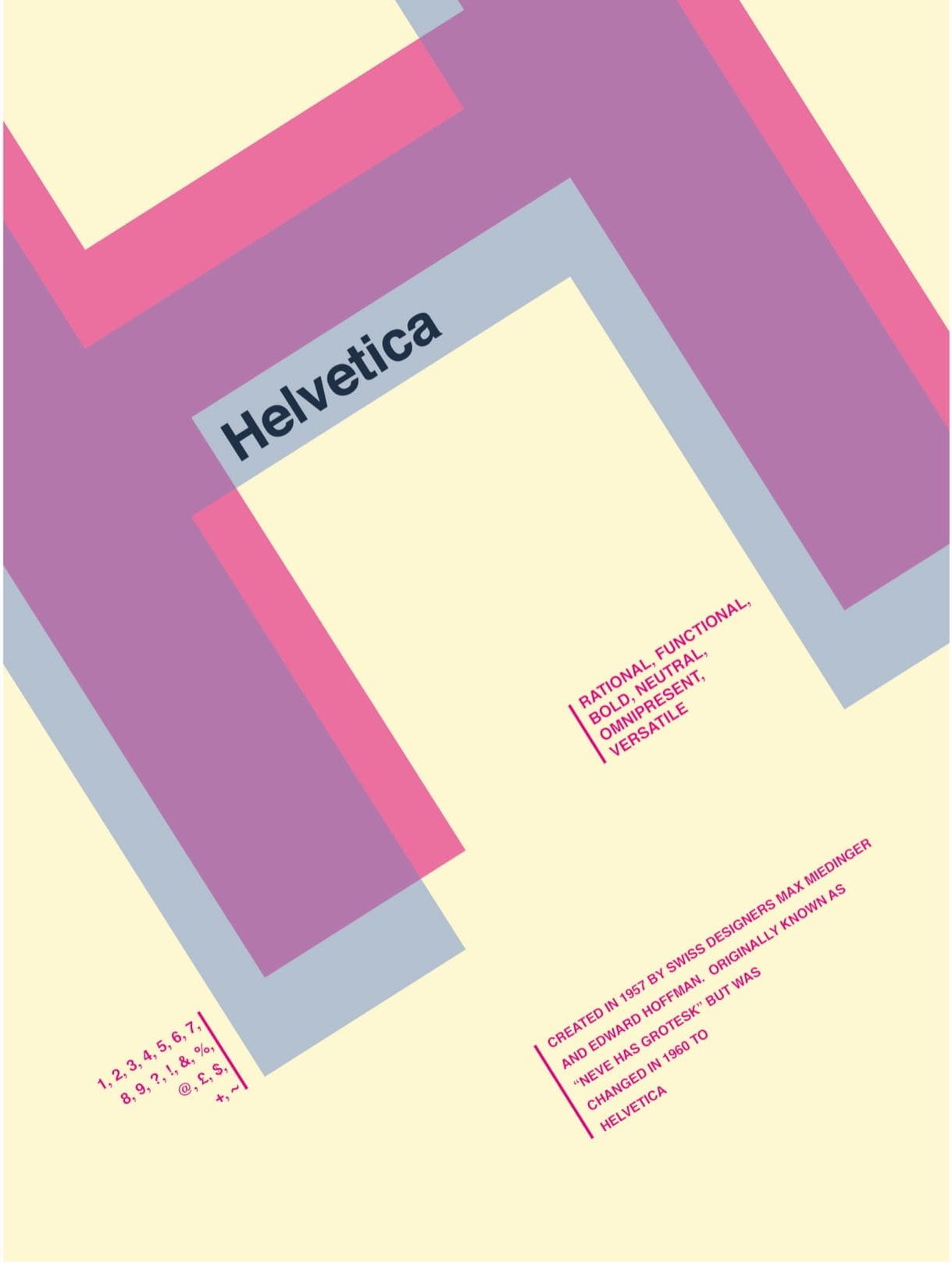
in Kyles feedback session he told me to line up the 1957 with the paragraph, however when I dd this I found it to look very boxy and not as easy on the eyes. My version is on the left and it adjusted with Kyles feedback is on the right:
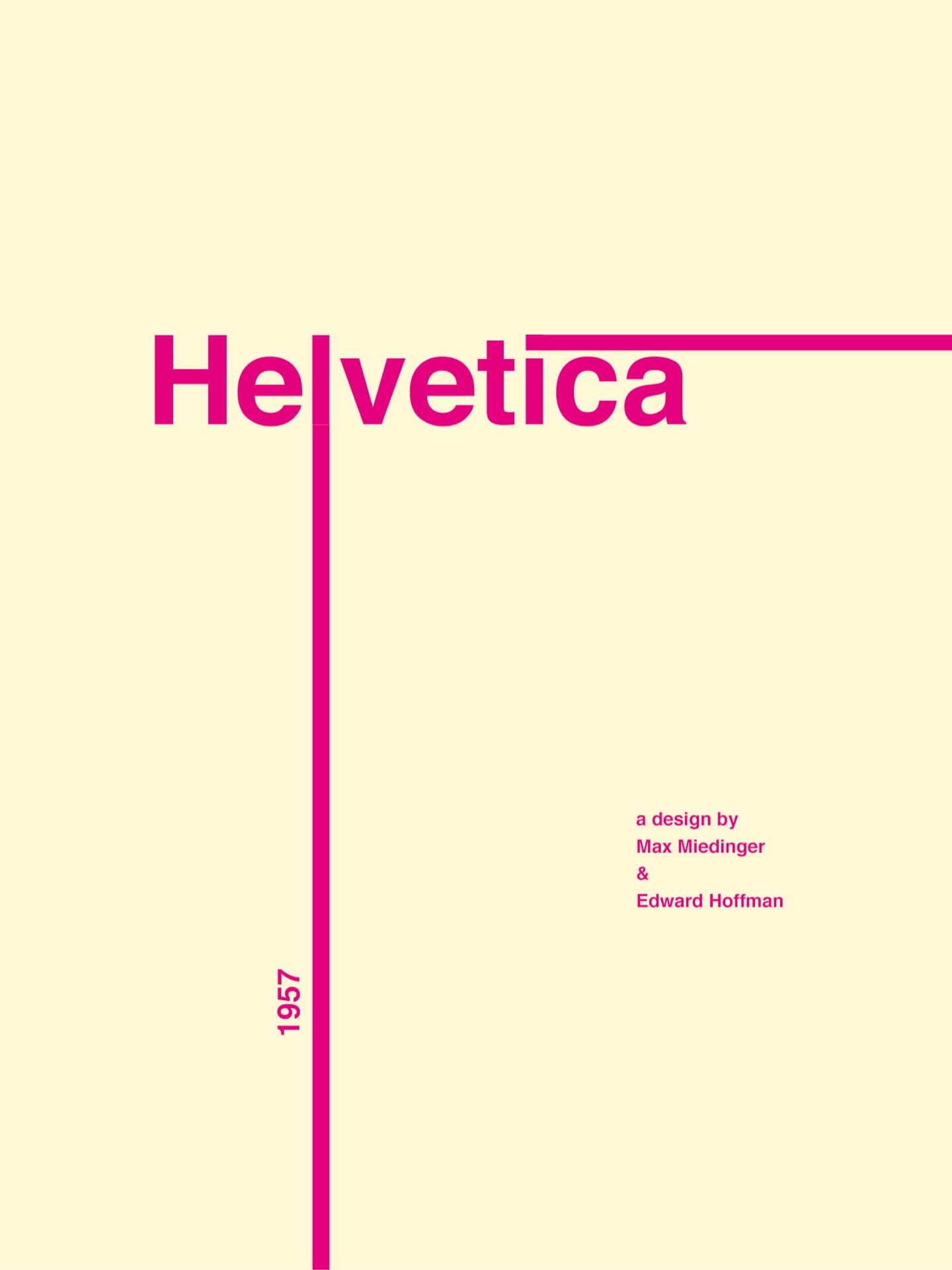
With this second screen Kyles advice was to make the “Helvetica” bigger and more noticeable. he said that the character list and as well as the alphabet was too much, and so to change the alphabet to be a paragraph of information about the typeface. Because he said to make the “Helvetica” bigger, I decided I’d try changing it to capitals to see if it was more effective:

Kyles feedback about this screen was mixed, he liked the fading Helvetica outline, however thought that it didnt Stand out enough; as a result of this I changed it to be white. I think this is a lot more effective in communicating the appearance of the typeface. He also said to fill the negative space underneath the “Helvetica” with a paragraph of information about the typeface- replacing the 1957. He said that he wasn’t keen on the alignment of the top and bottom text on the screen and so suggested aligning them both to the left of the screen, however I felt this looked a bit out of place as the rest of the screen was centre aligned. I moved them to the middle of the screen and I like the appearance of this more.


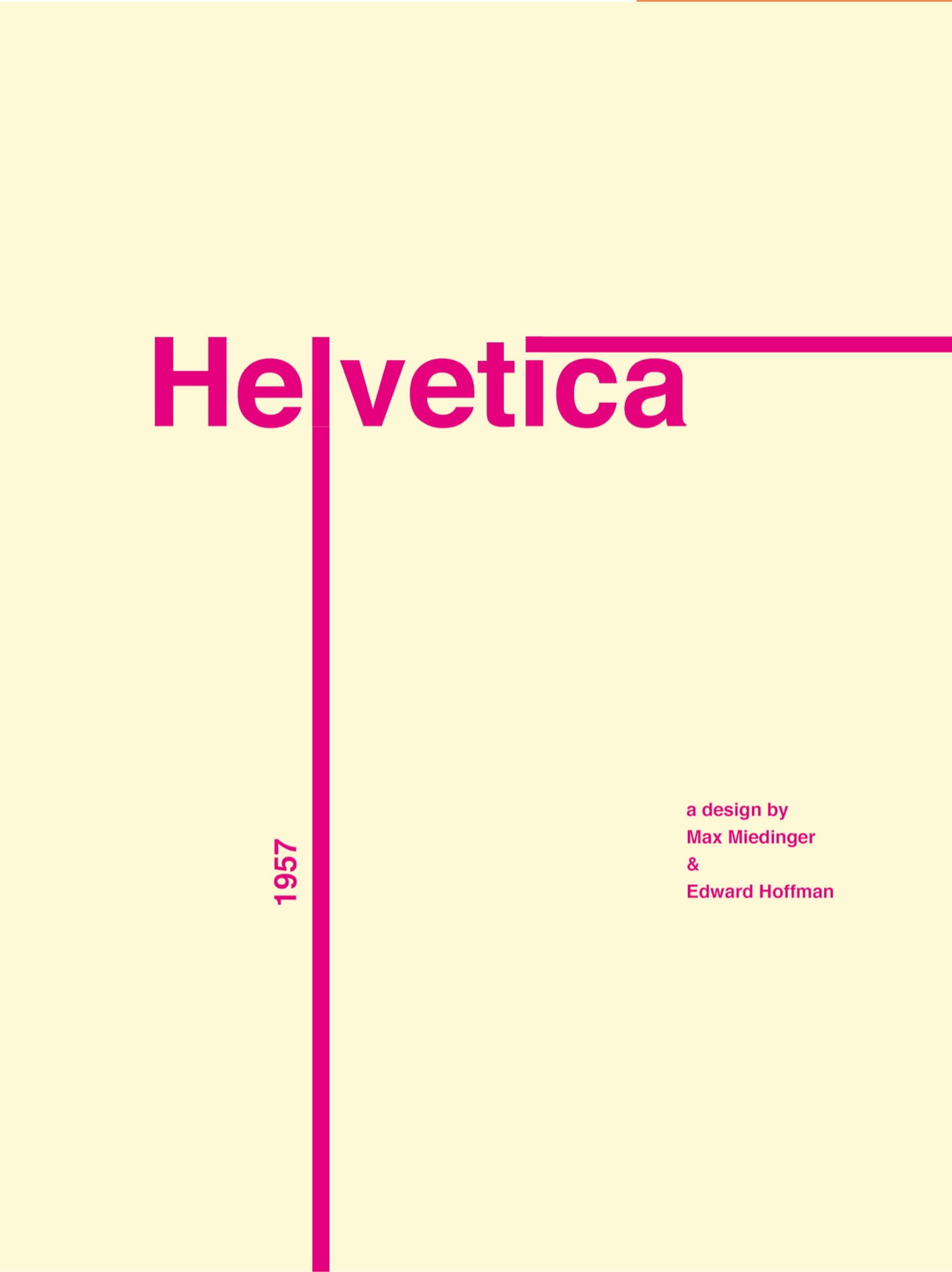
My final 3 designs after feedback and further refinement: