Paul Button creates infographics that not make data clearer and are also visually pleasing. The data in question a lot of the time is manipulated so it visually creates shapes or patterns – still while being clear and understandable to the audience. An infographic should make information clearer and understandable to the reader/ viewer – the design should therefore be uncomplicated and simplistic in order to achieve this and as a result Buttons work does what it sets out to do – all while being very visually pleasing at the same time.
EARLY WORK:
THE YOUNG DEFENDERS
PURPOSE:
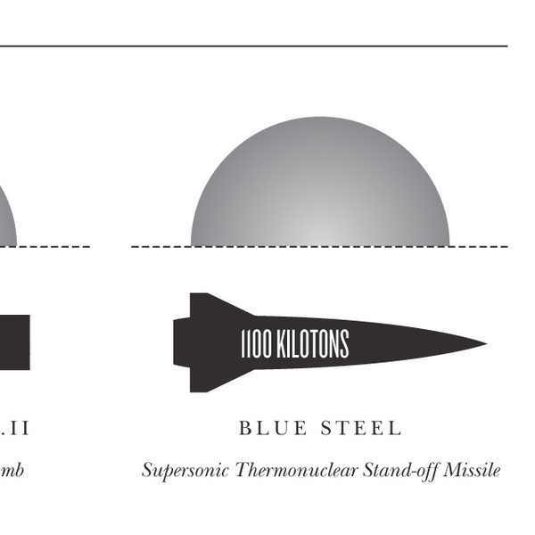
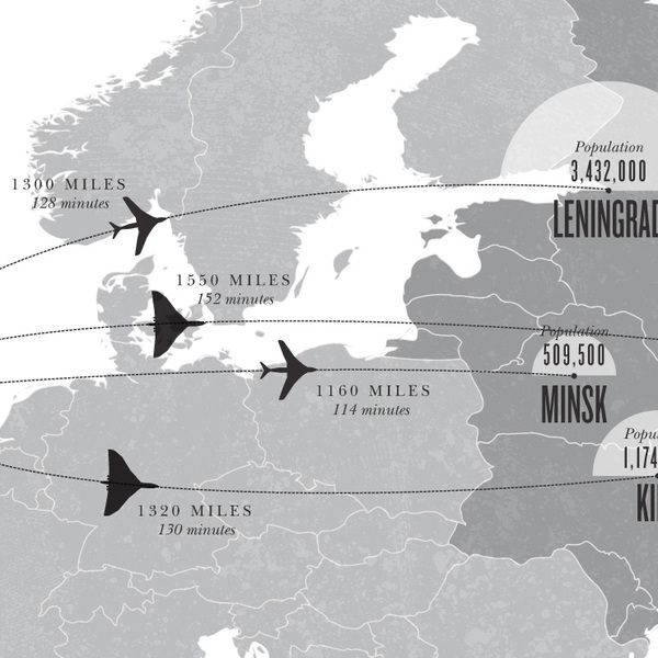
I felt that delving into his earlier projects would give me an idea of what the fundamentals are of his style and how he began to create his infographics. This project below – titled “The Forgotten Defenders” is meant to draw attention to the planes which fought in the Cold War as well as the bombs involved.
HIS GRAPHIC STYLE:
I noted that throughout he only uses grey scale – this allows for the viewers to not get distracted by colour and extra details that come along with colour. The fact he uses only lineart and silhouettes of objects allows the viewers to also again – not get too distracted. The sans serif text is clear and straight to the point – communicating effectively and looking put together.


TOP GEAR VS FIFTH GEAR REPEATS
I like how he uses a pie chart style in this in order to convey information – but at the same time adds his own spin on it by adding the title in the middle, turning it into a doughnut chart, and finally (and most importantly) adds lines protruding out of the segments. I feel this could be applied to my own work in an interesting way by thinking of objects in a similar shape – like a tree from above or a sun with rays coming out of it.


DIGITAL NOSTALGIA
I love how he uses an interesting shape in the centre of the page instead of just a bog standard timeline – it turns into an interesting grass shape instead of a straight line down the centre. I also particularly love the charts at the bottoms shape showing the progression of the amount of data being put into technology.
The illustrations down the side of the page are again key to an interesting and visually exciting page. Theyre detailed but the greyscale of them balances this out so they aren’t overwhelming to the viewer. I sketched out the layout for the following pages to allow myself to have inspiration at a glance when I go to create my own infographic.

The following infographic on disk space is probably my favourite because I love how he uses bar chart and rounds it out so that a a pie can be layered over the top to create an actual disk shape.
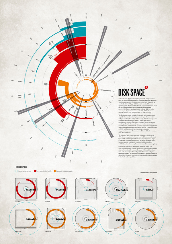

I love how the illustrations are interloped with the data in this infographic at the bottom – it gives u a good sense of what’s being talked about quickly and efficiently without having to read too much.

LATER WORKS:
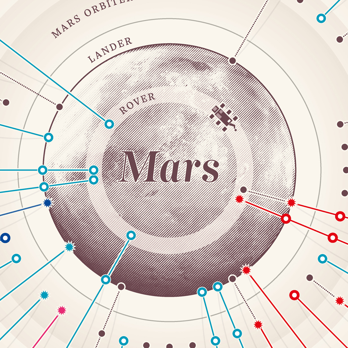
MISSIONS TO MARS
I love the simplicity but effectiveness of this infographic. The visuals communicate the three key pieces of information very well: origin of the object, distance, and the turnout of the mission are all very clearly communicated via a flag, distance of the line, and the shape at the end of the line indicates whether it was successful or not. After looking at this infographic I’ve realised I should really map out and list the key necessary pieces of information before illustrating or drawing out the data in the design I have in mind.


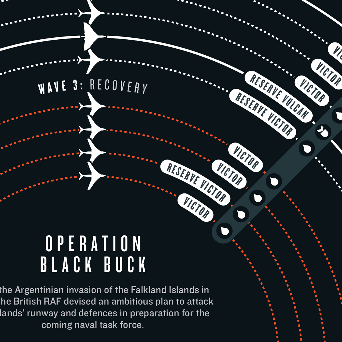
APOLLO & OPERATION BLACKBUCK 1
I think these two final pieces of work that he did really encompass how he uses data to create pieces of art. I can only assume his process for one of these works is to compile all the data together and try and represent it in as many different shapes as possible. Through looking at these works i’ve found that symmetry could work in my favour when creating my own infographic.


TAKEAWAY
- Take inspiration from well known, traditional ways of communicating information and turn them on their head – using aspects of them but changing the imagery completely
- for example – take the information about my topic and draw it out in piechart or bar chart format and see what shape it creates and how this could be incorporated into the potential imagery of your topic.
- I should make my illustrations possibly greyscale or else very lineart heavy to combat drawing too much attention away from the data – or else even make the illustrations part of the data itself.
- note down a list of the most necessary, key parts of the data before designing
- if the background is white – make it an off-white like grey or cream to avoid the contrast being too much
- keep symmetry in mind – symmetry is one of the key elements which allows his works to be viewed as works or art rather than just data