

Georgia Lupi runs a data visualisation design company called Accurat. They design different ways to make information accessible through visual communication. She is also the co-author of Dear Data, a book of hand drawn data visualisations along with another information designer – Stefanie Posavec. The goal of the project was to get to know each other as much as possible as well as get better at communicating data/information in a humanistic way. While Giorgia lived in New York city, Stefanie lived in London city; the two thought it would be interesting to use data visualisation to compare their lives living in the two different places. They did this by way of drawing out a different data visualisation for a different aspect of their lives each day for an entire year. They sent their designs to eachother each week and took a picture each time:
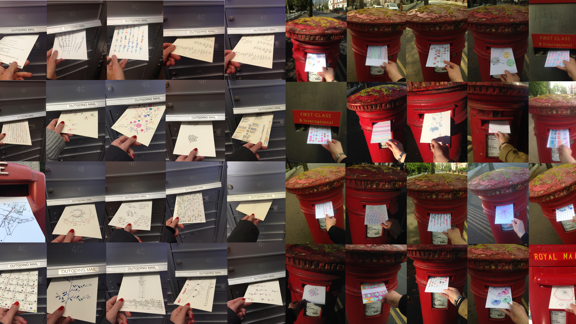
“Each week, and for a year, we collected and measured a particular type of data about our lives, used this data to make a drawing on a postcard-sized sheet of paper, and then dropped the postcard in an English “postbox” (Stefanie) or an American “mailbox” “(Giorgia)!
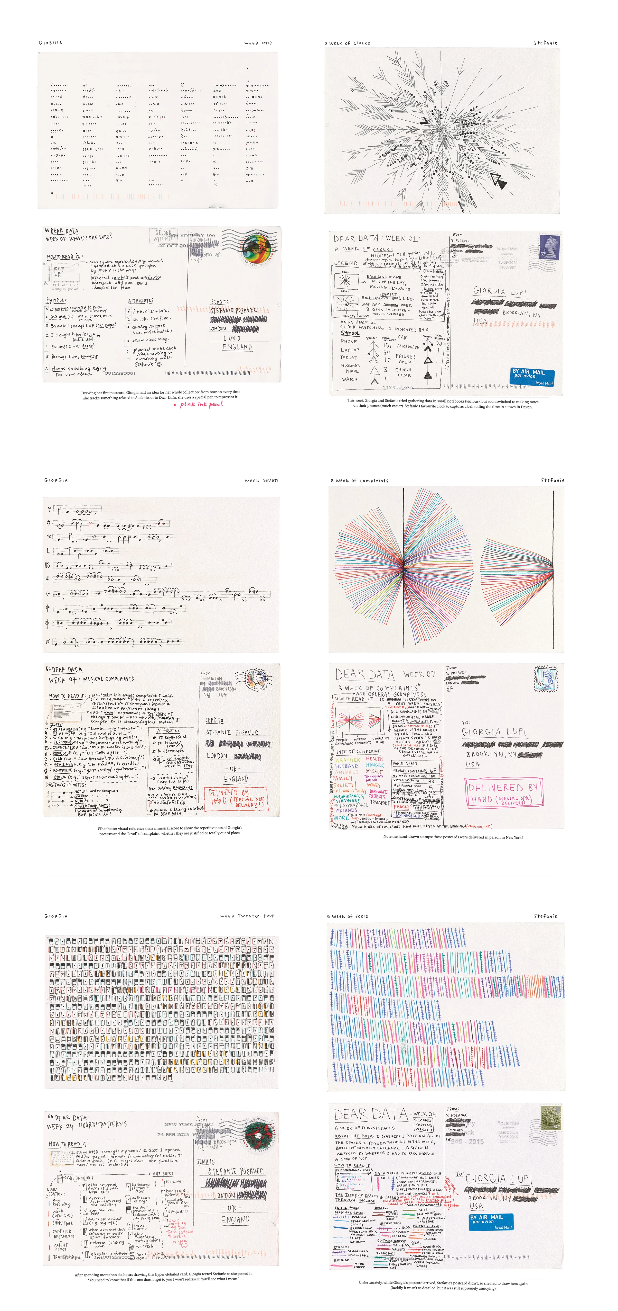
On the front of the postcard there would be a unique design of the weekly data for each of them. On the opposite side there would be detailed keys to the drawings in order to make sense of the data (as well as the postage and address).
Just looking at the range of different designs has made me inspired and excited to get sketching out my own data. I particularly like the colourful circle which Stefanie created to keep track of the complaints throughout her week. Something that I noticed about their infographics was how Stefanie represented the data so it could almost also be presented as a piece of art in itself, while Giorgia’s was more methodical and mathematical looking with less colours involved. Because of this I think I’ll take more inspiration from stefanie’s work.
TAKEAWAY:
Through reading these postcards and listening to Lupi’s Ted Talk on Humanistic data I’ve realised the sheer range of different ways of showing data visually. I love how Dear Data uses no digital software to create the infographics – just pens and pencils! Before reading them I would have just fallen into the trap of using line graphs, bar graphs, histograms, and pie charts lacking creativity and boring the viewer, I also wouldve thought an infographic had to be created digitally. Ive realised the importance of presenting data in an interesting and engaging way, and I’ve discovered that there are endless possibilities for the design of data visualisations and reading through their work has made me excited to design my own visualisations and for what the next 6 weeks have to offer.
- I shouldn’t hold back from making the infographic look almost like a work of art
- use lots of colour
- plan it out using colourful pens, pencils and paints – experiment!