EARLY GAME SKETCHES
This was one of the first sketches Olly Moss did when creating the visual style of fire watch. I think that through this I’m able to summarise how the key elements of Firewatch create the overall visual impact better. There are less details in this sketch than the later ones however it still gives off the exact same feeling. One of the most iconic things stylistically about this game is how there is a constant monochromatic colour theme- analysing the posters too has made me understand the importance of sticking to a mono colour scheme and how it can very easily create a sense of consistency throughout the design. One of the other noticeable things throughout the game is the prominent use of a lens flare – I really like this attribute and I think ill take inspiration from this in my own future work – it creates a sense of realism and it makes it feel like you’re in the scene yourself. The last thing is the inclusion of the heavily layered trees, mountains and hills. I love the effect this has on depth and i’ll definitely be implementing this in my own app. Despite this always being a technique used on trees I feel it could work equally well on buildings too.


WHAT MAKES THIS IMAGE SO STRIKING?
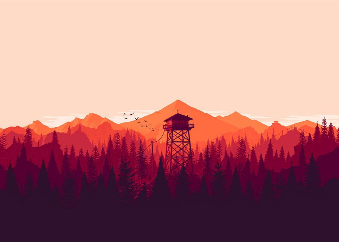
1.) LAYERS OF COLOURS:
The sky is the largest chunk of colour – responsible for every other colour in the scene. As a result this means I should pay great attention to the time of day in which my scenes are taking place in in my app. They’re very bold colours used in very distinct layers – each layer adds to a feeling of mystery and depth. This means that as the horizon goes back further the colours keep lightening, creating the appearance of great distance.

I found it interesting how in the game they needed a wider variety of colours – and so created different kinds of fog in order to create this depth once again:
No fog: Cyan toned fog added:

No fog:

Yellow toned fog added:

Green toned fog added:

2.)SHAPES
The composition is made up of flat shapes with very intricate details. This combined with the colours when layered right – creates this endless looking forrest horizon.


WHAT IVE LEARNED:
- I should decide on colour layers before doing any drawing in order to create a sense of depth and distance in my landscape designs.
- I should create a few separate detailed environmental layers in black and white (for example trees or plants) before adding colour.
- consider adding fog in order to increase this depth even further and add a sense of mystery.