GOING AGAINST THE CONVENTIONAL AIRPORT DESIGN:
Something that really struck me as interesting about this rebrand process was how they went against the usual sleek, boring, thin design that most airports logos would usually have in order to stand out amongst the competition. I would have initially thought that going for a logo that represented the goals, motives, and aims of the company would be the most effective, however after seeing these usual airport logos Ive completely changed my mind. Each of these logos as well as London Luptons previous logo was inspired by the three words (or similar) “flight”, “motion”, or “direction”, which you would typically think would be necessary for designing an airport brand.
HOW USING A MORE CHUNKY, LESS AERODYNAMIC LOOKING DESIGN ACTUALLY WORKED IN THE BRANDS FAVOUR:
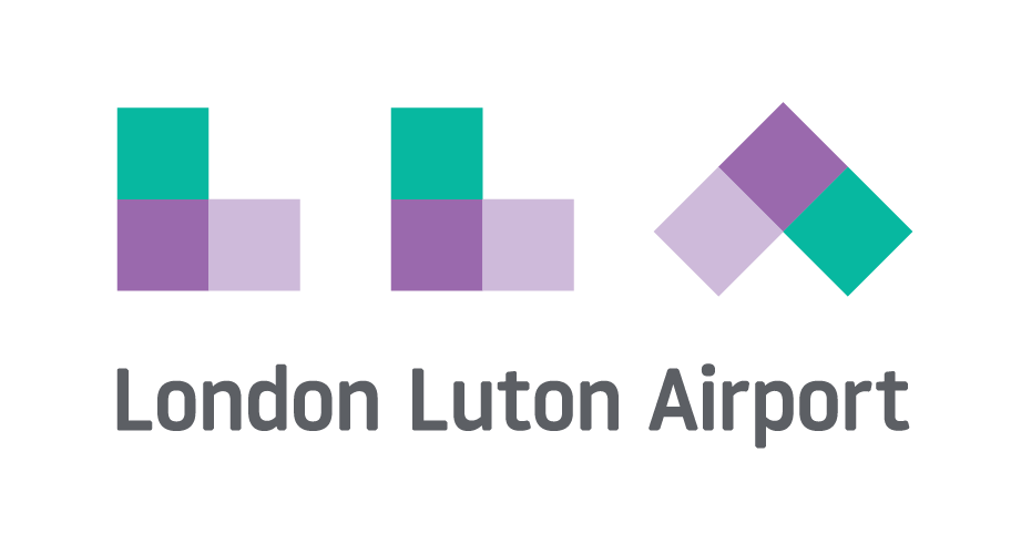
Designers for the brand clearly saw all of these typical airport brands as an opportunity to make London Lupton stand out. Instead of using the swooshy, skinny, and flight/ wind inspired design they instead thought of using a chunky, playful looking monogram. In using chunky, square lettering (paired with warm, bright colours such as pinks and yellows) they were able to present the brand as a fun experience, (similar to an arcade game or even reminiscent of childhood) rather than just another tedious obstacle to overcome before you get to go on holidays.


TAKEAWAY:
- When creating brand identities I should research the competition in order to gain an understanding of codes and conventions that would be viewed as boring or repetitive in that industry
- I shouldn’t be afraid to be playful with my identity colour wise and shape wise
- simplicity is key in monograms – you can jazz up the rest of the brand by using colour and patterns throughout


