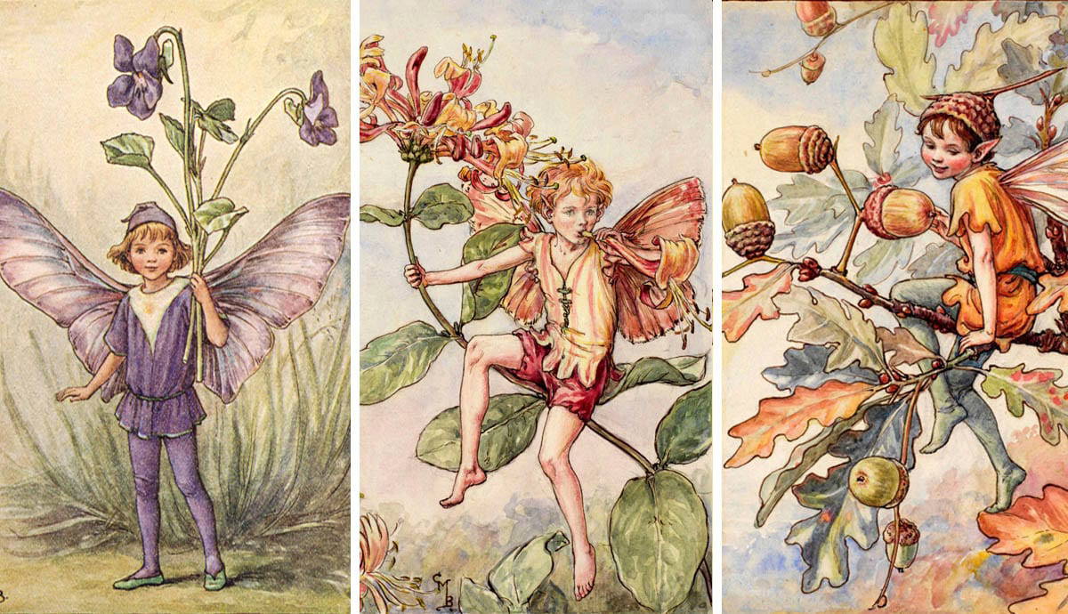
Artist Research

Cicely Mary Barker

Cicely is one of the first artists I researched when considering the theme of fairy tales and exploring the story of Thumbelina. Cicely is the creator of the “Flower Fairies” which are enchanting illustrations of botanically accurate drawings paired with children that resemble or sports outfits resembling the flora featured. I was inspired by Cicely’s character design and how upon first glance at her fairies you are able to match them to a particular flower. Cicely tried to draw from life as often as possible, reflecting her pre-raphaelite influences.
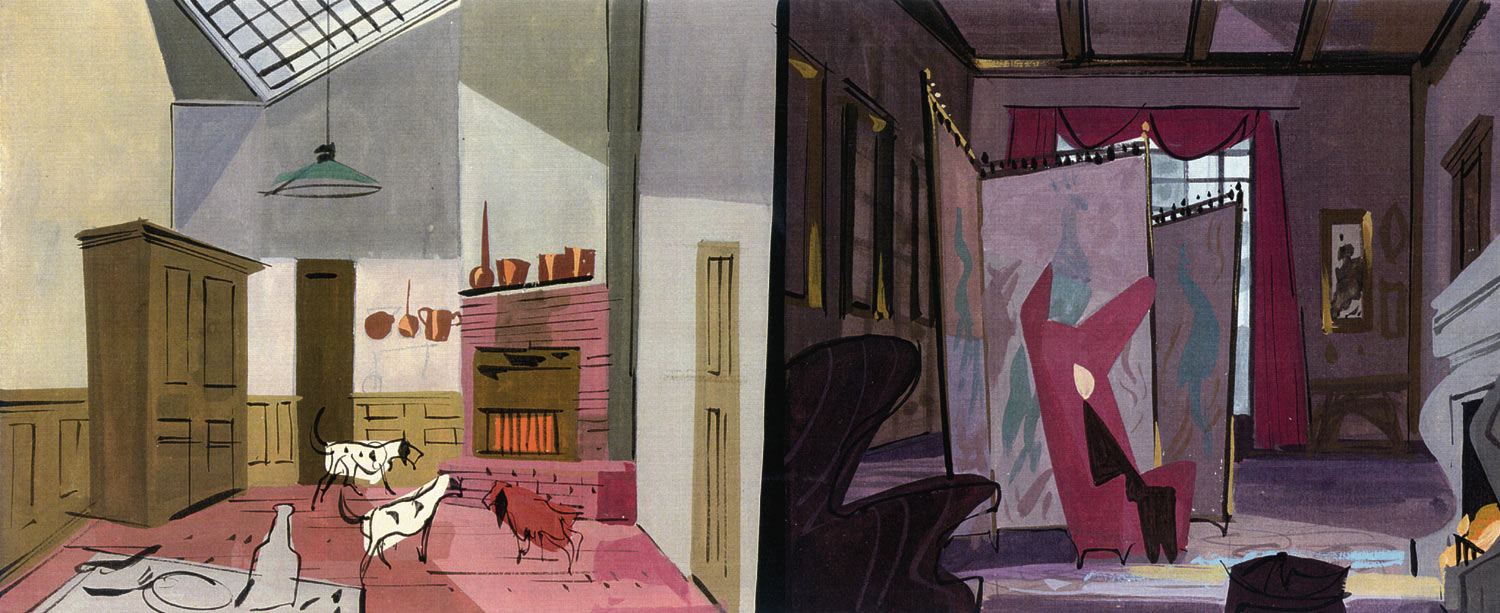
cicely mary barker flower fairies

Walt Peregoy

Walt is an artist for Disney who has worked on all the original 2D animated Disney movies. He is most well known for his work on “101 Dalmations” as a colour stylist. He brought a modernist style to Disney, as with his background design on 101 Dalmations he created more abstract scenes that Disney hadn’t seen before. After looking at his concept backgrounds, I can see how his style translated into the final films. His abstract style was unseen in Disney movies so to see his style adapted in the films shows how concept artists can influence the style of a film.
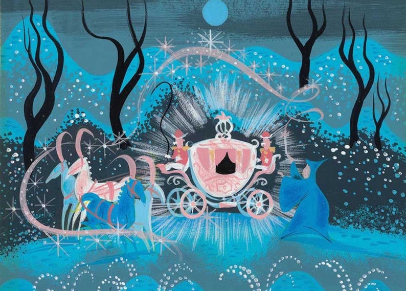
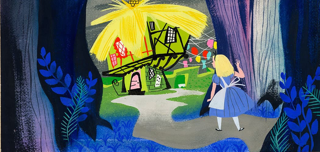
EYE-LIKEY: Walt Peregoy VINTAGE DISNEY SERIES 1950

Mary Blair

Mary is one of my favourite concept artists who worked for Disney on movies such as Peter Pan, Alice in Wonderland and Cinderella. Mary’s art style was inspired by the tropical landscapes she visited while she was on a trip with Disney. She started to work with a more vivid palette and, like nature, she wasn’t afraid to place similar colours together or completely contrast them. She used her colours boldly and her style slowly became more abstract.

Her concept art is captivating, embodying Disney’s sense of magic in singular drawings. Walt Disney said that Mary “painted like a little girl”. I believe this gave her an advantage as she was able to see the magic from a child’s eyes, making even the most “basic” scenes captivating.Cinderella  Mary Blair concept art print.  Disney Studios  image 1

Modernist Cute: Mary Blair's Art For 'Dumbo,' Golden Books, 'It's A Small  World' | WBUR News

Personal Project- Ink final piece

Ink final pieces


After a lot of style experimentation, I decided that this style would be my final piece. Therefore I sat and considered all the successful parts of my drawings as well as the unsuccessful ones in order to compile two final pieces that embody all my goals.

I did a few different final piece alternatives as I found this process of creating multiple drawings works best for me as they are such fast pace and I can then use the process of elimination.

This was one of the choices that I choose for my final piece. I successfully used a visual device (the human) in order to show the true size of Thumbelina which I have been aiming to do throughout my workshop. I was inspired by one of my practise ink pieces that i will include below the final piece.

This is the next drawing that I choose for my final piece. It includes the flowers that have been prevalent in the background of my experiments therefore I wanted to include them further in my final piece.

  • Below are my other drawings that were potential choices for my final pieces

For this piece I was inspired by a piece I had done that was very captivating on the top but because of the clothing choice, the bottom was very boring and took away from the piece. Therefore I took inspiration from the pose and created this piece where I eliminated the bottom half.

I wanted to attempt two characters interacting using this art style which resulted in the piece below.

Personal Project- Ink and scale

 Ink and scale


Throughout my ink experiments, I had been working on A3. This was helpful to me as during the whole workshop I was thinking of ways to scale up my art as I was constantly working on a smaller scale. However, Ashling suggested that I try to create my ink drawings on a smaller scale in order to experiment with scale.

There were a few successful outcomes but in the end, I found working larger scale with ink was much easier for me. The black ink also didn’t transfer too well on a smaller scale as it became too overpowering in some pieces.

Personal project- Ink

Ink


In the “bigger than life” workshop I created a piece that I felt really encompassed all I was trying the achieve. I wanted a style that was an enjoyable process and also had no stiffness. The drawing (shown below) is made with an ink life drawing as a base then I added details and colour using oil pastel.

As I was so happy with this drawing I took it into Photoshop to see if I could play with the colours and fix it to my colour scheme.

In order to experiment with this style, I began doing some pose studies in ink and then going back and forming them into my character. I experimented with black and green ink and found, in the end, green ink is more compatible with my colour scheme.

Some were more successful than others but I enjoyed this process of elimination in experimenting with a new style.

  • Ink drawings that i didnt end up working into

A1

A1


For my A1 I decided to use one of my ink drawings. It has a strong sense of composition with the flowers cutting across the character and the character being the main focus made me think it was perfect for my A1.

  • This is the original scan and drawing before it was fixed in Photoshop.

scan_b00892978_2023-04-27-13-44-22

  • Because the base of my drawings were such quick life drawings I never focused on details like the hands. However, since this piece was being blown up to A1 the hands would be of focus. Therefore I drew out new versions of the hands and photoshopped them in.

  • This is the final outcome for my A1.

A1 1.pdf

A6 Drawings.

A6 drawings


I missed the A6 class therefore I didn’t know the drawings were to be done in ink. Consequently, I made mines in marker and then went back to make a further 2 more in ink in order to have a chance to use the medium.

  • Marker versions

For my first drawing, I used my photography experiments from earlier to help me work with perspective. I wanted to use visual imagery to show my character’s true size and how small she is.

For my second image, I wanted to create some movement and build a relationship between the two characters. I found that with my marker and liner, my work becomes very stiff and in the above image there is too much going on as there are so many lines that make the image hard to understand. This realization helped me further in my experiments when using ink and also my experiments that were inspired by Hayao Miyazaki’s work.

  • Ink versions

In my first ink piece, I was thinking that on such a small-scale background, and character in ink would clash, therefore in order to make the character stand out I kept her predominately white. However, we found that when looking at my sketchbook experiments when the character is also in ink turns out better as she’s less stiff, and there’s much more action in her. The background in this piece was very successful as its showing a lot of movement and looks very relaxed.

In my second drawing I created an older version of my character as within character design the progression of age is always really important. I took into consideration the storyline and how the ending could affect my character and it all comes to play in my design choices. For example: At the end of the story each character has a “crown” and from my earlier designs, I decided that the crowns would be based on the flora a character descended from. Therefore in this drawing, Thumbelina is sporting a Tulip crown. She also has a regal-like pose and clothes as the character she meets at the end of the story is a prince hinting that Thumbelina herself becomes royalty.