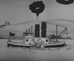
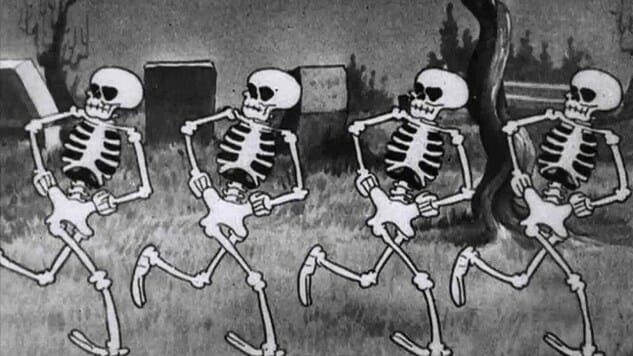
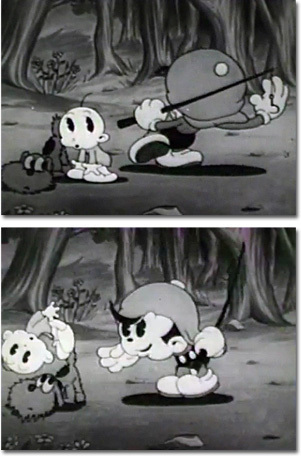
Steamboat Willie is a 1928 animated short, the debut of Mickey Mouse, and the beginning of the success of Walt Disney’s Animation Studio. The reason for the success of this animation was due to the fact that it was the first animated film released with synchronised sound which then made the typical silent animation outdated and unwanted by the public. This feature completely separated Disney from its competitors and boosted them in the industry. The animation was designed specifically to have sound as seen in Mickey’s famous whistle, the smoke puffs from the chimney, and playing the cow’s teeth as a xylophone. It’s interesting to see the thought put into every aspect so that they could use sound as strategically and effectively as possible.
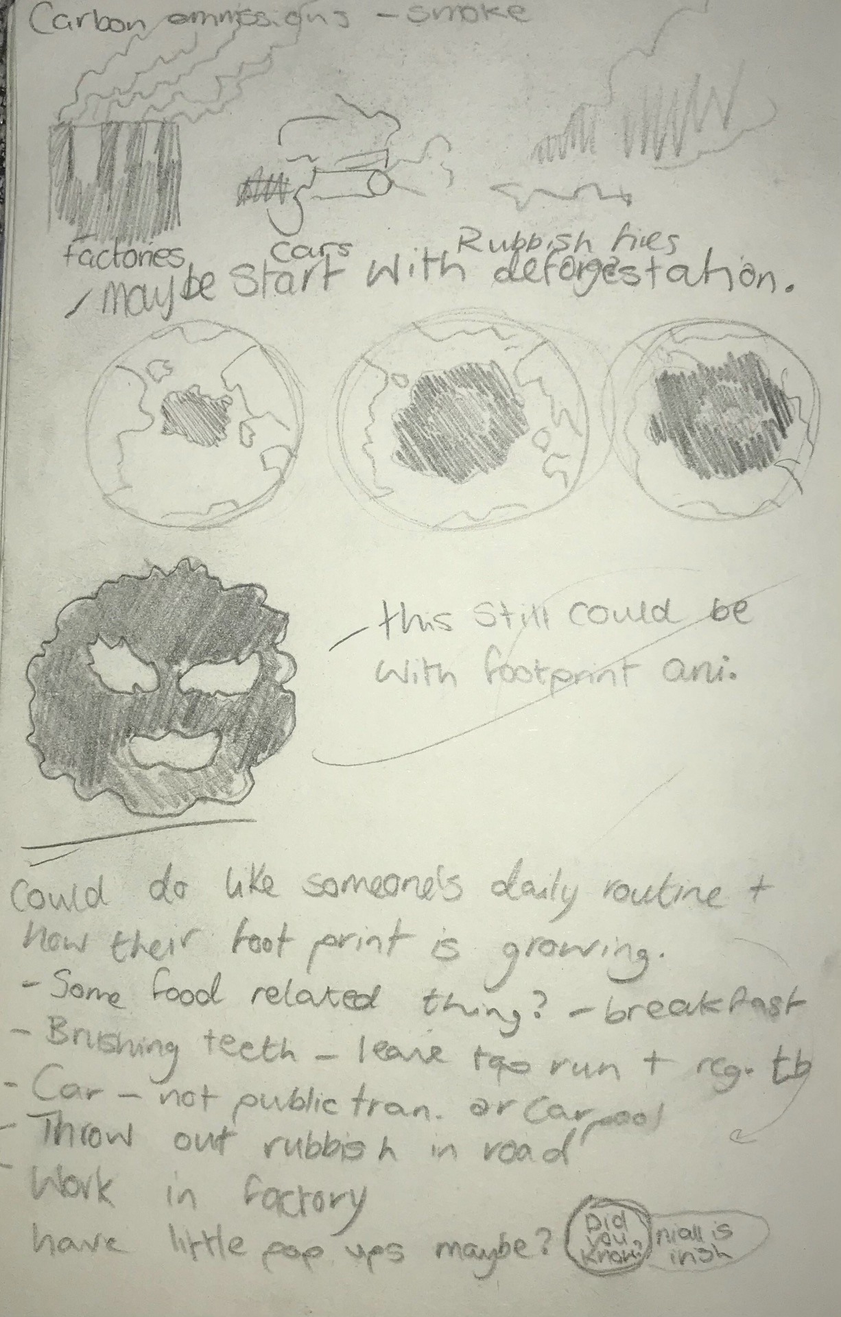
I was inspired to create an animation based on air pollution after seeing a factory and huge amounts of smoke coming from its chimneys on my bus journey home. I just liked how the smoke looked and could envision it in an animation. After this, I started brainstorming and researching effects and causes and landed on deforestation.
Designs
The style of my animation was heavily inspired by the art of Cuphead (Studio MDHR, 2017), I’ve always loved this rubber hose style and I could envision the story perfectly with this look and was really excited to work with it. I used a lot of Cuphead and Disney’s ‘Silly Symphony’ as references for my designs. I also wanted to keep everything in black and white to have the animation look more aged, so simplistic designs were vital.
Smoke Cloud
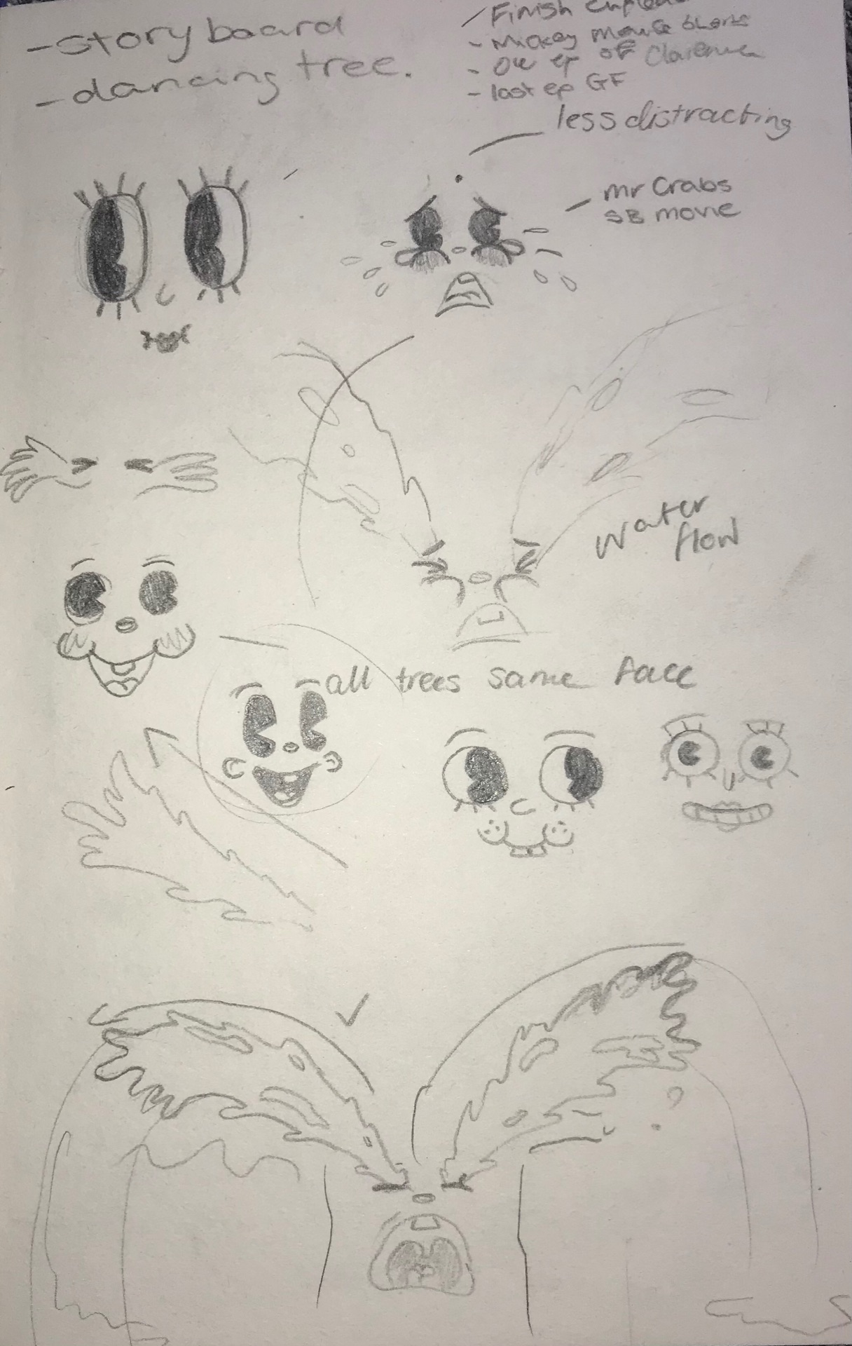
Trees
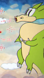
The idea for the trees was to have them all move in sync, similar to ‘The Skeleton Dance’ from Silly Symphony, 1929. As the main piece of the animation, it was important to me that I did a good job of designing the trees. I wanted to make sure that their movement was well done and it was easy to understand what they were doing, their dancing was fairly simple for me to work out but trying to decide how they were going to breathe in the smoke was much more difficult. I kept feeling that it looked more like the trees were blowing outwards, so I spent a long time trying to find references for this. I ended up finding that ‘Grim Matchstick’ a character from Cuphead, had a movement where he breathes in before blowing out fire, this was incredibly helpful to me and I was able to make a much more believable design.
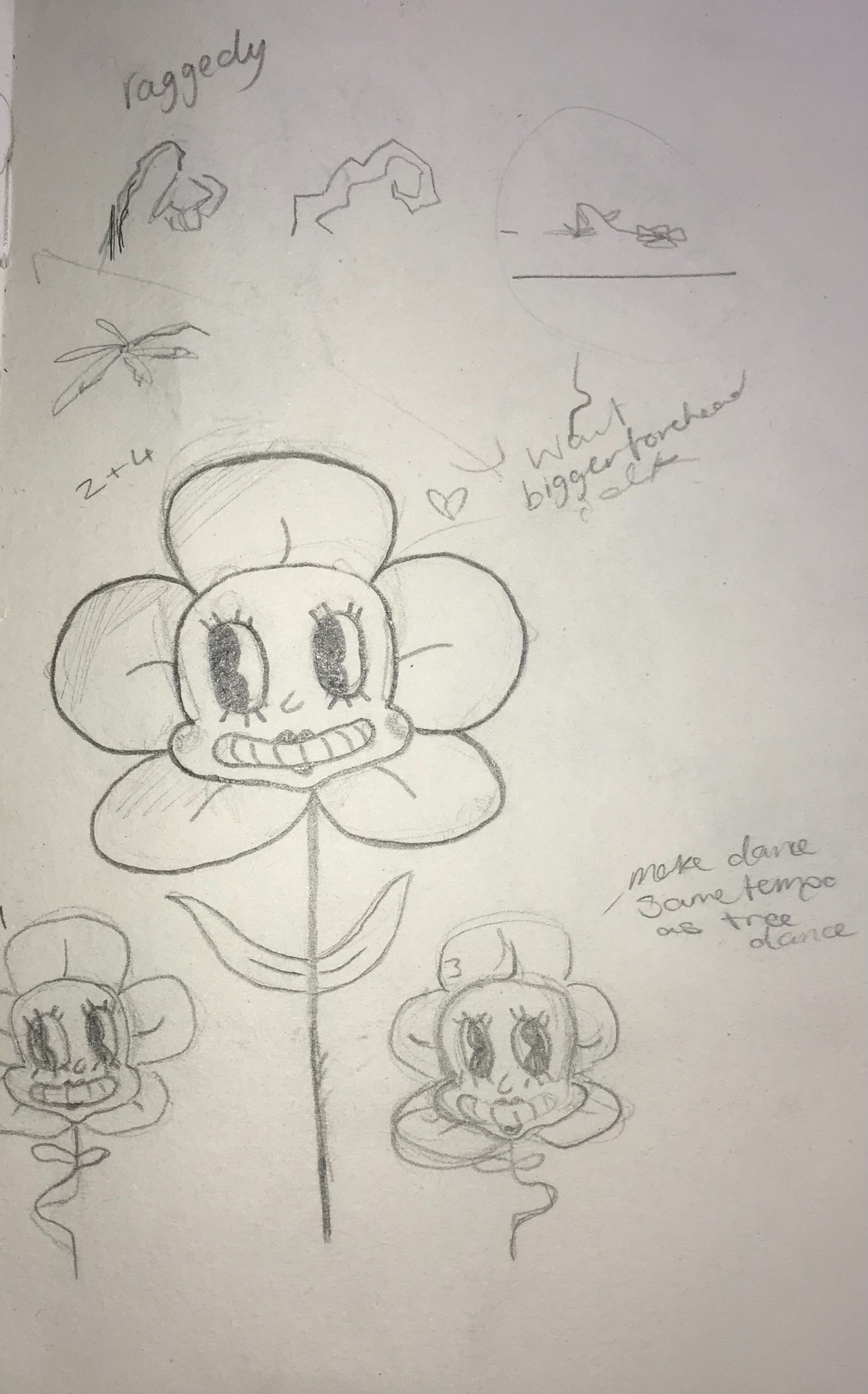
Flowers
I was going to have these flowers at the beginning of the animation dancing alongside the trees but felt that it would become too busy and over-complicated so decided to leave them out. I still really like the design but I’m still happy with the animation without them.
Gas mask Guy
I needed a character that would replant the trees to push the story forward. I wanted the design to be fairly simple and not to have a complicated face to draw in each frame so landed on this design with a gas mask. I felt that it fit in really well with the rest of the animation due to the smoggy atmosphere of the earth, a gas mask seemed like the right choice, I also think it really suits the rubber hose style by having an ambiguous character. I started researching gas masks because I had a general idea of what I wanted them to look like but wanted to make sure I wasn’t straying too far from how they really look, so it was still understandable. I struggled for a while on how the body looked but landed on this sort of bean shape. I really enjoyed designing this character and was really excited to have him in the animation.
Factory
To design the factory I had been looking up different factories from the 1920s and 30s, I found this quite difficult as every time I drew the design it looked like a school to me. I originally had a fairly tall building which I found drew attention more than the chimneys which I needed to be the main focus, so I made the building smaller which definitely worked to emphasise the chimneys, making it look more like a factory. Whilst animating I had struggled to get the right look for the chimney’s movement but took inspiration from the steamboat funnels in the early Disney animation, ‘Steamboat Willie.’
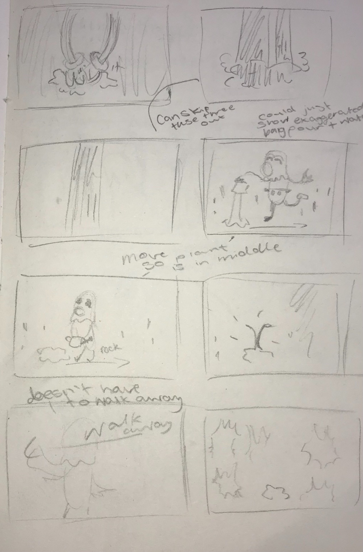
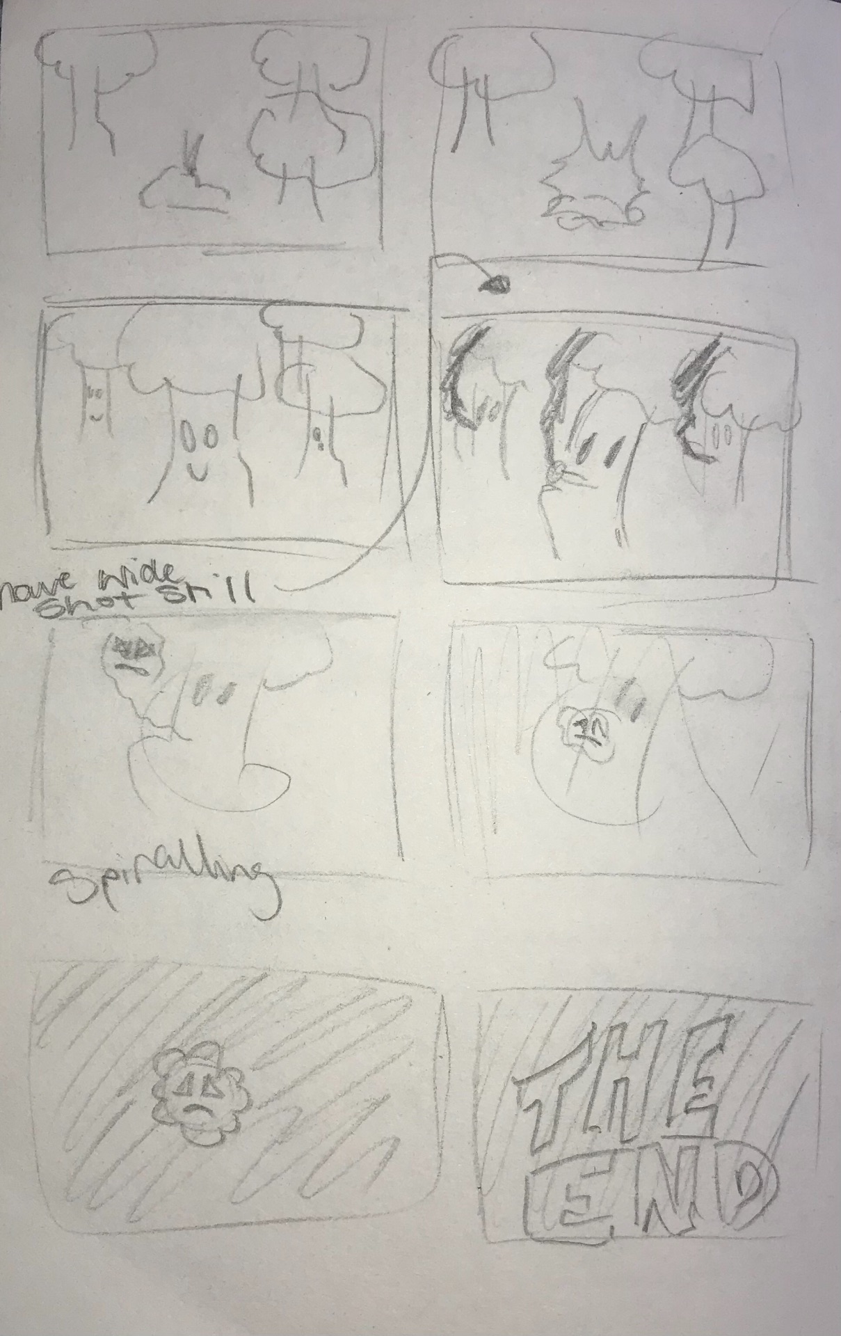
First Draft Storyboard
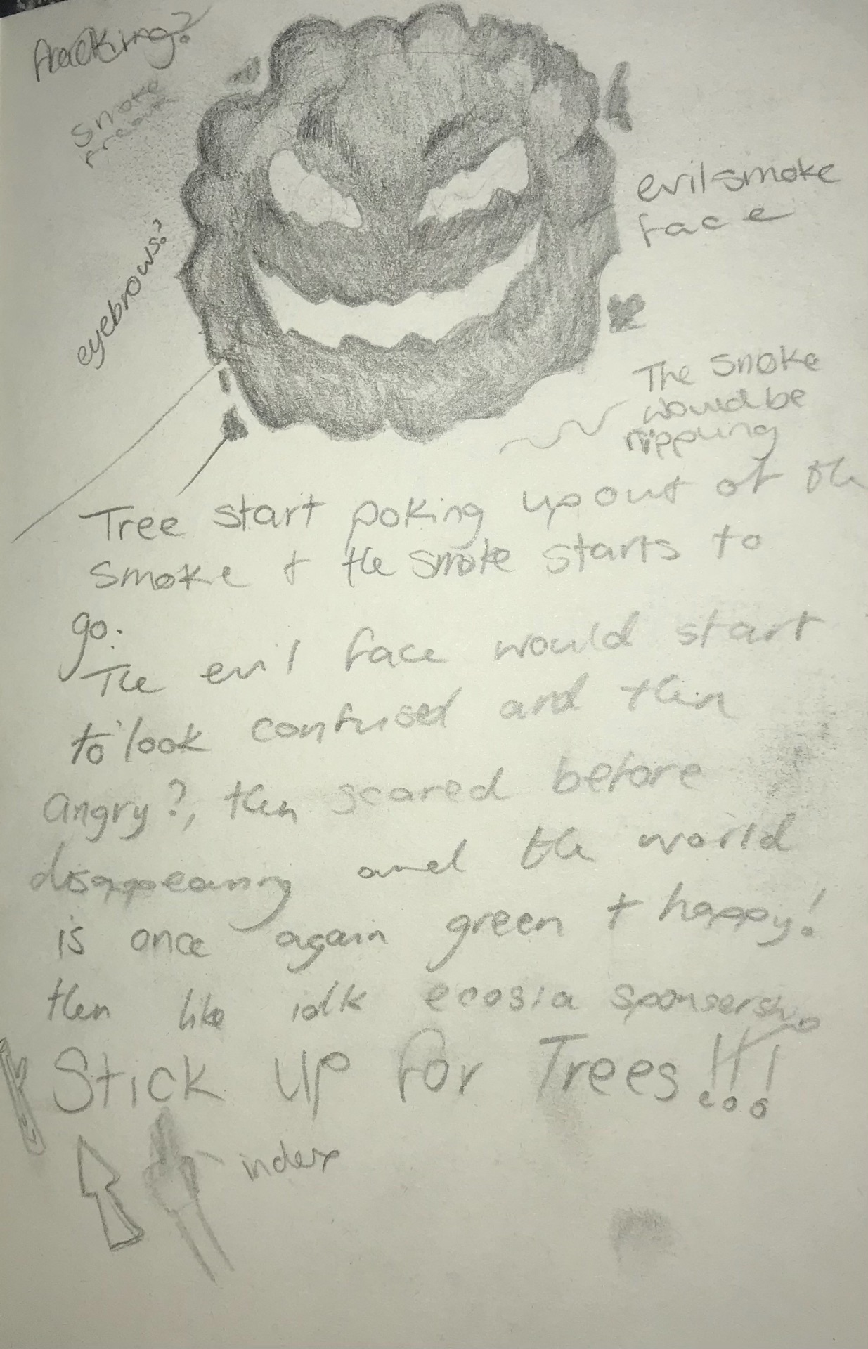
The idea of my animation is to have trees dancing and slowly being chopped down to reveal a factory that is pumping smoke into the atmosphere. This then would create a large smoke villain taking over the earth. At this stage, I wasn’t entirely sure what would cause the trees to grow again to disperse the smoke and had thought of using questions to then use Ecosia as my charity. Later I scrapped this idea because I didn’t want my animation to come off as an Ad. Later I made the gas mask character to replant the trees and created another storyboard with this added in.
Second storyboard
There were still a few changes from this storyboard to the final outcome.
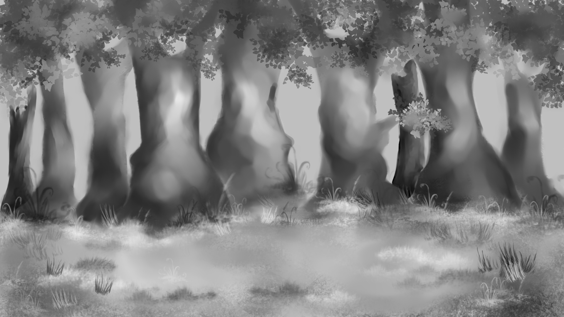
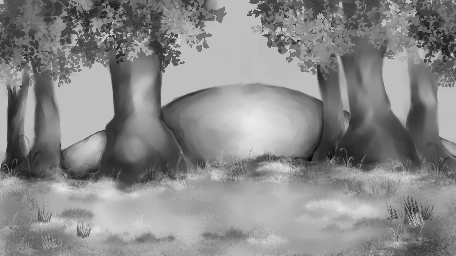
Backgrounds
Looking at old 1930s animation, the backgrounds are a lot more detailed and somewhat realistic in comparison to the characters and actual animation.
Frida Kahlo is best known for her self-portraits representing feminism, freedom, and gender fluidity.
Kahlo embraced both her feminine and masculine sides in her life and work, which helped remove barriers surrounding gender stereotypes. In this piece ‘Self-portrait with cropped hair’ she represents herself with tightly cut hair, as soon after her divorce from Diego Rivera she cut her hair off to separate her old self from him and her now fully independent self. Rivera had always admired her long hair that she has painted strewn all over the room symbolising her complete separation and removal of him from her life. She also shows herself in an ill-fitting suit similar to what Rivera would have worn, another declaration of her independence and strength.Frida Kahlo, ‘Self-Portrait with Cropped Hair’, 1940, MOMA
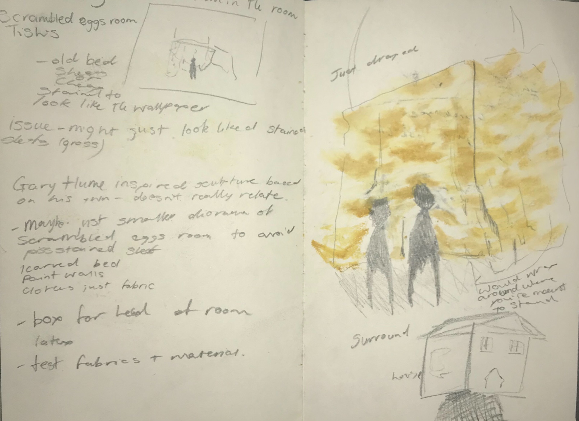
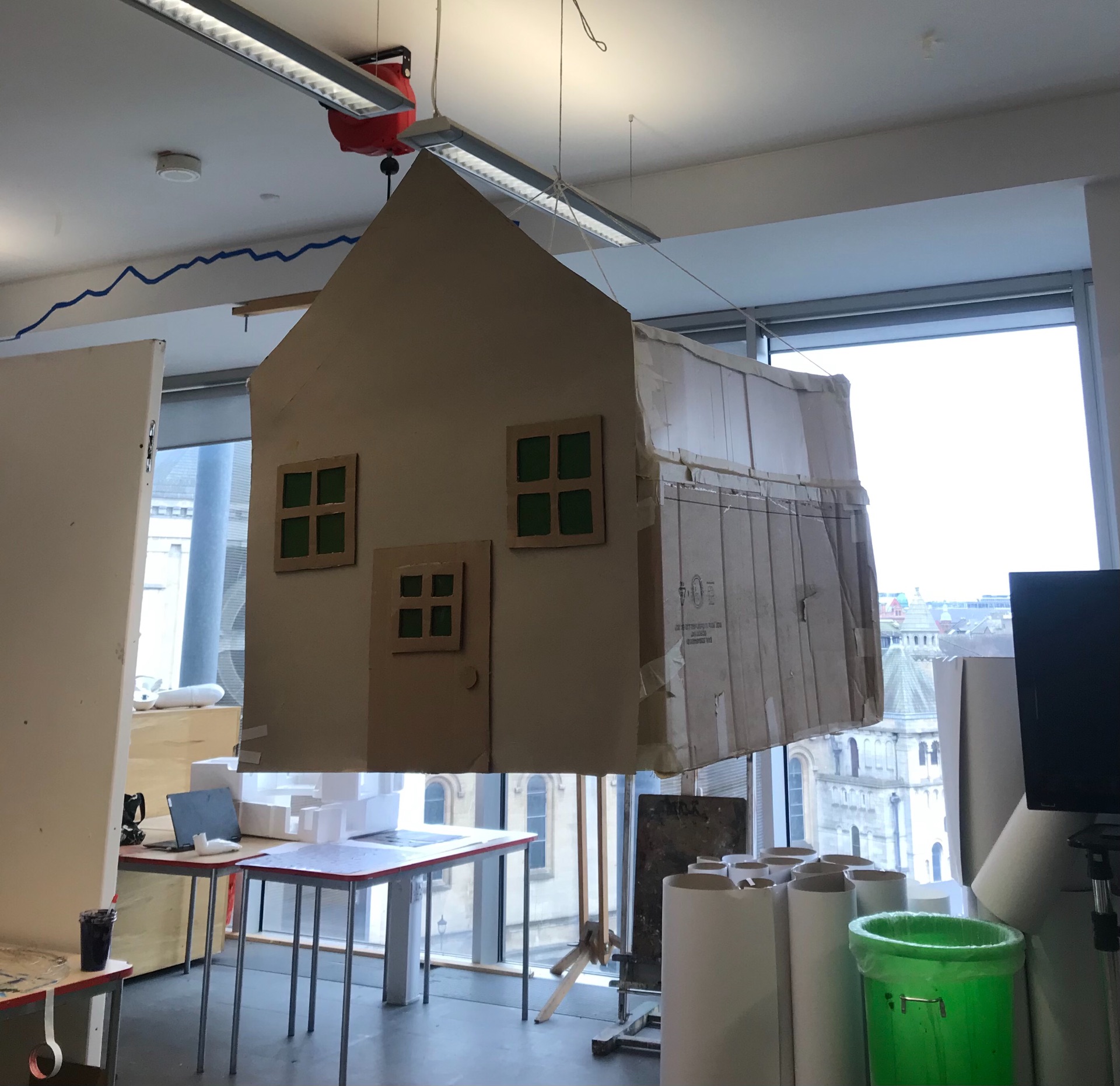
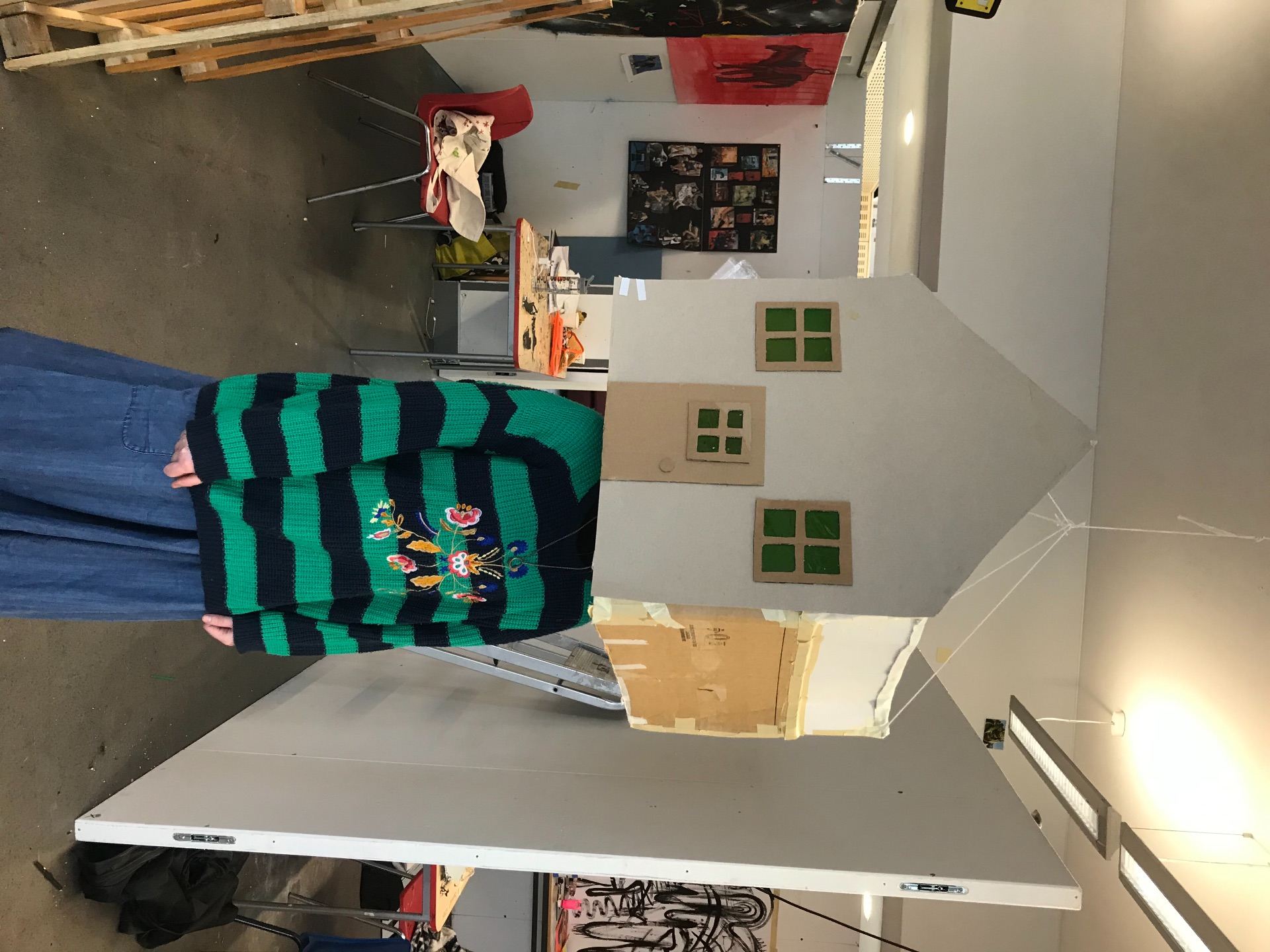
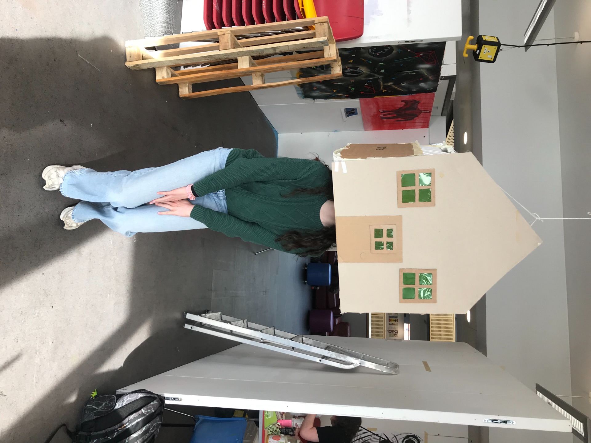
I attached the room to the ceiling so people could just come and see what was inside without having to worry about lifting it up. Though it was put at my height so some had to crouch down or stand taller.
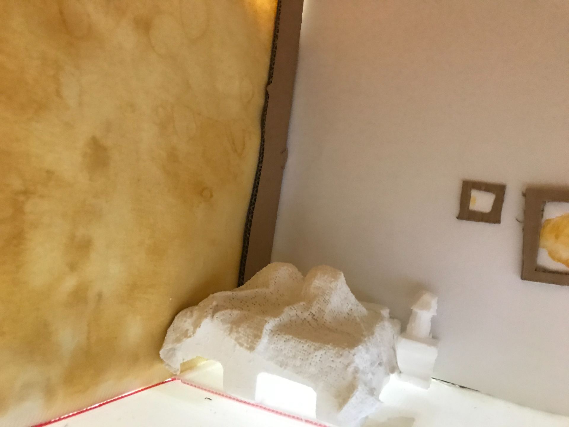
I kept the furniture plain because I didn’t want to take attention off the yellow wallpaper. I think if I had more time I would like to make the furniture a bit more neat and precise though I’m still happy with how it turned out. I also think I would have added audio to make it more atmospheric in there. I do like the effect of being in the room though, its actually quite cosy which is how I want the room to come across though when the house spins it can become a little disorientating.
I really enjoyed letting people look inside and getting to see their reactions after coming back out again. I think it was well received and enjoyed by most who tried it out. I’m really happy with the final outcome and would love to make a more developed version at some stage.
Scrambled egg room wall paper. The ‘Scrambled egg room’ is a room in my auntie’s house affectionately named after its yellow and white wallpaper. The reason I wanted to use this as inspiration for my sculpture was because it has many memories associated with it as it’s where my sister and I would have stayed most often when visiting. The wallpaper will always be something that I associate with some of the memories made in that room.My original idea for my sculpture of sheets stained in the pattern of the wallpaper and to drape them around so that people could walk through and be surrounded by the room in a way. Though I began to be concerned with how it would actually look with no explanation and moved on from this idea.
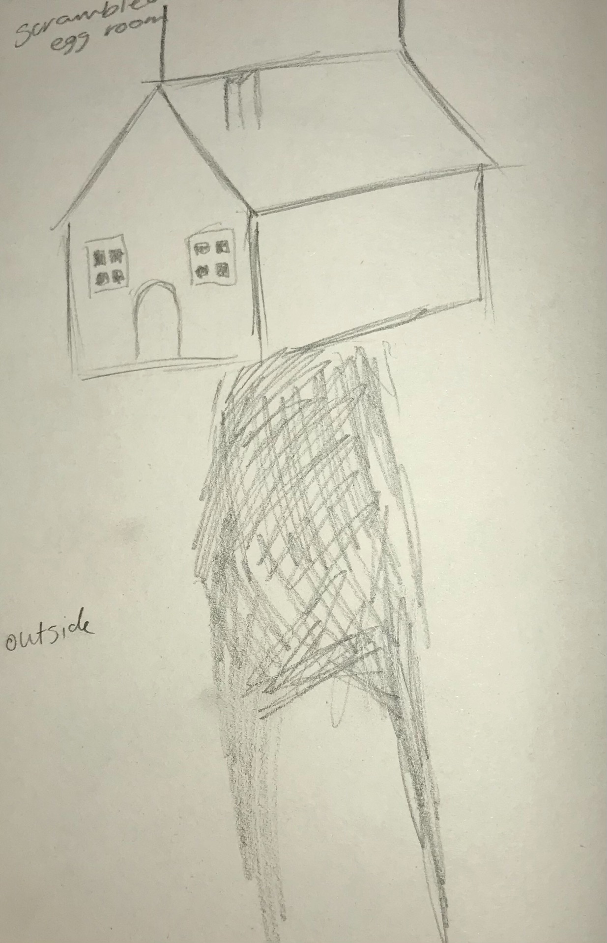
After more brainstorming the surrounding fabric became a diorama of the room and then with advice from Laura became an interactive sculpture where the viewer puts their head in to look around the room. I also tested some fabric to see if it would have the effect I wanted.I wanted to make the outside look like a playhouse or doll house as I had imagined it to have that playful theme of childhood. Also whilst constructing the box I was sitting in it a lot and it felt like I was being transported back to that time in childhood when a cardboard box and imagination was enough to be called entertainment.
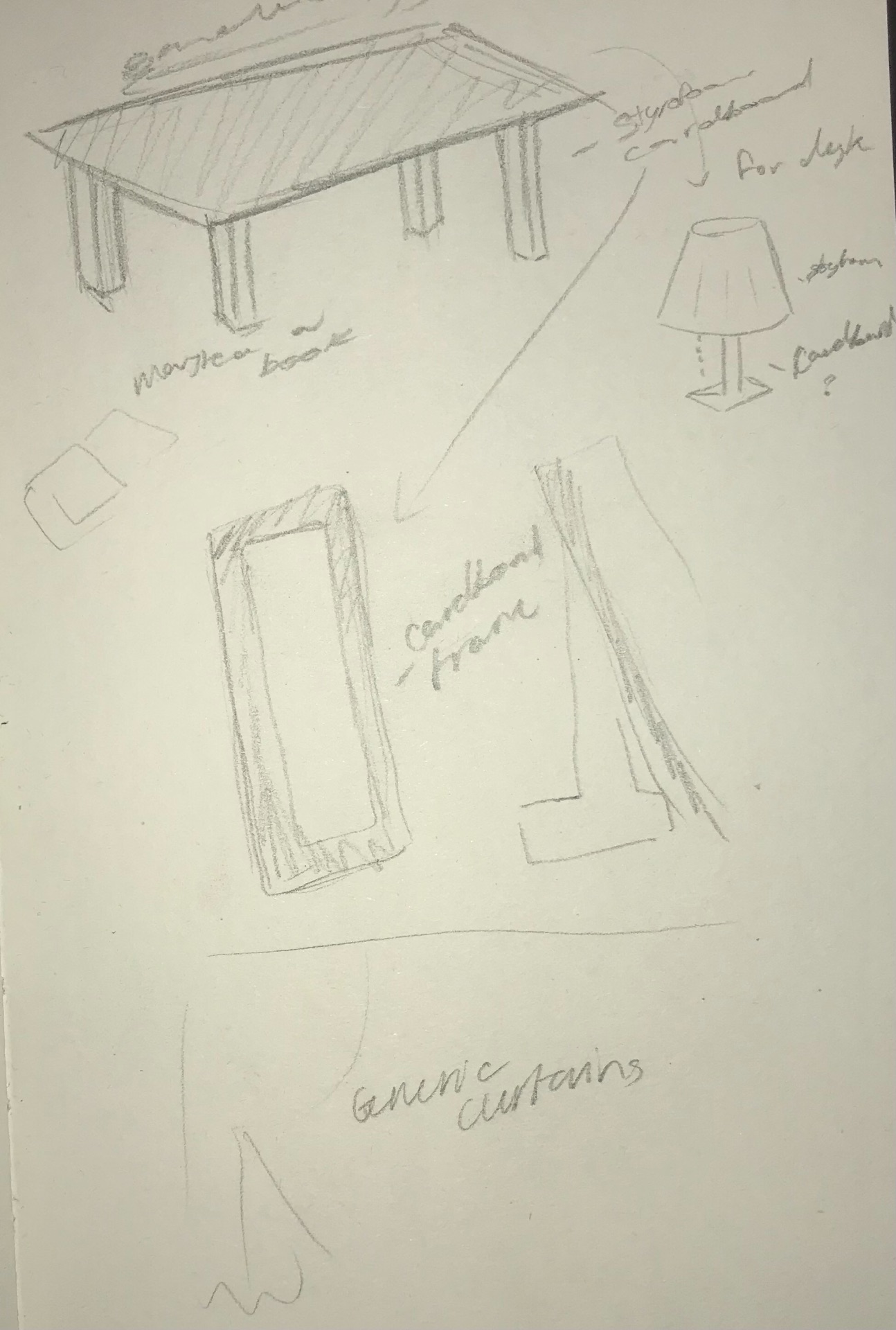
I wanted to make some furniture for the room as I wanted there to be a little more to loom at than just yellow walls, though I wanted to keep them simple and not paint them so it didn’t completely draw attention from the wallpaper as it is the main part of the piece.
I started to construct my own box so that it was able to fit around people’s heads without feeling too closed in and gave them the opportunity to look around the whole room. while making this and thinking about how I wanted the outside to look I decided to just have the front have any kind of design as leaving the rest as a regular taped up cardboard box represents the imagination of childhood.Acrylic paint on fabric for the wallpaper.
Using my collage of Monea Castle I creating this simplistic etching. I didn’t want anything overly detailed as I felt it wouldn’t fit with my previous work in this workshop.The final outcome of my prints were a little more eerie than I had expected, I had originally been going for a more clean clear image but ended up not taking off an awful lot of the ink leaving this kind of fog surrounding the castle. I quite like this as I think it adds mood to the work instead of just a clean cut image with nothing else to look at. It creates a more visually exciting piece.I feel I could have been more experimental with the tissue paper I laid down, as I had been worried about making the print too much. Though, I think I could have been braver with size and placement as what I did doesn’t look intentional.
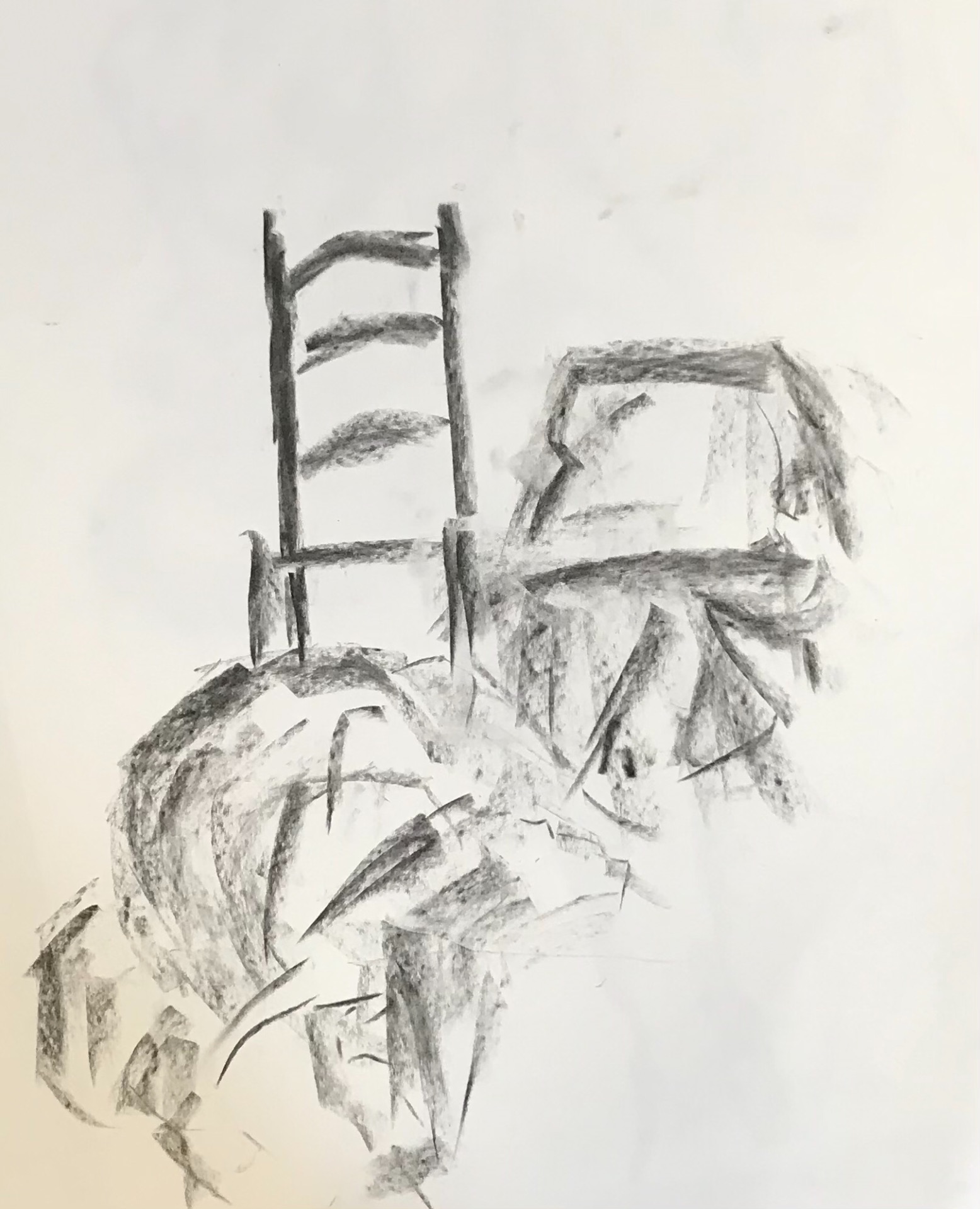
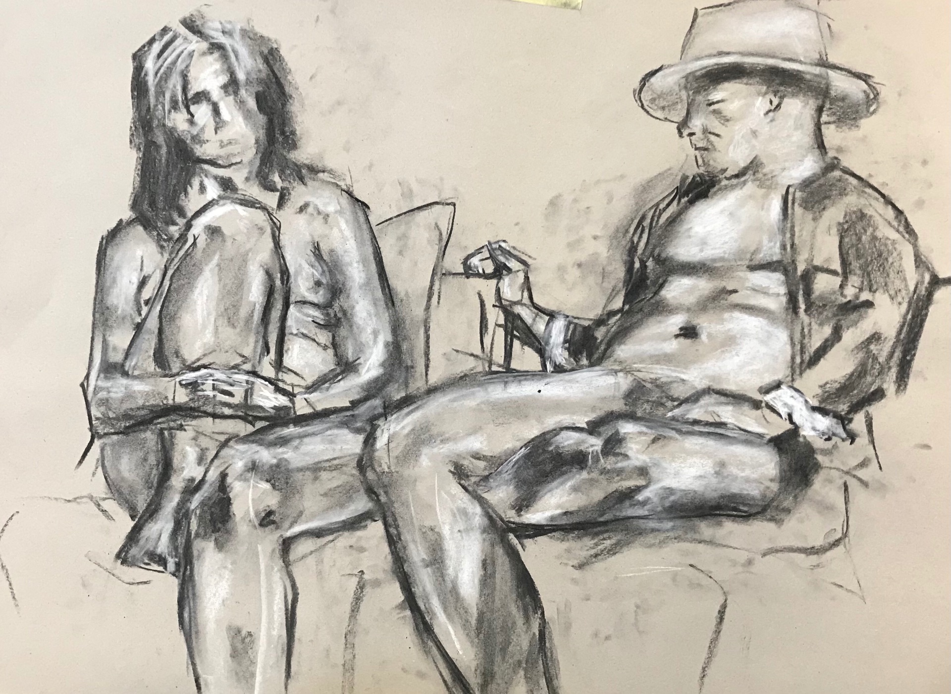
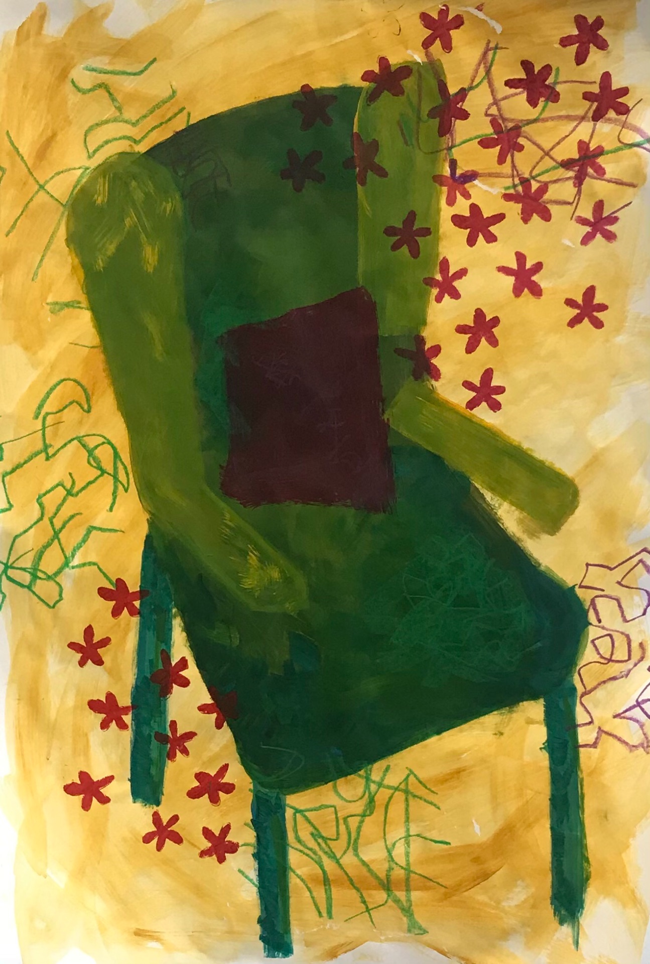
Post box bus stopMonea CastleWet floor signOut the windowSienna’s FlowersMum’s FlowersGreen Kitchen chair inspired by the work of Florence Hutchings.I had already been working on collages in my sketch book so for our collage workshop decided to recreate one as a painting and use techniques we learnt during the morning brief. Using cut out stencils I created the pinks and red flowers surrounding the chair, and using masking tape I created random shapes and used oil pastels to scribble over to keep the naive feeling the original collage had.