Category: Main Workshop

Final Submission

After creating my final prototype, I then made images and text for my poster for the show at the end of the year.

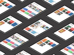
This is the image that will be on the poster, I used Photoshop to add each of the different frames that I made to the Ipad layout design. The same was done with the 2-week project but on an apple watch which will be added to the poster.

The text is “My project consists of an add on feature to Apple books. Allows users to loan out books for a set period of time, between friends and globally. The benefits for loaning books consist of, allows you to broaden your library, explore your friends’ taste and try something new. A reward scheme to encourage usage is also included. This means for every 10 books you loan out you can select a free book of your choice.” this will be under the image explaining what my project is.

The poster will also include a QR code to my linked tree which allows access to my workspaces, research, prototypes and video for the show.

https://linktr.ee/erinwarde

That is the link to my linktree where you can go on to access all my work and research.

Below is the video that I have made for exhibit which contains some research, sketches and a screen-recording of me using my prototype.


Interaction Design – streaming figma and prototyping

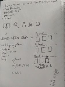
After doing my first Ipad sketches, I had the idea to add more options to allow for loaning out and options to buy.

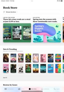
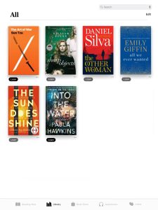
After sketching out my ideas, I research the current layout of apple books on an Ipad. Here are some of the screenshots that I went on to use on figma.

Here the link to my figma where I have created the lending options.

https://www.figma.com/file/Z4ZqzvncLMvX3OmQFP11zD/Ipad-designs?node-id=0%3A1&t=gruGbOC5eberY1JG-1

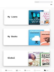
These are the pages I have made that I will use for prototyping with are the Library that give you options to loan out a book but also shows what you have already loaned out. The my loans page can be accessed by the icon I made and removed the search tab and replaced it with a option at the top of the page. My loans page also contains what you have borrowed, an option to buy and the page gives you options to open the Globally shared that has genres and for you books that I added the plus tabs to easily loan. The loan page also contains the My book page that show the ones you personally are loaning out and the tracking bar that shows how many you have loaned out as every 10 you share you get a free book of your choice which is to encourage usage. I had to also make search pages that could be linked up.


These are the pages I made which as well, I choice not to use as I thought the other layouts are better. One of these is the library page with the … options showing that I built in a loan out option with my icon.


I also went on to create dropdown options and link them up as well, I did experiment to see how the dropdown would look with the “due to be returned in (how many) days” but decided that it was too long and didn’t fit the space so I just added the Readers information option and return.

This is the link to my first Prototype which helped me realize a lot of issues and mistakes so I decided after fixing them on my original page I would do the final prototyping on a new page as it should how I have progressed and changed it.

https://www.figma.com/proto/q8nWODn5JeuUP34yO5pbvL/prototype?node-id=1-80&scaling=scale-down&page-id=0%3A1&starting-point-node-id=1%3A80

This the link to my final prototype which I am really happy with.

https://www.figma.com/proto/aaAJqwiFMkuZ6CP4M7whel/final-prototype?node-id=6-328&scaling=scale-down&page-id=0%3A1&starting-point-node-id=6%3A328

Interaction Design – streaming planning

After getting the brief, I explored different streaming services and then decided to explore book streaming services. The concept I came up with is, after buying a copy of a book it could contain a code that allows an eBook version to be downloaded. You can share the eBook version with another person without giving them the physical book as it may return damage.

Here is a link to my miro board which shows my thinking process and research like asking people questions and other apps. The second link is other ways I have researched with articles.

https://miro.com/welcomeonboard/eEJJa2FWbkNMeWFnQkhkdXA4SUtWN1M4QldQcTdydFI3UTJxM1FLZ1EwREpRa2IweXgycWhWcFpqaGhLdjMzWXwzNDU4NzY0NTQ4MzU0NjM2MzQxfDI=?share_link_id=962457607655

https://www.notion.so/Streaming-Project-1f267f8d50de4e599b9ad59e8ce25be0?pvs=4

Here are sketches of layout ideas to add the lending feature to apple books.

After deciding to use an iPad as the device, I sketched out on printouts of an iPad different layout ideas. The three sketches below are of one idea where the first sketch is the page which will the opening with the two different tabs opening each to the two different sketches.

These are two different layout ideas, one allowing each tab to be open separately and the other to not have any tabs but that the page just one page with the 3 different areas.