Portfolio
Walk

Walk With Personality

Run

Run and Jump

SECOND YEAR ANIMATION BLOG
I began this assignment by refreshing my memory on walk and run cycles. I did this by revisiting the blackboard content and reading a few papers about walk and run cycles, as it had been about half a year since this assignment was covered in class. I had missed this assignment due to illness back in October/November 2024. Hence why I am posting this blog in August 2025.
The most interesting paper I read was titled, “Limit Cycle Control And Its Application To The Animation Of Balancing And Walking” This study uses a mathematical approach to rigorously breakdown walk cycles into mathematical equations. Of course, this is much more in depth than necessary considering I am only animating my first ever walk cycle but I still found it useful. The paper’s most insightful point was its emphasis on combining the repetitive, cyclical pattern of walking with irregularities, such as small variations in stride length and timing. Including these subtle imperfections in animated walk cycles, whether they are intentionally done by the animator or not, make for a more authentic representation of life in motion.
I also used this practical tutorial from YouTube, which helped me remember covering the pose-to-pose method of animating walk cycles in class. I followed this structure closely, beginning by blocking out the contact, down, passing and up poses before adding the in between frames. Another useful reference I gathered was a video I had taken when originally preparing to do this assignment in October, of my boyfriend walking on a treadmill.
The treadmill made it very easy to see the patterns of motion happening in place but I was careful not to lean too heavily on this reference as I have had a habit in the past of overusing real life references to the point of borderline rotoscoping. This misses the opportunity to exaggerate movement and play with the fundamentals of animation, as well as producing a less expressive, and often less clearly posed result.

I forgot at this point, to get feedback on my block out before continuing. Fortunately, there were no major errors in my walk cycle, but there were still a few minor flaws I intended to come back to if I had time after completing the rest of this assignment. Another error I made was by animating on 15 fps instead of 24 fps as the assignment instructions had stated. Though I didn’t have time to tidy up the issues with form and timing, I am still pleased with this final product considering it is my first ever attempt at a walk cycle. I think the overall pace and posing are clear and I’m especially happy with the secondary motion in the ears and tail.

For my walk with personality I chose to try a quadruped walk cycle as I hadn’t animated one before and wanted to make the most of this assignment by adding more variation. After gathering a few references I decided to animate a cat walking low to the ground as if stalking its prey, to add more personality to the walk cycle. The reference I used most was this traditional animation from YouTube. I chose this as my main reference as it had very clear posing and was the closest to what I had imagined in my head. By slowing the video down in playback settings I was able to figure out the pattern and order of the paws making contact with the ground. Additionally, I used this popular clip from a BBC nature documentary as a real life reference, particularly the shot beginning around 1 minute and 22 seconds. This reference was helpful for anatomy and form as I didn’t want my cat character to look too similar to the cat from my animated reference.

Note: At this stage I had animated on 1s instead of 2s so the block out is at 2x speed
The main point of feedback I received on my block-out was that I needed to add more up and down motion to the hips, shoulders and head. I had neglected this as I thought it would make the walk look more sneaky to have the body remain level as the cat was focused on whatever it’s stalking, but after adding the subtle up and down motions, as well as correcting some issues with spacing between frames, the end result does look a lot more natural. In hindsight, the main reference I used also keeps the body strictly level, which makes it look somewhat mechanical in the same way my block out did. In the end, this is the cycle I am most pleased with from this assignment, and potentially my favourite thing I’ve animated so far. I think it is the most smooth result I’ve achieved to date, and was the most satisfying to watch come together. This is likely because I have a lot more experience drawing quadrupeds than bipeds in general.
My main reference for my run cycle was one of the examples given on blackboard which broke the cycle down into its key frames. This was a very clear and straightforward reference to replicate as the key frames for my run cycle.

I also used another real life reference of my boyfriend running on a treadmill. As with the walk cycle this was helpful for comparing a real life run to ways in which I could exaggerate the movement to make for a more clearly posed cycle.
My initial block-out had some form and size inconsistencies which were easy to correct, however a more annoying error was that I had repeated the silhouettes almost exactly for both strides. I had been advised not to do this before beginning my run cycle, so when I received my feedback on the updated block-out and realised I had done it anyway, I felt a little silly. However, I was also advised to focus more on correcting issues with my run and jump as the deadline was only a couple days away at this stage.

Fortunately, I did have time to add more variation to the silhouettes of the second stride. This was effective in making the cycle look less mechanical, though I feel I could have pushed this even further to get a more natural looking result. This is also the most rough looking part to this assignment as I didn’t do a final pass to tidy up the linework as I had with the other cycles, though maybe this lends to the faster pace of this cycle as a kind of motion blur. I am satisfied with my run cycle but I think it was my least favourite part of this assignment as it felt the most finicky and turned out to be the most sketchy final result, with the most room for improvement.
Oddly, the run and jump was the only part of this assignment I had animated before. In January 2024 I did a simple rotoscope practise on another video of my boyfriend, this time of him serving during a volleyball match. Though the camera movement is not ideal, I could still clearly see the most important parts of the jump.
I reused the reference from this exercise for the jump as well as referencing a few frames of my run cycle for the run-up. Blending these two references together while keeping consistent size and form was challenging, though I overcame this after a second pass. My block-out still had a few errors that I had not noticed before receiving feedback: On one frame the legs had clipped to be the opposite way around, and the anticipation of the jump needed more emphasis. I also had not realised that the character needed to run off the screen after landing instead of just standing upright.

These corrections didn’t take long as I only had to add 2 additional frames of anticipation to the jump, adjust the arms to swing in an even arc along with the new frames, and I again referenced my run cycle to animate the character running off screen. Since I was less tight for time than anticipated I also added more secondary movement by animating ears and a tail as I had done with the other biped cycles. I am also pleased with this final result as I think I achieved strong arcs of motion in the swinging of the arms as well as the jump itself. Overall it looks to flow naturally to me, especially since making the character run off screen so that the whole animation is more cyclical.
This is the assignment I have enjoyed most so far. I am very grateful I got to work on this assignment during summer as I didn’t have any other modules to balance alongside it. Though I had some early stage work for my Enterprise Placement Year to do, I was able to pretty much give this assignment my full attention, which allowed me to learn more thoroughly from the process instead of focusing on time efficiency. Since I was able to make the most of these exercises thanks to the generous timeframe to work on them, they have turned out to be of a noticeably higher standard than my work for previous assignments. It was also very convenient to work on this during the summer as I had the opportunity to have weekly discord meetings with Aodhan for feedback and any questions I had etc. instead of relying on in-person feedback during a busy class or asking for help over message/email. Perhaps it also helped that I first completed the more challenging assignment 2, which made this assignment feel straightforward in comparison.
Not feeling as if I were rushing an assignment for the first time in a while has helped to improve my confidence with Toon Boom as I got to enjoy the process more. I now think I will continue my subscription to Toon Boom despite not needing it for university next year, as I would like to further my understanding of its features in preparation for final year. I am particularly eager to animate more quadrupeds and learn how to add colour and backgrounds to my animations within Toon Boom, as I have previously only made coloured animations in Procreate. Overall this assignment has been a positive conclusion to my second year studying animation and I am excited to see where I will be a little more than a year from now, when I return to final year after completing my EPY.
Goodbye!
For this assignment, I developed three key element of a job application: a CV, a cover email and a showreel. As I am not actively applying for jobs or placements in the animation industry this year, I approached this assignment as a valuable exercise in understanding the importance of presenting myself professionally in a creative industry. This blog outlines the research, development and reflection that went into creating each component.
Before I began creative my new CV I spent some time researching what makes a creative CV stand out. I read some articles advising on how to make a CV specifically for creative careers. I found this article from the University of Oxford’s Careers in the Creative Arts guide particularly helpful as it breaks down different approaches and requirements for a CV into a lot of detail. The article covers practical advice about layout, tone and visual presentation, with emphasis on expressing individuality without compromising how organised and legible the content is. I also looked at a few examples of CVs by illustrators and designers that I thought had a good balance of creative flair and professionalism. These examples stood out to me as I noticed a common technique of adding illustrations to their CV rather than a photo of themselves. This immediately communicates their creative style without interrupting the written content of the CV.


In my first draft of my CV I simply rewrote my old CV I used to apply to previous part time jobs. This CV had a simple format consisting of an ‘About me’ section and summaries of my work experience and education. to focus on skills and aspirations that would be applicable to a job in a creative industry.
However, while this version was functional and followed a standard format, I felt that it looked too plain and could be more refined to suit applying to creative jobs. In my second draft, I added a software section, hyperlinked my Instagram profile and split the text into two columns to allow it to all fit on one page. I think this looks much more thoughtfully arranged and gives a better impression that the CV is dense with information without being too busy. Additionally, as the illustration isn’t hidden on the second page it makes a more striking first impression that more effectively shows creative personality.
A cover email acts as both a first impression and a short pitch explaining why I am a right match for the job. This part of the assignment requires not just self-promotion, but also company research and concise writing. My aim was to express interest in a specific job posting in a way that showed enthusiasm in a way that still came across as authentic and informed.
As I was not actually intending to apply to industry jobs, I was able to choose an example job posting that wasn’t necessarily in a location that would suit me. hence, I chose this posting from Blue Zoo Animation for the position of junior background artist. Before writing my mock email I browsed Blue Zoo’s YouTube channel to find recent work of theirs I could comment on. Their series of short, charming ads for the RSPB stood out to me as environmentalism is a key theme I want to pursue in my creative work.
Dear employer,
I hope this message finds you well. My name is Erin Reid, and I am excited to apply for the position of Junior Background Artist at Blue Zoo Animation as advertised. I am a passionate 2D artist with a strong background in creating immersive environments, and I am eager to contribute to your creative team.
With a Bachelor of Arts in Animation from Ulster University, my coursework has given me a broad range of experience in both 2D and 3D art, alongside personal projects and freelance commission work. These experiences have equipped me with skills in composition, shape language, perspective and visual storytelling to name a few.
I have followed Blue Zoo’s work, and I particularly enjoyed your recent ‘We Campaign Because They Can’t’ series for the RSPB. I am inspired by your studio’s uniquely charming and humorous approach to celebrating nature, which really comes through in your world-building. The way your team creates striking natural environments resonates with my own artistic vision and aspirations.
I believe my background in digital 2d painting will allow me to contribute effectively to Blue Zoo. I would love the opportunity to discuss how my skills and enthusiasm can further elevate the outstanding work you’re already doing.
Thank you for considering my application. I look forward to possibly discussing my application in more detail.
Warm regards,
Erin Reid
Creating a showreel was likely the most challenging part of this assignment. I was worried I wouldn’t have enough content to make it feel complete as I haven’t done as much 2D animation this year as I had expected or hoped to.
As with the CV, I began by looking at examples. I watched a lot of showreels on YouTube and added my favourites to a paylist. I knew that I should put some of my best work towards the beginning but it was very hard to decide what that would be. I don’t honestly feel confident in having any of my 2D work from this year or last year as a first impression, and I wanted to use clips that were complete scenes rather than just assets so I ended up going back to my foundation year to make my showreel well over 30 seconds. Although this isn’t ideal I think it overall improves the showreel and gives a better balance of quality over recency. Additionally it helps show my personal style rather than focusing on projects where I had to adapt to be consistent with a project’s visual style.
After deciding on what clips to use and how to order them, I made a simple title card using an example of my background concept paintings and adding animated text in procreate. To add music I searched YouTube for license free music that would be fitting for my showreel and not distracting, and eventually settling on using the audio from this video.
Overall this assignment has helped me understand the importance of professional self-presentation in the creative industries. Each component required different approaches to reflection, editing and self-evaluation. I would have liked to also make an ArtStation profile or similar online portfolio for this assignment if I had not ran out of time, as I have a lot of conceptual and illustrative work that would be relevant to job applications such as the aforementioned example from Blue Zoo.
I think my CV could be refined further to include more detail about my creative skills and maybe more visual development though I think it is well balanced already. My email felt a little forced on my end but I think from the perspective of a potential employer it would come across as confident and friendly. Finally, I think my showreel made the most of a limited selection of work to use, though I personally would not feel confident if I were to actually present it to a potential employer. In conclusion, this assignment was eye-opening as it brought a lot of areas for improvement to my attention which I can work on alongside alongside my EPY before returning to final year.
For this module, I worked as one of three 2D artists on the development of a 2.5D platformer game titled Lanternlight. The game follows a lone character navigating a haunted forest, interacting with NPCs along the way and using their lantern to relight beacons. As the lantern and beacons restore light, they drive away monsters and purge the darkness infecting the forest. My contributions focused primarily on environment design during the early stages, and later extended to UI design as well as designing and animating an enemy for the game.
Research:
Our team created a Miro board to gather our initial ideas, references and potential design directions. We collaboratively defined the project’s visual tone by discussing other platformer games we knew of with similar environmental themes. This board was very helpful in the early stages as it allowed everyone to see and get involved in how the concept was progressing remotely, as we often didn’t have everyone in our team present for in-person discussion.

after further discussion my group decided on Over the Garden Wall as the best example of what visual style we would aim for. In my research for our style guide I focused on art director, Nick Cross’ work on the show. Thanks to the success of Over the Garden Wall I was able to find lots of helpful articles, tutorials and books that gave me a detailed understanding of how visual semiotics and environmental storytelling were used. 


Concept Art:
I started developing different colour pallets for levels within the forest to reflect the different stages of the main characters journey. I gathered reference images I could colour pick from, using a mixture of photos I added to our group Pinterest board, as well as stills from other platformers with dark fantasy/whimsical aesthetics: Blasphemous and Night in the Woods. From here I began to try out thumbnail sketches and simple tests to explore ways of using the pallets to add depth and mood. These early experiments where useful for finding a balance between visual interest and clarity for gameplay as I started to think about composition and silhouette readability.


At this stage I was pleased with how each environment was progressing to be different but still cohesive, however I wanted to experiment further with texture and refine a style to use in my final designs. Although I wanted to make more detailed concepts of each environment such as this, time constraints made that impractical. However, this concept piece was very helpful for getting into the routine of drawing different tree variations while staying consistent. I also added a quick character design as a stand in since we didn’t have a finalised main character at this stage.

Before moving onto more concepts I also made a revised version of the final environment as I felt my initial concept lacked vibrancy and composition. I’m glad I made this second iteration as it was a big improvement and better communicated my idea to the games team who would be making the 3D environment.

For our style guide I made the first variation of each kind of tree with ‘Dos and Donts’ tips to help the games team with modelling the 3D versions, as each environment would have a corresponding species of tree. This would also be useful for when I came back to make more variations of each species.


At this stage we were still deciding what assets should be 2D or 3D so I made a couple concepts of the beacons if they were to be 2D. I think these designs where a little too simple and didn’t make the beacons look important enough but I didn’t need to develop this further as we decided to have the beacons be entirely 3D instead.

Production:
During production, I had intended to make 4 variations of each tree but I only managed 2 of each due to time limits. Fortunately, Charlie, one of my team’s game design students, had made plenty of 3D variations of each tree to populate the environments so my trees could be scattered more widely to avoid visible repetition. I like how the painterly textures turned out, though I think I could have made more variations if I had rendered the trees more simply, as the environments are dark in the game anyway, making smaller details barely visible.

Concept Art:
For the fireflies we needed to decide on the size and level of detail we wanted, as the fireflies are central to the main game mechanic. Their design needed to be emotive but not anthropomorphised as we didn’t want players to feel guilty about using them as tools to light the lantern. I experimented with different silhouettes and detail levels, eventually returning to my first concept. To research for this design I returned to Over the Garden Wall and also looked at Mr Bug Goes to Town, however I decided against using a Fleischer-like style to prevent giving the fireflies to much personality.

My initial enemy design was a tree monster inspired by the eye-like knots on the bark of birch trees. For the enemy’s attack I was inspired by the Wakeful Alcove enemy from Blasphemous, which similarly lies dormant and blends into its surroundings until the player gets too close. 


While this design was visually successful, it’s attack was too similar to the game’s other enemy, which also uses a swiping action to steal fireflies from the player’s lantern. During feedback it was suggested that I combine this design with another enemy design by Charlie, one of the other 2D artists in my group, to make an enemy that would contrast more with the existing enemy.

Charlie’s enemy design
My redesign:


I was pleased with this redesign as it retained my idea of an enemy that is camouflaged as one of my 2D tree assets. Additionally, this design gave me more opportunity to animate, whereas my original design only had one moving limb. It is also more stylistically similar to the other enemy in the game, as it is also a black silhouette with white eyes, yet it still has more variation in its behaviour and anatomy.
Production:
The firefly animation was very straightforward to make as only the wings needed to move, since the glow and flight path could be added in Unreal Engine by the games team. This was efficient as it ensured no unnecessary overlap. I also referenced slow motion footage of insects flying to help understand how the wings would beat.

Animating the enemy was more complex but still less challenging than I expected it to be. Thanks to the simplicity of the enemy being solid black, I was able to focus on staging without having to add detail or colour in multiple passes. I mostly used pose-to-pose animation, but for some of the tentacle movements, particularly in the walk cycle, I used straight-ahead to help with fluidity. I think this blend worked well and helped me understand when to use each approach.
Death:
Attack: Appearance:
 Walk:
Walk: 
Concept Art:
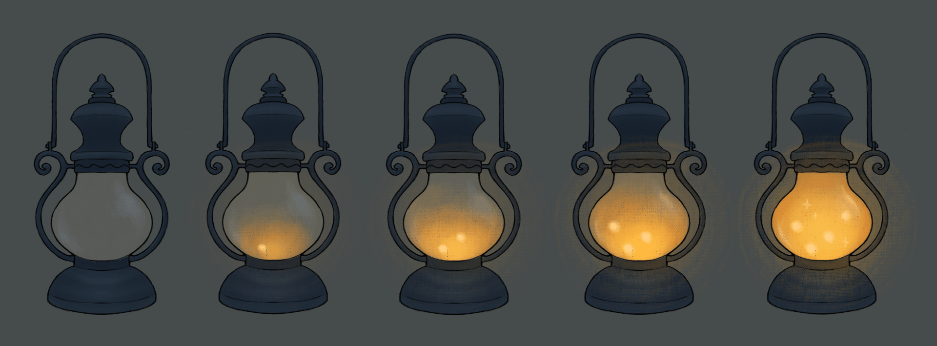
I designed a lantern for the UI that could visually scale in brightness to reflect the number of fireflies the player has acquired while staying consistent with the lantern held by the main character. I tried several designs and my group agreed on number 5 as it was well balanced between being detailed enough to be visually appealing, while simple enough to be also used for the smaller lantern held by the main character.
 I also proposed a storybook opening sequence for the beginning of the game. By making the main menu a book cover, it could transition into the book opening to frame the game’s narrative in a fairytale format. I looked for inspiration from Shrek and Cuphead:
I made one illustration to test what style I wanted to use. I settled on using warm flat colours and dark line-art to ensure the visuals would still be bold and legible even if they had to be somewhat small to allow for overlaid text on the screen.

production:
Making the lantern variations was straightforward as I used several transparent layers to create the glass bulb and simulate the glowing light. I decided to represent the fireflies simply, as orbs or sparkles, to avoid overcrowding the design.
For the pause menu screen I made a simple background that tied in with the storybook format. This was also a very straightforward process as it didn’t require much detail, however I was careful to use the correct resolution as it would need to cover the screen entirely.

The storybook cover was inspired by gold foiled, leather hardback books. I used a symmetrical composition with some detailed ornament but kept the main focal point on the simple shape of the lantern and firefly.

 Animating the storybook was probably the most time consuming part of this project for me but it was also my favourite part. I created two main illustrations that could be recoloured and adjusted across 3 different page spreads to reflect the forest’s gradual descent into darkness, as this would be more efficient than a new set of illustrations for each spread. I also chose to make a fading transition between each stage rather than animating the page flipping. I think this turned out to be more effective in highlighting the smaller differences between each page.


This module has been a rewarding experience, and I’m proud of how our game came together. I feel that the final product successfully captured the atmosphere and tone we set out to achieve as a team. Our shared vision of a cosy yet spooky, dark fantasy platformer was clear throughout the whole design process, and I’m satisfied with my contribution. I’m also glad that I got to work in a visual style that I personally enjoy, as in previous group projects I’ve often had to compromise or adapt to work in styles and use mediums/software that are outside of comfort zone. This project gave me the opportunity to lean fully into 2D painting, animating and illustrating, which made the work feel much more creatively fulfilling.
However, I found time management to be a difficult aspect of this assignment. Ideally I should have finished all of my animations with a few days to spare before the deadline, as the final implementation of my work into the game depended on the teammates from the Games Design course. I felt a little guilty as they had to rush implementing some of my work into the game to have the final playthrough recorded in time for the submission, this meant there may have been some bugs or playback issues with my enemy and storybook intro that had to be left unresolved. This was partly due to my underestimation of how long the exporting and delivery process would take. I chose to do all of my animations in Procreate which does not allow for mass PNG export. This was no issue for the shorter animations such as the enemy actions, however, my storybook intro was several hundred frames, too many to export individually. I had to resort to using an online MP4-to-PNG converter and while this was a workable solution, it was not ideal as it added an extra step and complicated file handling.
Additionally, I could have communicated with my team more effectively during periods where I experienced health issues that impacted my ability to keep up with the project timeline. This created a knock-on effect later in the production pipeline as while I was absent, the level layouts and environments changed significantly. Unfortunately I didn’t have enough time to adapt my environment designs to reflect these changes. However this luckily didn’t make my previous work obsolete, and I think the ways in which the games team used my assets to decorate the levels looks just as effective.
Despite a few setbacks, I still enjoyed this module more than previous projects. It has taught me a lot about the importance of consistent communication in team settings and planning for technical limitations in the tools and software I use. In future group projects, I will remember to aim to finish animation work earlier than scheduled if it needs to be integrated by other teammates, and keep my group updated on any delays I encounter. I look forward to taking what I’ve learnt from this module into future projects that will further develop my visual storytelling and animation practise.
For this assignment I was a member of group 8. We chose our article by each picking our 3 favourites from browsing the options and reading the abstracts. After narrowing down to the most popular choices and voting for our favourites we chose ‘The Kraft of Labour, Labour as Craft: Hayao Miyazaki’s Images of Work’ by Jo Law. My group communicated well at this stage and we agreed to all read the article and pick a section on a first come, first serve basis as we had 5 members and the article had 5 sections including the conclusion.
At this stage we hadn’t received specific directions on what to focus on in the presentation so I kept it simple and broke the section I chose down, summarising each paragraph in a few bullet points. I chose the section Labouring with Machines as it mentions a few topics that interest me: the industrial revolution, the British Arts and Crafts Movement and philosophy. I don’t regret my choice however I would have approached it differently at the beginning had the criteria for the presentation been more clearly detailed at the start of the assignment. Hence, I did some unnecessary work at this stage by relating the content of my section to other examples of art that also focuses on idealised human labour and labour with machines.

‘Young Steel Workers’ Ivan Bevzenko (1961)
My favourite example I thought of was this example of Soviet Socialist Realism. For the sake of keeping this blog succinct I set obvious political and historical context aside when I make this comparison. I thought of Socialist Realism, and this painting in particular as it illustrates an idealised scene of manual labour wherein workers collaborate, their physical enthusiasm reflecting their genuine commitment to labouring for the collective. This scene is comparable to a scene mentioned in the article, of the women working together in the Piccolo plant in Miyazaki’s ‘Porco Rosso’. Much like Bevzenko’s painting, a group of workers diverse in age and brightly dressed are immersed in their collaborative task. They don’t just look at their work but at each other. Another scene the author uses as an example of labour with machines is the boiler room from ‘Spirited Away’. Although featuring soot sprites in plase of humans, I think this scene is still comparable to this painting, the sprites work dangerously close to a huge industrial coal fire that could consume them if they where to fall. Like the steel workers, the sprites don’t fear the machine and embrace working with it. Despite this being a slight tangent, I found relating this article to other artworks to be a helpful warm-up exercise as I haven’t had to talk about art from an academic perspective in a while.


Spirited Away (2001)
When I learned that I would only have 2 minutes to speak during the presentation, I refined my initial notes on my section of the article down as much as possible. Making the slides was probably the most straightforward part of this assignment. I split my slides into 4 main points the author makes, each containing a few bullet points that the audience could follow along with during the presentation and a few images that provide examples from the artists and movements mentioned. I also made my group’s title and ending slides. The last step of my preparation for the presentation was making a rough script of what I wanted to say so I could rehearse it and make sure it fitted within 2 minutes. I found this list from the discord server very useful for making sure my script covered everything required. I think my section meets the first 4 points but to fulfil the last 2 my group would have needed to communicate better, as we didn’t really discuss any conclusion or a main point to take away from the article. 


[you can view our final presentation on canva here]
Unfortunately despite my section being about 1 minute 40 seconds, my group still went over the maximum 10 minutes. I think I did well at condensing a lot of information into a very short time, although I did stumble over my words a lot more than usual and was cut off before I could finish. Overall my group’s presentation would have been more cohesive and succinct if we had communicated better to find a collective conclusion and ensure everyone’s sections where of equal length.
At first I struggled to think of clips that I could use for this assignment but after a YouTube rabbit hole of watching clips from my favourite movies and shows I compiled a few options into a playlist so I could rewatch them and compare. Most of these clips feature too many cuts, awkward angles or multiple characters that overcomplicate things for a first time lip-syncing. Hence, I decided on this clip from ‘Better Call Saul’ as all the shots of Saul speaking are shot from straight ahead and uninterrupted by any other characters.
Before I started animating I wanted to practise drawing Saul. Similarly to last year when I had to animate Nicholas Cage, I started by drawing over reference images, drawing over the tracing and then drawing independently until I felt I had a rough formula in my head on how to draw them. I found Bob Odenkirk’s likeness harder to simplify and keep recognisable and I knew I wouldn’t be able to draw him this detailed for my whole animation but I had to move on.

Initially, before I moved onto animating I was told rotoscoping for just the key poses was fine so I imported my reference video and plotted these poses as simply as I felt I could. It was at this point I received conflicting feedback from different staff but since this didn’t take much time or effort so far I was fine with restarting. That was until I ended up having to focus on the character creation module during my extension until finally I was left with just under a week to finish my weight lift and restart this. I figured it would be unwise to spend extra time on the body of my character when the lip sync is the focus so I continued where I had left off. I had also originally intended to do the full 15 seconds of Saul speaking but I had to cut this down to the first 8 seconds.

After finishing my weight lift I had 3 days left so I made a first pass, pose to pose, so every 10 or so frames, excluding the mouth. This was honestly rushed so I had to reduce the table, books and body to as few lines as I could within reason. Like with my weight lift, I added more frames where they felt needed instead of spending more time making multiple passes. Before starting the lip-sync I would say the most challenging parts were the hands and the eyes, as it was hard to not get carried away drawing and redrawing them endlessly since I couldn’t afford to be a perfectionist for this assignment. For the hands I was able to add motion blur for the frames that were hard to make out in my reference, and for the eyes I just had to accept they would be mostly wonky to varying degrees. When I felt I had a sufficient base to start lip syncing, I used the expression chart included in our class content.
It was also very convenient that the way my room is arranged, I have a large mirror right next to my desk so I was able to mouth the words to myself as I worked. Additionally, I kept my reference video open on another monitor throughout the whole process. I was expecting this stage to be the most tedious and tight for time as I had never lip synced before but as it turned out, I had some time to add more frames to the body and smooth out the hand actions. I animated the lip-sync on 2s with occasional 1s for words that had more syllables. I found this went quickly as I didn’t have to redraw over mistakes as much and the scrubbing feature on ToonBoom felt very straightforward to use. However when I started adding more frames to smooth out the animation as a whole I found myself having to redo parts of the lip-sync as the mouth would no longer sit at the right point of the face. When it came time to accept I had to add what finishing touches I could and export, I had an error message I couldn’t find an answer to.


I spent some time trying to follow solutions online, I also tried exporting as images and editing them together with the audio but that was also not effective. In the end this problem was solved thanks to a friend’s kind offer. I was able to send my Harmony file as a zip file and have them export it for me.
I can’t honestly say that I am satisfied with my final result for this assessment. I keep seeing frames where I did not adjust the lip-sync to fit the later added frames better. I also thought that I had shortened my clip to the minimum of 8 seconds but it is really 7. I would have liked to have had time to restart without rotoscoping as I was told to since it would have given me more space to experiment with exaggeration and adding more flair rather than plainly replicating the reference. I think my timing and the lip sync itself flows with the audio just fine but generally I think it really shows that this assignment was somewhat rushed. It is satisfactory for a first pass and a first time lip-syncing but not as a final product. There is even a frame where his tie just disappears. To try and end on a positive note, I am glad to finally be 2D animating neither on an iPad nor my old drawing tablet that I never really figured out. I now know lip-syncing is not actually very complicated. I’m really looking forward to starting a new semester where I (hopefully) don’t get sick again or have any extensions to work on alongside other modules, so I can actually do my best in 2D.
Beginning this assignment, I first thought of Irish lifting stones as potentially a good example and looked to YouTube for references as that was where I first heard of Stonelifting. There is a surprising amount of videos and channels dedicated this niche hobby so I didn’t have to dig for references. I started with this video and sketched the key poses in ToonBoom. It almost goes without saying that I have chosen to use 2D for this assignment as I will only use 3D when I have to.

I didn’t progress any further on this assignment until after I had completed my character creation module. When I returned to these keyframes to start another pass I realised the feet where not planted and I would have to restart. Instead of restarting with the same reference I wondered if I could find some references of people lifting something a little more interesting than a big stone (I doubt there are any avid stone lifters reading this to be offended)
I thought it would be fun to animate someone lifting a large dog but surprisingly this was harder to find references for. After a little searching I found a few videos I could use together. At this point I had just under a week left and still most of my lip sync to do as well so I decided to rotoscope the key poses this time, based on this reference, to save some time and make sure I didn’t repeat mistakes from my last attempt.

From here I animated my first (and only full pass I had time for) mostly straight ahead as I could be confident my keyframes would keep me right. I found this process quite straightforward despite it being my first time animating with ToonBoom. There are probably a lot of shortcuts I could have used to save time but while I’m new to the software I just drew each new frame individually as I didn’t know how to copy elements of one frame into another etc. This is usually how I prefer to work anyway as I just prefer how it looks. I chose not to include my character’s face and instead add more detail to the dog as I tend to overthink and spend too long drawing and redrawing human faces, and I had plenty of that to look forward to in my lip sync. With the dog being a living thing I took the opportunity to add some fluidity, extra expressions and follow through to the head, neck and floppy ear as this was a time efficient way to add more flair to my animation. I also exaggerated the anticipation of my character lifting the dog as in the reference it is obvious the dog is actually not very heavy, just large and I wanted to make my animation look more like the examples I had seen in class. After drawing all my frames I found it didn’t take long in ToonBoom to adjust the timing without having to add more drawings. I found that after animating straight ahead the dogs head was the only thing that morphed over the course of the animation, starting off smaller and narrower and growing slightly larger by the end. This is not so noticeable in my final product as I was able to go over it when adding finishing touches without spending too much time being meticulous.

I think my final weight animation lift looks good although if I could do it again I would have liked to further exaggerate the follow through after the character lifts the dog, as I feel I only made it noticeable by the dog’s head rather than the weight of their whole body. I would also have liked to add more follow through to dog’s tail and fur and the character’s hair. I also would have liked to add more frames in general as I didn’t strictly animate on 2s or 3s and instead just added drawings where it felt essential. As well as the rotoscoping of the key frames I think this contributes to my final result looking more rigid and simple than if I had had time to work from scratch. Although I like how the dog turned out and it was much more enjoyable than just drawing a rock, I would have had to focus more on my character if they were lifting a very simple object. Initially I was worried going into this assignment without having done part 1 of the module and hence having no previous experience with ToonBoom. I was expecting a first time using a new 2D animation program to be tedious, as I found animating in Krita last year to be an annoyance, but it was not nearly as difficult as I imagined. I think this is also largely thanks to upgrading to a display tablet which has so far made all digital art in general feel significantly more intuitive. Overall, given the tight schedule I had to complete this animation within and my inexperience with ToonBoom I think my final result is satisfactory.