While designing my brand logo, I was also continuing to improve my wordmark in the background.
we last left off our wordmark in this design;

Having shown this to my teacher, something was still not quite right with it. We decided that it is still a bit too complicated.
Feeling a little lost as to what direction I should go next, I went back and relooked at some of the resources provided to me in class and study them a bit more.
I found some more logos with an added “twist” to them, and compared them to my wordmark;
![]()
![]()
![]()
In the end, I can finally see why my wordmark was way overcomplicated. All these logos with a “twist”, although the twist is obvious, it does not overpower the wordmark. The font choices remind clean and simple, and the added twist is also clean, such as a clean cut with “tease” or a clean loop for “THREAD”.
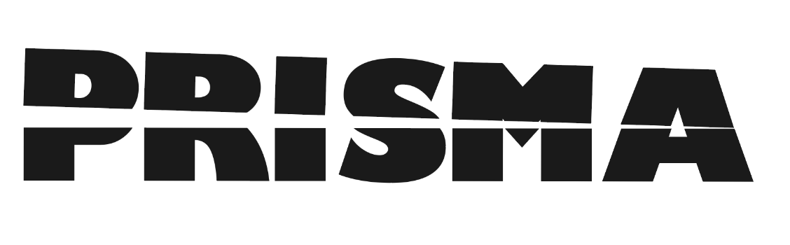
With this in mind, I backed tracked a little. I went back to a cleaner sans serif typeface, and while in class designed the final versions of the wordmark;

In the end, I went with the third idea from the top;
( changed to a thicker font)
I’m very happy with this design, it is clean, and simple. The important thing is that now twist is just a clean cut line through the middle to represent the light coming out of the prism. One big thing I have learnt from this wordmark project is that the font comes first, an
I also decided that I wanted to keep my wordmark all in all capital, I like that it gave a more serious feel to the brand. After all, it is a bank that I’m designing for, the trustworthiness and
Once I’m happy with the design, I did try my hand at kerning. I watched a few videos on youtube about kerning, and read a very helpful article called ” The Art of Kerning Typography: 10 Tips for Kerning Like a Pro” which explained kerning in detail. However, I still find the process to be a bit confusing, as there are no set rules, and kerning depends on many factors such as typeface, font size and what letters are bedside each other. All the tutorials I watched stressed the importance of practising, how only with time and practice will a designer gradually develop an “eye” for kerning. Nevertheless, I decided to give it a try for my own wordmark;


I don’t think much has changed, and I am a little confused as to whether I have made it better or worse. Asking around class it seems that no one could really tell the difference. Perhaps it was kerned well, to begin with. I definitely need to practice this skill more.
Back to the logo. After showing my logos in class, I decided that this was the best option;

I decided this because this logo fits the criteria that my teacher has set out for us;
- Is the mark simple in its concept and therefore easy to understand – yes the logo is simple in concept, it is not obvious what it stands for, but fits my brand name well
- Can the mark be used in all desirable applications? Does it work at very, very small sizes? (Scale) – yes, I have tried this in different sizes and the simple triangles allow for wide application
- Does the trademark distinguish itself from other marks? – yes, I have done some research on other banks, and this mark is very unique
- Is the ‘feel’ of the mark in keeping with the ‘product’? – yes, the triangles are very much in
- It is contemporary? Is it likely to lose relevance over time? – because of how simple the wordmark is, and it is made of basic geometric shapes, I think it is not likely to lose relevance for a good amount of time.
Next was to decide on the colour of my wordmark and logo.
Frist the logo, because I already have an idea in mind. While flipping through Aaron Draplin’s book I came across this logo;

At first, I was thinking about how the logo looked similar to mine, but then I noticed the colour. I realised that the colours were the 3 primary colours.
Then I came across another one of Aaron’s work. The gradient in the type was really eye catching;

Thinking about how the prism gives out a spectrum of light, and how when mixed together the three primary colours gives a spectrum of the rainbow. I thought about making my own logo’s triangle with the 3 primary colours, and allowing the application of these 3 colours in my branding, just with 3 colours I can make a whole spectrum of different colours;
I first tested out my theory in Figma;

The outcome was good, but defiantly not as nice as I first thought it would be. I was a little confused as to why it wasn’t like a rainbow gradient as I expected. Going onto the internet did some digging into colour theory;
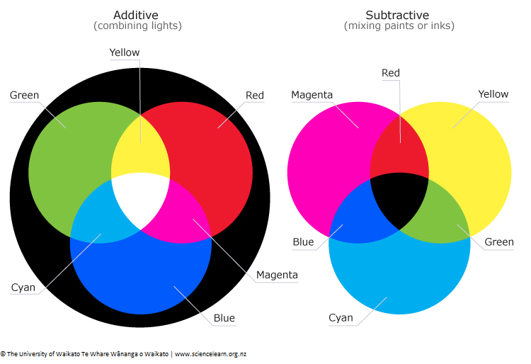
I realised that what I’m actually looking for is the subtractive colours magenta, yellow and cyan. A quick test on Figma showed great results;
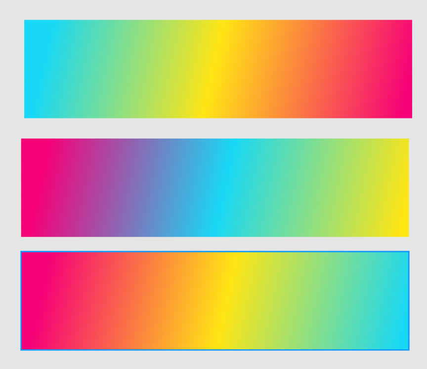
I’m very excited about this finding, and I can’t wait to see the applications of these gradients in other aspects of my branding. And therefore my logo mark colour was decided;

I did do some experimenting with colours to determine my wor mark colour ;
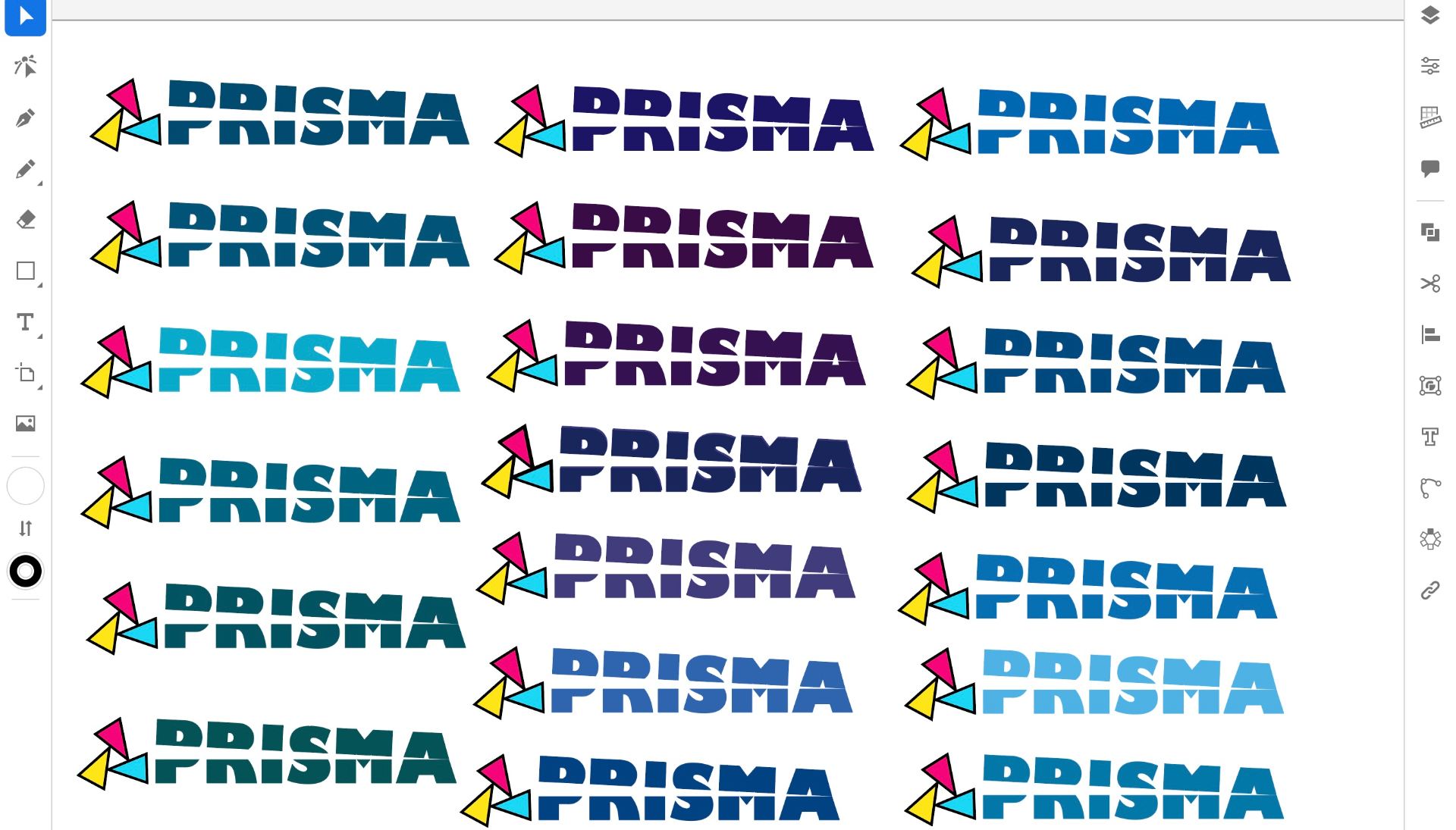
I chose mainly blue for my colour experiments as I learnt in class that blue conveys trustworthiness. With my logo being so colourful and bright, I do want to convey a sense of seriousness and trustworthiness in my branding. I wanted I try to keep the colour as dark as I can to not clash with the logo. I did try green as well, which I liked a lot. when I see green in branding I think of nurturing, caring brands.
In the end, I couldn’t really choose between blue or black. I like the blue because I think it might appeal more to the younger audience and makes the branding a bit more unique. However I also like the black, it makes the logo pop.

