Having done the illustrations and the icons, I can finally put together my user interface in Figma!
I also played around with different typefaces in Illustrator to find good fit for my word marks;
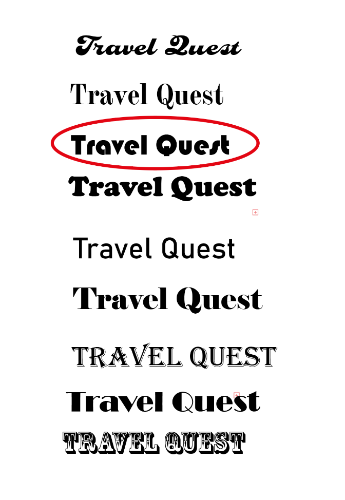
I chose the logo mark circled in red because I like the thick typeface, the added bonus is that it is also playful but modern at the same time. My character logo is already very detailed and eye-catching, I wanted something a bit more structured for my wordmark to contrast.
I also had to decide on a font choice font size for my app. I eventually decided on the font Nunito after reading about it in a Figma blogpost. Nunito would work well for me with its thing stroke, from my illustrations to my icons I have done them in thick lines, I feel like this typeface will give a well-needed contrast to my app ;

As for the sizing of the headlines and body text. I got the proportions off the type scale tool at materialdesign.com;

When I actually used the sizing in my app, I found that I had to twig a few measurements at times to suit my own app better, but as a general guide, the tool was a very helpful way to get started. I also, for the headlines, used the bolder versions of the typeface to help it stand out more since I find the headline was too thin for my liking.
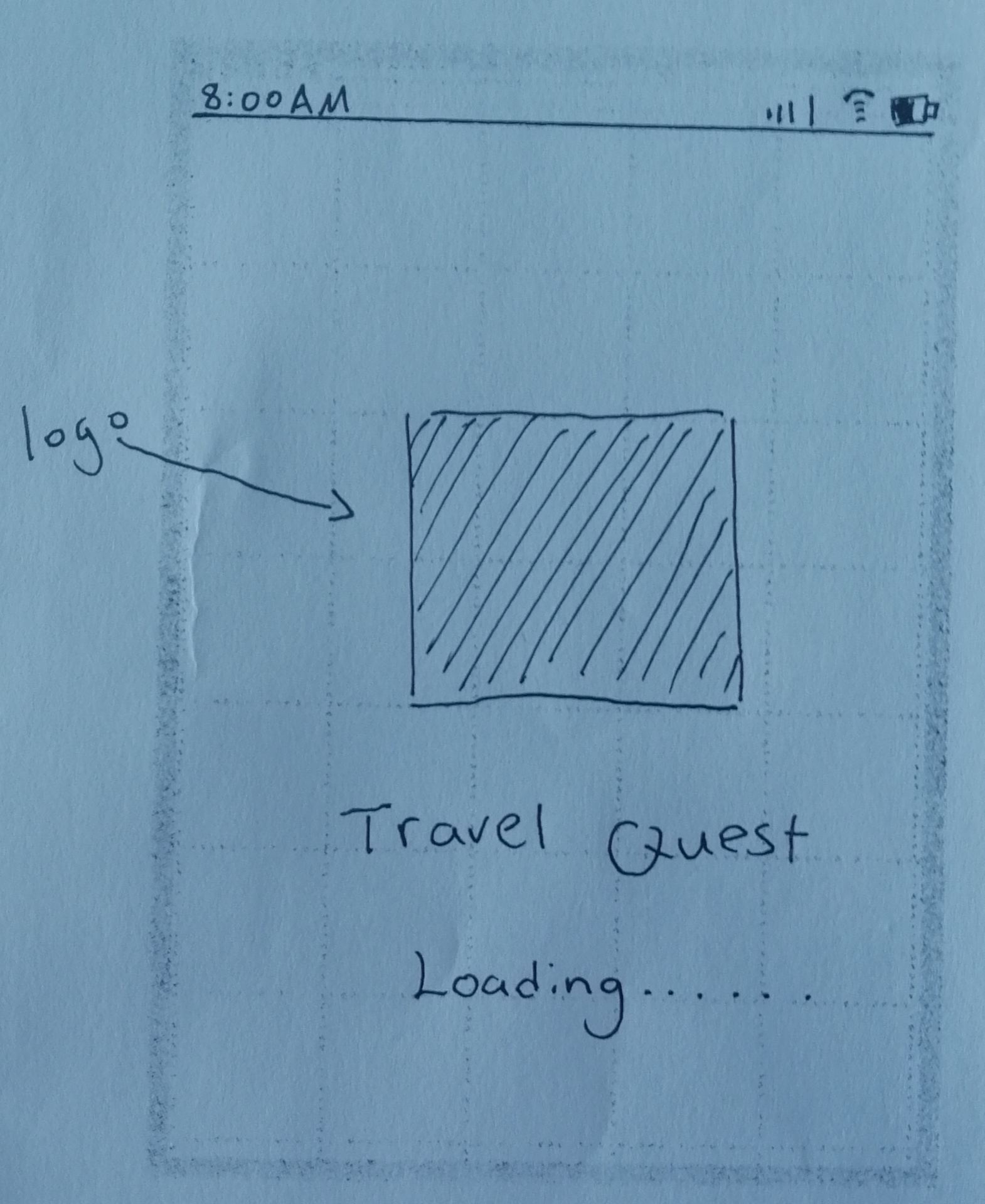
For the rest of the blogs, I’ll be showing you first my original mock design on paper, and then comparing that to the end results.
First, my loading page;

My summary page;

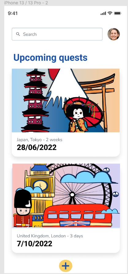
I decided to add in a few more details, such as telling the user the date of the trip, how long each trip is and an added bottom at the bottom of the user would like to add a new quest.
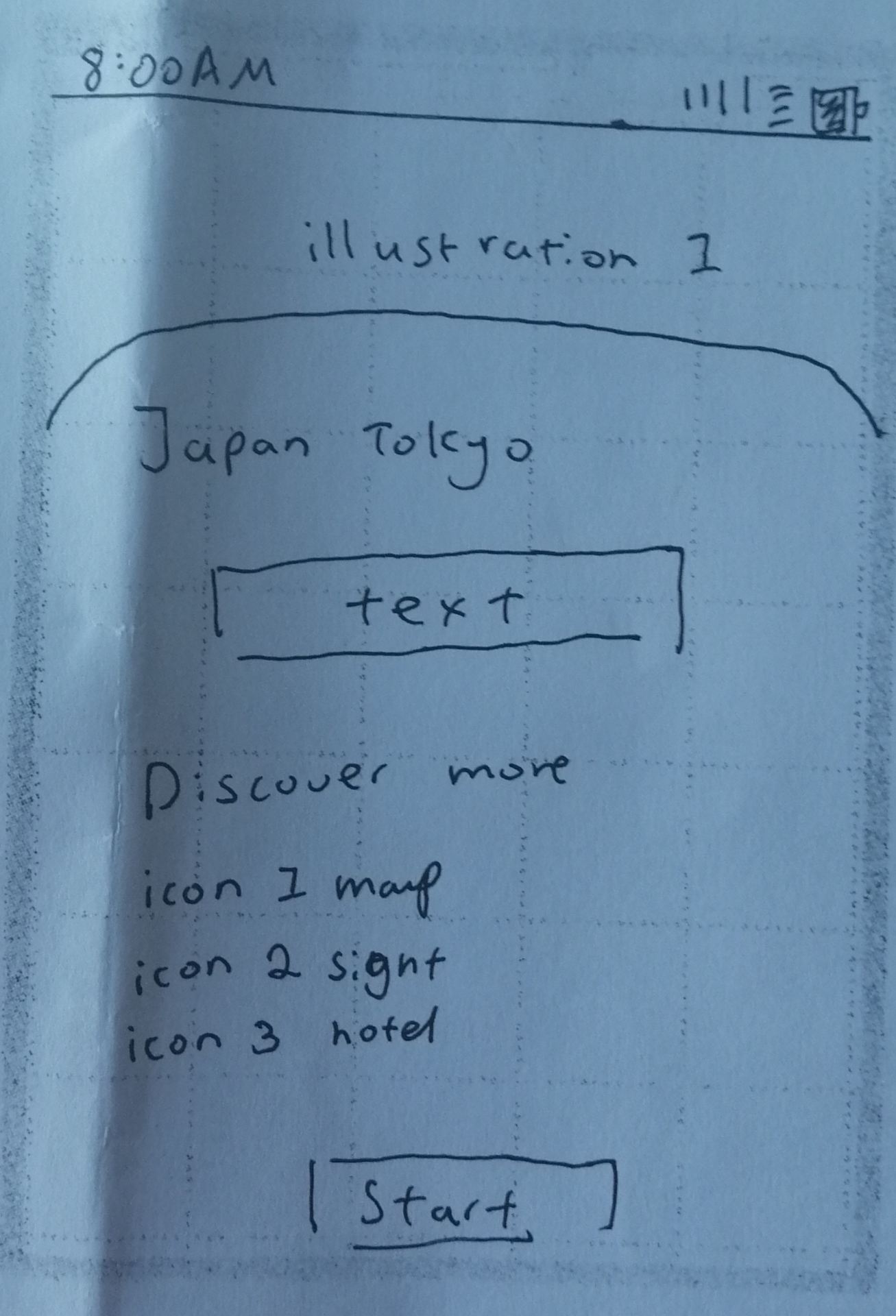
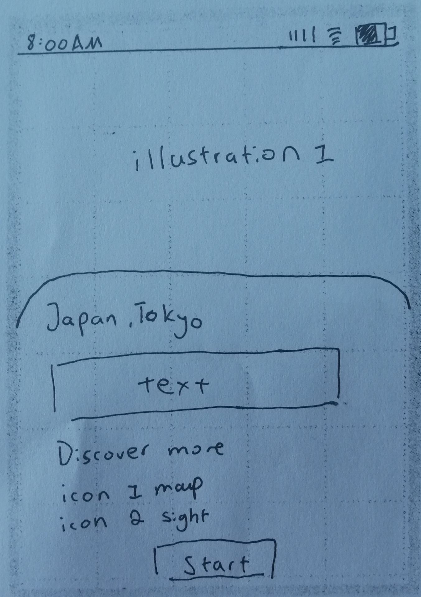
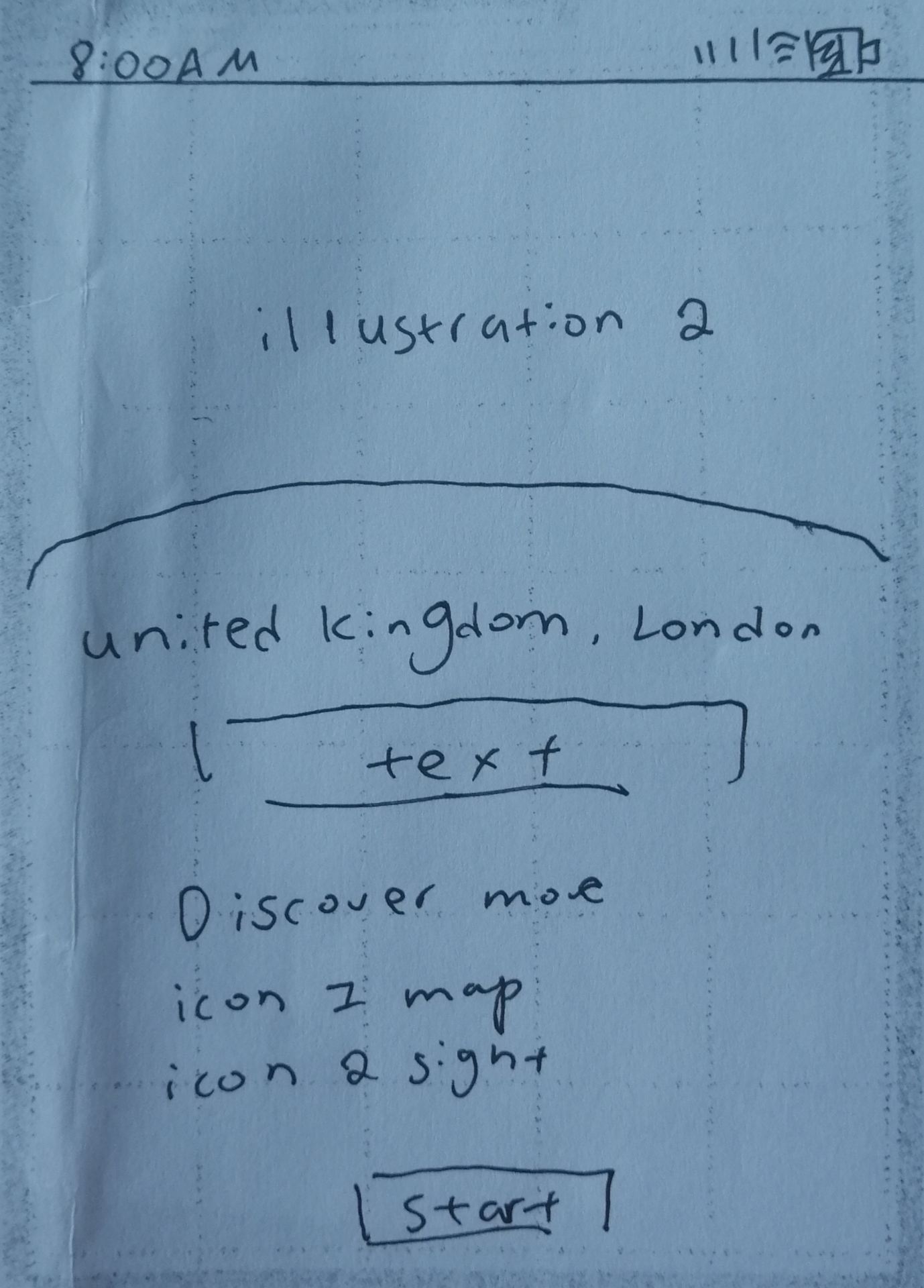
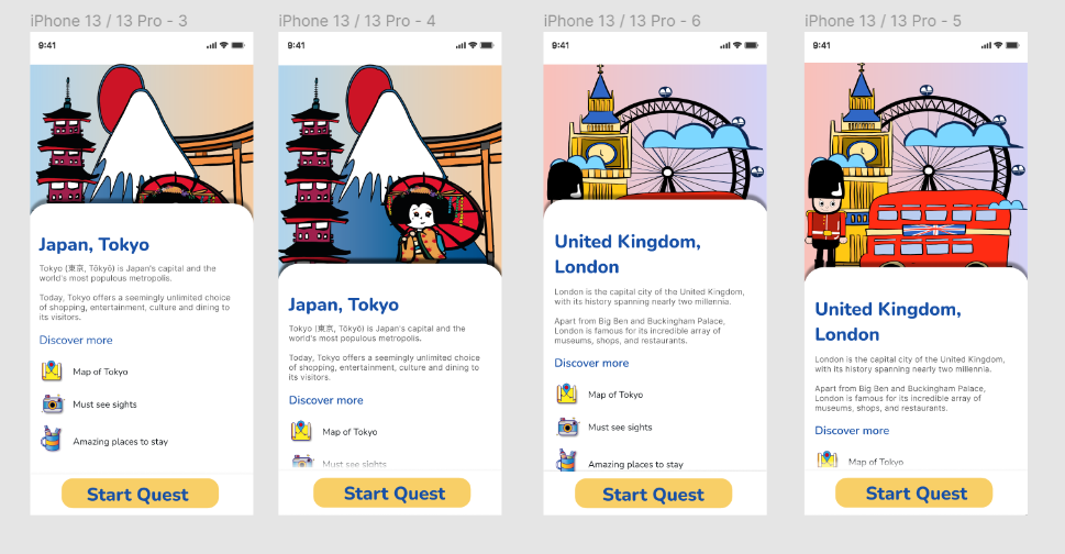
next is the travel information page, just a reminder, I had 4 pages planned. 2 for each destination;

For my quest timeline, it took a few tries to figure out the right structure and colour scheme;
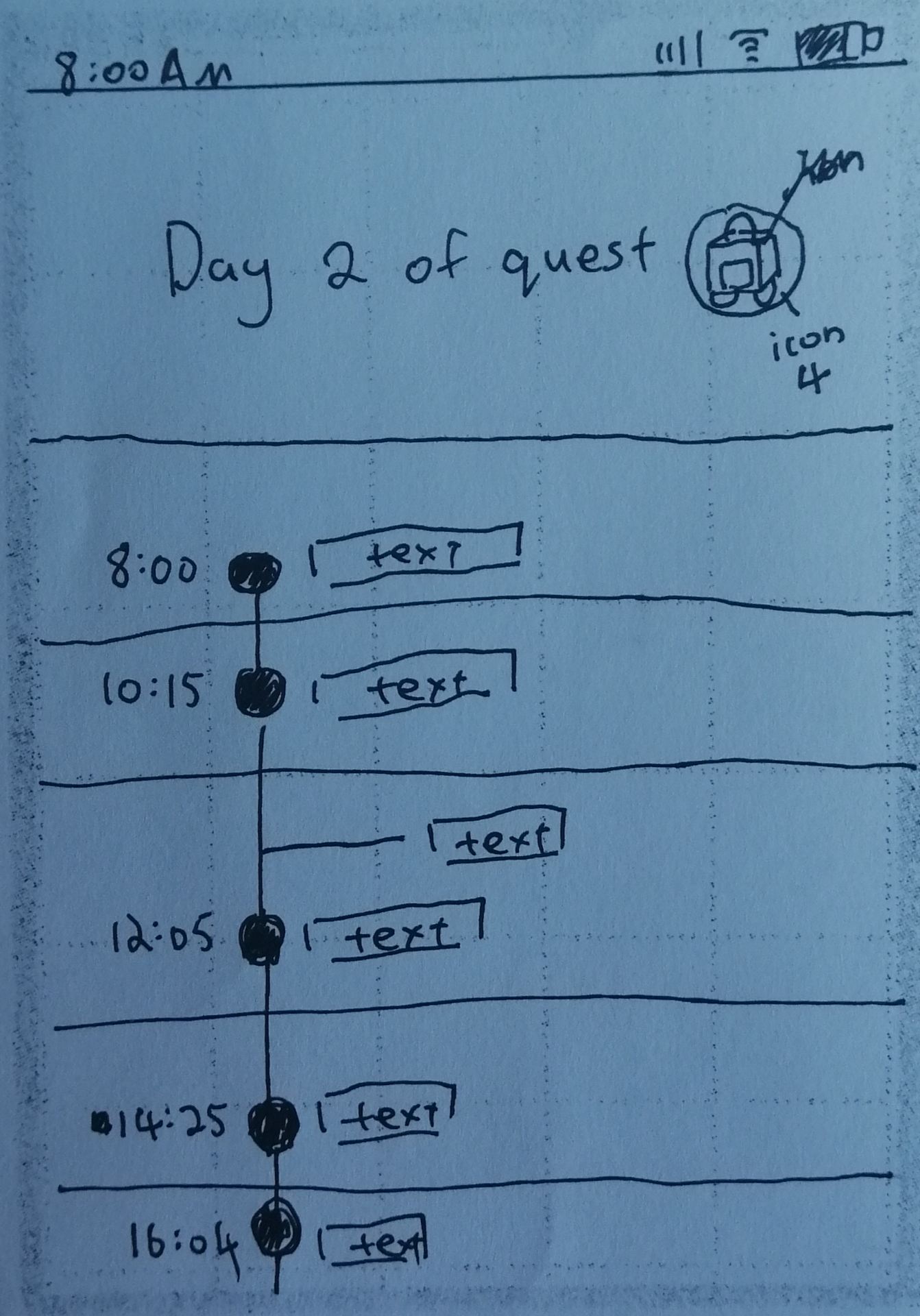

But I finally decide on this design;

I actually found a use for my 6th icon – the compass. I originally only planned for 5 icons, I did the compass as a spare. Now, this icon is used for my direction icon signifying the user whenever they need to go somewhere.
I also swapped the baggage icon from the right to the left to allow me to add the “share” icons and the “add” icons. ( both of these icons were done in Figma with simple shapes)
Now for my rewards page;

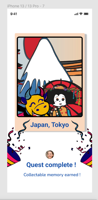
Instead of the original 1 party popper, I changed it to 2 to give it a more uniform look, and also allow the text to centre. I also hid a part of the party pooper illustration to allow more negative space.
Lastly, my interactive map page;


I have added more elements than originally planned onto the map;
- the blue pointer icon = capital city
- orange icon = important big cities within the county
- round white icon with binoculars = recommendations ( there is a recommendation tap at the bottom, for better interactiveness, every month’s recommended places will also have this icon on their location on the map)
- icon with a picture inside ( Dragon and the English guard) = when the user has gained a collectable from travelling to that place, It will show on the map as this icon with a specific illustration according to the location. So the user can see where they have been, they can also click on it to see their polaroid reward page.
I also went back to Adobe Fresco and added an outline and borderlines to the map to make it look more realistic. Without the lines it’s just a yellow block, it’s very hard to tell countries apart, where one began and where one ends.
Below is my finished travel app, I’m very proud of it. It took a long time to come up with an idea, make the mock designs, do the research, make the illustrations/icons and finally putting everything together in Figma. But I think the end product was worth the effort!
