In this blog, I will start looking at the design strategy, specifically designing my wordmark;

First, I need to further my understanding of what a wordmark is. In my research, I was able to look at a few different sources to guide me in my understanding. One of the best sources I found was an online article called the “Wordmark Logo Design: A Beginner’s Guide”
From the article, I learnt that wordmarks are “a type of logo design that includes only the company name — no symbols, mascots, or badges.”
One of the reasons why wordmarks are so important for a brand is that the wordmark will eventually become the visual landmark for the brand. Some examples where the wordmark has become a visual landmark for brands include;

Those famous brands demonstrate to us what it means when wordmarks/typography become and visual landmark. If we did not know the meaning behind the words/did not know the brand themselves, the fonts would just be letters and shapes. However, as we get to know the brand and see it in our everyday lives, as would be the case for famous brands; the style, colour and lettering of these words become specific to objects and organizations.
Another good explanation of this is by Ian Paget, a U.K based graphic designer –
“if I asked anyone to choose an appropriate font for the word ‘Army,’ most of us will picture a heavy stencil typeface, and we would most likely color it in dark green, too.”
Paget also states that before designing a wordmark, it is crucial to understand your target audience. Only through understanding your audience will we be able to ” take advantage of these cultural and visual associations to communicate specific messages through the use of font and color in your logo.”
What Paget said reminded me that as I develop my logo, I must keep in mind my young target audience. So before I resume any future reading into the online article about wordmarks, I need to have a look at what competitors’ wordmarks are. As a young person myself, i decided to look at some online banks/online payment services which appeals to me, such as Monzo and Klarna;


I contrast this against the older “legacy” bank word marks;
This is an older version of the Santander wordmark;
![]()
I also took a photo from my bank card as a real-life comparison, below is the newer version of the wordmark;


Comparing the “newer” banks along with the older banks, I realised that the newer banks have bigger, bolder and more bubbly sans serif/slab/modern fonts. While the older banks have a more “elegant” and “sophisticated” feel to them by having skinner typefaces. While researching, I noticed that most newer bank brands use sans serif/modern/slab fonts in their wordmarks while the older banks seem to be more serif based. Personally, I think the current trend is leaning towards the cleaner sans serif for the younger generation. For example, Santander themselves have rebranded their wordmark to have a cleaner sans serif feel.
Through this research excise, I have also learnt a little bit more about the different types of fronts;

To further my understanding on the application of different typefaces, our teacher gives us time to go out onto the Belfast streets and have a deeper look into different wordmarks of different shops and brands;

So paperchase has a script typeface that makes the logo look like it was handwritten, it makes a lot of sense as paperchase is a stationery company.


I’m also seeing a few serif typefaces. Although more common than the script typeface, these are rarer to find. For L’occitane and Molton Browns, the serif typeface conveys a meaning of class and expansiveness to its audience ( the higher prices reflect that). For Gordon the chemist, it might be a legacy thing like the older banks, conveying class and heritage to its customers. I noticed that they are all in uppercase, perhaps to convey a sense of seriousness to match the more expensive tone, but I also noticed that if it was in lower case the serif typeface is sometimes harder to read.


Now we come to the more visually cleaner sans serif typefaces. Which in its own quiet way also conveys class due to how minimalist they look. Looking at Boss and Calvin Klein for example, the simple typefaces with minimal modification coneys
For the dpd wordmark, they are a delivery company and perhaps they want to convey a message that they will deliver fast and with no hassle, thus a simple typeface matches their no-hassle, responsible message.
After my research, I’m definitely leaning more towards sans serif typefaces for a more modern, cleaner look in order to market to my target audience.
Another important factor in my wordmark is how I can make it more unique. While in class, my teacher’s lecture notes gave me some good inspiration. I especially liked the idea of adding a twist to my wordmark;


My favourites are the “Cut” and “glasses”. The cut wordmark looks as if it has typeface has gone a little glitchy, I like the simple twist that makes the wordmark fun and thus memorable. Since my brand name is related to a prism, I thought maybe having streams of light running into the wordmark could be nice.
To get started on designing my wordmark, I looked up some photos of prisms to generate some ideas. I put together a mood board of the pictures i found on Figma;

I find that having a mood board of pictures really helps. I enjoy looking back and referencing them when I think about my word marks.
The next thing was to get pens on paper and start sketching ;
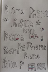
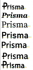
Once my sketching was done and I have generated a few ideas, I went on to a few helpful websites to have a preview of the potential typefaces that I could use.
One very useful site was called wordmark.it, you simply type in the word and it gave you a preview of your wordmark in different font types. Although it doesn’t offer exotic typefaces beyond of what you would get in Abode fonts or google fonts, it is still a good place to start and get a feel of how your wordmark would like in different font styles;


With the help of this website, I was able to place and condense all my favourite typefaces into a file on Illustrator;

I originally didn’t want to include any script typeface, but I included one out of curiosity.
Then I chose some of my favourite fonts and did some experiments with it;


As we can see above, most of my experiments try to incorporate either the shape of a prism ( triangle) or the colour/light aspect of the prism. The straight white line which cuts through the word mark signifies the single white light that shines into a prism and the 3 strips of colour at the end signify the colour that comes out the other side.
I originally chose green, yellow and green as it is the primary colours, but somehow it looks too much like the flag of Ethiopia;

So I decided that it would do no harm to experiment with other colours too;


I can see an idea starting to come together, I like what I have done so far. I’ll need to first show this idea to my teacher for a critique session. I feel like a fresh pair of eyes and a new perspective on my design will really help me as I have been staring at my own design for so long that I have started to feel a tiny numb from it.