Within this blog post I will be making note of the feedback that I receive in this weeks final critique class.
Feedback:
We are at the final push and in our final class for years semester. We got to do our final showing of our prototyped designs and receive our feedback from the class. This feedback class went so well this week and has really gave me the push that I’ve need to know that I am going in the right direction when it comes to my designs and concept ideas for each page. Paul requested for us to have product logo/brand to show, an overview of all screens to date and 5 screens that represent the main focus of your digital product.
I created a short presentation that included all of these elements and posted it on the required miro board for this lecture. I have included my short presentation in the link below:
Week 12 feedback presentation link
Within this presentation then I include my new and improved brand that I have been working on from the last feedback session in week 7. I also including my screen grab and the following screens.
These screen represent the emotion/pain log in screens and the login and sign up screen.

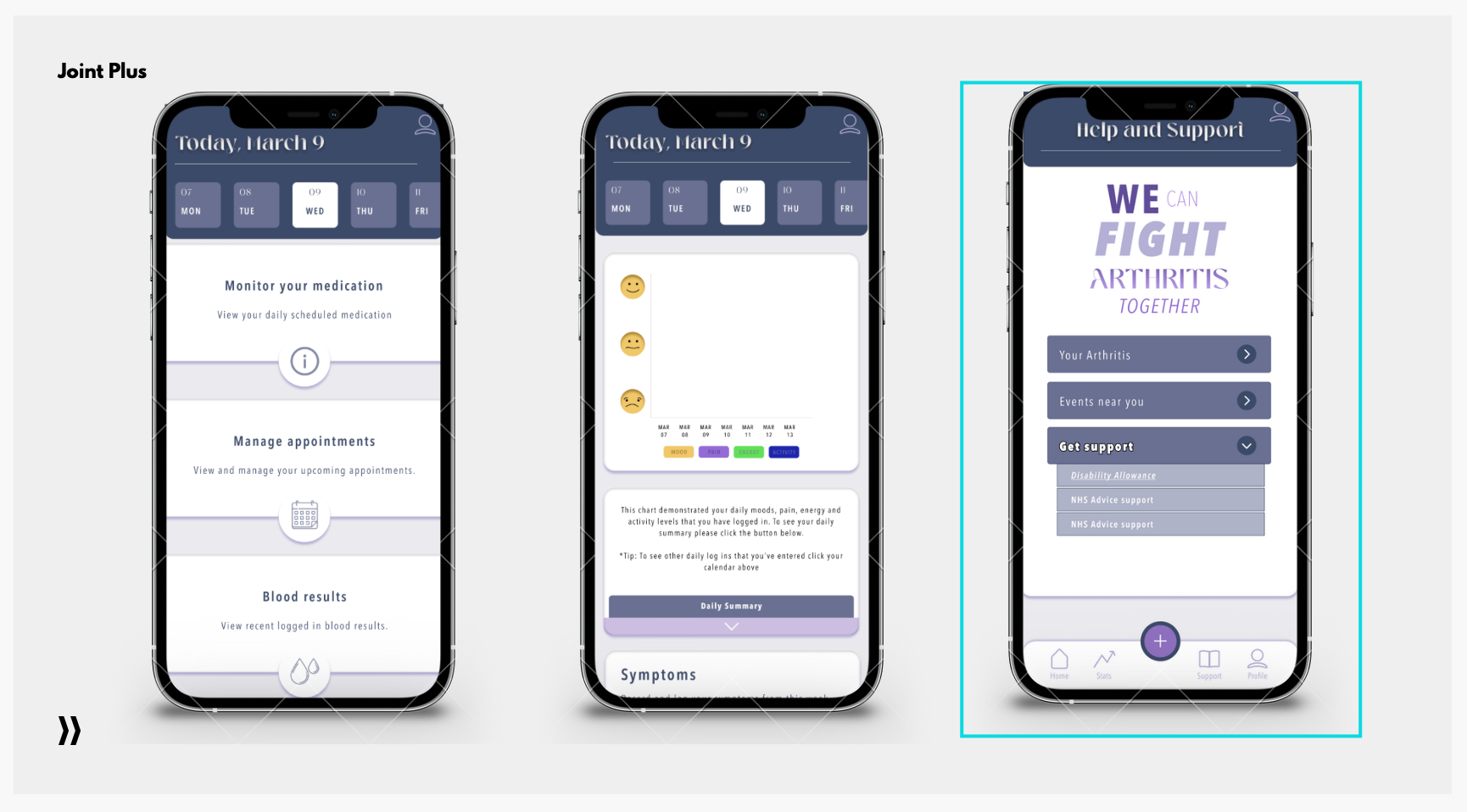
These screens represent how the user will input medication and manage their appointments and blood results received. The middle screen include the stats given from the users logged in pain/emotions from the first screen and will give them options to scroll through and click each day they have inputed the data. The third page then includes a support page the gives the user some options to move forward with their support and guidance.

The feedback that I received by on this weeks final critique was mostly strong and positive. Comments mentioned that they my new brand had a much more appealing feeling towards the app and Paul mentioned that I took the previous feedback on well. The overall screens that I have created also got good strong points made about the layout and functionality being presented well with the concept of design. Some comments mention just to watch my alignment which I will make sure to look out for before my final submission.
Overall I don’t have much feedback to work on from this class other than small things that I missed in structure and layout. I feel confident much more in the direction that I am going in now with the feedback given this week and look forward to continuing to work through my screen and perfecting them as much as I can.
Class feedback on miro board:

To conclude this blog I have focused on the feedback given I week 6 and showcased how I have implemented and taken on the critique that I was given prior. This has proven to work in my favour as I have very little feedback to take into consideration and have came out of this weeks class determined to finish up my designs.
