In this weeks lecture with Paul we covered a class on Sketching Interfaces and the importance of sketching and starting your design process on paper. We included some class tasks this week to allow us to begin understanding the process to take to bring into our Health care project.
What well be covering
- Relearning to draw
- draw toast
- practice practice practice
- PlantCo Team Exercise
-
Sketching Interfaces
Sketching is important in any design process and is apart of any designers job as it allows you to process the best ideas and gives you an idea of how you will reach your final design. Being able to sketch allows your mind to run freely and in a way do it’s own thing whereas when going straight to your designing software easily misses that element of uniqueness. Having a range of sketches allows you to see where you might be going wrong then narrowing down elements of your sketches and working on those more.
When it comes to sketching I enjoy having them to glance back allowing me see what direction I want to go down. The more sketches I drew the better my ideas seemed to get as I was able to take features from one sketch and incorporate them into another.
When you begin the process of sketching this allows you to:
- Iterate ideas quickly without overthinking
- Explore ideas and clear minds
- Create a range of variations
- Have a flexibility with your design concepts
- Brainstorm and plan
- You can take elements from within one sketch and add these another sketch to create a new design
- Sketching will enhance your creativity on a project
- Its easier to get your ideas from head to paper than head to screen as software can restrict what you can produce
- Ideation
*Sketches are not prototypes but can be early stage to get to your prototype*
paper = fast thinking
I’m the type of designers that finds sketching a little hard just with my lack of experience with drawing in general I feel at times my sketches don’t pop off the page like others do. So with sketching I tend to lack a lot of confidence in this area at times and because of this alongside this weeks lecture content with Paul I came home and began watching through some Youtube videos on sketching and the methods I can approach to get the most out of sketching for this project.
I came across a series of videos by Matt Corrall called the first called Sketching Techniques #1. In these videos Matt takes you through some sketching techniques for UX designers with tips and tricks to help give your sketches more of a real life feel.
Some main point that were covered in this video included:
- Equipment you can use – Nothing fancy or experience any paper, pen and pencil does the job
- Construction lines and screens – Light lines that map out the path of what your working with i.e phone, website
- Lines and Circle – Matt demonstrated that your sketches are never to look perfect and his favourite and most accurate method is to work at a fast pace when he’s mapping out his elements
- Cropping Areas – Solid dark lines at the bottom of screens represent the end of the screen designs
- Hatching – This demonstrate dropshadown an areas that you want to come off the page.
Diverging to converge
- low fidelity
- lots of outputa
- pens and paper
then take this digitally
- high fidelity
- fewer outputs
- computer
Practice practice practice
Paul reminded us that confidence is key when it comes to sketches and that even if we aren’t fully there with how we create our sketches that practice will make perfect and that we can only get better over time and over the process of using sketches regularly.
Paul taught us the 5 basic elements of sketching and if we could draw these then we were sorted to draw basically anything to do with sketching. The 5 basic elements included:
- Dot
- Cirlce
- Triangle
- Square
- Line
These 5 basis shapes and elements is what makes us all areas of a sketch and of most sketched images. Paul was to show us that sketches do not have to be a work of art, they should be basic ideas. As long as we understand and can showcase our understanding behind our sketch and ideas then that’s all that matters.
After our lecture on how to draw we had a quick speed drawing exercise with Pauls were we were task to draw a padlock, speech bubble, house, heart, magnifying glass and camera in 20, 10 and 5 seconds. Doing this task would demonstrate to us the detail we are able to put it in the time difference of only a few seconds.
I have included my drawings below:


Paddy Donnell
Eva Lottchen – Instagram
Science
- visual are processed 60,000 x faster than text
- 43% more effective
- 90% more information transmitted
Mapping flows
Alongside sketching we also went through mapping through the flows of a user through our sites and projects. Paul demonstrated to us how ed would map out our flows firstly by paper to quickly iterate our idea of a flow and begin setting how our users would navigate through sections of our project. This is something I will be completing not that I have a strong idea of where I am wanting to go with my health service application.
Mapping flow task:
To help us understand sketching our map flows a little further we were set a task in our groups to develop an app for a “Smart plant pot”. We had full control what would go into the app and free range of how the user would flow through this we would just have to demonstrate this to the class with what the group had agreed on.
Brief: Companion for the smart pot you are required to design an smartphone app which will allow the users to keep track of:
- plan guild idenicication
- plant recommendations
- moisture, lights, natural lights
- Temperature
- Plant location
App should include:
- home screen
- add a plant
- plant care
- check moisture levels

I had a lot of fun getting to work on a task with my class mates as it allowed me to see how differently our minds worked creatively when it comes to sketching and the methods behind what should be included in our overall screens for this exercise.
In my group then we first discussed our target audience for the app my mind mapping some ideas that branched of young 20-30 year olds. The reason we choose this age group was because it is the age ranges that we all fit and could relate to what we would want in an application based around plants.

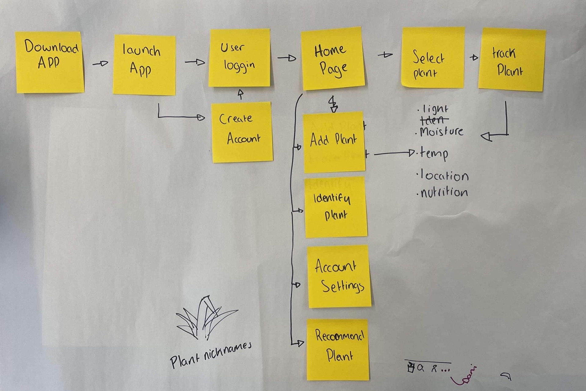
From here then we agreed on the screens we would have throughout the application these are show below alongside our flow through our app. 
Once we had agreed on a flow and our the content of pages/screens we would have we then move forward to sketching out our own ideas which then lead to creating our agreed ideas which are shown below. We took the ideas and design elements from everyone opinions and ideas that we had created separately.

Overall this was a really fun exercise to do with our class as it got us thinking in more a physical way of how to generate ideas and finalise ideas and how to flow through a project all from just sketching through the length of an hours class. This has been my favourite class task that we’ve done so far as I felt I could really get stuck in with my friends and get to see how other designers minds work and sketch through their ideas.
To conclude this class has been one of my favourite with Paul so far just with how physical the class got to be this week have plenty of hand on exercise really help be grasp the importance and methods behind sketching for this project and the project I head into in the future. Im aware my sketching isn’t perfect at the minute but I have made it my goal to continue to sketch through my idea just to help practice my skills further in their area and begin adding in more details and aspects to my sketches to bring them off the page.
For next weeks class I have tasked myself to complete my sketches of my Health App alongside a flow map sketched out of how I want my user to navigate through my application. With this I will begin sketching through brand ideas to begin my idealisation for the brand also. From the completion of my sketches I will move over to Figma to complete some lo-fi mockups. These will be covered further in a blog linked here.

