Designing Infographics
The Rise Of Infographics
At the start of our lecture we went over some of the recommended reading material for this project of our IXD103 – Image & Data Visualisation module to help us understand how information can be displayed in a visual format. Infographic design is something completely new to me and I have never done this before so I want to try and find some resources like these to help me gain a better understanding around this area of design. I have included a list of the recommended reading below as a reference:
- Knowledge is Beautiful by David McCandless
- Information is Beautiful by David McCandless
- The Power of Visual Storytelling Infographics by Josh Ritchie, Ross Crooks, Jason Lankow
Commonly known as Infographics, information design is a form of design in which data, information and/or knowledge is represented in a visual manner with the soul purpose to display data and information in a clear and concise way. People tend to process visual information like images and icons a lot faster than words which makes them perfect for displaying factual information and statistical data as these can become extremely boring. Infographics are a more enjoyable way of displaying information to the viewer and allow the viewer to digest the content and information a lot faster than just plain text.[1] The old saying “a picture can paint a thousand words” is true when it comes to designing infographics and visual representations of data, information designer and graphic designer Edward Tufte said “infographics help fill the gap between words and pictures” which is a good way to sum up what an infographic actually is, they help display information in a way that is graphical and visually appealing to the viewer thus bridging the gap between their differences and using them in parallel with each other as opposed to one or the other.
“Infographics help fill the gap between words and pictures.”
– Edward Tufte
Every good infographic design has a story behind the information and data being displayed, this could either be in the form or a process in which the viewer needs to follow or a set of step-by-step instructions in which the user needs to follow to complete an action, creating a story to your infographic design is crucial as it allows you to dictate what information should be displayed and read by the viewer first, you decided the story behind your infographic. Story telling through infographics has been around for centuries, being seen in elements on history like the Egyptian hieroglyphs and ancient cave paintings where they used to depict stories through visual representations of what happened – some of these markings and drawings still remain today and can be seen in museums around the world. While infographics and information design has come along way since drawing actions and stories on walls with stone the main principle of telling a story still remains to this day.[2]
“ Infographics are generally created for the purpose of telling or explaining a specific story, and will usually be intended for a specific audience, thus infographics are subjective.”
– Jack Hagley
Graphic designer Jack Hagley stated that “infographics are generally created for the purpose of telling or explaining a specific story, and will usually be intended for a specific audience, thus infographics are subjective.”, this was interesting as it made me think… all design is subjective in some form as we all have different styles and tastes that we are more attracted towards but when it comes to infographic design the audience has a huge effect on how the design is perceived as the information is usually confined to a narrow audience.
“Data visualisations should be objective and the entire data set may very well be presented without editing.”
– Jack Hagley
Different Styles Of Infographic Design
During our lecture we went over some different styles of infographic design and some of the components that go into displaying information is a visual way, we also took a look at some of the work done by previous students to see how they created their infographic designs to fit with the same design brief. One of the most commons ways of displaying information in a visual way is through diagrams and charts as these are easily represented by numerical values to portray the data in a visual format, these can either be in the form of a pie chart, bar chart or line graph. A good example of information design being used is when I log in to my Coinbase account to check how my investments are doing my portfolio value is displayed as a line graph and can be displayed in a number of different time periods ranging from 1 hour to 1 year.

While this is the most common way data is represented in a visual way it is not always the case for some designs, other designs may choose to represent their data and information in a more creative way. Iconography is commonly used throughout infographic and information design as it allows the designer to place a piece of text alongside a visual representation of what it is about to give the viewer and insight into what that piece of content is about, for example having an award icon in conjunction with a piece of data stating how many awards a designer has received for their work throughout their career.
I have included an example of an infographic design below to demonstrate some different styles in which information and data can be displayed in a visual manner.

Creating An Infographic
We went through some basic steps when it comes to creating an infographic design, since an infographic design is based around information, data and statistics it is extremely important to conduct thorough research to ensure the information you have is both trustworthy and factual. With the internet being so easily accessible these days it is common for false information to be made public especially with this rise of social media platforms like Instagram, Facebook and TikTok where false information can go viral extremely fast. Triple checking your data and sources is crucial for creating a good infographic design as this is the soul purpose of the design in the first place. Once the design is complete it is important to proof read the content to ensure it displays the research and information that should be displayed, it would be a good idea to get a couple of other people to proof read the design to ensure nothing slips through the cracks – I have a couple of friends who are hawks when it comes to spelling mistakes and grammatical errors!
I have included the step by step process we covered in our lecture below as a quick reference guide:
- Process The Data
- Check Your Sources
- Create A Wireframe
- Tell A Story
- Set The Tone
- Consider Your Type
- Control Colour
- Utilise White Space
- Take A Break
- Proof Read, Proof Read and Proof Read Again!
- Test Along The Way
- Revisions & Refinements
Master Apprentice Task
After our lecture we were asked to work on a Master Apprentice task in order to improve our infographic design skills and see how certain visual elements of information design are created. For this task we were asked to recreate 2 of the bar charts, line graphics and pie charts that were chosen by our lecturer Paul, I found these infographic elements extremely interesting as the majority of them were quite simple and almost had an iconic feel to them which shares some similarities with icon design. The designs chosen are also very similar to what I would have went for if we were asked to choose our own images to recreate for this task, I love the simplistic style with block colour and the use of shades and tones to create difference between each element in addition to the interface style infographic and dashboards.
I have included the images of the two designs I wanted to try and recreate for this task below.
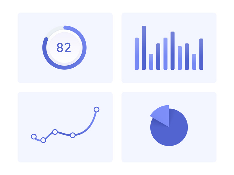

Overall I really enjoyed this task and found that it gave me a lot of insight into how different types of charts and graphs can be made to represent data, for this task I used Figma and I found the arc feature on the Circle tool was extremely useful when it came to designing pie charts as it allowed me to enter specific percentage values. While I was recreating these designs I noticed that they were really simplistic in the way they were put together, a lot of the design was made up of basic shapes, either squares or circles, along with some typography that represents numerical values as a guide for the visual data, this is something I want to consider when it comes to creating my own infographic as simplicity will allow the viewer to read the design easier and more efficiently.


References & Sources
- Wikipedia. 2022. Infographic – Wikipedia. [ONLINE] Available at: https://en.wikipedia.org/wiki/Infographic. [Accessed 23 March 2022].
- Infogram. 2022. What is an Infographic?. [ONLINE] Available at: https://infogram.com/page/infographic. [Accessed 23 March 2022].