
Introduction:
Last year, we were given a similar assignment that focused on curating and developing our personal brand. At the time, I approached it with interest, but I knew there was room for growth. This year, I was determined to push myself further and really start shaping a clear identity within the animation industry. To do that, I made it a personal goal to be more proactive in engaging with the broader animation community. I joined several animation-focused Discord servers such as Feed Me the Light, Rookies, and the Sketchfab community. These platforms have not only helped me connect with other artists but also given me insight into industry trends and feedback on my work. Throughout the year, I discovered that my strongest and most compelling work has been in 3D modelling. It’s the area where I’ve seen the most growth and where I feel my passion and skill truly align. Because of this, I’ve decided to shift my focus toward updating and refining my portfolio to better highlight my 3D modelling work and present myself more effectively to potential collaborators and employers.
Poster
To help streamline our creative process, I created a Miro board for our group to collect ideas and visual inspirations for the Creative Futures poster. This collaborative space allowed us to share references and brainstorm together. We began by gathering imagery from movies that we felt shared a similar tone and genre to our short film. These references helped guide our choices in terms of composition, colour schemes, and overall mood. After reviewing all of our ideas, we ultimately decided to move forward with Nicolle’s concept for the final poster, and she took the lead in producing it.


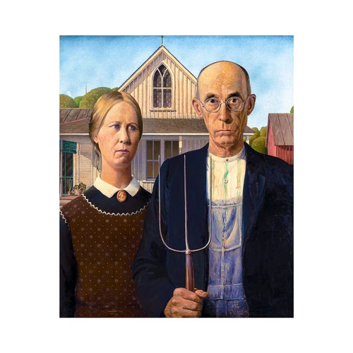
As part of my own development process, I explored an alternative poster concept inspired by the iconic painting American Gothic by Grant Wood. I felt that the relationship between the two central characters in our film closely mirrored the dynamic portrayed in that painting—stoic, quietly tense, and deeply rooted in shared history. Using this as a reference, I aimed to visually reflect those emotional undertones in my design.


In developing my own concept for the Short film poster, I also drew inspiration from the promotional artwork for Wallace & Gromit: The Curse of the Were-Rabbit. I was particularly intrigued by how they used shadow and lighting to suggest a foreboding presence—something unseen but strongly felt. I thought this technique would be a fun and fitting twist for my own film, allowing me to hint at underlying tension or mystery in a subtle, stylized way. This approach led me to move away from referencing the American Gothic painting and instead explore more playful and cinematic visual storytelling. As I developed several poster designs based on these inspirations, I received encouraging feedback from my group. Henry mentioned that two of my designs would actually work well as front and back covers for the group’s artbook, which was a great confidence boost and a sign that my ideas were resonating visually.


This is Nicolle’s poster and our groups final poster.

Artbook
Since the visual design of the project incorporated my illustrations and artwork, I felt it made sense to take on the responsibility of creating the artbook itself. I began by planning the overall structure—estimating the number of pages we would need and outlining the potential chapters that would best showcase our creative process. This included sections for concept art, character design, 3D modeling, environment development, and promotional materials like the poster. My goal was to create a clear and engaging flow that not only documented our progress but also presented our work in a cohesive, professional format. By organizing the content early on, I helped ensure that the artbook would feel polished and complete, serving as a strong visual companion to our final film. Artbook.pdf


Logo and Showreel
Logo Development for Showreel
For my showreel branding, I wanted to create a personal logo—something playful and instantly recognizable that felt like a “mini icon” version of myself. This logo would act as a signature or visual tag across my work, helping to build a consistent personal brand. I began by sketching out a series of drafts that explored different stylizations and visual metaphors.
Each draft experiments with how to capture my likeness through simplified shapes, emphasizing features like glasses, bangs, and a signature hair accessory:
-
Top left: This version frames the character inside what resembles a computer window or interface, hinting at the digital nature of my work. The character wears sharp, stylized glasses, suggesting a fun and tech-savvy persona.
-
Top right: A clean, symmetrical design with oversized glasses and the name “Andrea” written across them. This one plays with bold shapes and graphic impact, putting identity front and center.
-
Bottom left: A circular badge-style icon that feels like a complete emblem. It includes a cute profile view with large glasses and a small hair accessory—perfect for use as a profile picture or app-style logo.
-
Bottom middle and right: These versions simplify the form further while keeping expressive elements like the oversized glasses, hair shape, and signature hair pin. The one on the bottom right begins to lean more toward a final design, with a balance between character and logo clarity.
Through this process, I explored how to distill personality into minimalist design while maintaining recognizability and charm. These early drafts helped me understand which features were most important to include and how I might apply the logo consistently across platforms like my website, portfolio, and showreel.


CV and Business cards:


above are my previous drafts of my CV. After getting feedback from Henry about composition and colour I landed on this one.


EOYS Display
On Thursday afternoon, my group came together to begin assembling our display for the End of Year Show. We wanted to reflect the cozy, vintage atmosphere featured in our short film, particularly drawing inspiration from the “granny aesthetic” of the living room couch that plays a central role in the story.
To help bring that look to life, I contributed several decorative items including a lace table doily, a small toy lamp, stickers, and other charming accessories that echoed the nostalgic tone of the film. These touches helped to create a warm and inviting visual narrative that ties directly into the world we built on screen. I also printed and brought in a copy of our artbook so visitors could flip through our development work in person.
Looking ahead to Friday, we’re planning to enhance the setup further by adding more props like teapots, soft pillows, and lace trim for the computers. These additions will continue to build on the “granny aesthetic” theme and create an immersive, homely space that draws people into the heart of our project’s story world.


Promoting / Advertising
To create a professional online presence, I began building a personal website to serve as my portfolio, showcasing both this year’s work and selected pieces from previous years that I’m especially proud of. The site is designed to be a central hub where I can present my animation, 3D modeling, and concept art in a clean, accessible format. While the website is still a work in progress, I’ve been using my ArtStation profile in the meantime to share my work more publicly.
In addition to building my online presence, I’ve also started actively promoting my projects on social media and preparing for this year’s End of Year Show. These platforms and events provide valuable opportunities to gain exposure, connect with industry professionals, and share my creative journey with a wider audience. Through these efforts, I’m working toward establishing myself more confidently within the animation and digital art community.


