
Industry research of a CV
What is a “CV”
A curriculum vitae know as a “CV” is a important piece of paper that states a person skills, experience, education and short sample of his history. It’s used for companies who are looking to hire a skilled person. It gives employers the ability to have an insight of who they are employing and is the first thing they look to see if they fit the job role. This why it is very important to have a good CV because it is the first step in being considered to be accepted and a way to give a very good first impression.
What makes a good animator CV ?
A good CV always have a
- Clear and neat Layout
- State clearly important information
- Stating quantifying skill that are required in the job descriptions
- Clearly state further contacts option
- Showing a range of Software’s I use.
- State my experience in working.
I planned to make my CV paper tailored to the job as a 3D Generalist because I planned to apply to 3D studios such as Billy goat and Humain studio. The problem was that the two studios had very two strong different style. Billy Goat appeared to be a fun, creative active 3D studio and Humain had a very professional style, hard working in high detail models and projects. I want to go to Humain to better expanded my skill in rigging because its well know for their great works of rigging. I also really liked Billy Goat but I needed to have a professional looking CV to be even considered for Humain I decided to make that one first. I Also thought that maybe Billy goat would be okay in accepting a professional compared to Humain picking a less professional looking CV.
First CV inspiration refence


I was thinking my CV should be seen as very professional looking so I looked at a list of professional CV mostly Directors and manager CV’s in the animation industry. These were the two I ended up really liking. I tried basing mine similar to this layout and text.
First draft of CV
When making my CV I didn’t like the look of the CV format. It was too square and happen to have too much writing. I wasn’t getting the professional look that I desired and was struggling to layout my CV in a neat and nice working flowing layout. I got to this point of the the CV and decided to go back and researched other CV options.
NI Screens placement roles opened
NI screens placement roles just opened when making theses CV. I knew that Humain and Billy Goat was taking part in the placement scheme and was the best way to apply to them. I found that I was not highly suited to the job role Humain was offering this year. I did look at Billy goat and was happy to see I was better suited to the job offering. I was also was not liking the Professional look of a CV and was not really suited to me and I was not great at making it. So I decided to shift my CV to fit Billy Goat and researched again a new CV
Billy goats Job description requirement

I got the file of the job desperation for this year. I look at the criteria of what they looking for in a person and was need to be suitable to this role as a 3D generalist in their company.
2nd CV researched draft

After looking at the CV examples paper to gain new ideas of how my CV should look like. I seen the two CV examples on the example paper and I actually like the softer tone of a professionally looking CV. I knew that these CV would be more Appling to the Studio of Billy Goat. I also thought that the CV in blue had done a very nice layout of their CV and I like the text layout set up in the red CV. I thought to try combine the two CV into one.
My Photo sketched idea.

This was my photo editing of the two CV mixed into one. I did this first to visual see how the CV would look like before starting because the first CV I really struggled in the vision of the CV and moving boxes and text in word document messed up everything when you move or edit a paper layout. I learnt my mistake on the first one and made this.
My 2nd CV

This photo was what the final look of what I had made, I didn’t managed to save picture of each time i changed the layout of the CV. I only ended up taking this picture. I did originally have it perfectly the same layout design to my photo refence. However, I realised that the contacts layout in the red CV was better than the Blue CV and I didn’t have a nice spot on the front page to put it anywhere. I eventually Mixed and moved things around and none of it felt right. I eventually put it at the bottom. This wasn’t the greatness spot to put the contacts, ideally CV contacts are often put at the top to make it clear. I worked alot on this CV but still didn’t like the final outcome of the paper. I felt that I still made the same mistakes from the first draft of having way too much text and was not standing out as much.
3rd CV Refence

This time I went out to look at a colourful CV. I Found this lovely neat, vibrant and arty CV by Lorna on the website “Canva”. I liked this CV because it stood out and was stating that this person is creative and might have an playful personality. It had idea elements already similar to my past refence CV ideas that I had in the second draft paper. However, this one was more of a blocky layout. I went and tried it out to see how it would look like.
My Third CV draft.

I really liked this CV ending, I felt that I captured the look of the refence CV this time and I worked on my past CV problems of too much text and cut it down by half. I thought about the colour background of this CV and picked the colour of blue. I did this because I like how the boxes where standing out and popping of the background. The colour yellow is a contrasts colour to the colour blue so it was sticking out strongly in the CV and was used to highlight the headline text well.
CV Eye Line


I think that my work follow of the CV templet works really well for what I was looking for. I think the yellow highlighted boxes grabs the employers eyes and hopefully guide the viewer around the CV. I drew out a red line on the guided path the viewer might see first. I feel like the “experience” box will be the first thing the employee will want to look at on my CV.
Testing

I later on experimented on placing the contacts at the top of the CV because most CV ideally put it at the top. I was really pulled on which one to finally pick now as my final CV. I went back and forth on which one I liked but finally found that it would break the established CV flowing layout that i made and it added to much of a blocky look to the my final CV format. So I kept the original placement of the contacts box at the bottom.
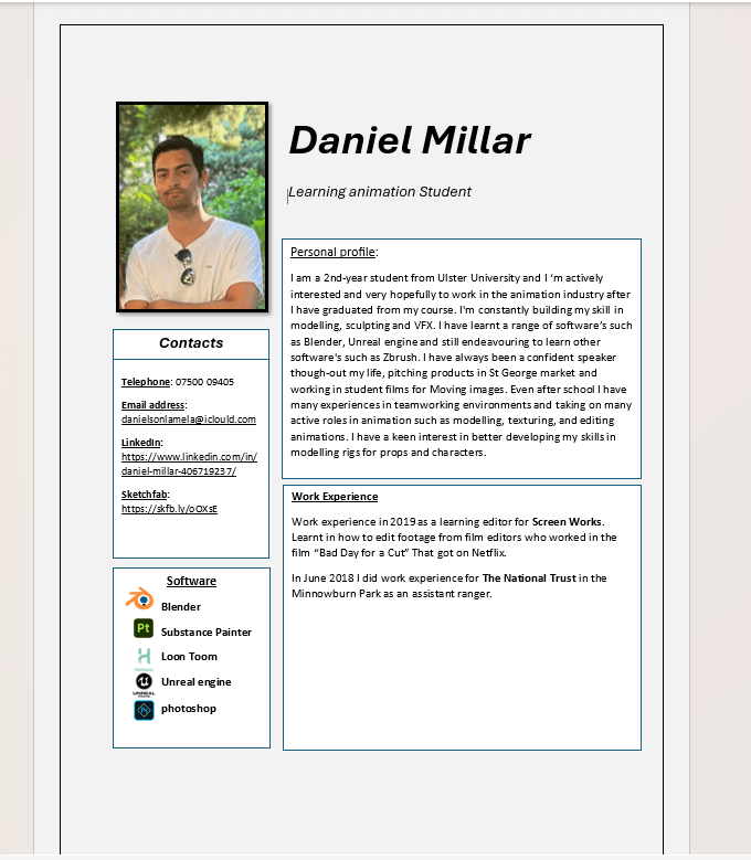
Final Rendered CV


I went and added on the second page my grades and a bit of further details about me at the back that i thought was not really important to put in the front page but was a nice extra bit to show more insight of me and my experience.
I think that my CV had hit all its goals of having a clear and neat layout that stand out and clearly showing important information to the employee. It shows my range of experience and a list of important software’s skill that they are looking for. I also have a section box at the bottom to give them a rang of ways to get in contact with me or to further see some of my other work.