3D Environment – Reflection [200 words]
I was pretty excited to start this assignment, as I enjoyed 3D modelling and wanted to practice and improve my modelling and texturing skills. I really liked the tavern wedding theme idea and so I moved to that group from the group I’d initially begun with. Learning Unreal Engine and how everything works inside its engine was intimidating initially, but I enjoyed learning how to use it. I’ve learnt a lot about the pipeline incorporating Unreal Engine and environment building and I know I’d be able to do it more efficiently next time.
Creating the cinematic was very daunting to me as I’ve never done anything like it, and have no experience with cameras or cinematic theory. In the future, I’d like to be able to test out more features with the camera in Unreal as I didn’t have a lot of time to play with post-process effects due to being behind on work.
Overall I enjoyed working with my group, as they were all communicative and active online, so it was easy to reach out to talk about concepts, art styles, and get advice or help if you were stuck on something.
3D Environment – Rendering and Cinematic creation
My laptop couldn’t handle lighting the scene, and the PC in my house couldn’t handle rendering so I went to Uni to use the computers there to render it after getting an extension.
I had some issues with the rendering, as it broke at one point and kept rendering the same scene over and over no matter what I changed so I restarted the computer and it seemed to fix it, though I’m still not sure what was going on there. I also failed to realise I had to increase the size of the camera cuts section as well as the length, or it would only render the parts in the camera cuts. So I had to do some last-minute panic rendering as I went to make my cinematic and realised only half the shot had been rendered for 3 shots.
I followed the instructions in this video to try and make sure my renders looked as good as I could get them to.
3D Environment – Building the Scene
The basic layout
Ellie and Manny worked on the basic layout of the walls, floor and stairs while everyone else finished up models and texturing. As a group, we had agreed that we would use the same base and fill out the insides differently with our own visions of the tavern.
Adding my models
Transferring all of my models into the Unreal file for people to use proved to be pretty easy, although I had a few problems with some of the FBX files due to forgetting to turn smoothing groups on and my less than impressive storage file of FBX files. I did clean up my files to make sure I’d not get so confused in the future, especially if a group member asked me for something, I didn’t want to send them the wrong file or something.
I originally had exported all of my textures from substance painter in the default settings, before Ellie informed me that there was an Unreal package version, which I had seen previously but forgot to look into. I re-exported them as the correct files and brought them into my scene, although I think by that time my group members had just used the original ones.
My laptop and the PC in my house were struggling a lot so I looked up ways to try and fix or optimise the scene, as the main error was ‘out of memory’. I think doing this helped, as I was then able to run it on the Pc.
Window Credit
We used a model in our scene that wasn’t made by any of us for the smaller tavern windows. The Tavern – Wall Window was made by François Espagnet, and is licensed under the Creative Commons Attribution.
Laying out the scene and Lighting it
I had some issues understanding the blueprints and references, etc at the beginning but eventually, I sort of got the hang of it. Though blueprints still mildly confuse me. I’m quite proud of my layout for the scene, and I like the colours I chose to use from the different variations, as I was trying to stick to a colour scheme; especially with the lighting.
I watched some videos on lighting for the sort of vibe I was trying to achieve in my scene.
Manny Provided this stylised lighting tutorial;
Professional Practice – CV and Research
CV Research
I had a look at some existing CVs being used by artists or similar jobs. I found these through LinkedIn, Artstation and Pinterest.
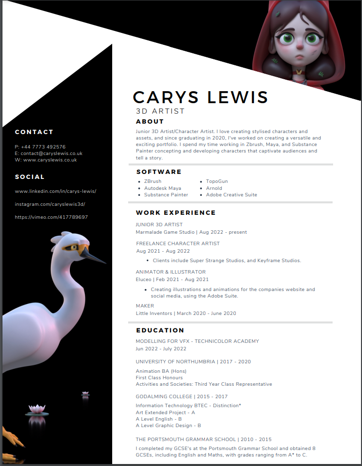
I also had a look at the CV of the 3D artist I had looked at for some of the other tasks, Carys Lewis. I think Carys’ CV is a good example for making a CV as it is clean and you can find all oft the information easily due to the good font and bold section titles. The colours on the actual CV are limited, which is something I liked less about it than other ones I looked at, but I think it’s a good design choice due to the coloured models and the geometric design. I think it was incredibly useful to look at her CV as well, because she works in the career area I’m interested in and she is only a junior 3D artist so her experience, while much more than mine, isn’t relied upon too heavily.
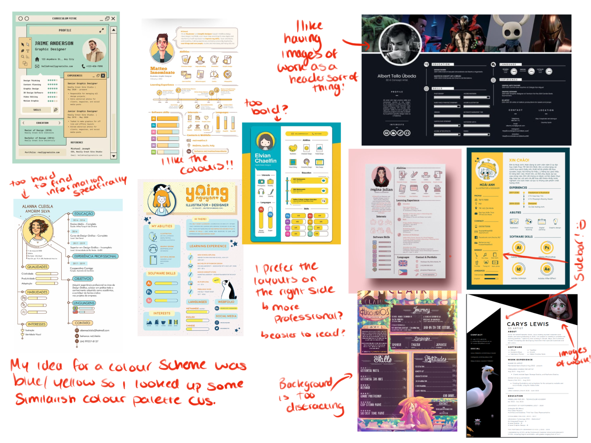
I had originally came into the Cv making process with the intention to make my CV with a blue and yellow colour scheme, as it’s a combination I’m fond of, as well as orange and blue. So there is a lot of CV examples there with that colour scheme. I think some of the layouts were too visually reliant for me, with all of the fun symbols and bars, which look really good, but I don’t think it’s as professional. The one based off of a coffee shop menu is too hard to read and find specific information from, as cool as the original concept is.
Layout Sketches
I decided to try laying out my CV roughly and abstractly through sketches, just to get a feel for some of the different designs I was thinking of. This helped me visualise it better and understand what I liked in theory and what actually looked good.
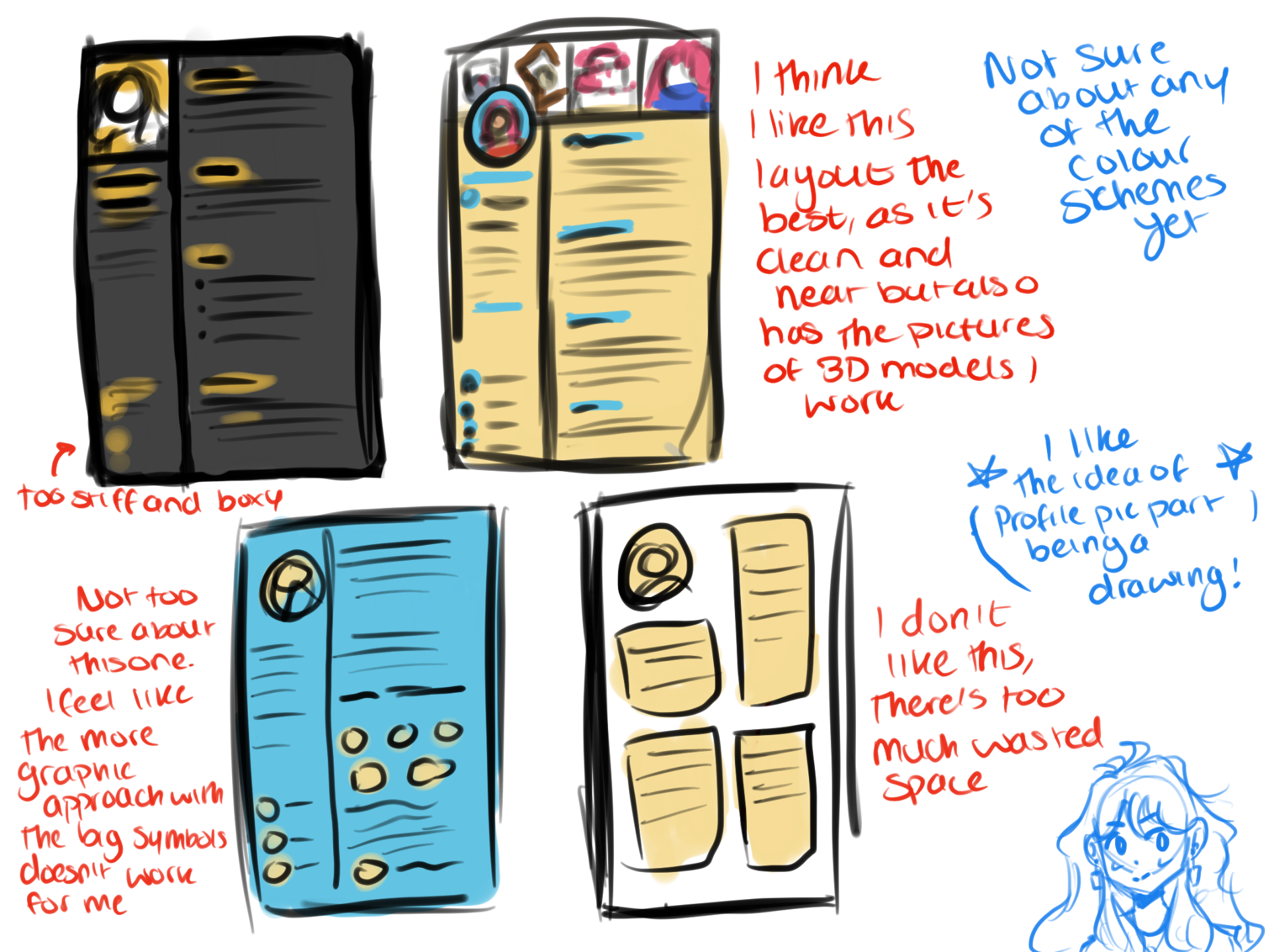
I decided to make a clearer one out of my favorite layout, so that I could get a better idea of where to put the different sections of my CV. I think I like the layout of it, but if it doesn’t look as good when I actually make it, I will change it.
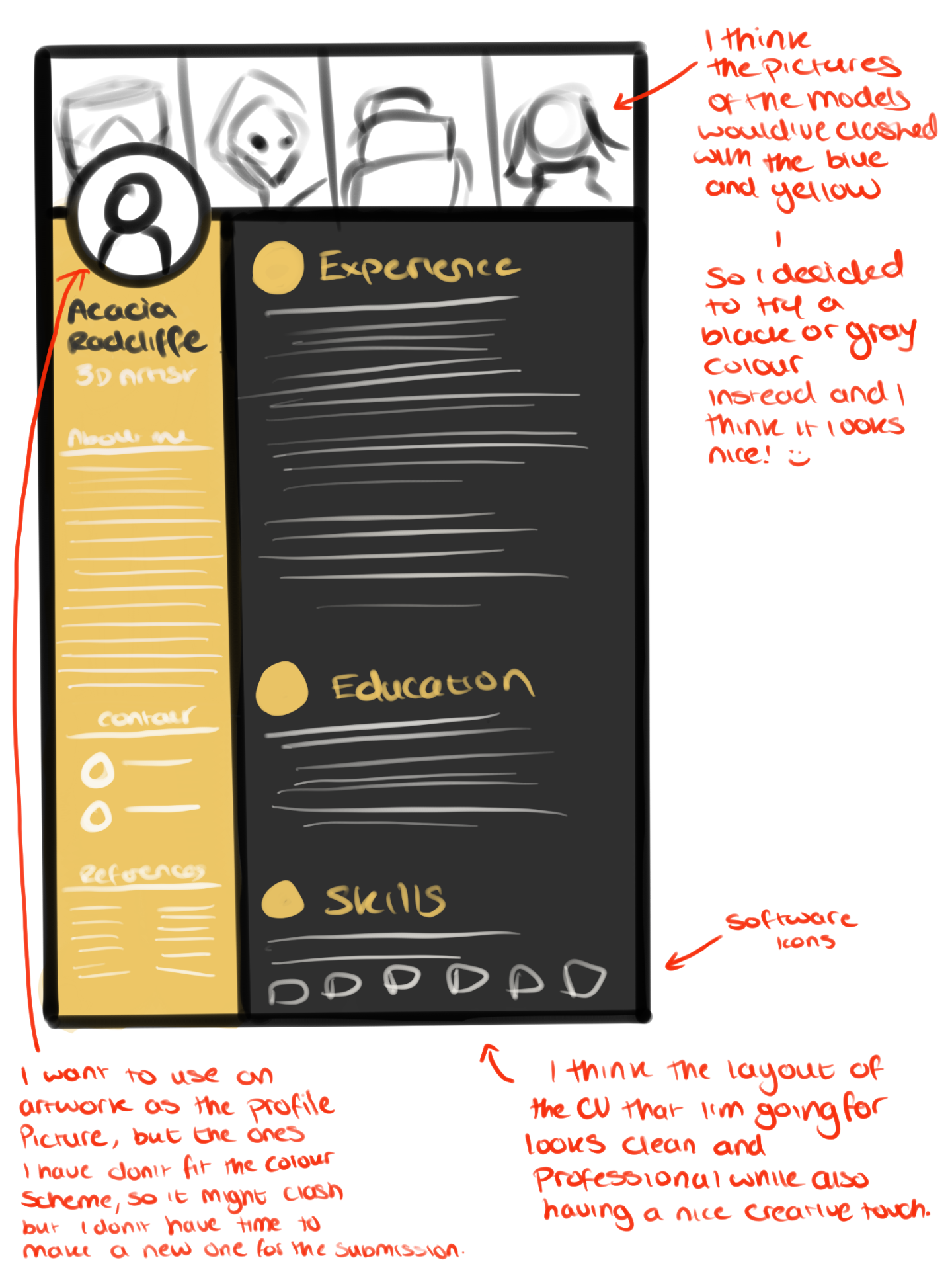
The CV
I am pretty pleased with the final CV, as I think it looks quite neat and I like the colours. The profile picture will be replaced when I get time to make another one, as I feel like having a drawing of someone looking sort of angry isn’t ideal for a CV – but it was the only artwork I had that I felt looked alright on the CV. Maybe I should’ve changed the colour from yellow, to pink as there’s a lot of pink from the models and the profile picture, but I was really intent on having yellow.
I probably should’ve included a soft skills section as I don’t have much experience, and the about me could’ve included more buzzwords from the gaming industry and modelling jobs.
Professional Practice – Cover Letter and Research
Research into Goldfire studios and job listing
I chose to base my cover letter off of a job listing up at the current time, as I was really struggling with not knowing what to write when the situation was hypothetical. So I found a studio with a job listing in a similar-ish area that I’m thinking I might want to look at working in?
After some research into various open job listing at the minute, I have chosen to base my cover letter off of a 3D artist job at Goldfire Studios. This is a small indie studio who are currently in the process of developing a narrative adventure game called ‘Arctic Awakening’, which is the game the job opening is for. I watched the trailers for the game and read through the information available on their website.
I had a look at the job listing and the requirements listed in it, as it’s important to know these so you can add keywords or buzzwords to your Cv and cover letter.
Requirements
- All experience levels are welcome, but a strong portfolio of 3D art and design is required (particularly in the context of game development).
- Ability to model and texture within a stylized approach to fit the current project (see current screenshots and select style influences).
- Strong understanding of tools/concepts with the ability to resolve related issues during production.
- An eye for details and a strong aesthetic ability.
- Solid understanding of visual design principles including color, composition, form, silhouette, light, etc.
- Knowledge/experience of processes, pipelines and best practices with game art production.
- At a minimum, understand how to create assets that are ready to be rigged/animated when needed.
- Ability to self-manage, prioritize workload and learn new tools/processes.
- Ability to shift gears quickly based on the changing needs of a project.
- A passion for games and visual storytelling.
Pluses
- Work on previous games that have shipped.
- Experience or familiarity with game engines like Unity or Unreal.
- Experience in other areas of art: animation, rigging, lighting, shaders, level design, etc.
- Strong foundation in traditional arts including painting, sculpting, illustration, etc.
I decided the most important points to focus on were
- Ability to model and texture within a stylized approach to fit the current project
- At a minimum, understand how to create assets that are ready to be rigged/animated when needed.
- A passion for games and visual storytelling
- Knowledge/experience of processes, pipelines and best practices with game art production.
Plus the experience in game engines in the pluses section.
Extra Research
I also looked into what makes a good cover letter, by reading articles on good cover letters and having a look at examples posted on forums and by other people.
Personalising the cover letter towards the company you’re applying to is one of the key aspects of a good cover letter, as a company will want to know that you are personally interested and excited about what they’re doing. It’s much better than a generic letter that can be switched to other company names and sent out in mass.
It seems to be a good idea to put your contact info somewhere in the cover letter, either as a heading or after signing off on an email.
Finding out the hiring manager’s name if it is stated somewhere on the job listing and addressing it to them is a recommended thing to do.
https://hbr.org/2014/02/how-to-write-a-cover-letter#:~:text=Have%20a%20strong%20opening%20statement,challenges%20the%20employer%20is%20facing.
https://www.themuse.com/advice/how-to-write-a-cover-letter-31-tips-you-need-to-know
https://novoresume.com/career-blog/how-to-end-a-cover-letter
My cover Letter
I specified that I’m interested in the video game industry due to a genuine love of games and that I know of their upcoming game due to my interest in similar narrative games. I believe this is a good way to show that I have looked into the studio before applying as I have read up on the Studio’s values and expressed an interest in the subject matter.
I chose to include information about the Unreal 3D Environment project as it showcased a general understanding of game engines, production pipelines and my ability to model and texture assets. All of these were things outlined in their qualifications part.
I ended it by saying I believer I’d be a good fit for their team and would love to work with them.
3D Environment – Texturing/Final Models
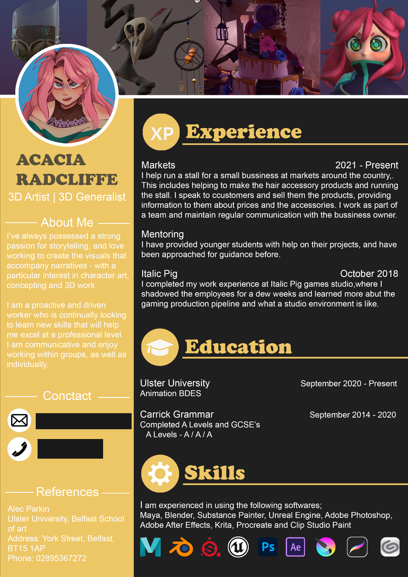
I tried to put more effort and time into texturing for this assignment, as in my previous semester I hadn’t played around with substance painter in too much depth, in my opinion, the textures were quite simple. I had a go at hand painting details, like the label of the wine bottle and shading in the fireplace. I also learned how to use the opacity and height maps properly, as last year I failed at the height ones epically.
Wine Glasses


Wine Bottles


Tankards


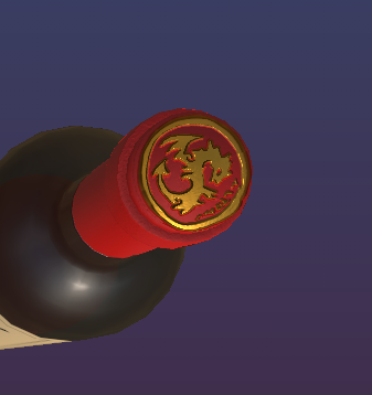
Cake

Chandelier

Fireplace

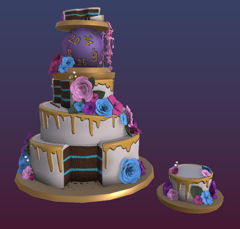
Animation Strategies – Week 4
This week was about learning how the nodes system in UE5 works, and how to use it.
Metallic & Roughness


Texture
I couldn’t seem to get the wood/grime bump/textures thing to work properly


Transperancy
![]()
![]()
3D Environment Update – Concepts/Modelling
Before modelling most of the props or assets, I created concepts for the model. I mainly concepted the bigger models, or the ‘hero’ props I thought would feature more in the scene or that were very important to the theme tavern wedding.
I admit I was a bit out of my comfort zone as I’ve always loved the look of stylized art and scenes but I’ve always personally found it easier to go for realism. So this pushed me to try and adapt to a very different style than what I usually would.
Glasses and Tankard Concepts

Cake Concept
1st is the full cake and the second is the cake after the party, so it’s been cut and eaten. The top layer is set to the side, as there is a tradition that you keep the top layer to freeze and eat on your one year anniversary.

Chandelier Concept

Fireplace Concept
The fireplace was originally meant to have a fireguard on the middle section that was shaped like a dragon, I was going to do this with a plane and texture maps. Although since I was running very low on time, I cut that part out as I thought it’d be very time-consuming.

Research
PureRef Boards used while modelling


Professional Practice – Week 2 Homework
This showreel showcased a good variety of animations, not relying too heavily on one piece. I think the editing was well done, everything feels fluid and the changes in animations aren’t too jarring. The music was upbeat and fit the animations being shown nicely, and it wasn’t too loud. I think the title part of the showreel could’ve used an art piece you could see more of and make out fully, instead of just a section. It also could’ve used the person’s name and email to be displayed on it so people interested would have an easy time finding it, instead of having to check the description.