Week 7 – Bouncing Ball Task

The lecture had an example of balls being animated in ones, twos and threes. I decided to have a go at it, as I don’t feel like I understand the timing and spacing part of animation very well yet. I struggled a bit with starting and completing this exercise, and it actually took me a few tries. I was spacing the frames out wrong and really having issues with the timing of it, as it was either too fast or too slow. I think I got there eventually, as I’m happy enough with my attempt at that task. The ball animated in threes is a little slower than the others, but I managed to get it roughly timed the same. 

Homework Exercise

The homework assignment for this week was to complete a ball bouncing exercise, along with assigned reading.

After attempting the other exercise, I was slightly more confident with starting to try the ball bouncing task. I feel that as I continued animating the different balls, I became better at the timing aspect, and it took me less time to figure it out and be happy with it.

The first ball I attempted was a bowling ball, so I could focus on the timing and spacing without thinking about stretch and squash. I’m not completely happy with this one, it looks too stiff? It also shouldn’t have kept moving as much or as fast once it had stopped bouncing, which ruins the effect a little.

The second attempt was more so I could learn how to use squash and stretch in my animations. I used the video tutorial linked at the bottom,that was provided in the course content for this week to try and animate a smaller, squishier ball. Instead of just making a shape and dragging it along the screen into the various positions, I actually sketched out the balls’ movements and then lined it on another layer. I feel like this gave it more personality, and I like the result of this one a lot more as I feel like it moved better overall.

For the third ball, I used a reference video of sports balls and chose a football, as it was a good medium space between my other two attempts. I tried to use squash and stretch to show it losing speed as it goes along, and it becomes more rigid. I like this one as well, and I feel like the timing and spacing was much better after I watched the tutorial videos as well.

References used

Reference used at 0:45 seconds in third video.

Spirit Sky fish – Practice, concepts and research

Choosing the final Groups

When we were asked to choose what group we’d like to stay with to create the final animation, I chose a group I’d never been a part of before. I chose to join the spirit sky fish group as I liked everything I had seen from their group so far, and the storyline and the aesthetics were really appealing to me.

I was online for this week, but the people who had been in the group and were rejoining and the other people interested in choosing this group were very helpful with explaining the world from their knowledge of it. We then created a discord server for the people working in this group so we could separate things into different channels and pin things easily.

We worked on fleshing out the story on this server and all the concept art and research done by the original groups was uploaded into the right channels. I spent some time reading through the storylines, concepts and looking at the character designs. I also did some research into Inuit traditions, housing, clothing, and hairstyles so that I could understand the setting of the animation better and ensure I was representing their culture properly.

Concept Art and sketches

I decided to try my hand at coming up with a design for the main character Amka, mostly the clothing. It took inspiration from Manny Maguire’s design as it seemed to be the main one throughout developing the world. It also kept key design aspects, like the braid and necklace.

I also needed some practice in drawing side portraits, so I chose to do some of my practices using Amka. The Amka ones are shown here. I think I definitely need more practice with anatomy, like how people move and side profiles. I have been practicing this more since.

After we decided to go with Manny’s design for the main character I decided to make some sketches of their Amka design, so I could get more comfortable withdrawing her. This allowed me to see how the character might move, or what expressions might look like on her face, a lot of the ones I chose to draw were all ones I thought would be relevant to my scene of the animation.

References

Spirit Sky Fish Moodboard

Inuit Clothing

Animated Inuit Characters for reference (references for the animation from group members)

Edit: Ended up using this video a lot to try and get boba’s (the whale) movements right in my animation, so I figured I would put it in the research post.


Week 5 – Character Design

We were asked to design characters for the worlds we were a part of. I’ve decided to put some of the character designs I did that were inspired by and belonged in the magical academia world, which I was just moved from as well.

I am not extremely well versed in character design, as I had stopped drawing characters and stuff to focus on my A level art course, which was mostly working from photographs of models and people. I have recently been trying to get back into this aspect of art, as I used to really enjoy it, so this task and lecture were helpful in making me practice.

Neo Noir

This was the group I was in when we were asked to design characters, although most of the characters for this world already had been designed a bunch of times.

Magical Academia

This character was an idea I was developing as a witch type character who was attending the magical academy to hone her skills. She was intended to be a sort of gardener type character, who enjoyed tending to magical plants and helping keep them alive. I did a quick digital sketch to try and mess around with colours, although I’m still not sure about those colours as I feel they don’t get her character across right.

This was a concept for a travelling character in the magical academia world, as the idea of a roaming merchant or character who collected ingredients for the academy appealed to me. I have a soft spot for travellers in games or stories. I didn’t get very far with it though. I was having a hard time trying to stick to the general aesthetic of the magical academia world, with the cute and more simplistic designs.

Neo Noir World Building

I was swapped into the Neo-Noir group this week, which I had actually been hoping for as I was interested in the aesthetics of their idea. This was my first time moving groups as I had stayed with my original world for the last few swaps. The concept and aesthetics of this world were appealing to me, and I was excited to work on this group, however, there were issues with communication within the group, and it killed my enthusiasm a little, as I felt a little lost in an unfamiliar group and concept.

Plot

The scene takes place in the diner, as someone has been killed in an alleyway outside of it. The detective is called to investigate, and the robot girl helps him as she was friends with the person who was murdered. (another robot worker?) They think that the shady figure they find is the killer but it’s then revealed that the chef robot was the actual murderer. The shady figure is actually related to the murder victim somehow, and therefore was investigating himself which is why he is always around.

The characters that are included in the scene so far;

  • detective
  • woman sidekick robot
  • chef
  • shady figure

Moodboard and References

I made a mood board for the aesthetic of the world from what I’d been told through the group members so I could try to get inspiration and get into the right headspace for this world.

I think that some good references for this concept world would be;

  • Back to the future
  • Dreaming Machine (unfinished)
  • Fallout
  • The wolf among us
  • Grease

Week 4 Classwork

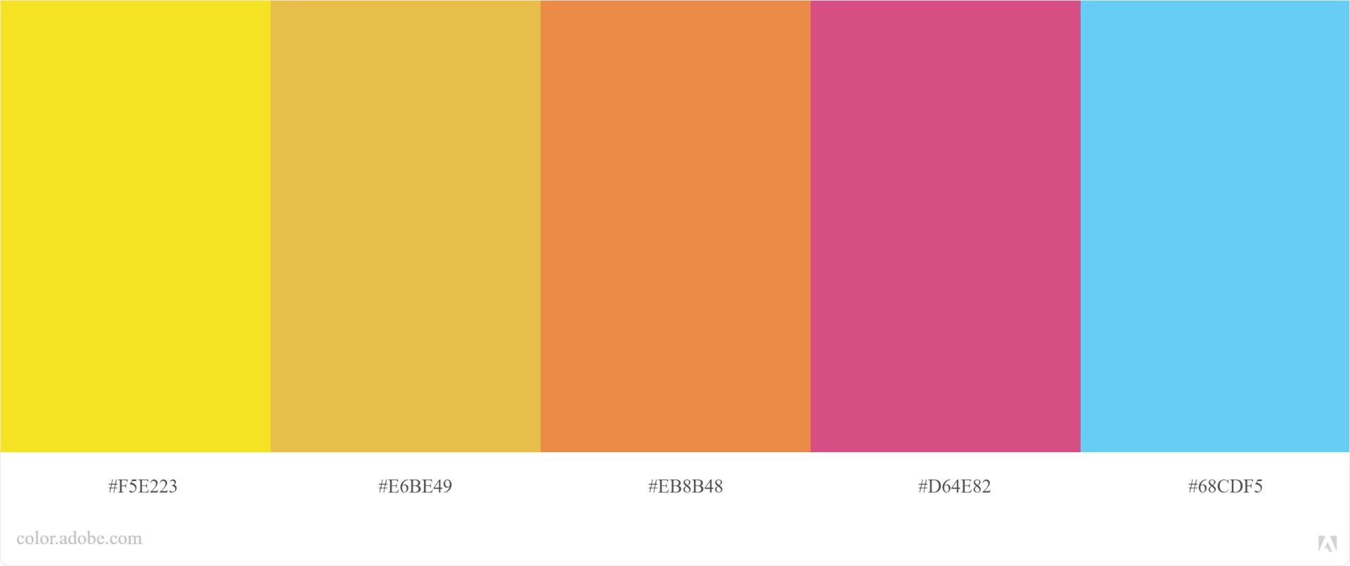
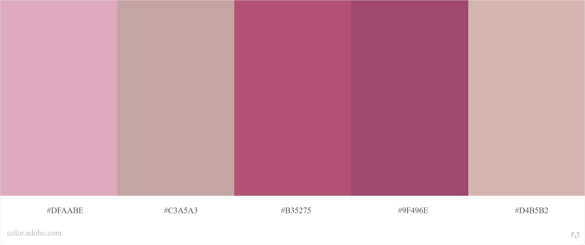
The lecture today was on colour theory and the different types of colour palettes. Originally we were asked to create colour palettes that represented our world, or different emotions. As I was online, I was put into a group with other online people and therefore we decided to go with a more general theme. I found this difficult, as I don’t know much about colour theory so I was mostly just choosing colours I thought looked nice together; these were the ones I created.

Joy-

Nighttime –


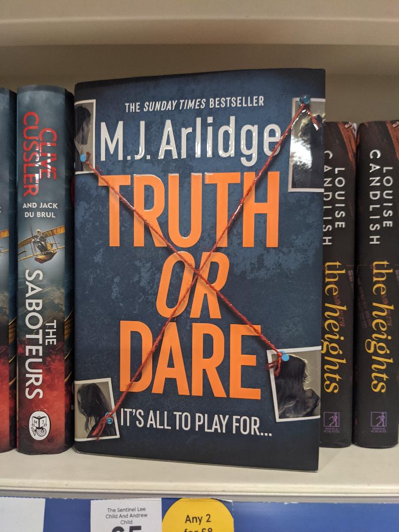
We were then tasked with finding objects that showed one of the colour palettes and using adobe colour to make a palette from it. I was online for this lecture, so I took photos of objects around my house and to use, as well as using photos I already had. The photo for the analogous one actually came from the time we were doing the icebreaker activity, as I couldn’t find anything in my house I thought worked for that scheme. The complementary one was of a book I saw in the store weeks ago that I really liked the cover of.

Monochromatic

Analogous

Complementary

Week 4 – Colour

This week was about colour, which is an area actually that I feel unusually confident in, considering I know virtually nothing about the colour theory itself. I’m excited to start working in colours though, as I dislike working in tonal.

Colour Palettes

I used Adobe Colour for the first task, which was to take a scene from multiple animations of your choosing and to take a palette from it. I chose Spiderman: Into the Spiderverse, Tales of Zestiria the X and Voltron, which are some animated shows and movies that I thought were very aesthetically pleasing when I watched them. I think it was helpful to examine the colour schemes used in professional animations and explore different palettes.

Colouring a thumbnail

The other task was to colour one of the thumbnail drawings. Looking at colour palettes from other animations and images, and seeing what emotions they portrayed was helpful in trying to choose appropriate colours for this task. Due to my issues with timing, I have chosen one of the first set of thumbnails to colour.

Moods portrayed through colour

The third task was to take the landscape image given to us and to colour it to suit different moods, therefore I chose to colour it simply so I could experiment more with the colours. I chose sadness and mysticism as my emotions to try and show, however, I am unsatisfied with how the first attempt at this task went and I’ll come back to try more at some point. I feel like the sadness was a little too literal, just taking natural colours and making them duller when I want to try and incorporate more colours into my art.

Sadness

Mysticism

Week 3 – Tone and Value

This week we looked at tone and value in the lectures. There were tasks to create more thumbnails using certain things, like two-tone and crosshatching. Due to my personal issues, illness and bad time management, I wasn’t able to catch up on this piece of work completely. However, I really wanted to try out the two-tone thumbnails just to see what possibilities it could create for striking thumbnails. So I had a quick go at it, adapting one of my Magical Academia thumbnails to a two-tone study instead.

I found it difficult to begin as I’ve never tried it before and couldn’t see how it would work. So I just started into one and it developed into an interesting piece. I like the atmosphere it creates, although it could be more refined.

Magical Academia – Ideas and Designs

The World

The Magical Academia world has taken inspiration from animal crossing and harry potter. It’s a world of magic, with an academy that people can attend to learn how to control and manipulate magic. We discussed the academy being in a tree, kind of like a treehouse as if it was built around the tree. I think the general design of the world and theme that our group decided on was medieval fantasy so that we could have small fantasy towns with crooked buildings and glowing lanterns/lights. As it is a fantasy and magical world, it is filled with things like old abandoned ruins, glowing mushrooms, large forests full of fairies, caverns and underwater areas. (The underwater areas were because we couldn’t quite let go of the underwater world idea yet.) We would also like to have floating islands and areas, as it reinforces the magical theme as well as presents some unique landscape design potential.

We decided to have some anthropomorphic characters in the world so that some of the group members who aren’t as comfortable with human and their anatomy and prefer to draw animals or anthropomorphic people, could still work freely in the world. It also fits in well with the world idea itself, as most fantasy-based stories have different races, and one of the inspirations, animal crossing, is full of animal characters. There are also humanoid characters, for people who prefer to draw humans, elves and other similar types can also be comfortable with the world.

Ideas, Moodboards and References

Caity had created an interesting board centred around this world idea so that we could all add relevant images and find references and inspiration. This is the Pinterest board!

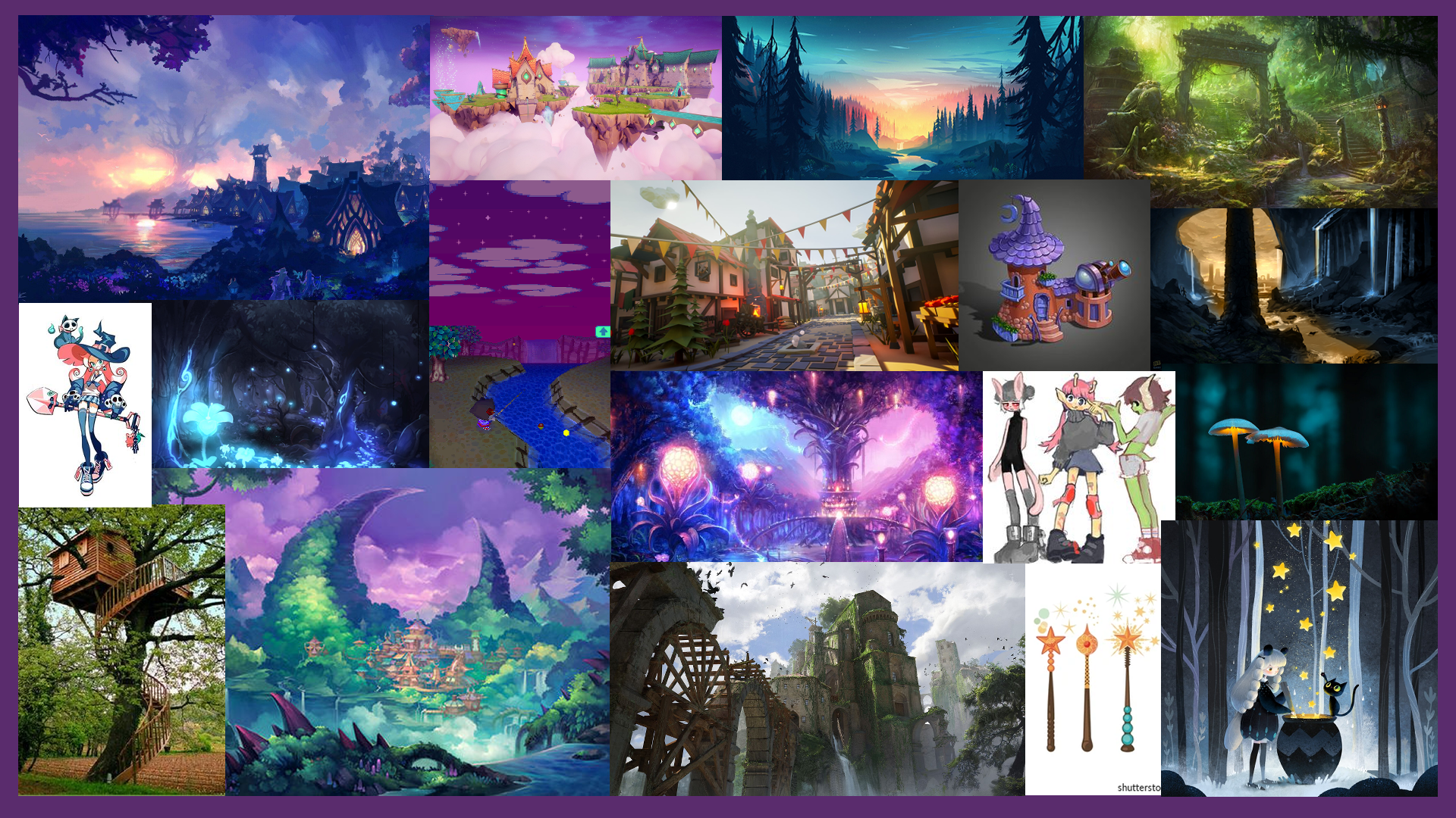
I also created some mood boards to get some inspiration and further develop my ideas for the world. This was for the general mood and aesthetic of the world in my mind

This asset kit in unreal engine provided some good ideas and inspiration for the world’s buildings as well as having the cartoonish kind of style.

Week 2 – Thumbnails

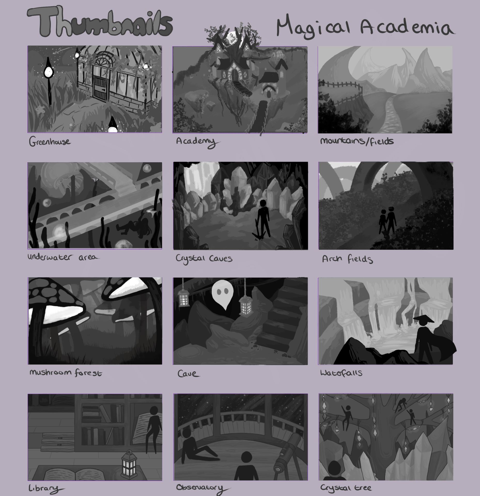
We ended up choosing the Magical Academia Idea to move forward with as it was the collective favourite after some more in-person discussion. We were asked to draw out thumbnails for the world we chose, to help flesh out ideas and try to practice with the themes and feel of our world.

Quick Sketch Ideas

Thumbnails

I don’t have much practice working with backgrounds, especially not digitally. So this exercise was difficult for me, and took me a ridiculously long time, as I was trying to learn how to use digital software to draw as well as trying to figure out perspective and backgrounds. I feel like I made definite progress throughout the process of drawing these, as I really don’t like the first one but I like some of the later ones. Working in grayscale was also a little challenging for me, as I usually work in colour and am not very fond of tonal mediums like graphite pencils. The last few thumbnails need a larger range of values to be used, as the similar tones don’t provide a very good sense of depth.

I’ll practice more at digital art so that I can try and improve my art skills using it, and my knowledge of the software and processes, to make it easier to do.

I wanted to have an underwater area because a lot of our other ideas had been related to the sea and I was a little invested in them. These images (One, Two, Three) offered some inspiration in designing that small area. Tales of Arise inspired some of my landscape choices (One, Two)

Build A World Project – Initial ideas

We had to try and come up with a few ideas to build a world out of, and these are some of the concept ideas my group had come up with before narrowing them down.

  • Everyone is a superhero
  • Animal people – humans are pets
  • Racoon Overlords
  • Politicians are food
  • Everyone is blind and there are obstacles everywhere
  • Everything you think of materializes
  • Birds are people/people are birds
  • Life is a survival horror game
  • Kitchen utensils instead of a limb
  • Random portals everywhere
  • Magical university 
  • Harry potter/animal crossing
  • different folklore fused into one
  • Submerged civilisation – pirates/mythology/dragons
  • Faeries and Cyberpunk
  • Freckles are dot to dot prophecies

The bold ideas were the ones we seemed the most interested in exploring further. We then planned to meet up to choose a definitive idea to focus on.