Typography.
In todays lecture we explored more typography. We learned more about letters, words and paragraphs. We developed what looks pleasing and what does not when working with type. However in the beginning of the lecture we learned about Childrens’ code which I personally found really interesting, it showed me that designers have to make their apps/websites suitable for those of all ages because 1 in 5 people who use the web are children, this taught me that the content I produce should be applicable.
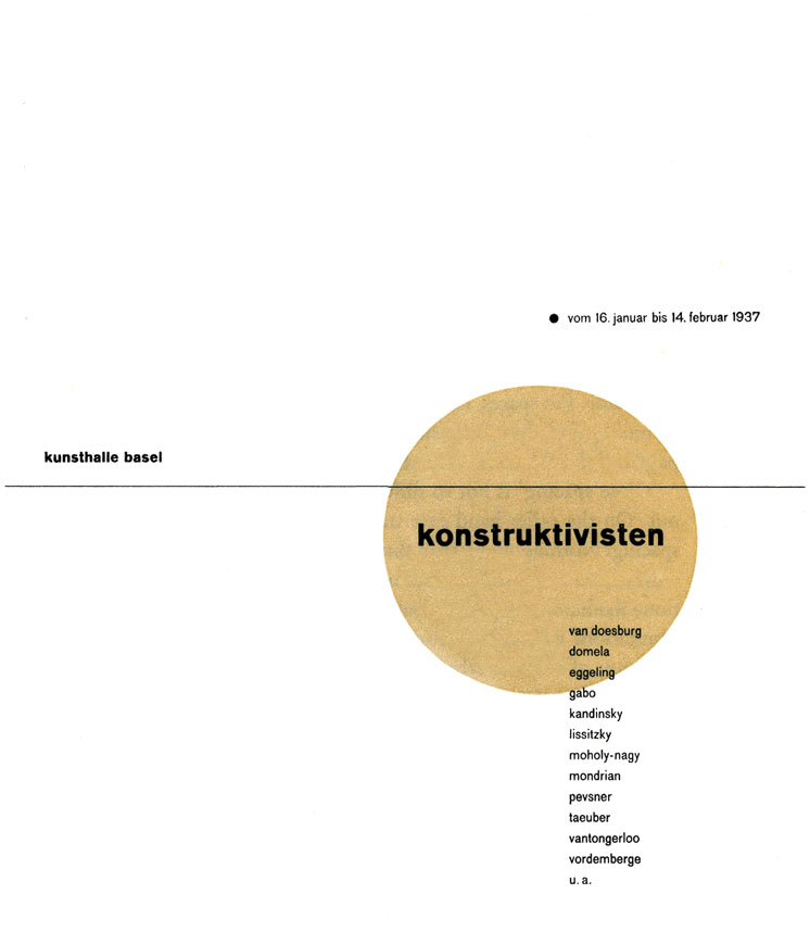
Wili Kunz
Wili Kunz is a designer originally from Switzerland but immigrated to the united states. His work was extremely well placed and it really made me think about the placement and structure of my work. He has written several books such as Typography macro + microaestetics and Typography: Formation + Transformation.

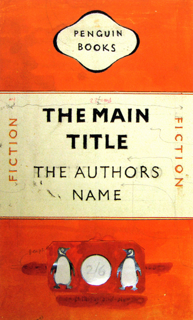
Jan Tschichold.
This is another designer that is extremely influential in the design community. He worked closely with Paul Renner who is the creator of the Futura typeface. However jan had to flee to Switzerland because of persecution from the Nazis. His main use of Typefaces where in the sans serif category, which he used for the penguin books. I really enjoy Jan’s work because of how simple yet incredibly effective his work is, I could tell he did not need a lot of components to create an effective piece of work
Class Activities.
During class on Monday we did several activities to work on our typography and placement. The first activity we did was all about letters.


In this activity we got to manipulate typefaces and research how each letter can be manipulated to form a different structure. The letter I went for was Q in the typeface Baskerville because of its interesting sarif style. The below letter is an H which I have distorted to look almost like an M.


We also used an older form of creating typography. I really enjoyed this activity and found it extremely interesting how type had to be done like this by hand not that long ago. These are some of the pieces I created.
With the process of learning about words and paragraphs we also learned about the importance of tracking and kerning to ensure that letters are an appropriate width apart


Paragraphs.
Next we learned about paragraphs and what form a paragraph should be written in (from the left) to ensure the reader stays engaged. This means that certain forms of writing should not exceed a certain length.
Here are some examples-

I tried to enhance the aspect of the show that people who are interested in musicals would want to see. In turn this resulted in me choosing to enlarge the “Ant middleton” in the poster.
Next we started learning about grids to help align text, which really helped to add structure to what I was doing. This is a quote from Dieter Rams a designer who gave 10 principles about good design. His quote about long-lasting design really resonated with me because design can be recognised as good when it can withstand decades of change in our modern world.


My Classmates work-
we used miro again this class to show others work, it was really helpful to see were others went with the concepts we were given.


What I learned-
- Letters, words and paragraphs, the basics of how to keep a reader interested and what is appropriate when using typefaces.
- How to turn a letter into a graphic on figma.
- Grids work.
What I want to work on-
- Placement of my text.
- Read into more typefaces and styles to enhance my knowledge of where type has come from.
Bibliography
http://www.designishistory.com/1920/jan-tschichold/
https://www.rit.edu/carycollection/willi-kunz
https://ifworlddesignguide.com/design-specials/dieter-rams-10-principles-for-good-design