Animation For The Creative Industries – Assignment 2 (The Animation)

Since Clip Studio Paint doesn’t allow audio scrubbing, I started by going through and very meticulously timing the animation using quickly drawn stick figures, essentially. I wanted to map out the audio and major movement prior to roughing out the animation more definitively so I had an idea of the flow.

Then I started drawing out the characters. I struggled to stay stylistically consistent during this part, I realise this could be attributed to not practicing enough in the style before animating, I think an expression sheet, a full reference of the head angles, and a proper reference sheet would’ve helped me with that a lot. I also recognise that I was very swamped with the vertical slice project at the point, and barely had time to sleep. I think I’ve made massive improvements with time management, but there’s still some work to do in that area.

I knew with the time I had to animate that I’d only get a cleaned up, lined animation, no background or colouring. My intention is to submit the cleaned up animation and then finish it for my portfolio.

Here are the various stages the animation went through.

It was when I began lining that Alec gave me the feedback that Jude (the girl) need to move a bit more. So I took his feedback and added a subtle jump when he says ‘sure I do’ as per what I was told to do. I also added an eyeroll at the end of the animation so she wasn’t so static.

I think I could’ve still added more movement to Jude, and smoothed out more for Cardan, but I’m happy with my progress on this animation so far.

Animation For The Creative Industries – Assignment 2 (The Start)

For this assignment, I knew I wanted to try animating in a style that was a bit more cartoony than my usual style. This is to show more style diversity in my portfolio, which is super important for trying to find placement.

It took me a while to find an audio I liked, initially I was debating between 2 songs,

I wanted to a part from the second verse of Hayloft II by Mother Mother or the bridge from Hell’s Coming With Me by Poor Man’s Poison. Eventually I settled on this audio from 10 Things I Hate About You.

I edited it down to exactly 11 seconds.

The next thing for me was to determine how I wanted to draw. I decided to not base it off of an existing studio’s style mostly due to a wish of developing my own more cartoony look, and also because I know myself well enough that I would never complete the assignment in time due to taking my time studying the style of both drawing and animation of whichever studio I chose. It’s a plan of mine for over the summer to practice animating in different styles so I can dedicate the proper amount of time to studying.

So, the next step was deciding on a style, so I ended up sketching two characters out. I have to admit, after listening to the audio, I decided to take inspiration from a book called The Cruel Prince, so the two main characters’ appearances are based off of the protagonists Jude and Cardan.

I wanted to get used drawing in this style, so I sketched more and made small adjustments to the designs because I wanted them to be pretty simple so I could focus on the actual animation rather than worrying about consistency. I wanted to focus on it more so I could practice things more intentionally in this animation. Specifically, I wanted to practice overlap, easing and overshooting and settle.

I’ve never done an acting animation before, so I took the opportunity to watch some videos on lip sync, acting in animation and in general paid greater attention to shows that inspire me.

These two videos were the most helpful to me. I found their advice insightful, since I’ve never done lip sync before. Especially Toniko Pantoja’s advice on not drawing every single vowel or consonant, it’s definitely an easy thing to fall in to doing, so I’ll try to be conscious of it during my own animation.

I then took animation reference for the part I thought I’d struggle with the most. (Spoiler, it was and it shows).

The Video (I want to forget this exists of me)

Animation Strategies – Final Animations

View the final animations in SyncSketch

run cycle

walk cycle

jump animation

I’m very proud of these! I think I’ve improved a lot since my first year 2D animation, and this is definitely my passion. I was very ill while making 2 out of 3 of these animations, so I had to ask for an extension, but despite my set backs, I think the final result is really good! I would’ve loved to have coloured them, but time constraints meant that wasn’t possible. I have a lot to work on, like volume control, pushing secondary action and overlap. these are all things I’ll be practicing over the break and the next semesters. This assignment pushed me in a lot of ways, but I learnt the value of experimenting in animation, the use of studying reference, and how character impacts how I should animate.

Animation Strategies – 2D Animation (Run Cycle)

I started with researching run cycles, so I turned to Pinterest and Youtube for inspiration, I was looking specifically for strong fast runs.

I found inspiration like this animation –

I also found 3D walk cycles like –

I found the further someone is leaning forward, the more intense the run, so I tried to implement that generally with Nyx. I started with blocking out the general movement. I slowed this down to show off posing.

I began implementing smear frames as an experiment, and I ended up keeping them after recieving feedback that they added power to the run.

This was me still filling in the character pass. Something was off but I couldn’t tell what it was at this point. I felt like there wasn’t enough weight in the animation.

The hair gave me a lot of grief, but I think I conveyed movement alright here. I also realised what was throwing off the motion was the up pose was too drastic, so I scaled it back and it look a lot better now.

The finished animation! I learnt a lot from my walk cycle. I used separate layers for smaller details that moved, like the eyes and her tattoo, and I think that really helped with consistency. I captured the energy that I wanted to convey, so in that regard I was successful. I also really enhoy the experimental side of animation, trying things to see if they work and trying out ways to implement it into my workflow. The smears/motion lines were a part of that. It’s the benefit of being a complete beginner, I get to try techniques I never have before.

Animation Strategies – 2D Animation (Jump Cycle & Other Unfinished Body Mechanics)

Initially, I wanted to do a sword tricks animation, as tw0 swords are Nyx’s usual weapon of choice besides her magic. I realised as I was doing it that I didn’t have time and it would be better to stick to something simpler and do it well than something complex badly.

I got this far before deciding to go for a jump instead. This is an animation I’d like to go back to over the summer, maybe. It also wasn’t a waste of time as it allowed me practice with smear frames, which is something I’d like to experiment further with.

I used this account as reference –

@edenwilliamskarate

I vibe with this. #sword #martialarts #karate #sportkarate #weapons

♬ If We Were A Party – Alexander 23

@edenwilliamskarate

a lil sword action ⚔️ #martialarts #swordtiktok #sportkarate #karategirl #sword

♬ Jupiter & Mars – ARDN


As Nyx is athletic and has been doing things like jumping buildings for a long time, I started by looking for reference from parkourists. I found a few good refs on Youtube shorts.

These all helped me figure out general posing and jumping with confidence. It also helps that they slow down the video during the height of the jump, so I had a better idea of how a jump actually works.

I also gathered reference from Richard Williams’s book, which is included in my Pinterest board here

His book, along with multiple animated references within that board, helped to inform my animation.


I started with blocking out my animation, as I have previously done. I included my run cycle as height reference, and also because I planned to insert a few frames to give power behind her jump and also so I didn’t have to animate another run.

In hindsight, I should’ve left more room for the run up to be seen. Oh well, it’s something to keep in mind when framing future animations.

Here’s my blockout without the reference or secondary motion.

I sketched in hair and arms here.

Character Pass progress

I started lining not too long after this point. I actually made a progress video of some of the lining process.

Here’s the lined and sketch animation


Finished animation.


I think this animation really demonstrated my improvement, it’s got nice movement, a good flow and I think I improved a lot on consistency due to the errors I’d made previously. I’ll admit I forgot the smears in the second half of the animation, but I don’t think it looks too out of place. I think I’m finding a rhythm with animation, and that’s a really nice feeling. I’ve made massive improvements over the last year. I still have a lot to learn, there’s a little bit of snapping, the hair at the end could be refined, and I think I could make the jump feel more bouncy and stylised with some practice. In all though, I’m happy.

Animation Strategies – 2D Animation (Character Design & Walk Cycle)

I knew for this project that I wanted to do 2D animation to further my skills in it.  I also knew I wanted to use my character Nyx for the project, she’s a character I’ve drawn and doodled so I’d have a good shot at keeping things consistent, and I thought she’d be fun to do.

To try and summerise her character is a struggle for me, but Nyx is a criminal who, at the time we meet her, has just broken out of prison to hunt the man who put her behind bars. Againt a cyberpunk themed backdrop, Nyx is essentially battling the law, old enemies, and her former friends to reach her goal. She’s disciplined, confident, assertive and athletic. She’s skilled in combat, which informs the way she moves. It’s very precise, is the best word I can think of. These are core personality traits that will inform my animation.

This informs her character design, as you can see below. This isn’t a full design, I left out some details because I drew this generally knowing what I wanted to include in my animation. She usually wears a long coat and has weapons matching the theme, but I didn’t want to complicate these cycles too much.

I used this sheet as a way to draw her as I know her, and then refine further.

I started with drawing a sheet of her usual design, and began problem solving to simplify it down.

I’m at this weird inbetween with my art style where I can draw side profiles, but they don’t look consistent with my style, this is because I learnt how to do them a certain way, and I just haven’t been able to break those habits. this project definitely highlighted that area for me to work on. But, for this project I thought I could maybe get away with it, or get it to work.

I made some notes on the page to remind me when I was drawing up further iterations. Some of the key ones are her tattoos and her prosthetic. For the time that I have and the skills I currently possess, I don’t think I can keep these consistent while animating, so I plan to hide or simpify them down.

Then I drew up some very messy and not great sketches of the design. I wanted to get started quickly as I knew with my inexperience and general slowness, mixed with the other assignment taking up a lot of time, that I needed to start this asap.

Yeah, not great, but it’ll be enough for me to get started. If I have time I’ll go back and try to make these more consistent.

Next was to seek out reference for my animations, I started with the walk cycle.

walk cycle animation walking

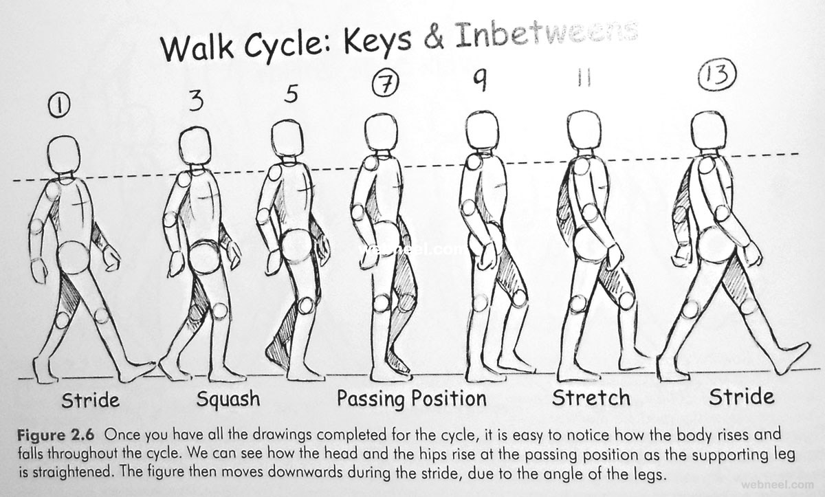
I found this on Walk Cycle Animation Walking 5 – Preview (webneel.com) and I found it quite helpful, it’s easy to over exaggerate the step the character is taking and make it look more like a jog or someone with a very wide gait.

I also used Richard Williams’s book, Animator’s Survival Kit to get more indepth advice and explain the why. Why his advice works and how the application should look if done correctly. I find his book to be of great help.

Nick Kondo 近藤 on Twitter: "Richard Williams taught me how ...

I also searched for reference in video format. I found a few that I took reference from, so I wasn’t letting the reference dictate exactly how I animated Nyx.

I also collated a Pinterest board for all of my animations here

I started animating in Clip Studio.

I started with a very basic body to focus on the movement and capturing how it should feel. I wanted Nyx to feel confident, her shoulders back, and I wanted it to feel purposeful like she’s very sure of where she’s going.

I added in the arms as well. I think I generally achieved my goal with the movement, I think she has some really nice weight as well. The hair flick was added in because I liked the energy it added, I feel like it adds some power to her walk.

This was the walk sketch finished.

This was the lining partially done.


I noticed after the lining was done that the eyes jumped about a little, and weren’t very consistent. So I went back to fix it.

Also, I acknowledge the prosthetic lacks consistency at points, I noticed after I’d finished how noticeable it was, but ultimately didn’t have time to go back and fix it. However, the mistakes I made in the walk cycle helped inform my other animations, so I think I improve my issues with volume and consistency throughout. There’s a lot I’d change, but I’m happy with this animation, considering I don’t have a lot of experience.

My CV, Cover Letter & Showreel

Ellie Wilson (2)

I think my CV reflects my style pretty well. I went for a darker colour palette to try and stand out from the usual template of pale backgrounds, which dominated my research. I think it was a good idea, but I also understand it may not be conventional.

cover letter (2)

My cover letter is addressed to Boulder Media, the studio I researched. I tried to include as many as my observations as possible.

This is my showreel! I’m pretty happy with the outcome, some of the animations are of slightly lower quality, like the cat puddle and floursack, they’re just supposed to be placeholder animations for my body mechanics and run cycle animations. I plan to change them out when I get those animations done.

Professional Practice – Cover Letters

We went over cover letters, and did a task where we had to point out what was wrong with the example given. During this task, it became pretty obvious that a common pitfall is becoming too informal or rambling in the cover letter. It should be a short piece that covers anything you couldn’t put into your CV.

During my research into what makes a good cover letter, I came across the National Careers Service;

Cover letters | National Careers Service

They include some good advice like ‘Convince them that you’re enthusiastic about working for them. Let them know you share their work values, culture and style.’ and ‘highlight your skills’. This resource will be quite helpful for me when I begin writing my cover letter.

I did some research into local studios to find job openings, and I came across Boulder Media, who, while not currently hiring, had an expression of interest open to 2D animators.

The use a third party recruitment system for their applications, so there was no name given to send the cover letter and CV to. To be safe, I’d address the letter as ‘Dear hiring manager’.

They seem to prioritise creativity, positivity and team work, so those would be things I highlight in my letter.

Professional Practice – Cvs/Resumes

In class today we took a look at CVs, we were provided with CV examples to help inform our design and layout. I sought further examples outside of the ones from class, but it was quite difficult to find them readily available. That’s understandable because CVs are usually sent in by artists, they don’t have them posted for everyone to see.

I did find one, Michelle Cheng.

This CV is a great example of less is more. The colours are limted, the font is readable, all of the information is laid out in a clear, concise way. She specifies her role in each job she’s had, and also lists her skills in software. My criticism for this CV is that it’s very bare bones outside of practical skills and achievements. I think employers also like to get an idea of who you are as well as your skillset, especially in an industry that relies on good communication and teamwork. A small profile outlining her ‘soft’ skills might be of benefit.

So after analysing the CVs given to us, and this CV, I think what makes a well-rounded resume is clear, concise language with a readable layout. The colour palette should be limited for legibility and aesthetic. However, as I don’t have the same level of experience, I would put more emphasis on my soft skills.

Professional Practice – Career Panel Talk

We had a panel in to talk to us about the industry and building careers within animation. There were professionals who had been working for years, and then a recent graduate in her first job. It was really beneficial to hear their stories and the many different ways they’ve achieved their goals. There was some reassurance that progress isn’t linear and there isn’t just one way to build a career in the industry.

I found it really interesting, talking about expectations in a studio setting, and the best way to market yourself for work. I think having the wide range of experience on the panel also helped get a better picture of how working professionally could pan out, and the stages my artist development could go through.

The advice they offered will definitely help me when I create my CV and cover letter.