MAJOR PROJECT – Week 13 & 14 (Christmas)

Week 13:

Lamb painting is now done!


lambing-at-chasemore

nameless (Watmuff, 2021)

3,700+ Sheep Front View Stock Photos, Pictures & Royalty-Free Images - iStock

Sheep Looking At Camera, ( kurilovych, 2020)

This image in particular inspired me, there’s something about it’s proportions and the way it’s eyes captivate that I wanted to capture. I made sure the eyes had an almost glassy look and super soft to try and portray it.

I exaggerated things like the eyes to try to push that look of innocence. I added the halo as lambs especially are associated with innocence, purity, and have holy symbolism in quite a few Christian denominations. The desecration of such a symbol is quite grisly and visceral, which is fitting for the state Valerie is in when she paints it.

I have a few ideas for the other paintings. I’d like to look more into paintings referring to death and referencing the topic. Things like memento mori still life paintings might be fitting?

I was also inspired by the paintings from Slow Damage (2021), a visual novel where the protagonist is an artist who paints the darkest desires of a person.

Create a Slow Damage Paintings Tier List - TierMaker

they’re more abstract than I want to go necessarily, but I like the atmosphere and style.

Create a Slow Damage Paintings Tier List - TierMaker

This one especially has a really nice contrast. the mood is communicated through a minimal palette. It’s just very effective, in my opinion.

Clean up on the shot from sc02 is slow, but I’m starting to get used to the vector brushes. Moving forward, I don’t think we’ll use them. They’re unpredictable and not as efficient as the ones from Clip Studio Paint, for example. The line width is dependent on how zoomed into the canvas you are, and whether you can edit it effectively is 50/50. Raster brushes would be a lot faster, I think. This was a good test though!

MAJOR PROJECT – Week 11 & 12 (Pre-Production & Paintings)

Week 11:

More reworking the animatic. There’s been new thumbnails done for the ending and I reviewed them with Will. I proposed an added scene so there was a little more time spent with Valerie mourning Meredith.

Will then did the updated animatic.

I finalised two of the paintings from the thumbnails. They were very easy and are meant to be a little messy. The point being that Valerie is fixated on blood at this point, so there’s focus on a lot of injury. Warning for some graphic content.

The pixelation is because I painted over the thumbnail, but this will likely be a background painting so it doesn’t need to be detailed and high definition. A couple of peers also said it looked interesting.

I started painting for the “Masterpiece” which took me a while to do.

This painting was quite hard because I haven’t painted in a long time. I knew what I wanted to achieve but it took some back and forth.

Week 12:

I have finished the Masterpiece

I also set aside a canvas for “The Lamb”. This is one of Valerie’s paintings, and Rachel really liked the idea of tying Meredith to “The lamb for the slaughter” idea. Having this be the painting she discovers pulls a direct parallel to it. I’d have liked to push that further with a wolf motif, but after peer feedback, most thought this lamb felt more fitting with Valerie’s previous artwork.

Finished the sketches for the model sheet we agreed to work from.


MAJOR PROJECT – (Semester 2) Week 1 (Production Progress Presentation)

Semester 2, Week 1:

The presentation went really well! Sarah and Aodhan told us that the story is much clearer and they liked the direction the project has gone in. Sarah recommended revisiting the very end scenes to tighten things up. She felt like we could keep it within the apartment and it would feel more contained. I thumbnailed that out to see if it would be better.

There was also a concern of time. We’re working very quickly and while I think that’s commendable, we need to discuss what are possible places to reign in. We decided from here that colouring will be flat as shadows are taking up a lot of time right now and we have enough shots with them in that communicate the look we’re going for. We plan to add them back in after submission. Realistically speaking, me and Will could push ourselves and likely get the film done, but I’m aiming for all lining and colouring to be done. Comp pulls everything together, but it’s more important for us to submit a film that is fully animated, at least that’s what I’m concluding from the feedback we received.

This revised schedule is incredibly optimistic but they aren’t realistic. We will definitely need Easter to polish everything but this tight schedule is to get us motivated and on track as me and Will can be distracted. I myself is incredibly prone to procrastination so setting these tighter deadlines to work to forces me to work.

The last week has been full ahead with production as Will has finished all backgrounds for now.

I’ve been working on scene 4 roughs.

For simple shots like this, I cleaned up and coloured to take time from clean up later.

This is an example of my process! I start by keeping it simple and working my way up. I have a bad habit of not charting my progress, but I worked from keyframes to in-betweens, and then tiedowns for roughs. I need to learn how to be a cleaner sketcher I think, these roughs might be a little difficult to clean up because there’s a lot of lines.

The next week will be focused on finishing scene 4 and starting layout in After Effects.

MAJOR PROJECT – Week 8, 9 & 10 (Pre-Production)

I took some time to practice drawing Valerie and Meredith with some expression sheets. Some of these aren’t correct anatomically or on model because this was one of the first times actually drawing them emoting. It was good practice, but I think I could do better. I really like the one of Meredith smiling though, it captures the vibe we want for her really well.

I took a confirmed shot from the animatic and decided to animate it, this was to practice animation while also progressing the project. I really struggled at first with volume control and consistency. I’m going to work on this in-between other things, just to keep practicing as we get closer to animating.

Will was continuing to edit the animatic. During this time, we were working on refining the story as we went, which was done during tutorials with Rachel and also seeking feedback from other sources.

Over the last few weeks, especially before the presentation, there has been some conflict between me and Will. We have very different ways of approaching creative projects, and the stress of the project was causing tension. However, we resolved the matter amicably after a conversation and are working better. I believe it’s important to note things like this to show our ability as a team to discuss and work through obstacles in this project. Conflict resolution is an important aspect to teamwork. It’s crucial to note that any difference in opinion or even personal character flaws are exacerbated by the stress of working to deadlines, but usually these are solved with civil conversations.

To set aside that tangent, I was working on turnarounds for Meredith and Valerie while Will made edits to the animatic.

This is the latest draft of the animatic. There’s no audio because there were a few changes.

We were having a lot of issues with the animatic. I feel like we keep getting stuck. Shots feel very beat by beat. Mike had given us the feedback at the presentation that we should try to be more creative with the shots. Will is working on some fixes and then we’re going to seek some feedback.

Week 9:

We posted the animatic for feedback.

Alec suggested that we change the ending so that Valerie turns Meredith into an effigy. We loved that idea! It resolved one of our issues which was that Valerie didn’t feel connected to Meredith, which we solved by extending their time together and putting more instances showing them together. Valerie creating an effigy of Meredith is deeply upsetting, but also incredibly fitting for the angle that Valerie is not in her right mind.

I immediately sketched up a quick effigy we could use in the animation. This isn’t the final look, just something to act as a placeholder while I work on other things that need priority right now.

We also sought advice from Henry, who gave us some really good feedback and we adjusted the story. Lel helped me sort through the feedback and offered his thoughts on the animatic as well.

These are the notes that Will took during our talk with Henry. This feedback gave us a lot to think about and was interesting to consider, on top of reinforcing our decision to turn Meredith into an art piece. After discussing with other lecturers, there was a lot of disagreement about the the timeline and whether the flashbacks work. We’ve decided that the animatic is likely not helping with communicating the story, it’s harder to tell the difference between past and present. The narrative definitely needs work, but Rachel thinks with a little bit of tightening the time jumps could work.

These are Lel’s notes, and I like the concepts he suggested. The suggestion for the bite is something I really like as well, so I’d like to do some work on that. I’m still unsure about the disagreement around timeline. It’s more important to focus on getting the project ready for production at this stage, though.

I began to focus on the paintings now that main character designs were mostly finished. Almost all other pre-production stuff was complete on my end, so I started on the paintings as they will be both time-consuming and important to set tone for the story. I sketched some thumbnails.

I kept some super simple and some more advanced as I knew a few of them would be background paintings. Rachel and I agreed on ones we liked and thought fit the tone of the short, and then I started painting them.

MAJOR PROJECT – Week 5, 6 & 7 (Pre-production Presentation)

Week 5:

Will finished setting up the shot list.

 TNVWM Shot List – Google Sheets

We’re breaking the project down into scenes and separated by the different areas of the pipeline. We colour-coded shots to assign them to keep track of each person’s work. This will hopefully keep us on track and also allow us to reassess time more accurately throughout this project.

One of the things that we haven’t really focused on is environment design. I decided to do a quick painting laying out the type of vibe I wanted. White is typical of galleries but I tend to prefer galleries that are darker, because it feels like more focus is on the paintings because the lights draw more attention to them. For that reason, I tried a different colour palette than my reference images. I sketched some different ideas for layout as well before taking these ideas into The Sims.


I used the sims to block out backgrounds because they have stock furniture that can fill a room quickly. I think this is a good tool for backgrounds because it allowed me to block these out super quickly, especially because my laptop has slowed down significantly and really, really struggles to run 3D software now. They’ll also help when getting to the animation phase, because it can help inform layout in 3D before we draw over it. I used the three reference images from real museums as my primary reference. Galleries are quite hard because they’re mostly open and empty spaces, so trying to make a room look natural was a challenge.

This is the progress on the roughs for the test shot. I picked this shot because it’s one of the shots we don’t think is going to change.

I test animated an expression change with Valerie to explore pushing expression and to get used to drawing her. I haven’t used Toonsquid before so I took the opportunity to play around with the software and find my bearings.

Week 6:

Doing last minute clean up of the test shot and starting the turnarounds. To help with the boards, I did some brief shot analysis so we could picture exactly what we wanted.

This shot from Jennifer’s Body has a lot of heavy shadows obscuring Jennifer’s face. The high contrast and cold lighting implies the dramatic tone of the scene. The colour grading is saturated, contrasting the red against the overall blue hue of the shot. This draws attention to her mouth and the fact Jennifer is covered in blood, further reinforcing the wrongness of the character.

Hereditary uses a lot of clever colour shifts to indicate mood and tone. To communicate grief, the room has heavy shadows. The character is silhouetted against the window, which has cold light. It’s a very dramatic shot and it carries a lot of visual intrigue through the lighting and use of colour. All the windows are drawn to drown out the light,

Alongside this, I lined the test animation for Valerie to explore her in motion. Kiki helped me colour it.


These are the designs so far. I really want to push how Valerie sees her, which is as this bubbly, fun-loving support who lights up every room she’s in. I don’t think the third design captures what I want it to, so I think it will be switched for the last design, which is a little more put together, in my opinion. Soft, earthy tones communicate she’s more grounded, steady, and the brightness in her palette is meant to make her appear more friendly and approachable.

Will put together the first sound draft animatic. Labelled 1.5 due to adding sound and changing some scenes slightly.

I have also done some paintings to explore Valerie’s descent into madness.

I needed to determine what Valerie’s paintings looked like before her descent. I wanted her style to be messy to sort of represent her disorganised life. There is some technical ability that I want to degrade over the course of the short.

This is an example of her work after she turns and begins to spiral. It’s mindless, unorganised and more abstract. This is to show her mental decline and disassociation from her humanity. Her art reflects a fixation on blood and teeth.

Week 7:

Pre-Production Presentation. It also went alright, the animatic needs a lot of work. Mike said it:

  • lacked enforcing emotion
  • the flashback was confusing (said that it could just be the animatic because it isn’t coloured and comped)
  • the ending needed changed
  • Art style still wasn’t right. Especially in regards to the Vampire.

The last point is something I agree with, however Rachel said she didn’t think it necessarily needed to be pushed further. She agreed with us that taking a look at The Vampire would be beneficial, but said she thought that Valerie and Meredith could maybe be pushed further if we had more time, but she thought they looked fine. Her focus is on the animatic, which I believe should be our priority.

Some things Rachel said were:

  • The animatic was a good start
  • could maybe push Valerie’s beast form a little further
  • thought we’d made some strong progress in refining the story and gave us some advice that we could maybe reuse the footage from the start for the ending because she agreed it was still lacking impact.


MAJOR PROJECT – Week 3 & 4 (Pre-Production & Pitch Presentation)

Week 3:

The pitch went alright, but we were told to rethink our narrative as it was a little cliché.

The story went through a lot of iteration. We discussed with multiple lecturers about how to improve it, and were constantly seeking feedback. Aodhan suggested maybe a ‘sold her soul’ sort of idea where the vampirism is a metaphor through making Valerie a starving musician type. That was intriguing and we built out an alternative story, but after plotting it out it wasn’t working the way we’d hoped. It would’ve had a lot of emphasis on sound, which we don’t have the capabilities to accomplish to the standard we’d like. Any horror short will be reliant on sound to a degree, but having a short centred around music felt a little counter-productive. We don’t have the funds to commission music, and relying on royalty free music would limit our freedom quite a bit. The story itself was ok and seemed achievable in the time frame, but it was pulling away from what we wanted to do, and the above issue further reinforced it wasn’t the direction we wanted to go.

Ultimately we decided on a different route where the protagonist is a struggling artist. We wanted our main themes to center around obsession and desperation, and her desperation leads her to an art exhibition where she has an unfortunate encounter. After she awakes, she’s changed, and terrified of what she’s becoming. She makes the decision to retreat into bad habits. Valerie isolates herself and spirals, focusing on her artwork instead. The situation escalates as she grows hungrier, unable to satiate her appetite on animals, and she descends further into obsession and denial. This isolation eventually ends in tragedy when her best friend visits her and she attacks her. The ending still needs a bit of workshopping. We want it to end with Valerie leaving, resigned to her life as a vampire and carrying the grief of her actions with her. That is part of the reason the short is called The Night Valerie Went Missing.

We gave the basic script over to Sarah, who gave us some great critique about structure and theming. Sarah and Rachel both think the flashbacks and non-linear narrative work, but we also received feedback that it wasn’t working. This conflicting advice was a little confusing, but after posing the question to peers, they think it could work depending on execution. Also, we would have the scenes anyway, so we could always re-edit the structure to be linear if it was decided it worked better told chronologically.

Will began to storyboard the short after we talked through Sarah’s critiques.

The biggest criticism was that the art style was a little too close to ‘saturday morning cartoon’. Mike suggested to look at the DC Animated Universe as a reference.

I began with collecting references from Batman Beyond and other DC animated works.

Batman Beyond - Is This Cyberpunk?

Batman Beyond - Is This Cyberpunk?

Batman Beyond (1999)

Review | Batman Beyond: Return of the Joker (2002) | UKFilmNerd's Blog

Watch Batman Beyond - Return of the Joker | Prime Video

Batman Beyond: Return Of The Joker (2000)

These were a good starting point for us to work from, but continued looking just to see if there was another style we could take inspiration from. Will suggested looking at Batman the Animated Series, but I felt like that was too cartoonish. Bruce Timm’s art also had the same issue of drawing one type of woman, and I found there wasn’t as much variation in designs between women in general.

The end of DC animated universes of Bruce Timm (BTAS & JLU) and Teen Titans. : r/DC_Cinematic

The Justice League Animated Series That Never Was: WB Forced Bruce Timm to Drop a Revolutionary Show Idea to Focus on 'Superman: The Animated Series'

Art of Batman: The Animated Series

Despite this, I really liked the strong shape language. It was something I wanted to keep in mind as I explored defining the style.

Batman: The Long Halloween, Part One (2021) - IMDb

Due to the lack of diverse body types in women, I felt like trying to apply these styles as closely as we were was beginning to limit us. This led me to collating all the examples and inspiration into one file and sketching using them as a loose reference.

Keeping in mind angularity, I tried to be a lot more free when sketching for Valerie and Meredith, trying to picture their personalities and the type of character I wanted to portray.

As pictured, I started with a style breakdown, and then decided it wasn’t really working the way I hoped.

Valerie – I wanted her to be a lot more angular than Meredith, and I also started to play around with what she would look like in her ‘starved’ form. I kept her short hair from the original design because I thought it gave her that alternative look we wanted. I drew her in a slightly more formal dress because she attends the art exhibition. I don’t think I was particularly ambitious with these designs due to the fact we have to hand animate them. I would’ve liked to push the designs further, but considering the scope of the project, I’d like to reserve the more challenging aspects of the character for scant few shots.

Meredith – I still wanted her to have an alternative edge to her, hence the piercings (which may be removed). I think it offers her some personality, but I do acknowledge that it makes her harder to animate. I wanted her to feel opposite to Valerie, who is supposed to seem gloomy in comparison. She’s softer, has an emphasis on curves and is supposed to have a sort of youthful joy to her, which is why I concepted her with the twin buns.

Week 4:

After getting the OK from Rachel about the style, me and Will looked into finalising character designs and boarding. I’m mostly just trying to finish up pre-production and work with Will on the boards.

I sketched hairstyles for Meredith on the 15th of October in an effort to push Meredith’s character design towards being finalised. People agreed that 1, 2 and 4 were the best for her. After further discussion with lecturers, Will, and my peers, we felt that 1 made Meredith seem youthful and fun, space buns being a very informal and cute hairstyle.

These were sketches for Valerie’s design. Because we’d previously explored outfits in the old style, I did slightly less the time keeping in mind what we liked from the old design. This is what I came up with.


Valerie colour designs! I wanted her to feel alternative and feed a little into the horror genre with a dark monochromatic palette. She’s a struggling, alternative artist who is a little naive and prone to losing herself in her artwork. I drew upon popular gothic fashion for the one on the end, the other two were still taking from the subculture, but in a more subdued way due to the formal nature of an art gallery. I did an earlier version with her in heels, but removed them because Valerie feels a little more practical than that.

I also did Valerie’s end design, which is a more casual outfit.

Designing A Monster

To start charting Valerie’s downward descent, I collected references from vampire media to start looking at what makes a vampire scary.

Some things of note are unnatural eyes, almost every iteration of a vampire has an unnatural element to their eyes that marks them as non-human. 30 Days of Night makes them quite shark-like, while Salem’s Lot has them glow. Castlevania takes the red sclera approach, and I really enjoy that interpretation. It’s very unsettling to me, and I think it could be quite fun visually to use.

I want Valerie to appear more monstrous than most popular examples of vampires, so I also sought out Ikumi Nakamura’s artwork to take inspiration from.

The Art of The Evil Within (2014)

Ikumi Nakamura was the lead concept artist for The Evil Within (2014) and its sequel The Evil Within 2 (2017). She specialises in horror artwork, and the monsters she creates are incredibly unique and horrifying to look at.

I wanted to take inspiration from the elongated limbs. The way they twist looks very unnatural, and I’d like in our project for Valerie to almost seem skeletal.

I started with some exploratory sketches going off of the one I’d made a few weeks ago when I was first working out the style. Then I tried to push the proportions.

This is Valerie’s progression so far. I didn’t want to push her anatomy too much because she has to return to her more normal self after killing Meredith. I didn’t want the audience to feel like it was too drastic. Rachel thinks we could maybe push it more, but she believes this is the right direction. I’m going to keep that in mind, but we agreed that the priority should be finishing up other things as we have a design that works. If we get time later in the project, we could perhaps revisit this design to push it further. I don’t want to make her too difficult to animate though, so I’ll need to consider that in future.

I also helped Will with thumbnailing for storyboards. This scene is when Meredith comes to check in on Valerie because we weren’t sure how Meredith discovering Valerie should work.

I did an alternative scene below, which is the one we went with. The feedback from lecturers indicated that the following scene was creepier and more suspenseful.

I actually took inspiration from a scene in The Fall of The House of Usher, an adaptation on Netflix of Edgar Allen Poe’s story. There’s a scene where a spirit stands behind a character for an extended period of time. The kicker, though, is you don’t really notice her until she moves. She’s out of focus and darkened, she looks like just a part of the already shadowed background. I really liked the principle of it. We do a similar thing earlier in the short as well which is closer to the inspiration in execution.

The following thumbnails are the start of the ending where Valerie kills her friend. 


This scene was after Valerie comes back to herself. I want there to be an extended scene with screaming.

MAJOR PROJECT – Week 1 & 2 (Research & Pre-Production)

Week 1:


After discussing with Will, we’ve agreed we wanted to do a Gothic Final Year Film – Miro

Our vampire short had two ideas. Will has experience animating action shorts, and had floated the idea of setting our project in a church with a vampire hunter who gets attacked cleaning out a nest of vampires.

The other idea was a vampire’s first night being turned. This was inspired by my character in Vampire The Masquerade, and I wanted to explore the transformative aspect of vampirism.

We tried to look at media with similar themes, I started with The Crow as it was the movie which inspired me visually.

The Crow (1994) - IMDb

The Crow (1994)

The Crow became a cult classic, especially within the goth subculture. The movie follows Eric Draven being brought back to life to avenge his and his fiance’s deaths at the hands of a local gang. I adore the aesthetics of this movie, but I’ve also found the character arc that Eric goes through quite interesting. He seems to have been driven mad by the memories of what happened to him and Shelly, so for a lot of the movie he is unhinged, which is enhanced by the scenes where it shows he can’t die. The transformative aspect of his character is a good inspiration for us, but I think I’ll need to explore something more horror based for Valerie’s transformation into a vampire.

The Crow (1994): With its macabre atmosphere and tragic backstory, the first entry in the gothic franchise is still a worthy watch - The Projection Booth

The Crow (1994)

Lighting is stark, characters are often cloaked in shadow. Most scenes in The Crow have shadows that are deep black. We have chosen to interpret this as black shadows in our film, because we feel like it fits with our genre. Muted colours give the film a dark and moody feeling, which is something we will also explore.

Original 'The Crow' director slams Bill Skarsgård reboot


Jennifer’s Body (2010)

Another movie that inspired me in particular was Jennifer’s Body. Jennifer becomes possessed by a succubus and starts to pick off the boys in her school. This is a horror comedy, so not entirely fitting for our project, however the horror elements are executed very well. I love the use of colour in this movie in particular, all scenes with Jennifer in her more demonic state are all very dark, with a grainy feeling. Again, most colours are muted, which communicates the tone really effectively. It also helps the red to stand out in a really striking way.

I don’t think the handling of Jennifer’s escalation is something we will reference, as I said this is a horror comedy, so a lot of it isn’t played with the sort of seriousness we’d like for our film.

Tokyo Ghoul: Anime's Return Announcement Disappoints Fans - AnimeNew

Tokyo Ghoul (2014)

Tokyo Ghoul follows Kaneki Ken after his transformation into a ghoul, human-eating monsters who have special powers. Of particular interest is the first couple of episodes where Kaneki transforms into a ghoul and realises what has happened to him. He experiences extreme panic when he keeps throwing up food he tries to eat, because ghouls can only consume humans. I think it would be interesting to convey this sense of panic and intercut that with the memories of her being bit!

Hellboy Animated (2006-2007)—Guillermo Del Toro's Forgotten Hellboy Films

Stylistically, we wanted to look at Hellboy, but after some research and discussion, we decided it was likely too difficult to animate consistently in for the time we have for this project. Instead, we looked at Sean Galloway’s art style for the short because it’s a nice balance between cartoon and still having realistic proportions. Sean Galloway worked on the Hellboy animated movies, which we thought showed some flexibility in the art style.

Fuelled (2021)

I also had a look at Fuelled to get some inspirations for the flashbacks,  where the use in colour indicates tone and also enforces the fact that this isn’t a current event. There’s also a few times an audio cue is used to denote a flashback. I think the use in colour will greatly help our project, and also it’s a clear way to make the events of the film easy to understand. I also love the idea of playing with colour to influence the tone.

After all of this, we put together a brief outline of the narrative and Will wrote the script.


Week 2:

I spent time designing Valerie and Meredith. I had some issue as Sean Galloway doesn’t draw plus size women, so I had to extrapolate his style.

This was initial sketching to try to nail down the style. I did breakdowns, as can be observed in the right hand corner, and then used what I’d learned to make a first sketch. I think this was really successful!


This was all design work I did for Valerie, she seemed the most important to sort out as she is our protagonist.

I also worked on Meredith, which ended up being a struggle because of the aforementioned issue with a lack of plus size reference.

I still don’t think she’s quite right, but we’re going to present this in the pitch.

Animation For The Creative Industries – Assignment 1 (Vertical Slice Game – Final Game & Reflection)

Link to game – Hard-Wired by BEANMOON (itch.io)


Reflection

I knew that this assignment would have its challenges, and I was correct. This ended up being both a very rewarding and interesting experience, and incredibly frustrating. From the beginning there were communication issues with the level designers in our group. In the end, only one person made the deadline and handed anything in, which did end up reflecting badly on us. We were stuck with an unclear direction, creating assets for general levels rather than specific ones. Even when we ironed out what the levels would be, there was no further communication from them up until the last few weeks, where only two out of three interacted with us at all. Furthermore, with more of a personal impact, the guy modelling the gun was hard to get a hold of, and only communicated when I messaged first, which ended up being frustrating because it led to mistakes and misunderstandings not once but twice.

Personally, I felt like I could’ve done more this assignment, I concepted, modelled, UV’d, rigged and animated the arms, and I concepted, rigged and animated the transforming gun. I initially agreed to work on D3 because I thought there’d be more to do for him, but unfortunately a lot of it was down to figuring out what could be done in engine, and any possible cutscenes or further animation would’ve been defined by the level designers and what was required to make a narrative work, which we had to remove because of time issues and the lack of reliability on their end. It ended up being a combination of being told it would be easier to do in engine, which is completely fine, and a lack of communication from key members of our group. In hindsight, I would’ve likely modelled the gun myself, and sorted an alternative to make sure we art students could still adequately work despite the inactivity of other members.

I’m proud of what I did produce, I recognise I made a lot of mistakes and I likely could’ve accomplished more if I managed my time better between all my assignments. However, I can say that I dedicated a ridiculous amount of time to this project, and I think my genuine care and willingness to apply feedback shows through the amount of iterations and tests I did. I rigged three guns total to ensure it would work, and problem-solved the blendshapes debacle quickly. I had plan A-Z on how to deal with it, and I’m proud of how I handled that situation. I also think I approached my roles with good understanding and communicativeness, I was one of the people who was constantly asking questions and was present for almost every team meeting. I feel like I pulled my weight in a team context, and I’m happy with the progress I’ve made as an artist this semester. I got to work on rigging, which was a skill I hadn’t had a lot of practice with, and I got to try modelling something humanoid. There’s a lot of areas for improvement, but I can acknowledge I made a lot of progress in various areas of the 3D pipeline, and I think I built better communication skills, I feel more confident communicating issues and advocating for what I think is a realistic goal.

I have a tendency to be too harsh on myself, so I want stress that I think I did a good job. This was so far outside of my comfort zone, I had no idea what would go into making a first person shooter, especially one where the main weapon is a transforming gun. At the beginning of this project, I had no idea how to even approach that. It took a lot of testing, trying new things, and even though it didn’t end up exactly how I envisioned, I did my part to the best of my ability. This was my first ever attempt at animating something robotic. I’m happy to learn from this experience and carry the skills I’ve developed into my next project. While I’m disappointed at some of the shortcomings, like the fact the gun doesn’t get bigger in the final prototype and that the gun didn’t have as much for me to play around with as I’d have liked, I also acknowledge that I had no say in those decisions ultimately, and those that did were stretched thin because of the lack of activity from important members of our group. I think despite this, we created a fun, fast paced fps.

Animation For The Creative Industries – Assignment 1 (Vertical Slice Game – Portfolio & Development)

I was part of Group H – Hard Wired. One thing I want to note immediately is that only the animation group and two of the game design students were active at all. This did impact our work quite significantly, but I think our game ended up being very successful regardless of inactive team members.

The initial idea was floated by Zach, and the group ended up agreeing that it would be the game we could make within the time frame we had. My primary roles in the group were art direction and animator, I believe modeller was a secondary role. I concepted for D3 and was the modeller, rigger and animator for the asset. There were a few tasks I didn’t end up doing for various reasons, and I’ll elaborate on that later on. A big part of this project was trying to figure out what would work, and that was definitely a struggle in terms of balancing tasks.

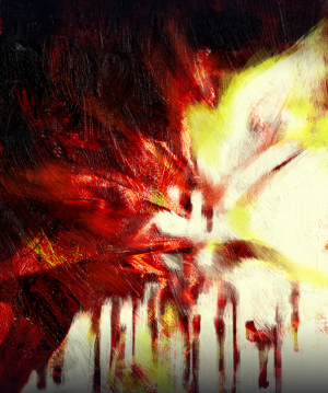
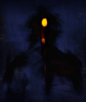
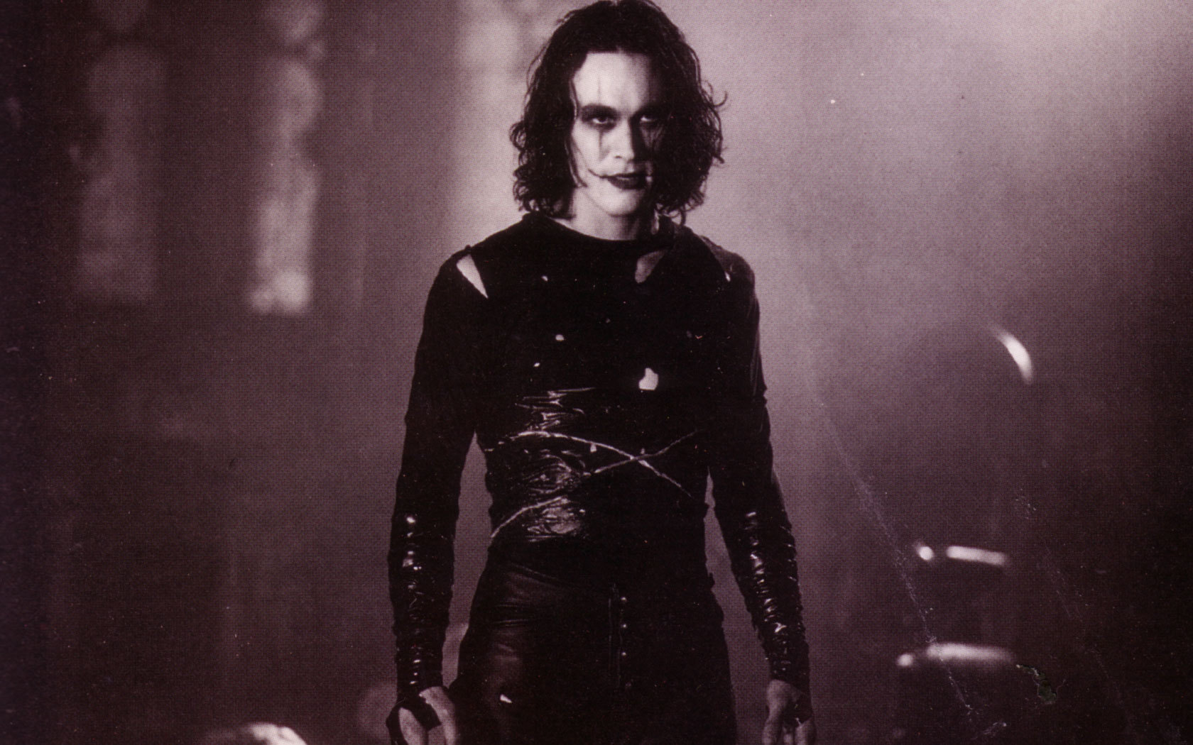
The game is inspired by DOOM and Ultrakill, they’re the main inspirations for aesthetic, gameplay and style in general. So all of us animation students pulled together our own moodboards so we could collate them later and see what we liked from each. Here’s mine.

It features images from DOOM, Ultrakill, and also old ‘sci-fi’ paintings that I thought matched our colour schemes pretty nicely.

I ended up making a quick style guide, and honestly it wasn’t very good, I wish I could’ve dedicated more time to fleshing it out, and also get more input from the other animation students. This is more of a hindsight thing. It’s also incomplete, it was forgotten during the process of production, and I didn’t have time to keep updating it with other assignments to do. I do think it helped us get an idea of what we were going for, but I definitely think having a more complete and in-depth style guide would’ve helped us.

Style Guide – Google Docs

I started concepting for D3, the protagonist. The ‘wow’ factor of our game was going to be the transforming gun model, which the modelling was being handled by a games design student. This ended up being not the most ideal arrangement, which again I’ll discuss later on. Below is the concept art I did for D3 and the gun. The concept colour schemes didn’t end up being used.

I wanted D3 to be sleek and feel like a new, advanced model. I used a lot of sharp, streamlined shapes and used dark metal to try and give that feeling of power. I took inspiration from things like Cyberpunk, because this is really far outside of my comfort zone.


I also concepted for props, but this was one of the only concepts that I finished and can find.

I also tested whether the gun idea would work, which initially it did. I had imported it into Unreal and it worked, but subsequent imports didn’t. After research I discovered that Unreal doesn’t like blendshapes that aren’t very very simple, which posed a problem because the gun was going to be pretty complex.

This was the animation on a test gun Brian modelled.

another with the arm animation together. I don’t think the arm animation ended up in the game, for some reason or another. It didn’t change beyond this animation test, I redid the blendshapes after rigging the arm, but it didn’t look any different, and it worked when I imported it into Unreal.

During this time, I was also modelling the arms. I first started in blender because I wanted to get more comfortable using the software, but I eventually changed back to Maya to save time and for retopology on some parts of the arm.

I also UV’s after doing retopo on some of the arm that was either too high poly or I thought needed cleaner topology.

Since the arm is so close to the camera, with the advice of Mate, we ended up using udims to get as high of quality textures as possible. I kept my uvs organised very specifically as well, they’re organised by the part of the arm.

After it became clear progressive blendshapes wouldn’t work, I ended up test rigging a gun using joints.

It worked in Unreal! It wasn’t much harder in the long run, so I ended up rigging the final gun this way too.

I ended up rigging the arm twice. I also learnt my lesson the hard way with skin weights.

My initial rig worked, but Josh wanted an extra set of joints at the knuckles so he could have better range of motion. This is an example of a task that was done because it was easier in engine, so I added the joints.

This was the old rig.

This was me testing out the first rig.

This was the first rig finished all together.

Then I redid the hand skin weights after adding the new joints, and it looked like:

I also made a short video displaying the rig as well. In game, the arms don’t really move, the melee is super quick and really the only thing the rig needed to do was move and close into a fist. I’d like the opportunity to play around more with complex rigging rather than the simple rig these arms needed.


I had initially combined the mesh at the direction of my lecturers, but this ended up being a pain. There were a lot of issues with the skin weights because of the amount of moving parts, I think in future I’m definitely only going to separate meshes for rigging if it’s a robotic character, especially if it’s complex.

Below are me figuring out skin weight issues. These specific issues aren’t problems in the final rig.

The finished rig had some skin weight issues, but because the game didn’t need anything dynamic, I chose to save the time and moved on to the other parts of the project, like rigging the gun. I’m going to revisit the rig later this summer to fix some of those issues.

There was a lot more mobility in the fingers after this, and while, yes, it was a struggle to get the skin weights working, especially on the fingers, I’m very happy with the result. I actually quite enjoyed rigging, my least favourite step is skin weights. I think it would be a lot more forgiving on an organic mesh, but because D3 is a robot, and therefore is supposed to be rigid, I had to be very precise.

The gun was done incorrectly at first modelling wise, which was flagged and me and Brian had a call where I went over what exactly needed to be added.

These are the gun transforms between each stage, Brian gave it to me for reference.

This video was me showing off the rig.

Here was the animation of the first stage.

Then this was of the 2nd stage, I believe.

This was to show what the smaller barrels would be like.

There wasn’t enough time prior to the playtest to fix the fact it wasn’t the correct gun so I rigged and animated what we had. It served as good practice for the final gun.

This is what the test gun looked like in engine.

Some playthrough footage of the gun in engine.

These were final versions of the transformations, there’s still small things that aren’t correct. I would’ve liked more things to play with on the model, but by this point there was a week before deadline and I needed to rig and animate the gun, plus leave some room for possible troubles. I decided to cut my losses and just get it finished. I had to wait a while for the gun to be done, so meeting the deadline was tight.

This is the gun textured, it deviates from the concepts, both the gun and arm textures do. I didn’t texture the gun, all textures were done by Mate, and they are beautiful!

This was a process image of my rig.

I did end up having problems, it seemed like a skin weights issue, but it wasn’t until I redid the skin weights in their entirety in a new file did the problem resolve.

I initially made the problem worse.

Then fixed it!

This video is showing off the final rig.

Again, a pretty simple rig, it is also scalable! As you can see in the outliner, I put it into a locator so it could scale correctly. I didn’t end up needing this feature because Josh could adjust the scale in Unreal, but I added it anyway.

Here’s the final animations shown in engine. These are stages 2-3

This video was a test of stage 5 but I ended up changing it.

These two were animations I did in case they wanted the cylinders to compress. I did two versions.

Animation For The Creative Industries – Assignment 2 (Final Animation & Reflection)

It is done!!

˖⁺‧₊˚♡˚₊‧⁺˖

REFLECTION

This project had it’s challenges, which could be attributed to the fact it was a lot of firsts for me. The first lip sync, the first acting animation, and the first animation I’ve done with two characters, especially interacting. I think my inexperience shows, and I still have issues with consistency. I think looking back, I could’ve added my dynamic movement, the girl, despite my effort, is still a bit static. I also know there are many messy parts within the animation, especially near the end. An example is the part where I didn’t erase the lines of Cardan’s tunic when his hand overlapped it. I intend to go back and colour it for my portfolio, so I’ll make changes at that point.

In general, I think this module went well, it pushed me to manage my time better, properly schedule time for my projects, and while I had a lot of issues, it was generally a very fun assignment that I think exemplifies my progress as an animator. My goal from here is to improve on the fundamentals like timing, squash and stretch, etc, and I also want to personally improve on volume consistency and cleaner lines.

Part of my struggle was definitely drawing outside of a style that I’m comfortable in. I haven’t practiced that skill much before, so I struggled a lot initially. It’s something I’d like to practice more in. While there are a lot of faults in my animation and references, my knowledge and understanding of animation and the 2D pipeline has expanded a lot this semester and I think it shows in the final work. I’m excited for future studying and improving even more at hand drawn 2D animation.