POSTER
I started with popular (mostly) horror posters that had strong design elements. I felt like Perfect Blue was a good fit as it is a psychological thriller. I also tried to find films with an eye-catching colour palette. Vampire films usually have posters that I don’t feel reflect our project.


I sketched based off of these ideas while keeping in mind the themes of the project.


After my first round of sketches, lecturers and peer feedback said the best concept was the 8th one. It had an interesting composition, visually good contrast and was eye-catching. I took 4 of the most popular ones and moved forward with developing them.

I finished two thumbnails before talking to Rachel and she agreed that the now 2nd one was the best. Henry suggested a bold, sans serif typeface because our genre is horror, he also said it would be even better if we could get something that looking handwritten.


I still wasn’t happy with the title, it felt too thin for what I wanted. Rachel said she didn’t think it looked handwritten, so I kept that in mind. Sarah and Rachel liked the pose and overall execution of the poster, though.
POSTER

I ended up adding a slight shadow after feedback that the poster felt flat. When asked if we should include our names like before, the general consensus was that it looked better without as the text at the bottom felt tacked on.
Business Cards.
I collected some pictures of business cards I own.


I wanted to have two business cards, one for the project and one that reflects me as an artist.


RoamingSonder is my online handle and has always been specifically for my art accounts. I’d like to continue using it since it gives me a unique identity online and a mode of promoting myself as an artist.


Rachel really liked this one and the text is more readable.
I tried an alternative project one first but decided I didn’t really like the direction.


I wanted Valerie to be on the card, and I think this is a nice sketch of her to work from.
I liked the idea of using red but I also tried purple because those are her colours and would look more cohesive with my other business card. I don’t think there’s enough contrast though.


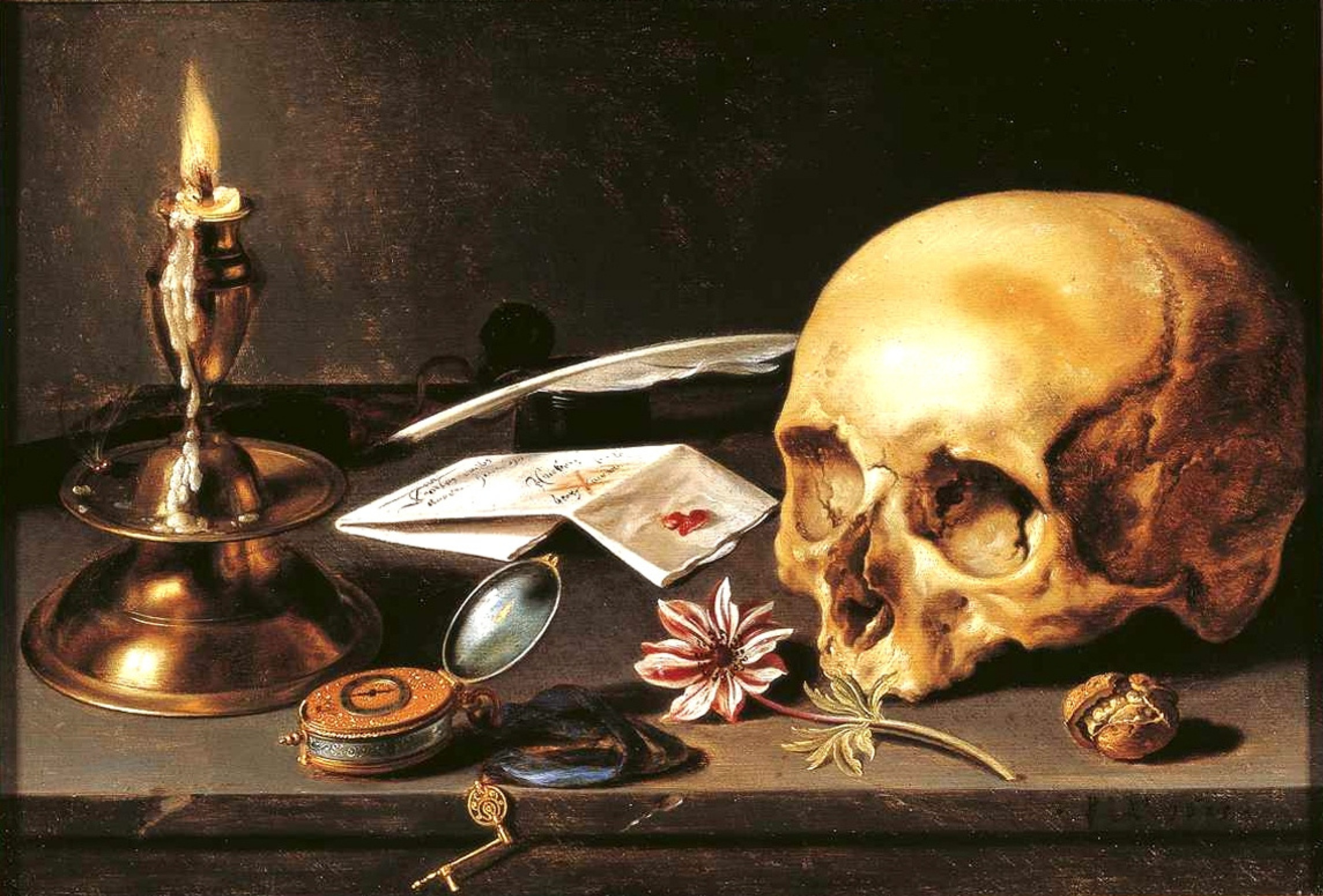
The background was inspired by the way I did the background in the vampire’s painting.

I used a rake brush to achieve that look! I liked the look of it and thought it would look interesting on a business card.


Henry said a QR code can look cleaner than all of the information listed out.
FINISHED CARDS


I want to go in to 2D animation, so I kept that in mind to demonstrate my illustrative skill and tried to carry that interest through the rest of my branding.
–
I had various issues with the business cards being printed. Despite following the advice of Digital Printing, they printed them wrong. When informed they very kindly redid the job, just for it to be wrong a second time. They used the fact that a 1 – 2 mm movement is to be expected in printing to excuse the mistake. The problem is that they repeated mistakes on various cards in the latest batch that they previously admitted was their fault. I completely understand the possibility of moving, but it is frustrating. Some cards being less accurate than others is to be expected, but I’ve chosen to just cut some of the cards myself to salvage them.

The backs of the red cards look lopsided despite being correct in the illustrator file, which is an example of their mistakes with trimming. It’s unfortunately too late to get the cards redone, alongside having to pay for table decorations. 

Art prints
I thought it would be an interesting addition to our table if we turned two of the paintings into art prints.


Rachel also suggested maybe higher quality prints with gold foil as two of the prints have gold parts. I really liked this idea but from the website Rachel recommended, it would be about £20 for each print. She also suggested maybe having a QR code on the back for people to scan to see the film. It was a bit more expensive and we decided it was a little unnecessary as most people who take art prints hang them on walls or something of the sort, which defeats the purpose of the QR code.

We ended up deciding against it and ordered standard prints, which were far more cost effective.
Table design
Sarah thought it would be funny to have feathers scattered on the table as a reference to the poor birds Valerie feeds on. I think that’s hilarious but we probably won’t end up doing that.
I sketched up some table ideas.

I think our table cloth will be black, and I would like to have gold frames for the prints to theme them a little.
I also made acrylic stands for the table.


ART BOOK
Will worked on the art book as I handled the poster. I was also very busy with comp at the time of wrapping up the art book, so Will could work on it far easier than me. I did some text edits and looked over it, but didn’t contribute outside of providing images.
(insert link)
CV

My old CV is cluttered. The font sizes are all over the place and I think it’s not very well thought out. At that point, I didn’t have any experience and was confident enough to do 3D professionally. I haven’t practiced 3D in about two years and I would like to specialise in 2D animation.

I stuck with using purple, and tidied everything up a little bit. Looking at examples posted to Blackboard, I really liked cvs that had a little headshot or drawing of the person. It adds more character and I think as artists it’s a nice touch. I redid my experience as well to be art focused and highlighted my work in the 2D pipeline to. I want to communicate that I’m a flexible artist.
ONLINE BRANDING
Website
I previously did a website for Professional Practice module in second year. Revisiting it, I’m unhappy with the presentation of it, so I’ve set to work redesigning it.
I looked at a few artist websites to get an idea of how a professional 2D animator lays out their portfolio. I was mostly looking for navigational ease and the separation of work as those were the two big things I felt like my website lacked.
kelanhordos | Instagram | Linktree
These websites are quite minimal for the most part, but effective and communicate to the viewer what is necessary to know. Lemoncholy’s is one of the more in depth ones, but I think it works because it helps layout her skills more clearly.

The biggest issue was difficulty navigating, there were way too many pages to click through. I’ve reorganised it so that the home page has buttons that lead to different areas of the website much more succinctly. There’s a main menu along the top as well for quick access from the different pages. I also didn’t like that it started on an about me page. I changed it out for a home page with bigger buttons for easier naviagation.

I also added a dedicated place for an about me page. I think it’s far more important to set my work forward first rather than about me as an artist. It also allowed me to expand a little on myself as well by having room. I combined the CV and About Me sections for convenience. I also removed my 3D models as I felt they didn’t reflect my work anymore.
Overall, I think the layout flows far better and is easier for an employer to navigate. You can see my work in very few clicks and it’s structured far clearer. I also think my work looks better.
I made a new profile pic to go on my social media.

I updated my Carrd by reorganising menus. This is for people finding my socials to navigate to my website. I chose to have the QR code on my business cards lead straight to my website for people to view the professional portfolio. My instagram is to promote my work, especially 2D animation and character work.
I created LinkedIn as a way to engage with other creative professionals and network. I plan to post my animations on there as well.


I have a professional Youtube account for me to post my animations to, I updated it with my new profile picture. Youtube’s public platform makes it accessible to find my work.
Showreel
I looked at others’ showreels to get a sense of how to layout the showreel. Especially the beginning and end screens.
I didn’t get time to finish an animation I wanted to have in the opening. I’d like to finish it after.

My previous showreel isn’t bad, but it doesn’t have consistent branding and includes a lot of work I’m not proud of. It also has 3D in it, which is no longer relevant to my career path.
I think this showreel looks much more professional, even if there’s still some 2D work I’d like to replace eventually.
Overall, I think this module went quite well! I think I managed to balance the work for the project and myself as an artist. I wanted to focus more on 2D animation, and my placement employment has offered freelance opportunities to me post-graduation. I’d have liked to spend more time iterating on designs, but my focus was on major project. I also feel like I should’ve pushed more to get feedback, but despite that I’m happy with my work this year.