Week 3:
The pitch went alright, but we were told to rethink our narrative as it was a little cliché.
The story went through a lot of iteration. We discussed with multiple lecturers about how to improve it, and were constantly seeking feedback. Aodhan suggested maybe a ‘sold her soul’ sort of idea where the vampirism is a metaphor through making Valerie a starving musician type. That was intriguing and we built out an alternative story, but after plotting it out it wasn’t working the way we’d hoped. It would’ve had a lot of emphasis on sound, which we don’t have the capabilities to accomplish to the standard we’d like. Any horror short will be reliant on sound to a degree, but having a short centred around music felt a little counter-productive. We don’t have the funds to commission music, and relying on royalty free music would limit our freedom quite a bit. The story itself was ok and seemed achievable in the time frame, but it was pulling away from what we wanted to do, and the above issue further reinforced it wasn’t the direction we wanted to go.
Ultimately we decided on a different route where the protagonist is a struggling artist. We wanted our main themes to center around obsession and desperation, and her desperation leads her to an art exhibition where she has an unfortunate encounter. After she awakes, she’s changed, and terrified of what she’s becoming. She makes the decision to retreat into bad habits. Valerie isolates herself and spirals, focusing on her artwork instead. The situation escalates as she grows hungrier, unable to satiate her appetite on animals, and she descends further into obsession and denial. This isolation eventually ends in tragedy when her best friend visits her and she attacks her. The ending still needs a bit of workshopping. We want it to end with Valerie leaving, resigned to her life as a vampire and carrying the grief of her actions with her. That is part of the reason the short is called The Night Valerie Went Missing.
We gave the basic script over to Sarah, who gave us some great critique about structure and theming. Sarah and Rachel both think the flashbacks and non-linear narrative work, but we also received feedback that it wasn’t working. This conflicting advice was a little confusing, but after posing the question to peers, they think it could work depending on execution. Also, we would have the scenes anyway, so we could always re-edit the structure to be linear if it was decided it worked better told chronologically.
Will began to storyboard the short after we talked through Sarah’s critiques.
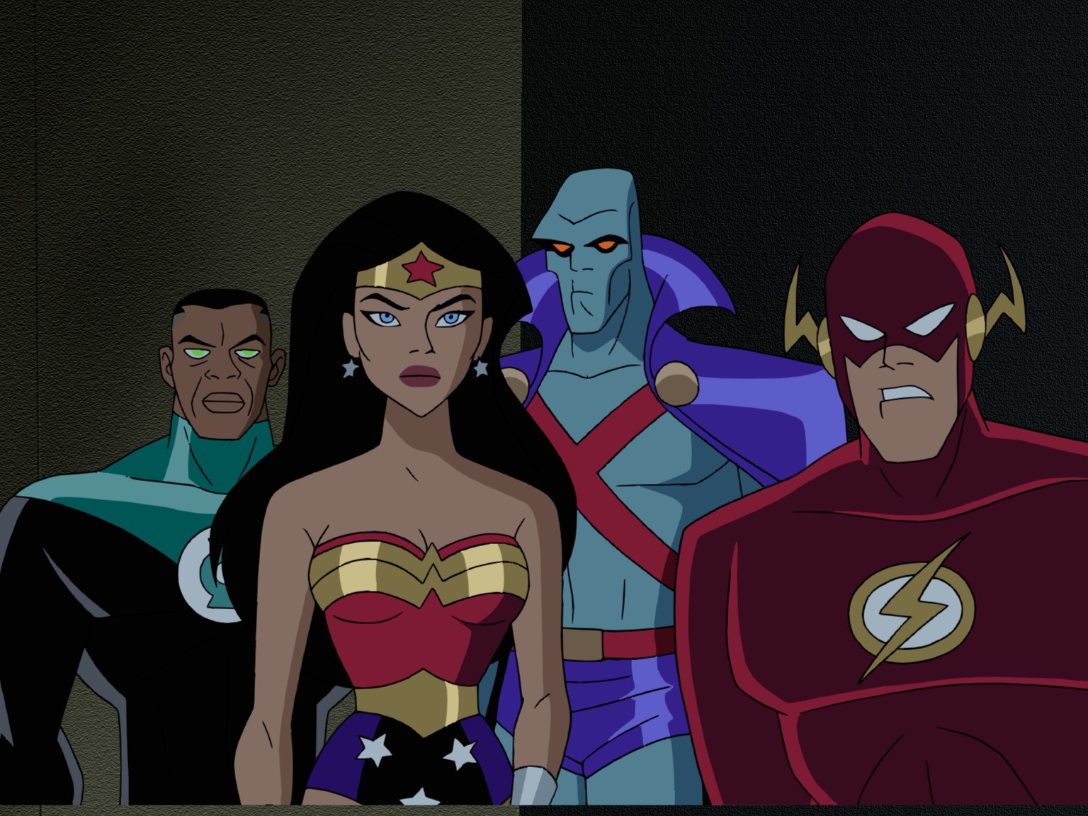
The biggest criticism was that the art style was a little too close to ‘saturday morning cartoon’. Mike suggested to look at the DC Animated Universe as a reference.
I began with collecting references from Batman Beyond and other DC animated works.


Batman Beyond (1999)


Batman Beyond: Return Of The Joker (2000)
These were a good starting point for us to work from, but continued looking just to see if there was another style we could take inspiration from. Will suggested looking at Batman the Animated Series, but I felt like that was too cartoonish. Bruce Timm’s art also had the same issue of drawing one type of woman, and I found there wasn’t as much variation in designs between women in general.

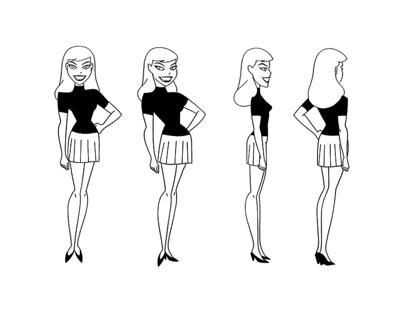
Despite this, I really liked the strong shape language. It was something I wanted to keep in mind as I explored defining the style.
Due to the lack of diverse body types in women, I felt like trying to apply these styles as closely as we were was beginning to limit us. This led me to collating all the examples and inspiration into one file and sketching using them as a loose reference.
Keeping in mind angularity, I tried to be a lot more free when sketching for Valerie and Meredith, trying to picture their personalities and the type of character I wanted to portray.

As pictured, I started with a style breakdown, and then decided it wasn’t really working the way I hoped.
Valerie – I wanted her to be a lot more angular than Meredith, and I also started to play around with what she would look like in her ‘starved’ form. I kept her short hair from the original design because I thought it gave her that alternative look we wanted. I drew her in a slightly more formal dress because she attends the art exhibition. I don’t think I was particularly ambitious with these designs due to the fact we have to hand animate them. I would’ve liked to push the designs further, but considering the scope of the project, I’d like to reserve the more challenging aspects of the character for scant few shots.
Meredith – I still wanted her to have an alternative edge to her, hence the piercings (which may be removed). I think it offers her some personality, but I do acknowledge that it makes her harder to animate. I wanted her to feel opposite to Valerie, who is supposed to seem gloomy in comparison. She’s softer, has an emphasis on curves and is supposed to have a sort of youthful joy to her, which is why I concepted her with the twin buns.
Week 4:
After getting the OK from Rachel about the style, me and Will looked into finalising character designs and boarding. I’m mostly just trying to finish up pre-production and work with Will on the boards.

I sketched hairstyles for Meredith on the 15th of October in an effort to push Meredith’s character design towards being finalised. People agreed that 1, 2 and 4 were the best for her. After further discussion with lecturers, Will, and my peers, we felt that 1 made Meredith seem youthful and fun, space buns being a very informal and cute hairstyle.

These were sketches for Valerie’s design. Because we’d previously explored outfits in the old style, I did slightly less the time keeping in mind what we liked from the old design. This is what I came up with.

Valerie colour designs! I wanted her to feel alternative and feed a little into the horror genre with a dark monochromatic palette. She’s a struggling, alternative artist who is a little naive and prone to losing herself in her artwork. I drew upon popular gothic fashion for the one on the end, the other two were still taking from the subculture, but in a more subdued way due to the formal nature of an art gallery. I did an earlier version with her in heels, but removed them because Valerie feels a little more practical than that.
I also did Valerie’s end design, which is a more casual outfit.

Designing A Monster
To start charting Valerie’s downward descent, I collected references from vampire media to start looking at what makes a vampire scary.

Some things of note are unnatural eyes, almost every iteration of a vampire has an unnatural element to their eyes that marks them as non-human. 30 Days of Night makes them quite shark-like, while Salem’s Lot has them glow. Castlevania takes the red sclera approach, and I really enjoy that interpretation. It’s very unsettling to me, and I think it could be quite fun visually to use.
I want Valerie to appear more monstrous than most popular examples of vampires, so I also sought out Ikumi Nakamura’s artwork to take inspiration from.

The Art of The Evil Within (2014)
Ikumi Nakamura was the lead concept artist for The Evil Within (2014) and its sequel The Evil Within 2 (2017). She specialises in horror artwork, and the monsters she creates are incredibly unique and horrifying to look at.


I wanted to take inspiration from the elongated limbs. The way they twist looks very unnatural, and I’d like in our project for Valerie to almost seem skeletal.

I started with some exploratory sketches going off of the one I’d made a few weeks ago when I was first working out the style. Then I tried to push the proportions.

This is Valerie’s progression so far. I didn’t want to push her anatomy too much because she has to return to her more normal self after killing Meredith. I didn’t want the audience to feel like it was too drastic. Rachel thinks we could maybe push it more, but she believes this is the right direction. I’m going to keep that in mind, but we agreed that the priority should be finishing up other things as we have a design that works. If we get time later in the project, we could perhaps revisit this design to push it further. I don’t want to make her too difficult to animate though, so I’ll need to consider that in future.
I also helped Will with thumbnailing for storyboards. This scene is when Meredith comes to check in on Valerie because we weren’t sure how Meredith discovering Valerie should work.


I did an alternative scene below, which is the one we went with. The feedback from lecturers indicated that the following scene was creepier and more suspenseful. 
I actually took inspiration from a scene in The Fall of The House of Usher, an adaptation on Netflix of Edgar Allen Poe’s story. There’s a scene where a spirit stands behind a character for an extended period of time. The kicker, though, is you don’t really notice her until she moves. She’s out of focus and darkened, she looks like just a part of the already shadowed background. I really liked the principle of it. We do a similar thing earlier in the short as well which is closer to the inspiration in execution.
The following thumbnails are the start of the ending where Valerie kills her friend. 

This scene was after Valerie comes back to herself. I want there to be an extended scene with screaming.