Week 1:
After discussing with Will, we’ve agreed we wanted to do a Gothic Final Year Film – Miro
Our vampire short had two ideas. Will has experience animating action shorts, and had floated the idea of setting our project in a church with a vampire hunter who gets attacked cleaning out a nest of vampires.
The other idea was a vampire’s first night being turned. This was inspired by my character in Vampire The Masquerade, and I wanted to explore the transformative aspect of vampirism.
We tried to look at media with similar themes, I started with The Crow as it was the movie which inspired me visually.
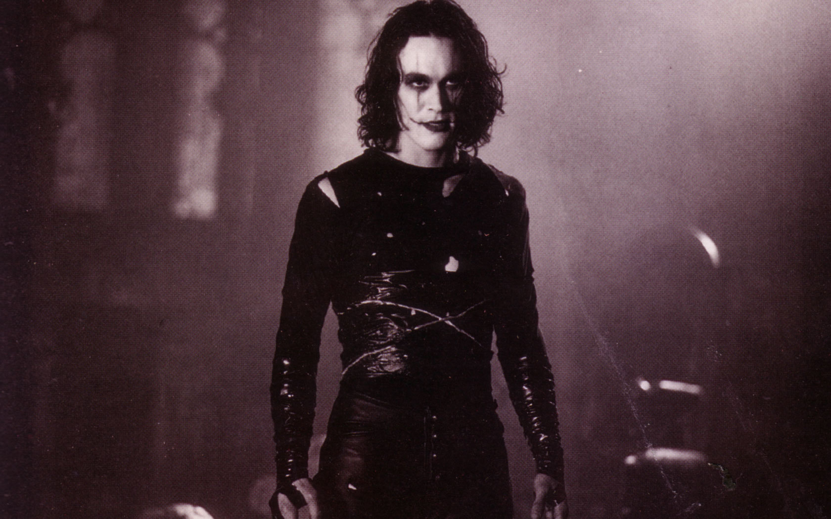
The Crow (1994)
The Crow became a cult classic, especially within the goth subculture. The movie follows Eric Draven being brought back to life to avenge his and his fiance’s deaths at the hands of a local gang. I adore the aesthetics of this movie, but I’ve also found the character arc that Eric goes through quite interesting. He seems to have been driven mad by the memories of what happened to him and Shelly, so for a lot of the movie he is unhinged, which is enhanced by the scenes where it shows he can’t die. The transformative aspect of his character is a good inspiration for us, but I think I’ll need to explore something more horror based for Valerie’s transformation into a vampire.

The Crow (1994)
Lighting is stark, characters are often cloaked in shadow. Most scenes in The Crow have shadows that are deep black. We have chosen to interpret this as black shadows in our film, because we feel like it fits with our genre. Muted colours give the film a dark and moody feeling, which is something we will also explore.


Jennifer’s Body (2010)
Another movie that inspired me in particular was Jennifer’s Body. Jennifer becomes possessed by a succubus and starts to pick off the boys in her school. This is a horror comedy, so not entirely fitting for our project, however the horror elements are executed very well. I love the use of colour in this movie in particular, all scenes with Jennifer in her more demonic state are all very dark, with a grainy feeling. Again, most colours are muted, which communicates the tone really effectively. It also helps the red to stand out in a really striking way.
I don’t think the handling of Jennifer’s escalation is something we will reference, as I said this is a horror comedy, so a lot of it isn’t played with the sort of seriousness we’d like for our film.

Tokyo Ghoul (2014)
Tokyo Ghoul follows Kaneki Ken after his transformation into a ghoul, human-eating monsters who have special powers. Of particular interest is the first couple of episodes where Kaneki transforms into a ghoul and realises what has happened to him. He experiences extreme panic when he keeps throwing up food he tries to eat, because ghouls can only consume humans. I think it would be interesting to convey this sense of panic and intercut that with the memories of her being bit!

Stylistically, we wanted to look at Hellboy, but after some research and discussion, we decided it was likely too difficult to animate consistently in for the time we have for this project. Instead, we looked at Sean Galloway’s art style for the short because it’s a nice balance between cartoon and still having realistic proportions. Sean Galloway worked on the Hellboy animated movies, which we thought showed some flexibility in the art style.


Fuelled (2021)
I also had a look at Fuelled to get some inspirations for the flashbacks, where the use in colour indicates tone and also enforces the fact that this isn’t a current event. There’s also a few times an audio cue is used to denote a flashback. I think the use in colour will greatly help our project, and also it’s a clear way to make the events of the film easy to understand. I also love the idea of playing with colour to influence the tone.
After all of this, we put together a brief outline of the narrative and Will wrote the script.

Week 2:
I spent time designing Valerie and Meredith. I had some issue as Sean Galloway doesn’t draw plus size women, so I had to extrapolate his style.

This was initial sketching to try to nail down the style. I did breakdowns, as can be observed in the right hand corner, and then used what I’d learned to make a first sketch. I think this was really successful!


This was all design work I did for Valerie, she seemed the most important to sort out as she is our protagonist.
I also worked on Meredith, which ended up being a struggle because of the aforementioned issue with a lack of plus size reference.

I still don’t think she’s quite right, but we’re going to present this in the pitch.