
Pioneers of Postmodern Graphic Design
We were given the task to create a group presentation based on one of many areas. Our group, known as ‘UX’, decided it would be best to look at the Pioneers of Postmodern Graphic Design as no other groups were doing this topic and it also seemed to be the most visually exciting. After careful consideration, we had decided to each look into one pioneer each and research a bit about their background, style, techniques and show examples of their work. I chose to research Jamie Reid.
Other artists that were chosen for our presentation were Barbara Kruger, Rosmarie Tissi and April Greiman.
Before beginning this, I did want to investigate postmodernism as a whole before looking at it in terms of graphic design and the main influences of this movement as we had not yet covered this in any of our lectures.
Some of my research is as follows:
Postmodernism
- The Tate Museum defines postmodernism as: A reaction against the ideas and values of modernism. The period that followed modernism’s dominance in cultural theory and practise in the early and middle decades of the 20th century. It is associated with scepticism, irony and philosophical critiques of universal truths and objective reality.
- By the late 1960s, many believed the modern era was drawing to a close in art, design and politics and many people believed that the modern aesthetic was no longer relevant in an emerging industrial society
- In design, postmodern is applied to the work of designers in the last quarter of the 20th century who broke the international style so prevalent since the Bauhaus.
- People in many fields have embraced the term postmodernism as it is a term used to express a climate of cultural change.
Jamie Reid
A graphic designer born in 1947 living through the risk of the punk and anarchy movements – inspiring a lot of his work in the 70s.
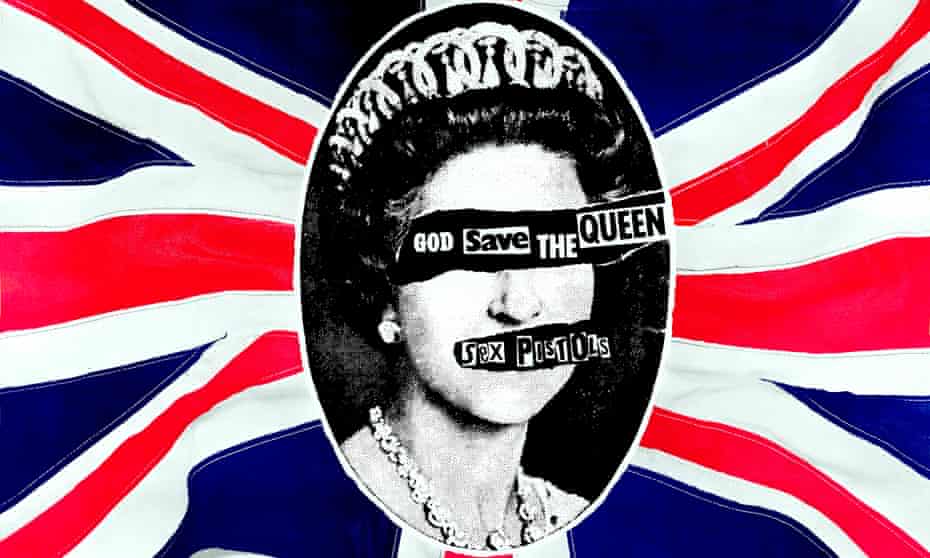
He worked alongside punk bands, for example, The Sex Pistols – where he created the artwork for their single “God Save The Queen”.
- The Queen’s eyes and mouth are ripped away in this piece to expose the title. This title can be seen as a ‘strange’ typeface as it is a mix of fonts ripped out of newspaper headlines.
- The ripping away of the eyes and mouth can symbolise how the anarchy should be abolished or that the Queen is covering her own eyes so as not to look at society’s mess that has been created.
Main Influences: were politics and music, Dada artists who used collage and photomontage to create anti-war images
Style and Technique: very much 1970s contemporary work.
- Photocopying, layering, lurid colours, torn up edges, collage, use of random and cut out lettering.
- Overprinting, adding objects such as safety pins, cluttering pages
- Shocking and juxtaposed images often deliberately offensive
The birth of the punk or DIY aesthetic created a revolution in the world of modern design, leading to public style becoming an important feature of the postmodern movement.
The Next Step
We then had to come together as a group to discuss what other information alongside the 4 pioneers that we wanted to include in our presentation. We came together on a group Microsoft teams call around 3 or 4 times during this period to put together our presentation. I had set up a google slides document which meant we could all work on it together on our own devices. We decided on including definitions of what postmodernism is and what it means in terms of graphic design and adding a ‘We are going to…’ slide to start the presentation off. Next, I had designed the title page to fit into the theme of postmodernism, and it was actually inspired by Jamie Reid for this as lots of his worked involved cutting out letters from a newspaper, so I took an example of lots of newspaper letters and cut them out individually on Figma to create a full title for our presentation. Later we added some pops of colour that matched the theme throughout the presentation so the title had a little bit of life!
Next, we are going to practice our presentation by running it through a few times and timing it to ensure we reach the 10-minute mark and not exceed it either. If any changes need to be made to suit this, then that should happen before we present.

After practicing with our group a few times, this gave us an overall idea of how long our presentation would last and we were able to make a few changes to the slides to fit the 10 minute time frame.
Critique
I think presenting our slides went very well and we received some feedback from Kyle and our peers on what went well and how we could have improved. Some of the feedback included:
- The overall theme and layout of the presentation worked well and was consistent with the theme of the Postmodern Movement allowing it to flow nicely.
- Lots of visuals such as imagery, shapes and titles which worked well. Not a huge amount of writing or information on the slides which kept everyone interested.
- We could have learned the information better as a whole group which would have allowed the information to flow best instead of having to reference notes at times – although overall it was mentioned that we spoke about relevant information and it wasn’t an overload or ‘boring’.
I feel as though we worked really well in a team and had to same drive to do well which definitely motivated us to come together as a group, discuss how things were going and get everything organised early on. I found the video calls to be very useful especially as we could do them in spare time throughout the day as we were at home.
I have also included some screenshots of the presentation and a link to view it.
https://docs.google.com/presentation/d/1DwF-tixcQvIbjyXOygseJ6Yhnlfk8XgBw6czBPytesw/edit?usp=sharing


