Now that I had decided I wanted to go with the Netflix Hive idea, it too a lot of steps and experimentation to figure out the aspects that worked and the things that didn’t.
Wireframes are quick, efficient in conveying an idea or seeing if it will work and not much time or money is lost if it doesn’t. It is used as a problem solving technique.
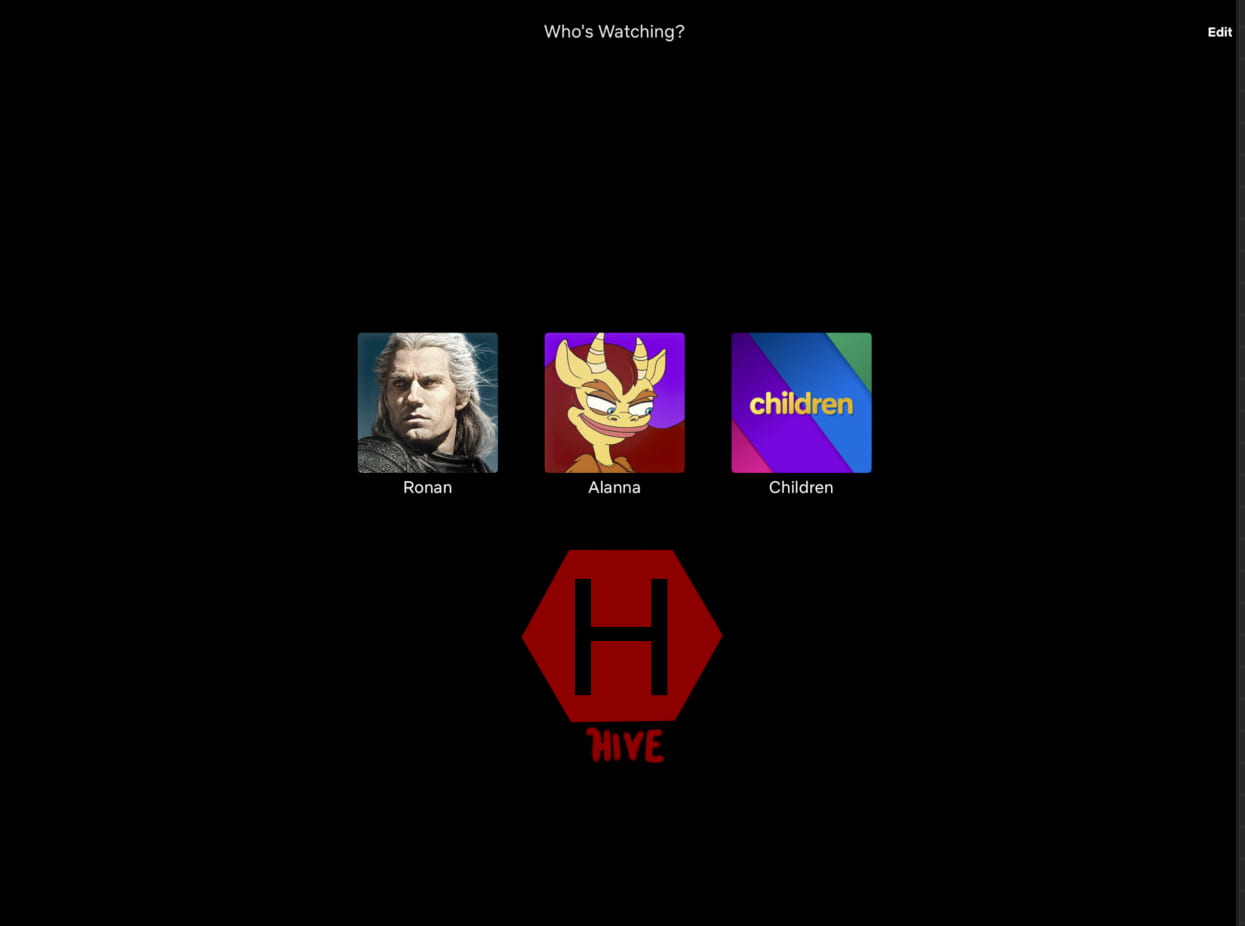
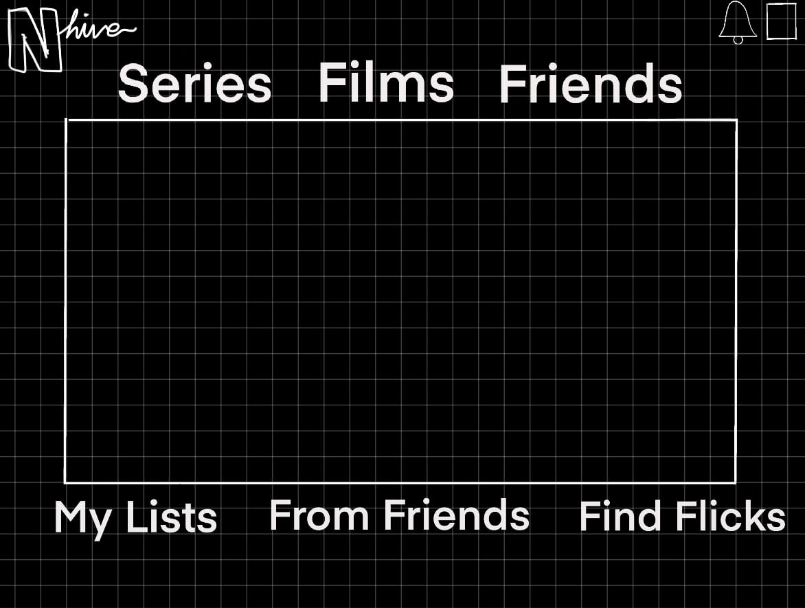
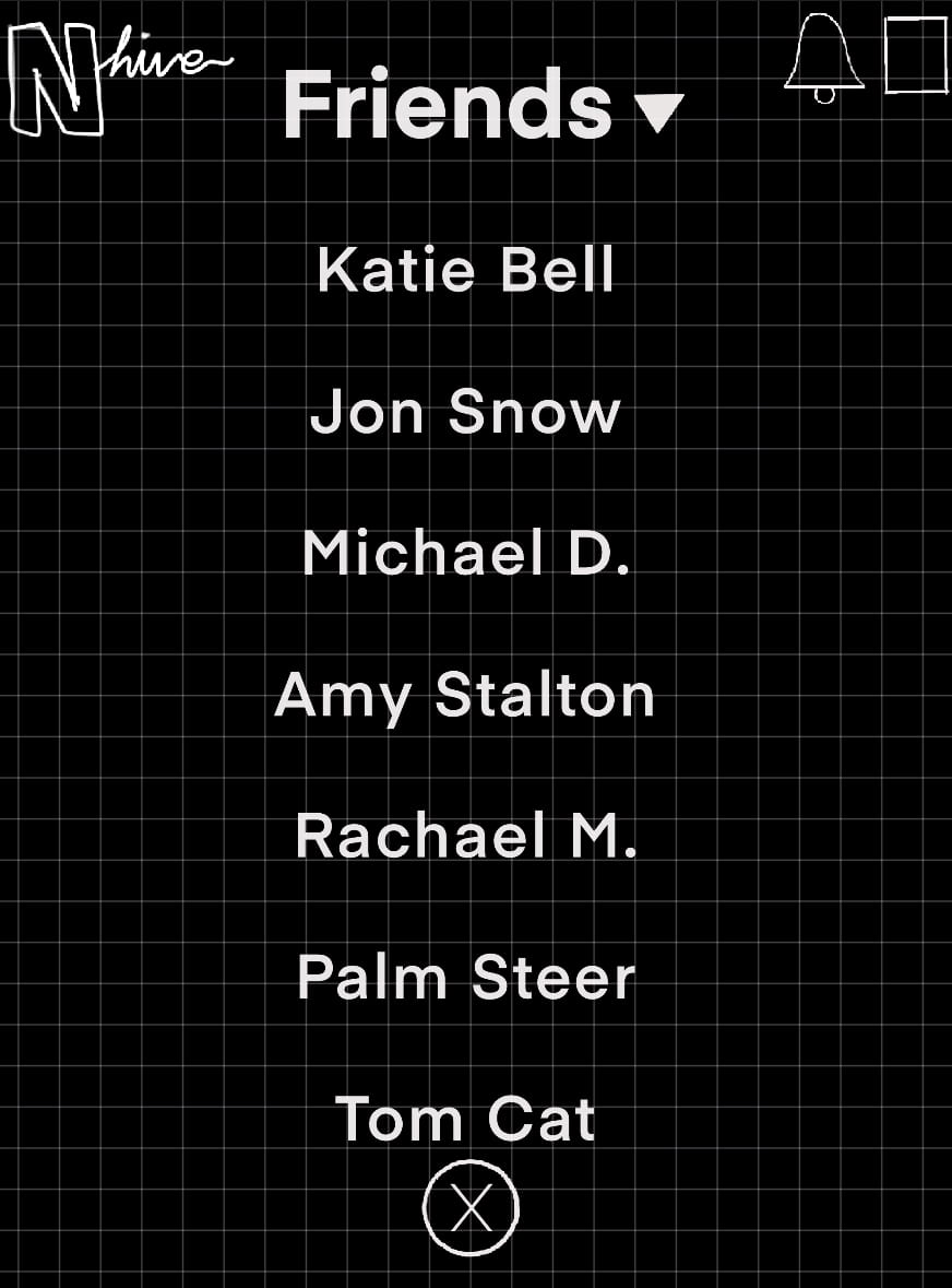
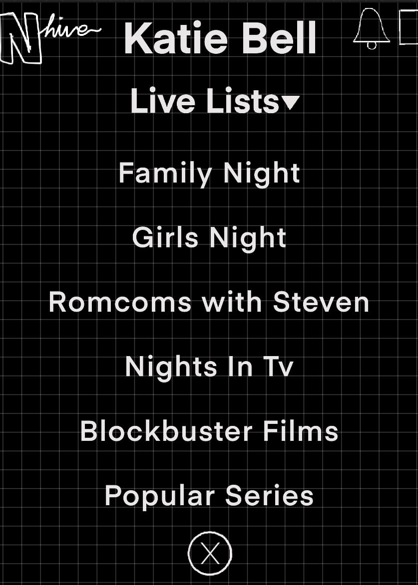
My first wireframe I created was a little busy with the amount of things presented on search screen. It started with the Hive area being accessed from the starting screen where you pick which profile you’re watching on. I had lists in a side scrolling layout just like it is on regular Netflix, only instead of it being titles laid out in rectangles, I created hexagons.

I felt that this design was too populated with text and icons and although I liked the layout of some of the screens, I didn’t feel the flow of the service was there. I started brainstorming how to simplify each screen and incorporate less buttons or options and add more hexagon style lists to make the Hive theme more evident.
Once I had figured out the layout I wanted to go with I made some simple wireframes to get an idea of what each screen would look like, where things would go, spacing and eventually it will help me flesh out each screen.
I initially created some paper wireframes lay out in order with the user flow in mind.

I then create digital wireframes on Procreate to get a more refined version.
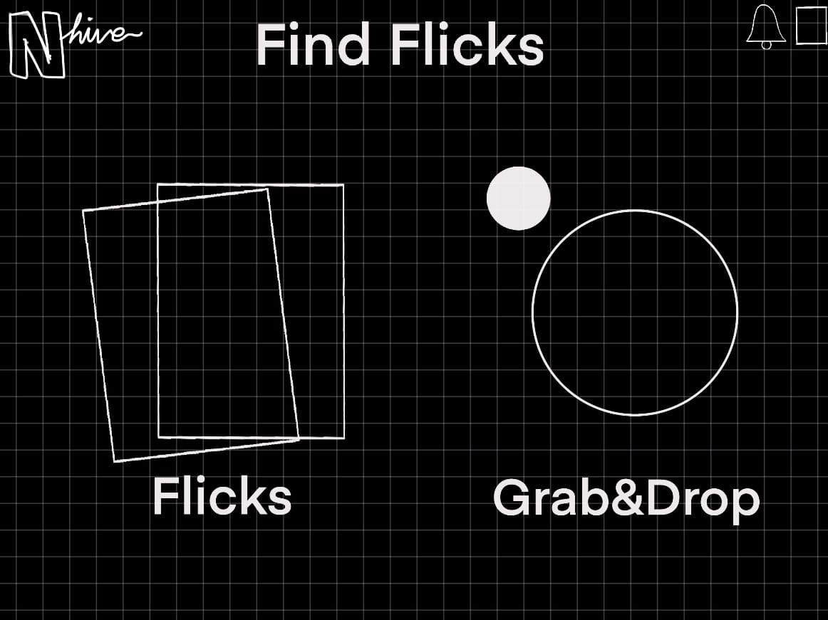
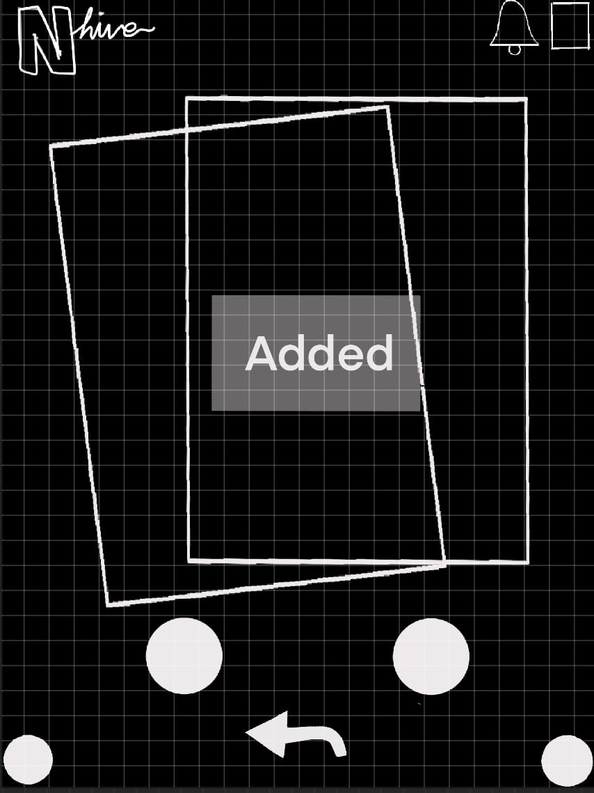
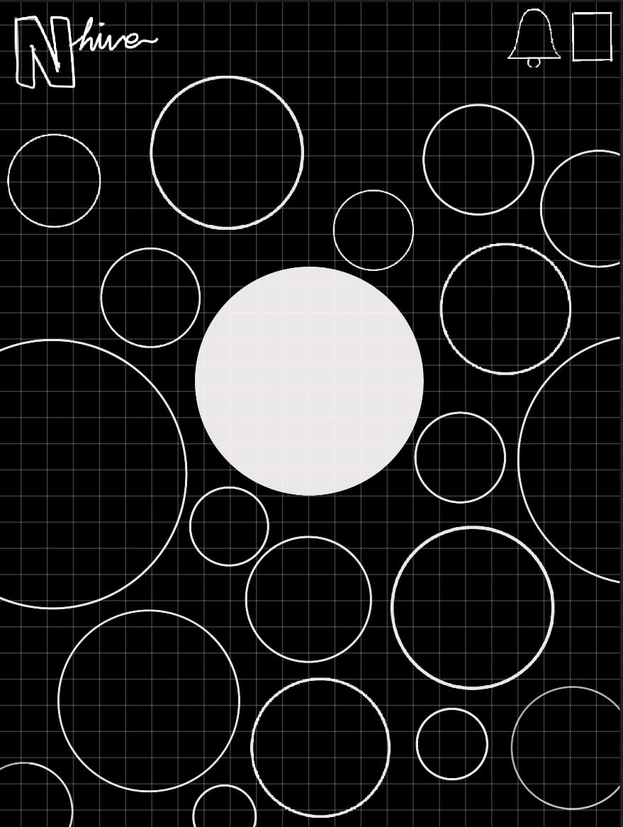

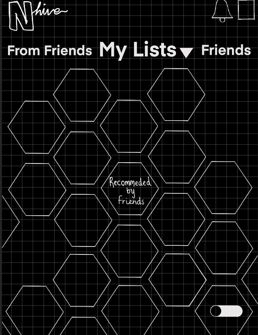
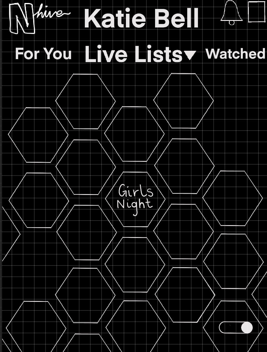
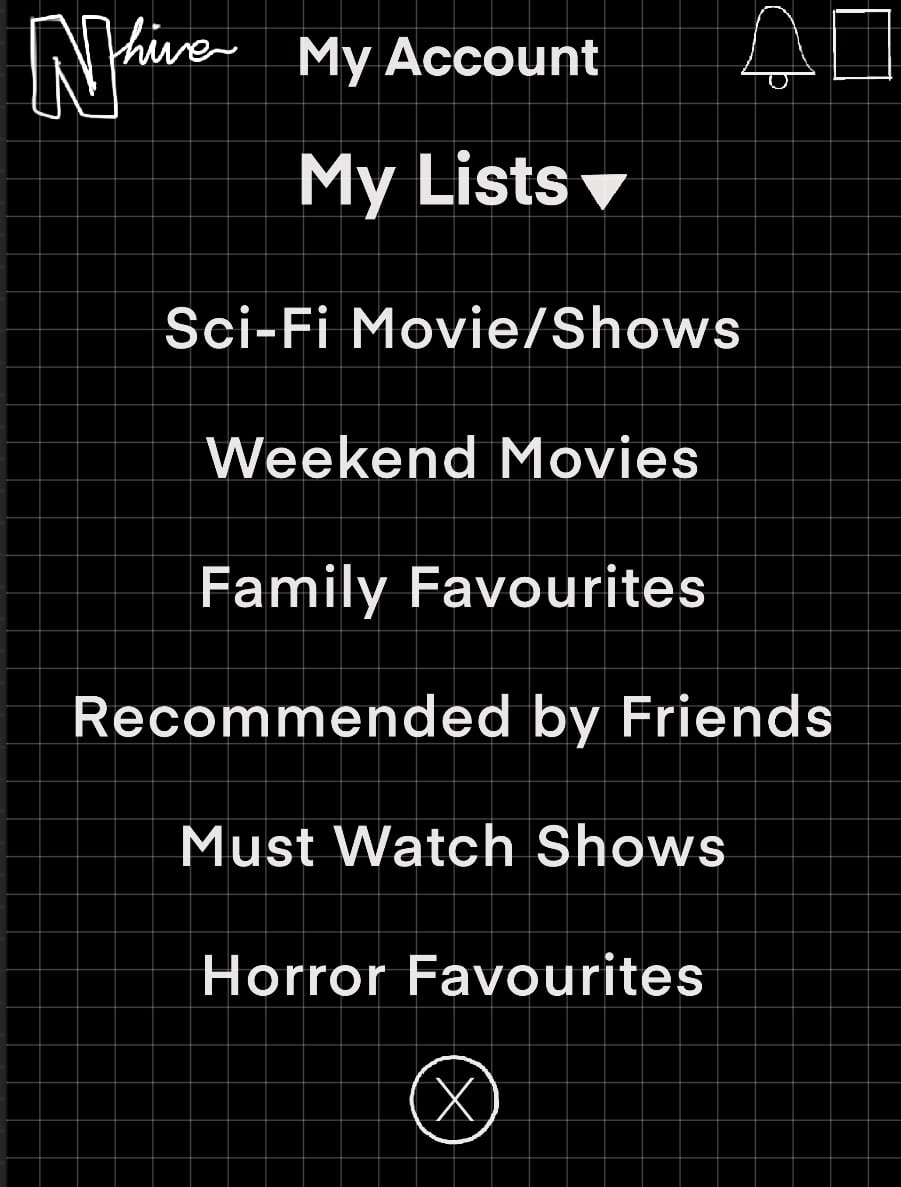
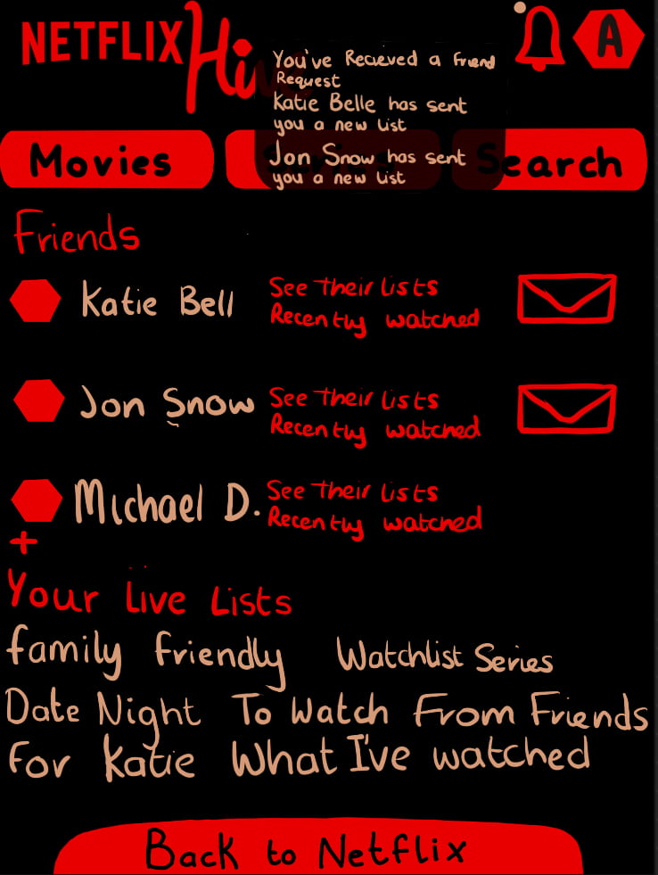
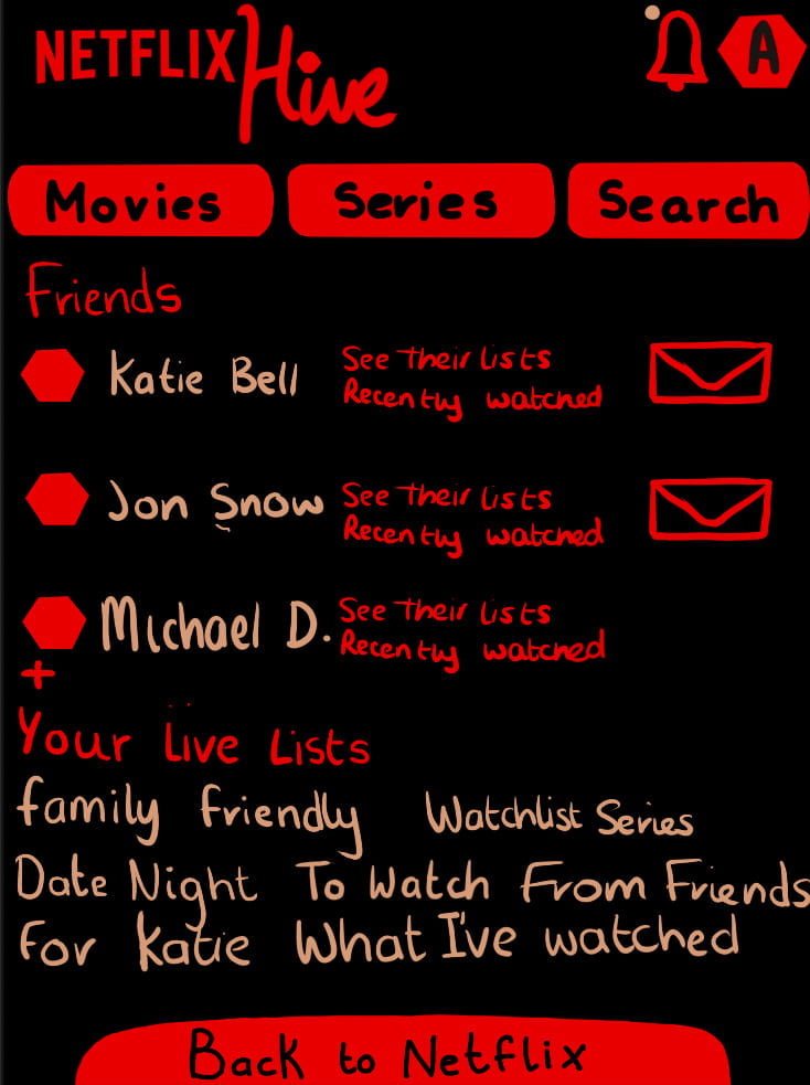
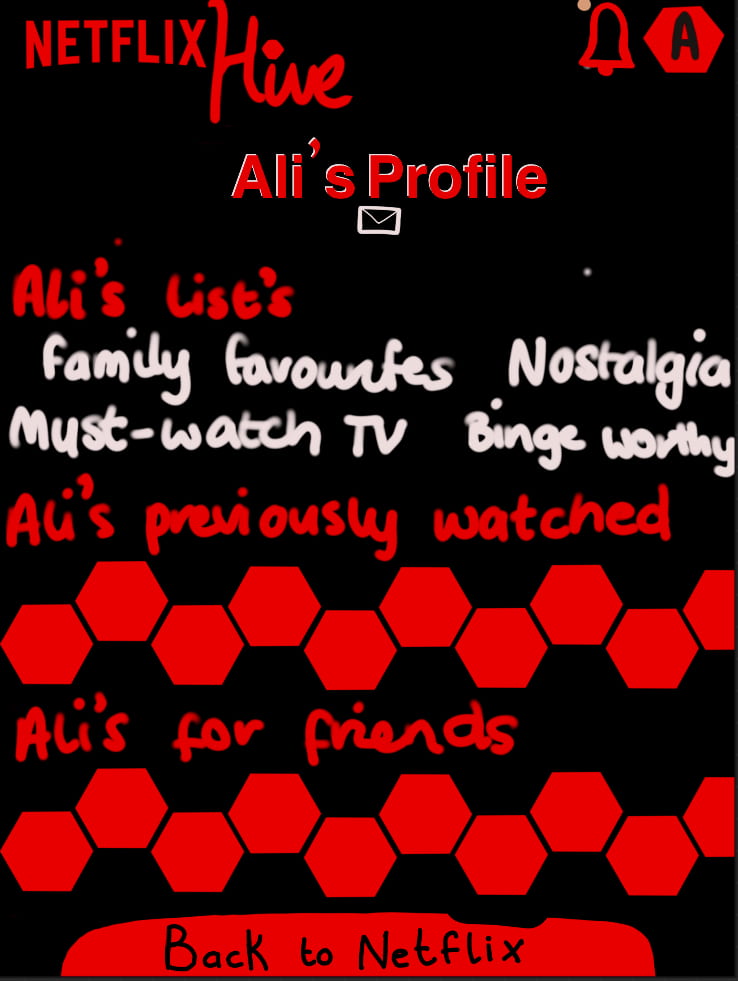
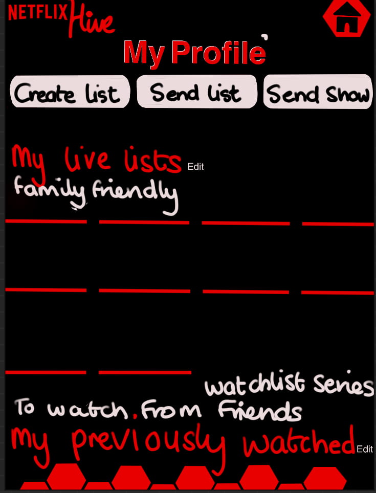
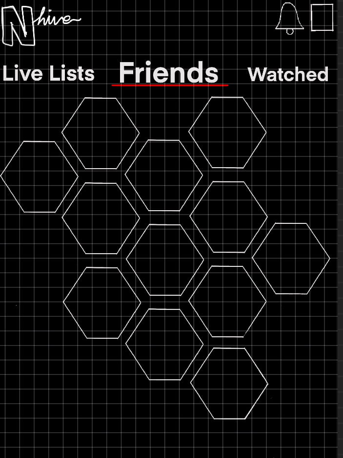
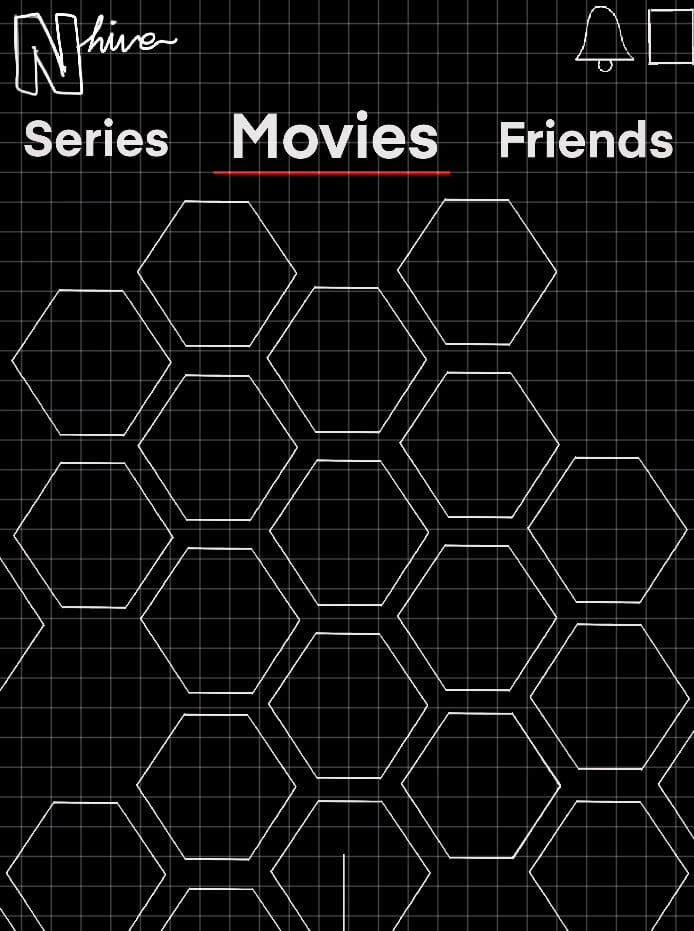
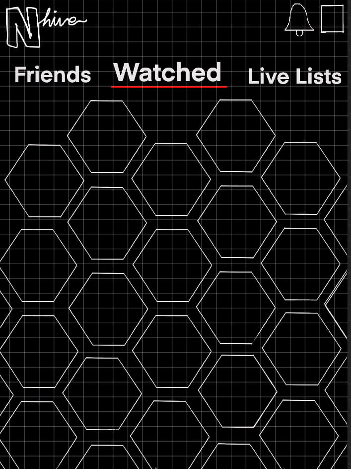
After a class discussion, I realised instead of making many different list options and drop menus, I could instead just create one mass list that could be zoomed out to reveal a huge accumulation of hexagons. In the same way, rather than just showing friends as a list of names, it would also be a collection of hexagons.
My next problem to solve was where to put titles sent by friends without having many different lists and I decided that on your live list you would have the option to toggle on/off a colour coded system where each friend is given a designated colour. This will overlay on top of the hexagon, and if more than one friend has recommended a title, the colours will cycle through over that hexagon.

User Flow Diagram

I felt that my screens where now simplified enough to have all the information and options needed and just needed to start building on my ideas and create the mockups for a more realistic and aesthetic view and to see if I could get Hive to match the Netflix layout.
Hive Icon
Up until this point, I had created my wireframes and draw ups on software I had experience using before, called ProCreate, but as for the next stages I wanted to use Adobe programmes such as Illustrator and PhotoShop.
The biggest obstacle I faced during this project so far was learning how to use these programmes and getting used to creating things with them. However, I knew this would be very beneficial for my future progression onto a degree to familiarise myself Adobe licenses and created my Hive icon using Illustrator. 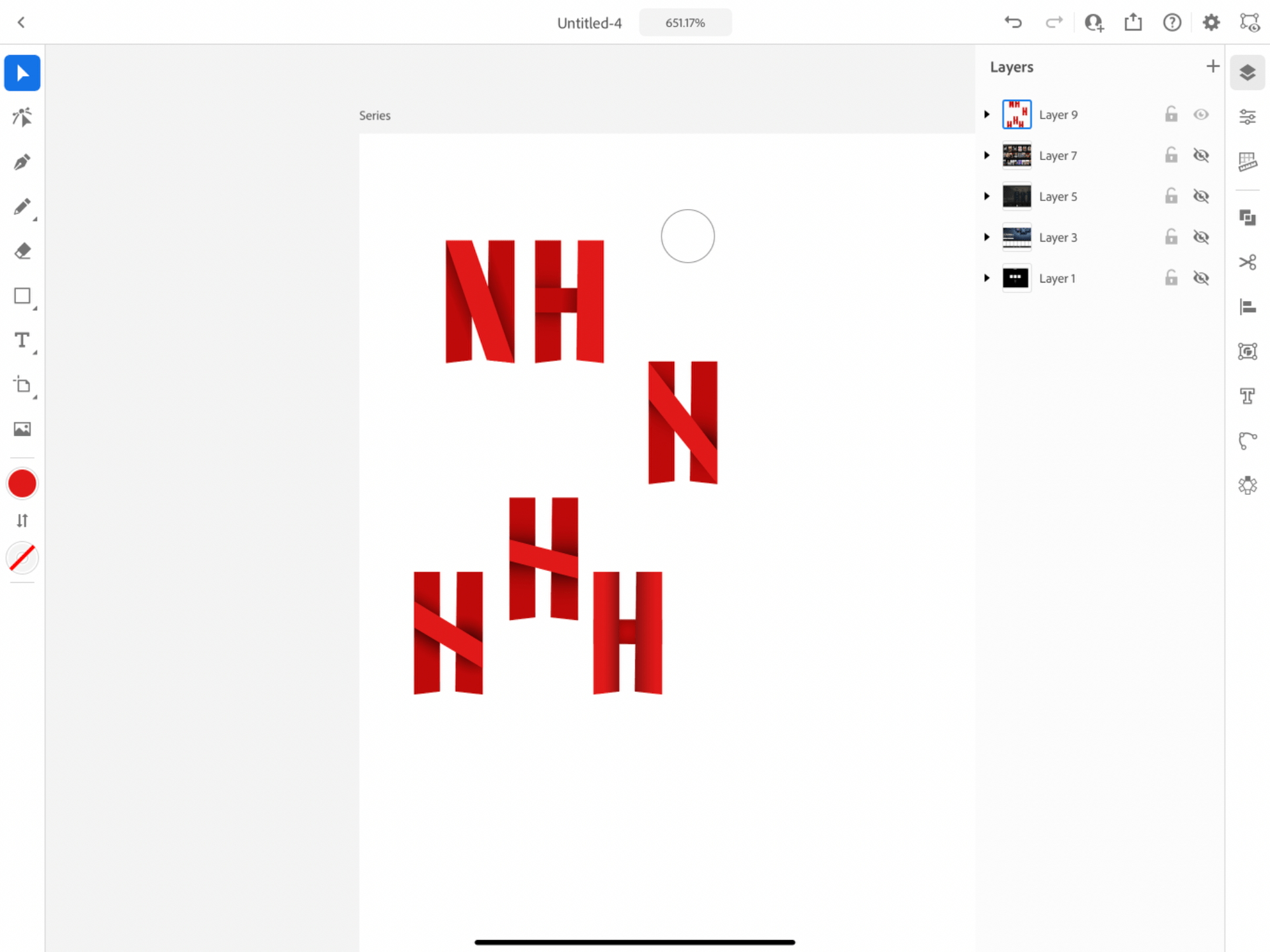
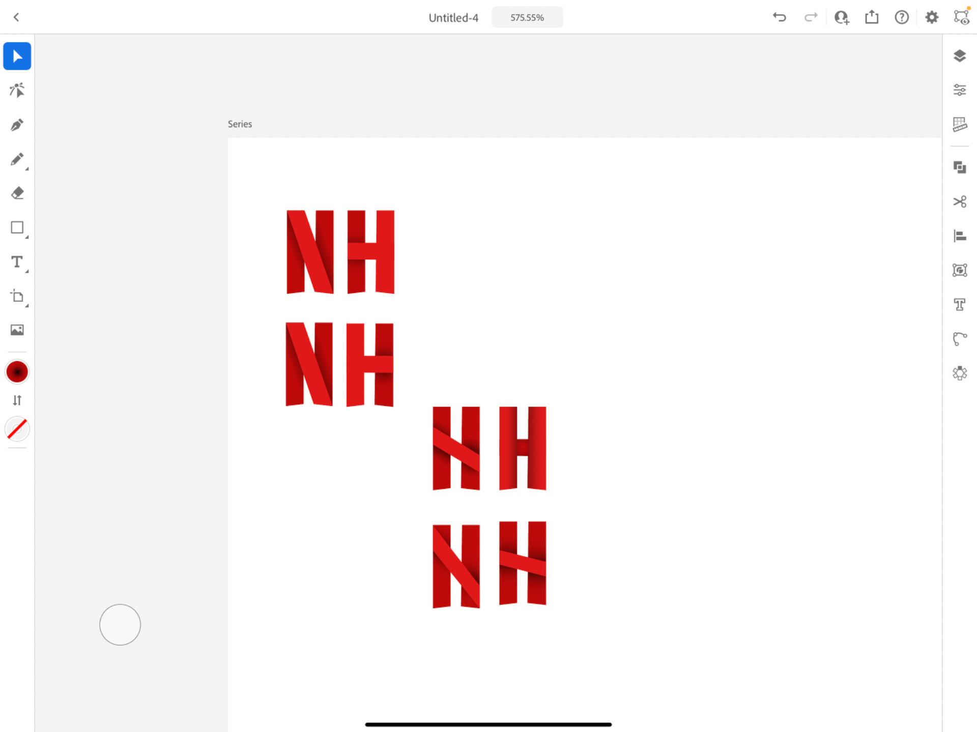
The Netflix icon consists of 3 rectangles, with the middle part of the N being a lighter red than the 2 behind it. The animation moves in a ribbon fashion when appearing on screen and I experimented with a way I could incorporate this ribbon movement in a H design but it started to look less like a H and more like the N.
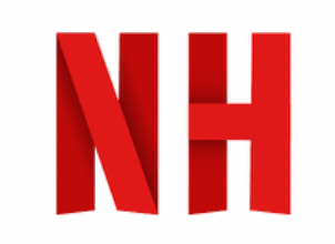
In the end I decided on a H with the left side in the back and the middle and right hand in the foreground, in a brighter red. I felt this way it was most discernible as a H and looks like its still in theme with the Netflix N.