Master Apprentice Tasks
Throughout the course of 104, we were set class tasks to recreate icons and illustrations. I used Adobe Illustrator to replicate these, a programme that I hadn’t had very much experience in prior to starting this degree. Something I expect to see as I do more attempts of master apprentice, is to have less inconsistencies and become more accurate over time.
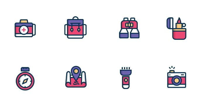
Master Copy Icon Set
The first set of Icons were travel inspired which were relevant to our first project of creating a travel app. This was my first experience of trying to recreate icons and I found it somewhat challenging. After finishing this project and comparing the two side by side, there are some differences I noticed where I didn’t accurately recreate the master copy.
- The lines, although consistently the same weight throughout my replicas aren’t as thick as the master copy.
- My version of the suitcase is too wide. (and missing the handle, oops)
- The bristles on the toothbrush are too wide.
- My toothpaste icon tapers too much at the ends and the white part beside the lid is too long.
- I tried a few different attempts at recreating the airplane symbol but found it almost impossible. I would like to revisit this after a while.
- The yellow line on the plane ticket is too thick.
- The arrow parts of the compass could have been bigger with the yellow middle smaller.

Apprentice Version

Master Copy Icon Set 2
These set of icons caught me out as I didn’t notice the subtle shading until I compared the two side by side.
- The ends of the strings are too round.
- The bottom of the lighter is too round and the flame doesn’t curve in the same way.
- The cameras edges are too rounded and the 3 lines above the button are too close together.
- The compass turned out quite well only the pink part is too thick and the 4 markers are rounded at the end in the master version.
Apprentice Version

Master Copy Scene
This was initially the most intimidating master copy to recreate because looking at the whole illustration at once its comprised of many graphic elements but when I broke them down into their sections I enjoyed this task the most. I started by making the line work with rectangles, squares and lines. I then coloured them with these same shapes, overlaying some on the linework to block out where appropriate. The shadows that I missed in the first icon set almost got me again with this one. It was very satisfying to add the shadows to the windmill.
- Looking back on my design, many of the line weights are inconsistent.
- The colours are just a bit off.

Apprentice Versions

![]()
Master Copy Infographic
The next lot of master apprentice tasks were fitting for the next project of creating an infographic. These icons required new aspects such as gradients and drop shadows and inner shadows. For these tasks I used Adobe XD as it is easier to add drop shadows and button effects. I really enjoyed these last two tasks and I think they turned out the best with the least amount of inconsistencies out of all the tasks I had done from the start of 104.
- The number font is just a little different
- I couldn’t figure out how to get the circle to end rounded which is disappointing.

Apprentice Version

Master Copy Infographic 2
This last master copy I enjoyed more than the city illustration. With this task I explored gradients and drop shadows again as well as opacities. Overall my copy seems to be a little darker than the master but the fonts are almosts replicated perfectly with the only issues being the 5 looks slightly different, my letter labelling is too bold and I have the opacities too high on my bars.

Apprentice Version 2

By the end of master apprentice, I saw this more a necessary training and a good way to practice some basic elements of creating icons and illustrations. I was grateful for this when it came to creating my travel app and infographic as some elements required using something that is more widely used, that people recognise and replicating it in some way to yield the best results. I would say that from the start to end there was noticeable improvement in my apprentice copies and even for myself I became more familiar with the programmes I would go onto use such as Adobe XD and Illustrator.
Comments