Researching Bank Logos
Until the 1940’s and 1950’s, banks were often identified by a sign saying ‘bank’ or the banks name in simple lettering. Stationary and advertisements didn’t feature any particular symbol or style. In the years following the Second World War, the emergence of a handful of larger high street banks saw growing competition and put more importance on differentiating each of their public identities.
When researching existing banks branding and logos I found that they all had a number of things in common. The colour scheme normally exists of 2 colours, one of which is a shade of blue. This is tied to the colour psychology of blue, symbolising order, trust and calmness and that when people see it it reminds them of traits such as tranquillity, loyalty, security and reliability. It is for this reason that blue is often used in banking, medicine, government and healthcare branding. Many banks have moved from the use of serif typefaces in their wordmark to sans serif for a more modern feel.
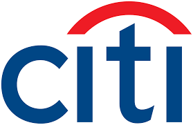
Citi bank acquired their logo for 1.5 million, with the designer creating the initial sketches within minutes of her first meeting with Citibank. The logo represents the business’s values well with the sans serif font, lasting well over a decade, and the striking red arch contrasting against the dark blue that signifies connection and unity. The logo is kept simple to promote a sense trust and security where something too busy would distract from the core mission of the company.

 In 1960, Royal Bank of Scotland adopted the coat of arms, symbolising the banks past and present, royal connections and representing the Scottish identity. This soon became the branding that could be seen on uniforms, stationary, bank notes and buildings. In 1969, the bank merged with National Commercial Bank of Scotland which coincided with the increasing use of marketing and advertising. The need for a more unique branding emblem was becoming stronger than ever and the coat of arms was losing favour. It was then that designers devised a symbol that was striking and recognisable in a range of contexts, sizes and materials and the ‘daisy wheel’ symbol has been central to the Royal Bank of Scotland’s brand since.


Santander’s logo represents a flame and the element of fire with the red colour scheme. On their website they say that this is because its;
‘evoking the role it (fire) has played in human evolution and prosperity: an ally that has helped us evolve and advance as a species.’
This branding became introduced in 1986, which started in a city in northern Spain. Prosperity is one of Santander’s main values and this is evident in their tagline ‘Here to help you prosper’. In 2003 the logo saw a relaunch moving from serif to sans serif giving it a fresh new face and more modern feel, reportedly costing £11 million. The inverting of the red and white was for the increasing usage of white backgrounds to stand out more in digital channels. This red plays a major role in Santander’s recognition with the public and reducing this with the logo change may have jeopardised this recognition they have built, as seen with other well established brands and associated colours.

![]()
ING bank is a Dutch bank, this is represented in their colour choice of the national colours, orange and white, which makes a nice change from the other banking logos I’ve researched. This logo works really well in terms of bringing energy and enthusiasm with the dynamic colour choice of opposing colour wheel colours blue and orange. The lion featured refers back to the country of origin, making this logo the most detailed out of the previous examples, while also symbolising loyalty and protection. All of this works really well to give the Dutch people a sense of national pride as well as simple but attractive logo. In my opinion, although serif typefaces look less modern, in this logo, it gives a sense of
Idea Generation
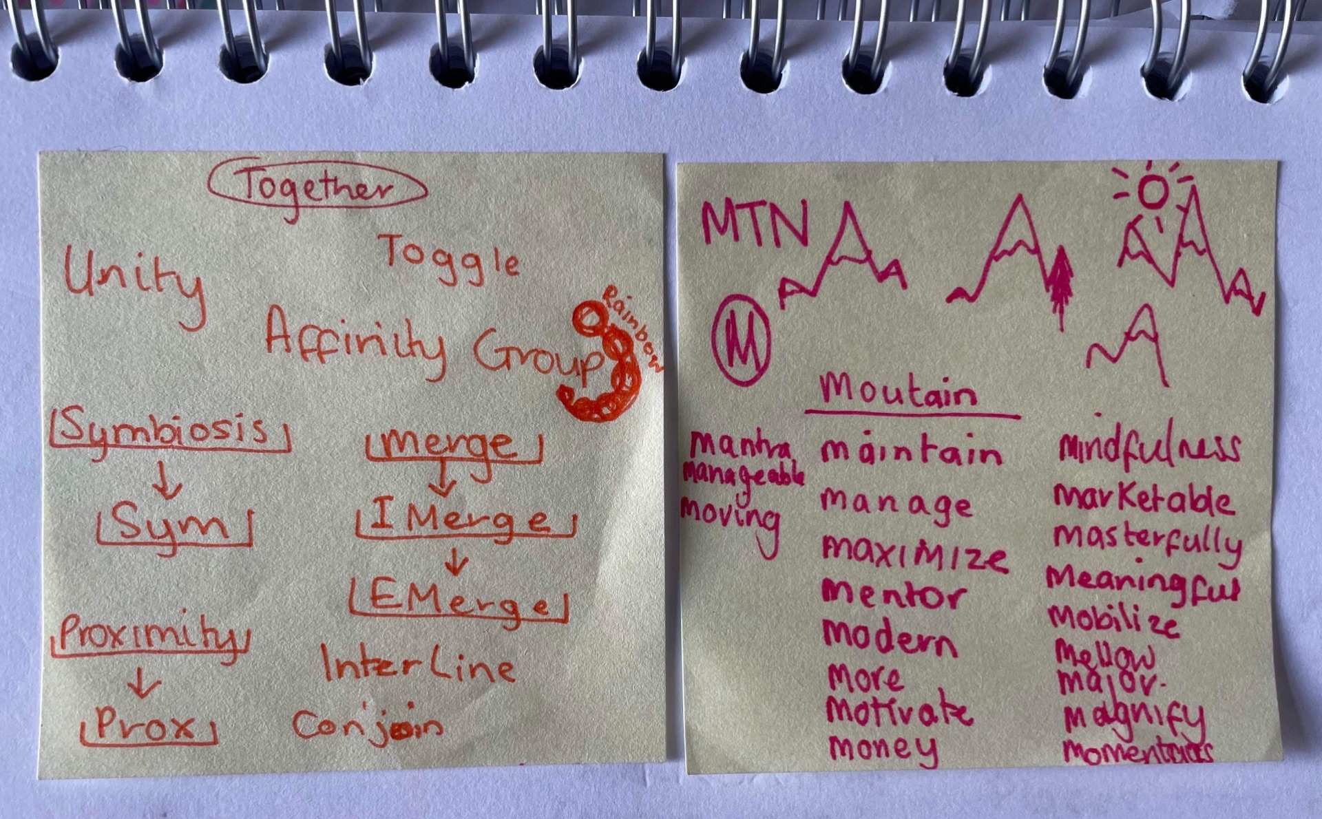
When at the idea generation stage ,in this case, coming up with a brand name, I find that mind maps work the best for me. I started with some key words related to banking and was able to work my way outwords with connected words. This process is a lot of fun and in the end having as many options as possible is always easier to choose from.


Above was another page of brainstorming where I chose a few ideas I liked the most. Below I was refining those ideas down further to things that were about togetherness or working together. Additionally, I thought that mountain worked well in conveying the idea of being strong and using the graphic outline of a graph going up just like your money. I then googled words beginning with m that could positively relate to money such as, managing, maximize, maintain and modern. The idea from this would be having each word morphing into another until it finishes on mountain like in this gif of Firefox.
![]()
I began researching word morphs and discovered kinetic typography and this would be something I would like to implement into my branding to add some movement into my logo. Some examples I found from my research to take inspiration from.


Logo Mark Sketching and Ideas
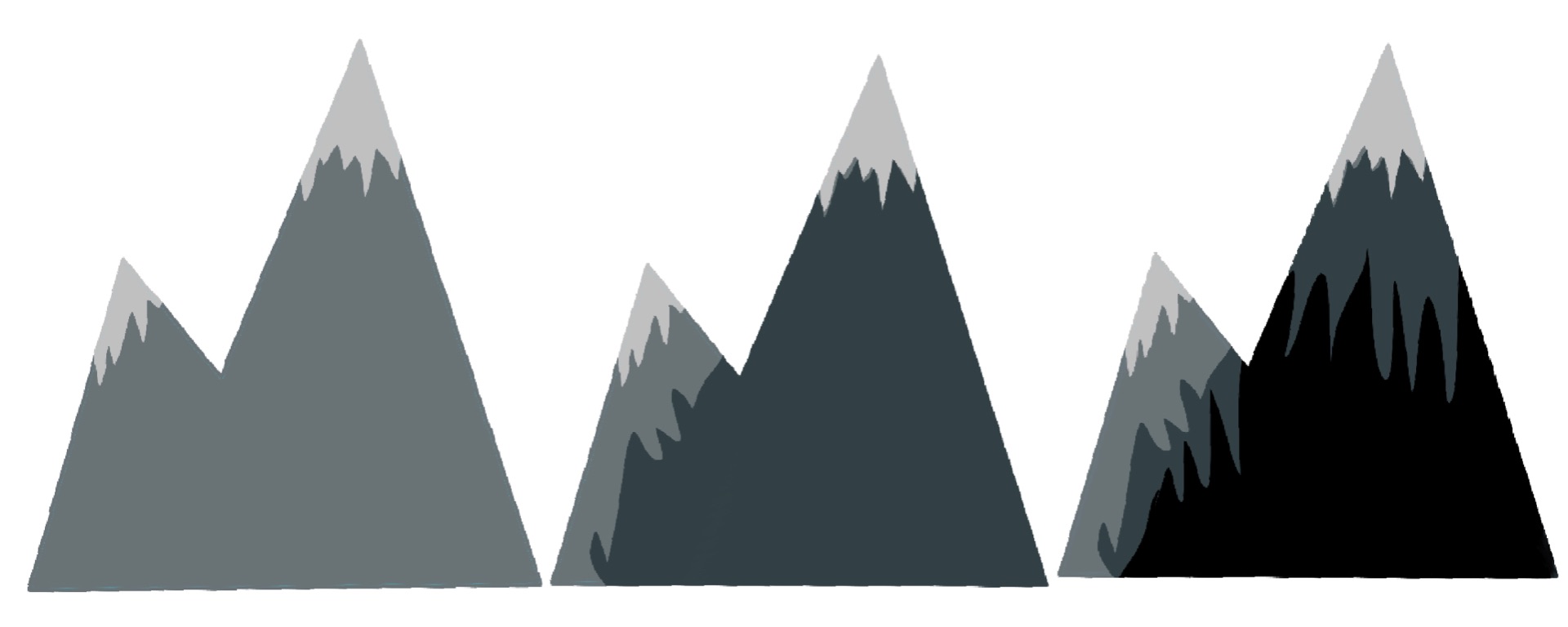
Now that I had settled on a name for my bank I began sketching some ideas for the main logo. I wanted to use a simple form that resembled mountain peaks as well as showcasing the letter M. After a few different ideas I decided to go with a simple geometric form composed of two pointed triangles. I felt that this form was the most effective and the cleaner look was something I wanted to achieve as I intend on basing my brand values around being simple.


First Digital Iterations
Once I had finished sketching my ideas and chose the one I wanted to move forward with, I began digitally drawing them up. Initially I planned to create a vector illustration of mountain peaks with shadows or more realistic illustrations with the use of shading. In the end, I refined this down to a few examples coloured with gradients. I felt that this was the most effective making them feel more modern.


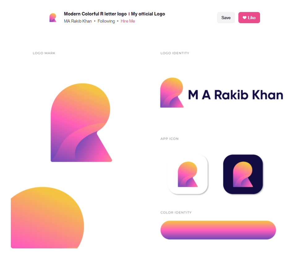
I have found Dribbble to be very useful for being inspired, where previously I would have mainly used Pinterest. One designer that I took some inspiration from was Rakib Khan and his use of gradients in the logos he creates. He designs simple forms for logos with the gradients adding this same modern feel.


Typography and Wordmark Sketching and Ideas
At this stage, I was still unsure of the logo type I was going for and began sketching up ideas for a wordmark. I used Adobe Fonts to find typefaces that I liked the most and took them down. I also began sketching any ideas I had of my own typeface and tried to incorporate the brand name into a scene of mountains and hills. I tried many different attempts of executing this as I thought it was a fun idea but I didn’t feel it was the strongest. However, I would like to revisit this at some point and try again because I feel that the concept is cool.
After playing around with the letter forms, I found that the o and u could be cut in half to form a sort of logo contained within the wordmark.


Using Adobe Fonts

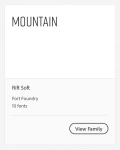

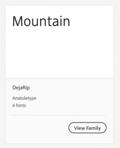


I experimented with an abbreviated version for the word mark with the letters MTN and MNTN with the M being the logo mark working as a combination mark.

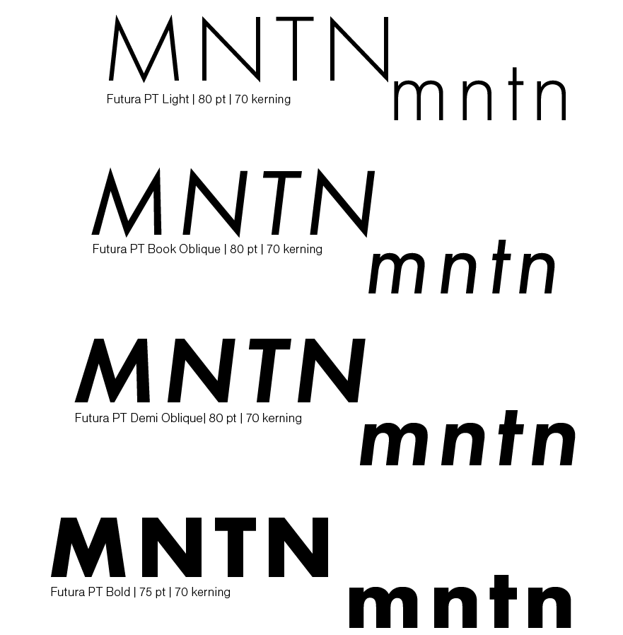
I took this idea a step further with refining it down to 2 choices for fonts. Helvetica and Futura. I felt these fonts were the easy picks because they are clear, simple and effective when on screen.

![]()
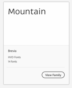
Final Two Choices
![]()

I decided to go with Futura as it felt the most readable. The comparison of the U and A between Helvetica and Futura was the main deciding decision. That and also the fact that the Futura font was created with geometric shapes I thought it was fitting considering I want the mountain branding to be comprised of simple geometric forms too.
References
https://www.rbs.com/content/rbs_com/en_uk/heritage/subjects/the-daisy-wheel-brand-mark.html
New logo design by Santander: the good, the bad and the questionable
https://www.santander.com/en/about-us/our-brand
Comments