Postmodernism was a movement that was born out of the want to change the rules that had been set by movements such as Modernism and the International Typographic Style. It was about challenging the norms and everything that was based on simplicity was changed into chaos. It was a movement of contradictions from theoretical and luxurious to the theatrical and ludicrous. The last generation of modernist designers had tried to create this perfect world of simplicity post-war with their design whereas postmodernist would purposefully take distressed materials for the apocalyptic, dystopian aesthetic.

When postmodernism was at the forefront of the 1980’s, also known as the designer decade, with its exaggeration, vivid colours and design, everything was a style statement and it was particularly prevalent within the punk scene and album art due to the rise of mass media.
In an interview, Malcolm Garret, an American graphic designer, explains how he was able to use the first ever photocopier to modify images. Paula Scher another graphic designer then goes on to explain, during the 70’s everyone was obsessed with international style for its simplistic, clean designs and how she found this extremely boring and began to experiment using typography to make it more expressive. Instead of creating order and following rules that design had at the time, it became about creating disorder.
Wolfgang Weingarten began as typesetting apprentice in the early 1960’s and during this time he conducted experiments consisting of carving letters into wood and most interested in the letter M. While studing under Emil Ruder in Basel School of Design, he was instructed to continue these experiments and for his end of year assignment, explored the letter M from Adrian Frutiger’s Univers Font family in a darkroom using photo-optical processes. Here he manipulated the M by blurring it thus making it thicker and by this created an additional font style for the Univers typeface.

In another experiment where he created a cube comprised on the later M on each of the 5 faces. Taking his camera he began capturing the M at different orientations and assembled the negatives into 5 rows of 5 M sequences.

In ‘Poster NR.4’ by Weingart in 1974, Letterforms are joined together in order to create an object that looks almost as if there are no letters and for some letters are joined together to create an entirely new letter. This piece of work is really interesting because it goes against the very natures of letters and words being used as a communication tool but instead the representing some abstract meaning that the audience could perceive as anything.

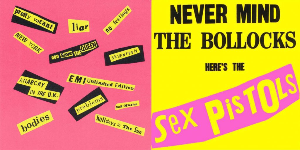
Jamie Reid was responsible for the DIY aesthetic that emerged during the postmodernist era. Lettering cut from newspapers, magazines or just about anywhere you could find them were then pieces together to create words comprised of many different pieces. Reid created many popular album covers for the sex pistols which were vibrant and featured this collage of lettering that he was famous for. This influence of punk music and postmodernism had an even bigger influence on graphic design as a whole.

Sources
Postmodernism In Europe: Jamie Reid
https://www.vam.ac.uk/articles/what-is-postmodernism
Comments