For the second project in 102, we were tasked with creating a design history presentation based on a list on options and as a group, which was named CSS and consisted of me and three of my classmates, we chose to look at the design systems used in the Olympic Games. Once we had chosen our topic, we began brainstorming on what we could focus on within this area. As the Olympics has been ongoing spanning many years we thought it would be interesting to look at how as technology has developed, how the designs have also developed with it. We also thought that since the Olympics are particular to each country that its hosted in every year, we could look at what cultural influences there are in the designs and different aspects of the Olympic design systems. From here we researched each year and city that held the Olympics and tried to pick ones that were old and more recent to see similarities and differences. We delegated four cities to each of the four members and these would be:
Member 1 & 3 – Looking at the affects of technology
- St Louis
- Tokyo
- Barcelona
- Seoul
- Mexico City
- Beijing
- Sydney
- Athens
Member 2 & myself – Looking at Cultural affects
- St. Louis
- Tokyo
- Barcelona
- Seoul
- Mexico City
- Beijing
- Sydney
- Athens
For the first week we decided that we would conduct independent research on each of our chosen cities and find out as much information as we can relating to our topic areas and then meet back for week 2 and begin construction of our PowerPoint slides. We would stay after class on Mondays and Fridays just to have a catch up and talk about our progress and regroup online when we needed to and created a group chat for this communication. One of the group members set up a Google Docs Presentation Slides and allowed access for the rest of the group to be able to edit it.
My Research
I began by research some important information of background of the Olympics and the Designs within in them. I also began to gather some quick notes of information on the cities that I was delegated, realating to the culture and how that influenced the design.
Pierre De Coubertin created the International Olympic Committee in 1894 in Paris and it was just 2 years later that the first edition of the modern games was held in Athens. His mission was to deliver a strong message for people to respect others and to compete together in order to better themselves in their everyday life.
The Olympic Rings
With each Olympic game having a different logo, theme and country the only thing that remains the same is the Olympic rings. Pierre De Coubertin designed the rings in the early 20th century without any clear strategy of how to display them until slowly the rings were integrated into the identity of the host city. The rings hold inspirational symbolism within the logo such as the circle, which is eternal, 5 rings representing the 5 continents and the colour of each of the rings holding a colour from every flag in the world. It also conveys a feeling of togetherness with the global design of interlocking circles and international design in its usage of colour. The Olympic rings belong to everyone no matter which country hosts the games and it is very simplistic in its design and from a logo perspective, its simplicity is what has kept it going after so many years.
Design of Olympics Games Logos
Design Challenge: Create a unique logo design that represents both the host city and Olympic brand with bold design choices that set the tone for the rest design program.
When designing branding for the Olympics games there are so many different avenues and deliverables that must be considered, so designers begin with the main logo that will become the linchpin of these thousands of other design projects. This logo must have the ability to be applied in numerous from stitching to television and coins. All other aspects of the branding must be visually cohesive; Connected to one another, conveying to the viewer that each design piece is all apart of one main event. With some of the venues being miles apart, the design must close this gap for the viewer, making it feel like the events are all held in one place.
Securing the logo or symbol means that the designers must then move on to the theme of the games known as secondary graphics. These secondary graphics must incorporate both the country and the values of the Olympics and the narrative plays an important role in this process as it gives people the opportunity to learn more about the culture of the country in a way that is fun and exiting.
These designs will reflect the story of the host country, with cultural references playing a big part of desgin and insuring that it is properly reflected. Residents can take pride in the fact that their country is hosting the biggest sporting event in the world and that people from all around the globe can see designs that represent their legacy and heritage. The Olympics are also the biggest design project in the world with the ‘look of the games’ being what makes it Olympic. The look is the background in each event that you see televised but it also extends to many other places for the spectators such as tickets, stamps, posters, t-shirts, keychains, wayfinding signage and wraps at a venue, on a plane, train or uniform, banners, mascots, digital advertising and publications.
Markus Osterwalder, an Olympic design collector says that, ‘you need to know the past if you want to invent the future,’ and he believes that ‘people who design(ed) good things in the past didn’t (know at) that time that they are really doing something fabulous.’ He has collected over 15,000 pieces from each of the Olympics games and says that he is contacted by designers every year that are involved with the Olympics that want to see what has been done in the past. Markus explains that the reason he collects Olympic items to build the impression on the legacy the designers have left as they had the funding and opportunity to develop something that was not invented before and he believes this has made the Olympics’ a pioneer of design in many ways.
This began with the 1964 Tokyo Olympics where the want to portray a message is prevalent in the design but this philosophy peaked in the next following Olympics that took place in Mexico in 1968. Before then, the term ‘look of the game’ hadn’t been invented.
Quick notes for the PowerPoint slides.
Mexico City
- The country’s unique culture has been forged by the very different stages of its long, rich history: the heritage of the pre-Hispanic civilisations, European colonisation and the war of independence.
- A “tree of life” is a popular type of clay sculpture in Mexico, always brightly coloured and meticulously crafted. The images depicted vary considerably, ranging from traditional festivals and Biblical scenes to Our Lady of Guadalupe, the patron saint of Mexico City.
- The National Museum of Anthropology in Mexico City was devoted to the archaeology and history of Mexico’s pre-Hispanic civilisations. It was inaugurated in 1964 and designed by Mexican architect Pedro Ramírez Vázquez
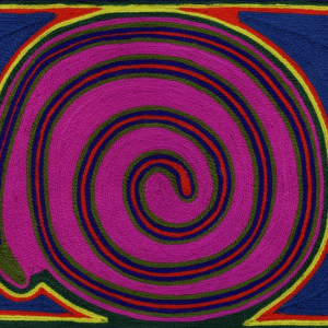
- Historically, Huichol art was a sacred, solemn form of art steeped in religion. Traditionally, works consisted of cave paintings, stone sculptures or yarn paintings, and were given as offerings to the gods.
- Bursting with bright colours and often featuring “naïve” and enigmatic images, this type of artwork was produced by the indigenous Huichol people of the Sierra Madre in the central-eastern part of Mexico.
- In the 1960s, Huichol art gradually became more of a craft, and lost its spiritual dimension.
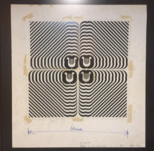
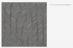
- OPTICAL ART – OP ART- This term, which appeared for the first time in a Time magazine article in 1964, describes a style of visual art that makes use of optical illusions.
- Op Art works are essentially abstract – they give the impression of movement and flashing or vibrating patterns.
- They have a destabilising effect on the viewer, producing something between pleasure and displeasure and creating a dizzying sensation similar to that caused by mild intoxication.
- Hungarian plastic artist Victor Vasarely, a major figure in the Op Art movement, whos works give a three-dimensional effect.
- Born from the imagination of Pedro Ramírez Vázquez, the Mexico City 1968 Games emblem reflected the fashion of the time: hippy psychedelia.
- The colour palette of the visual identity of the Games in Mexico City featured 19 intense shades and a deep black, a reflection of what could be seen and experienced in the country itself
- An attractive and effective range for all forms of communication, whether pictograms, sports posters, tickets or hostess dresses.
- The Mexico City 1968 pictograms: no athlete silhouettes, with the focus instead on sports equipment: a ball, bike, epée, oar, glove, etc., or a part of the body: a foot, hand or arm.
- Each sport had its own colour. And the same colour code was used on posters, tickets and even staff uniforms. This consistency made it easy for the public to find the competition venues.
(notes copied directly from a powerpoint on Mexico City Design Systems)
Mexico city
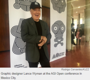
- The Emblem – collaboration of three artist Pedro Ramires Vaquez, Eduardo Terrazas and Lance Wyaman. It consists of a pattern like those use by the Indigenous people of Mexico, the Huichol. It also reflected the hippy psychedelia fashion of the time.
- The Medals – from 1928 to 1968 the reverse of the medals were the same – an Olympic champion carried by the crowd with the olympic stadium in the background. In 1972, the first reverse that went against the norm was designed by a Bauhaus representative, Gerhard Marcks for the 1972 Munich Games.


Barcelona
- The Emblem – designed by Joseph Maria Trias- created the dynamic human figure – someone jumping an obstacle
- The Medals – designed by sculptor Xavier Corbero- goddess of victory in a modernist style holding a palm in her left hand and winners crown in her right.
- The Mascot – designed by Javier Mariscal – Cobi, a humanised, cubist style Pyrenean mountain dog who had a wide variety of clothing- the name Cobi chosen because its simple and easily pronounced in most languages also an abbreviation of the Barcelona ’92 Olympic Organising Committee.
- The committee chose between 6 designers for the mascot. Javier also designed characters for the opening ceremony that represented Spanish culture and painting, as well the font used for the diplomas awarded to the first 8 competitors in each event.
- A 26 episode cartoon was created called ‘The Cobi Troupe’ that aimed to target 5-12 year olds to promote the Games in Barcelona as well as the new mascot.
Sydney
- The Emblem – based on Australian shapes and colours – sun, rocks and boomerang. colours of the beaches, red unique Australian landscape. The blue silhouette of the Sydney Opera House transforms into a trail of smoke from the torch
- The Medals – designed by Wojciech Pietranik – Olympic rings with a background included the Olympic torch and the Sydney Opera House on the reverse side of the medal.
- The Mascot– designed by Matthew Hatton – Syd, Olly and Millie
- Syd – Sydney, A Duck-billed Platypus. Olly – Olympics, a Kookaburra. Millie – New Millennium. Spiny Anteater.
- The mascots are typical to Australian fauna with each representing water, air and earth and correspond to the Game emblem.
- The objective was to avoid kangaroos or koalas and the 2 mascots were selected based on a survey. First time there were three official mascots. The Kookaburra and Duck-Billed platypus are emblems of the state of New South Wales where Sydney is the capitol.
Tokyo
- Believed to be a turning point in Japan as well as other major sporting events with the ground breaking designs paving the way for new design principles. The first Olympic Games with a design guide that created a cohesive identity scheme throughout.
- The 1964 games where the first to be broadcasted in colour and also the first large-scale engagement after the second world war.
- The Emblem – idea design by Yusaku Kamekura – represents the national flag of japan – the rising sun.
- He is regarded as the father of Japanese graphic design with his work having a long-lasting cultural impact on Japanese design as well as the rest of the world. He founded the Japan Advertising Arts Club (1951), the Japan Graphic Designers Association (1978). His designs were influenced by the Bauhaus.
Constructing the Presentation
Coming into the start of the second week we realised that we had too much information and wouldn’t be able to explore each city as much as we wanted to if there were too many. After much deliberation, we felt the most interesting to focus on where the Athens 1896 and 2004 games, the Tokyo 1964 and 2020/21 games. We chose these began they both had a significant amount of time between the two games that were held in the same city twice. The look of the games for both cities were also heavily influenced by the culture of the country they were held in and we wanted to see how this translated to design.
As it stood now, my new objectives were to focus on the history and culture behind the 1964 Tokyo games. I had hoped that I would have had more slides to talk about but it just worked out that we had to get rid of the Mexico City slides as it was going over time. As I only had seven slides I wanted to make them rich with information and visual design. We decided that every slide should have the same theme with the top consisting of an index of the layout of our presentation and each heading would be highlighted depending on the part of the talk the slide was on. The focus city would be place in the top left corner in bold writing with the right of this being the topic of the slide which was accompanied by 5 lines, each representing a colour within the Olympics which are blue, yellow, black, green and red. We included this to add a graphical element that was related to our topic chose as the Olympic colours represent a colour from each flag of the world. I thought this was a fantastic idea and help to pull of the slides together, giving the presentation a constant feel throughout.
We ran into a lot of issues as a group as is expected when collaborating, but everything was always resolved with communication between the members. Members of the group were concerned about the timing, such as myself, so we thought the best way to fix it was to practice together as much as possible while timing us with our phones while we practiced over voice chat. Before we could do this however, we needed to add relevant information in speaker notes so each member knew what they were going to say. Some members contributed to this more than others and it resulted in members researching additional games, which we did not mind doing as I and other group member had gathered this additional information from the start of the project before we realised we needed to shorten it. As we were still facing a timing issue after cutting out a lot of information, I thought that maybe writing a script for each slide and timing it would allow us to see what was too long or what information could be reworded to be more efficient, this also ended up benefiting the members that were anxious about speaking in front of the class. We agreed as a group that this would be best and began cutting down our speakers notes. Two of the other members of our group weren’t available as frequently as we would have needed to have the best outcome as possible but me and another group member decided to get to work on ensuring the consistent layout of the slides after the rest of the information had been places by the other members. I reworded some of the speaker notes to be shorter as a recommendation and added them just below the original script to see if it helped my group members out. During our final rehearsals we were able to finish the presentation just within our allotted extra time.
My Slides and Information


Originally Japan was to host the 1940 Olympic games but had to be cancelled due to outbreak of World War 2. Japan was the first non-western country to hold to Olympic games and this added emphasis to an already massively important event for Japan. This was an opportunity for Japan to tell a fresh story, post-war and designers were tasked with moving away from the perceived violent history of japan and focus on the future that the country was about to establish for itself.

The Japanese government wanted to push the ideals of Japan’s stability and modernity with Tokyo being the largest city in the world, the stage would be set for it to appear as a ‘Futuristic Wonderland’ with a Sci-Fi aesthetic. This modern-sci-fi look can be seen in their architecture that was built for the Olympics such as the Tokyo Tower and the Bullet Train.

As well as Yoyogi National Gymnasium and Metropolitan Gymnasium. This is the image that is still portrayed today within Japan with its impressive technology and culture and this is due in part to the Olympic Games.

Symbolism was used throughout every process and design within the Tokyo Olympic games. Japan wanted to convey there want for peace and post-war stability. The man in this image was the Olympic torch bearer, Yoshinori Sakai, who was born in Hiroshima the same day the atomic bomb was dropped on the city.

Kamekura Yusaku made the poster design for the Tokyo 1964 games using Lithography, 2 hours before the deadline. Lithography – printing process using a flat stone or metal plate and ink. Regarded as the father of Japanese graphic design, the logo was minimalist and even modern for its time, representing a red sun, an important symbol for japan that can also be found on their national flag while also showing influence from the Bauhaus movement Kamekura set a new standard for design systems within the Olympic games.

These were the first Olympic Games with a cohesive identity scheme used throughout. Helvetica had its first major international outing during the Tokyo Olympic games with a consistent typeface throughout numerous aspects of the design of the games such brochures, booklets, meal coupons and event tickets.
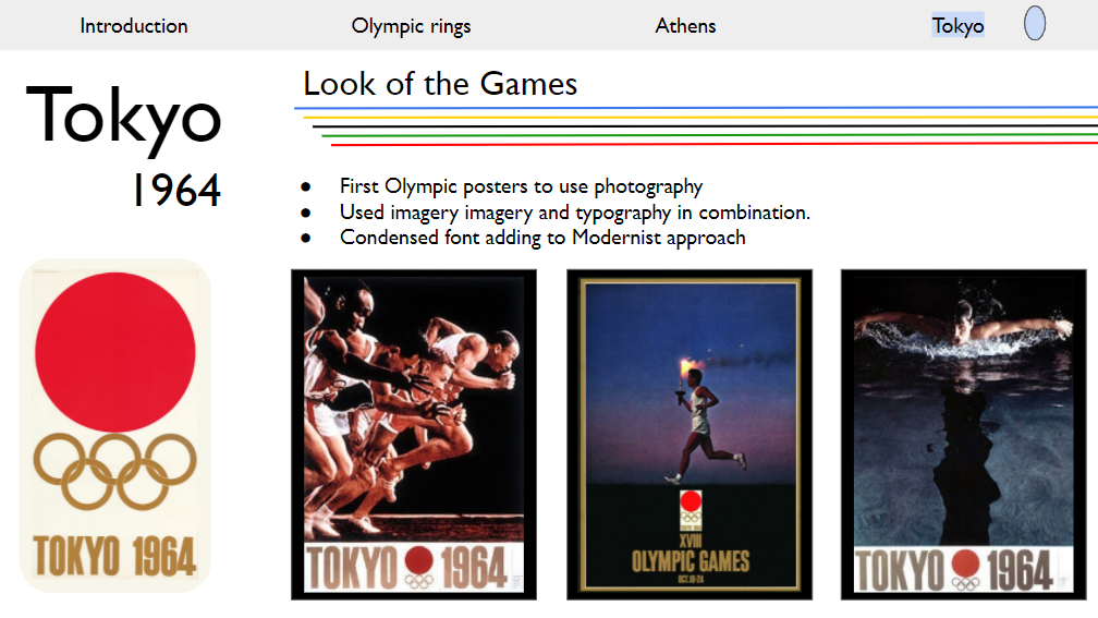
It was also the first time Olympic designers use photography for the posters as they utilised both imagery and typography to create impactful designs for the games. Final images are dynamic and include black backgrounds which were done painstakingly by hand as there was no way to edit images digitally.
Honourable Mentions
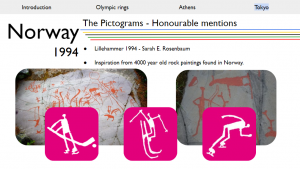
When doing research on the cultural influences of design, I found that the pictograms from the 1994 Lillehammer games were very interesting as they were influenced by rock paintings found in Norway that dated back over 4000 years ago and my group agreed that these deserved an honourable mention. As well as this, the the pictograms from the 2008 Beijing Olympics took inspiration form ancient Chinese carvings and resembled Chinese writing, this was also worth an honourable mention as it shows how culture was involved in the design of aspects of the look of the games.

Although it wasn’t featured, Mexico City’s Olympic design is another important example of a country’s history and culture that was prevalent in the making of the look of the games. Throughout many aspect, designers implemented their influences from the Hucholi people and created something that was modern but also strongly connected to the culture of Mexico. Ramírez Vázquez, the man responsible for the branding during the games said that he ‘saw the Olympics an opportunity to honour the cultural heritage of Mexico.’ The Hucholi people created sacred art in the form of bright colours weaved, sculpted or painted as offering to the gods. At the time, Op art, which was abstract art that gave the impression or moving patterns and optical illusions, was gaining popularity in fashion and art in the form of what’s known as hippy psychedelia.

Final Thoughts
For Tokyo the 1964 games were a opportunity to start fresh and give itself a new identity coming out of the war. As the first Asian city to host the Olympics, it was vital that Tokyo represented themselves as a well developed and even futuristic city that were striving for peace. Instead of trying to erase their history, the symbolised it through each step of the games such as the opening ceremony, which featured Yoshinori Sakai as the Olympic torcher bearer, how was born in Hiroshima the same day it was attacked. Using a modernist approach, the emblem featured a significant symbol in Japanese culture, the red sun. This marked the start of a new standard of design used within the Olympic design systems as it was the first Olympics to have a cohesive and consistent design throughout as well has using photography for the promotional media. It was also prevalent that as Technology has evolved, the Olypmic design systems and way in which designers create each aspect of the games has also transformed.
I felt that our presentation went very well, all of our group members were nervous about speaking in front of others but I think they all done excellently. Unfortunately, a few downsides would be that during the presentation a few slides were skipped and one of our group members decided as the presentation began that she didn’t want to use the script and in the end I think this costed us extra time that we couldn’t afford. The only other thing I would change would be to able to practice and meet more with the whole team as to nail down the presentation and also to gain some constructive feedback on what I could do to improve my slides or notes. If I were to do it again I would try to be more confident in my contributions and opinions towards the group. I really enjoyed this project, I got to research something that I had never thought much about before and had never realised how much design goes into every aspect of the Olympic games.
Sources
https://shotarohondamoore.medium.com/how-the-1964-tokyo-olympic-games-changed-the-global-identity-of-japan-274db4734df8
https://shotarohondamoore.medium.com/how-the-1964-tokyo-olympic-games-changed-the-global-identity-of-japan-274db4734df8
https://uxdesign.cc/tokyo-1964-the-olympic-benchmark-f2745f08b762
https://fronterasdesk.org/content/711559/after-50-years-iconic-mexico-68-olympics-design-still-revered-and-disputed
https://www.domestika.org/en/blog/8332-how-the-olympics-helped-popularize-pictograms
https://olympics.com/ioc/news/the-modern-games-caught-in-the-upheavals-of-history
https://www.britannica.com/list/7-ways-hosting-the-olympics-impacts-a-city
https://artsandculture.google.com/exhibit/mexico-1968-the-first-global-look-the-olympic-museum/AgKCIphtIsVfKA?hl=en
https://olympics.com/en/olympic-games/tokyo-1964/logo-design
https://olympics.com/en/olympic-games/mexico-city-1968/logo-design
https://olympics.com/en/olympic-games/athens-2004/logo-design
https://olympics.com/en/olympic-games/beijing-2008/logo-design
https://olympics.com/en/olympic-games/tokyo-2020/logo-design
Comments