Sections:
1) Project Intro
2) General Research/ Deciding on an Idea
3) Concept Work & Research
– 3a) Concept Art Thumbnails
– 3b) Concept Blockouts
– 3c) Proposed Prop List & Research
– 3d) Proposed Environment Texture List & Research
– 3e) Cinematic Composition Research
4) Asset Research & Creation Pipeline Research
– 4a) LODs & Mesh Smoothing
– 4b) Working with UDIMs
– 4c) Trimsheets
5) Creating Assets
– 5a) Jerry Can
– 5b) Floorlight
– 5c) Twin Worklight
– 5d) Notebook
– 5e) Clipboard
– 5f) Trowel
– 5g) LED Torch
– 5h) Generator
– 5i) Rope
5) Blockout, Presentation & Feedback
6) Refining the Textures
7) Creating Scene in UE4
– 7a) Blocking out the Scene in UE4
– 7b) Compositional/ Cinematic Influences and Research
8) Reflection
1) Project Intro
We were given a variety of options regarding what type of project we wanted to work on. I opted to work on the ‘Ancient Temple’.
2) General Research/ Deciding on an Idea
In our group we then looked at a variety of Temples from different cultures around the world (and even some fantasy) and then discussed what we liked about each of them and what elements we wanted to incorporate into our Temple.
___
Greek:

I really like the Grandness and Largeness of these temples. Makes me feel like it’s the temple of the Gods (or something), akin to when Disney’s Hercules went to the Temple of Zeus.
___
Norse:

Wooden with a knobby thing sticking out of the top. I don’t find it visually appealing.
____
Asian:

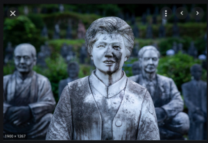
One thing I really liked about the Asian temples (specifically Japanese), was that some of them have rows and rows of statutes of people, dedicated to people who died, or gave their life in war. I just find the concept of loads and loads of human-like statues so unnerving. I think it’s a really cool concept.
___
Mayan:

Mayan has cool designs, but nothing else really appeals to me.
___
Aztec:

Similar to Mayans, they have cool designs.
___
Egyptian:

Similar to the Greek temple, I really like the sense of grandness and the giant statues.
___
Fantasy:

As a massive fans of the Dark Souls series, darkness and eeries is a style that I really want to incorporate. Though that’ll be more atmospheric and will be accomplished with lighting, fog, and volumetric lighting.
___
Roman:
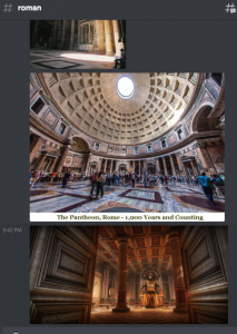
Roman- roman stuff was very round, i’m not a fan.
___
Hindu:

Hindu has some of elements that reminds me of the Japanese temples. specifically the tons of candles on the ground to commemorate people, it’s a bit more inviting than the hordes of Japanese statues. I really like the idea of a candle light environment.
___
Islamic:

Again, wnothing really sticks out or appeals to me. all looks bland and not visually interesting to me. the giant chandelier is kinda cool though.
___
Celtic:

by far the worst ‘temples’. they just look like ruins, and are massively uninspiring.
___
Indonesian:

I think the elongated spikes look kinda cool, though I’d probably exaggerate them a bit more to make them look more gothic/victorian.
___
Underwater:
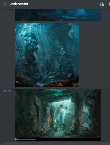
Underwater – the underwater temples look really cool, but we were informed that it would be very difficult to do in Unreal4, so it’s best if we ignored this idea.
_____________
Deciding on an Idea:
Upon further discussions we decided that we should work on an Egyptian Temple. Although the Temple would be Egyptian-styled I still wanted to incorporate the elements of the Japanese and Greek temples, namely the feeling of having the main elements be overly large (thus making the person feel like they’re small/ in the presence of something massive or important.
**We also discussed what time period we were have the Temple in. The general consensus that we were leaning towards would that it would be an abandoned ancient temple that has been discovered in the modern era (yet to decide wherther this modern equipment will be abandoned due to a curse or something).**
Artistically, we all decided that we should do a photorealistic style environment, and the main theme/feeling/narrative elements that we’re aiming for will be;
“An abandoned Ancient Temple that was rediscovered and abandoned by the Discovery Team”.
We opted for the theme as we felt it gave us more freedom with potential props, and lighting opportunities (light sources, and lighting types from the modern equipment). Personally, I really like abandoned environments as their desolation tells a story as they were once lived-in/ occupied, but something (usually tragic) happened that made everyone abandon that area.
Games like Dark Souls (and the other FromSoftware games) and The Last of Us do this type of environmental story-telling really well, and it’s just something that I thoroughly enjoy.
I also really liked the visual art of the abandoned objects/props, with things being visually weathered, damaged, abused, dirty.


Although thematically it would make sense for nature to have started to ‘reclaim’ the temple (having foliage creeping through cracks in the walls/floors), because this will be our first time using UE4, never having worked on environmental foliage before, and this project is in a style that many of us hadn’t work on before; we thought it would be best to not include foliage in our environment (basically due to skillset limitation and to help with workload management).
Concept Work & Research
As part of the Concept Work I made a Blockout of my environment ideas, created a proposed asset list for the group from research (including potential props and environments textures), and also researched what type cinematic lighting
—
Concept Art


—
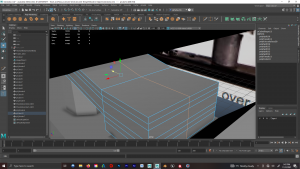
Blockouts:
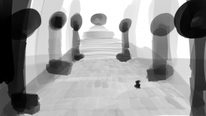
I made some rough blockouts in UE4 to give a idea of the environmental atmosphere I was aiming towards creating. I used low-level camera angles looking upwards to help intensify the feeling of scale, and some of the screenshots were just solely so you could see what’s in the environment.

1) Main room, can visibly see the Greek influence. “Temple of the Gods” is the thematic direction i want to go. I’m thinking that I might have giant Egyptian statues in front of the columns, with the environment leading to a Sarchophegus which is watched over by a Giant stone head. (Camera looking upwards for scale)
—

2) Showing the end of the tunnel that leads into the main room. I probably wont use an angle similar to this during the final cinematic ‘cos it’s not very interesting. But at least you can see how the map-area will be laid out.
—

3) Steps leading to a giant head (of a god) as it looks over the temple. I seen a giant head statue whilst researching temples (it was probably from a fantasy temple), and i thought it look so creepy, so I wanted to incorporate it.
My current idea is to do a photogrammetry of someone’s head, and use it. My sole reasoning for this is that I’d like to learn how to do photogrammetry, and I think this would be a good time to attempt it as I’m much more comfortable with 3D software and the Modelling/Retopo/UV-Mapping parts of it.
—

4) Sarcophagus of the God. Significantly bigger than a human. This will probably be made via sculpting.
—

5) Inside the long tiny tunnel.Will be dark and have hieroglyphs either side.
—

6) More inside the tunnel. I was debating whether to have Egyptian sarcophagus/statues in the tunnel, or have traps with corpses beside them. still undecided.
__________
Proposed Prop List & Research
We decided that we should each create a ‘Proposed Prop & Texture’ list for what we think we should have in the scene, then from there we can decide what elements we want to include and what parts we want to work on.
In order to create a proposed prop list I did some research on Egyptian Temples, Archaeological Discovery/ Digging Sites, and Portable Work Equipment to see what types of props we should have in our world. Because we decided on a photorealistic artsyle, I thought it would be best to keep the prop lists as real and real-world practical as possible.
—
Ancient ‘Prop’ Assets
Because my idea for my environment focused a lot on the ‘scale’ of the environments (greek-inspired influence), I looked at large things like Coloumns and Statues, and some lightsources that would’ve been used by the former civilisation. And of course, a sarcophegus.
I also made a proposed asset list for our group, including visual boards showing what the items look like.
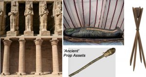
‘Ancient’ Prop Assets:
1a) Columns
1b) Column (Broken)
2a) Egyptian Statue
2b Egyptian Statue (Broken)
3) Sarcophagus
4a) Wooden Torch (Standing)
4b) Wooden Torch (Hanheld)
Basically, believable props that were made by the people who originally built the temple and also contributed to hleping them build the temple.
—
‘Modern Archaeological’ Prop Assets:
These would be the Archaelogical Equipment that was used to inspect/survey the site without damaging the temple. Since I didn’t know anything about Archaology I researched different types of Archaelogical sites and the different types of equipment they used, and why;
https://www.lparchaeology.com/prescot/learning/what-tools-do-archaeologists-use
https://archaeodirt.weebly.com/blog/archaeology-gear-list
Because there are a wide variety of Archaeological sites, they use different tools for different purposes. E.g. some are excavation site that involve digging tools, some are more like preservation sites where they treat everything very delicately, and others can be more like surveying sites where they analyse the area.
So after researching the different tools that are common, I made a list of Tools that I thought would be most appropriate for our Ancient Temple site. I felt that the goal/narrative of my Temple was that it was rediscovered and the Discovery Team wanted to survey and study the site (and take notes of their findings). But they uncovered something that made them abaondon the site, perhaps the same thing that made the original civilisation abandon the site/ get wiped out.
Since there wouldn’t be any digging or siffing through soil in our temple, the Archaeology Equipment list i proposed was;

‘
1) Paint Brush
2) Trowel
3) Clipboard
4) Pencil
5) Notebook
6) Measuring Tape
7) Tool Case
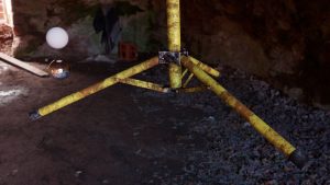
8a) Total Station
8b) Tripod
Brush and Trowel would be because the team were being gentle whilst investigating the area, the Clipboard, Notepad, and Pencil are for the team taking notes on their discoveries. The Measuring Tape and Total Station is for them to Scan and Survey the Environment, and the Tool Case is obviously to store their tools (this could be a soft-case or hard-case depending on how much I want to challenge myself.
—
‘Modern Tool’ Prop Assets:
The second part of the Modern Equipment would be the Equipment that allowed the Archaelogy team to investigate the site, especially since it was an interior environment with almost no lighting.
https://montemlife.com/10-must-have-gears-for-all-outdoor-activities/
While researching what types of equipment people bring with them for outdoor adventuring, and outdoor worksites, there was a long list. So I can to cut it down relative to what I felt was appropraite for the environment.
The two main categories I came up with was “lighting” and “traversal”, Lighting allowing them to independently see the environment regardless of the time of day, and “traversal” allowing them to navigate the environment, and potentially collect/move larger objects for further study.
This was my proposed ‘Modern Tool’ Prop Assets List.

1) Petrol Generator
2) Work Light (Twin)
3) Work Light (Portable/Floor)
4) LED Handheld Torch
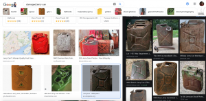
5) Jerry Can
6) Backpack
7) Rope
8) Storage Box
Petrol Generator would be absolutely essential to powering light sources (and any other electrical equipment) in any location, and the Jerry Can would be essential to fuel the Generator.
Work Lights – a variety of lightsources with different uses and applications; the Twin Worklights would be placed in easy-to-access locations in a semi-permenent location. The floorlights are easy to carry and can be placed in more obscure places/ places where you couldn’t placea twin worklight. The handheld LED Torch can be brought anywhere, and they’re battery powered so they don’t need to be connected to a generator.
Backpacks would be fill with essential tools that the Archaelogy team brought with them when they arrived, just like general living essentials Toothbrushes and stuff like that. The bags left would show that the team had to flee the area quickly.
Rope with Hook – another useful tool, particularly when need to move or secure big objects
Storage Crate
used to store samples and other things they found at the site. Can also double as a makeshift table to place props on.
—
__________
Proposed Environment Texture List & Research
This Environmental Texture List would be the themes and styles around the walls. The bulk of the research for this was just looking at the walls of Egyptian Temples and deciding on what general styles and concept I thought would be best suited to our project.
This was my proposed ‘Environmental Texture List’;

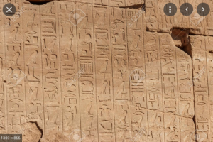
Environment Textures:
1a) Sandstone Wall Texture
1b) Sandstone Wall Texture (Damaged)
2a) Floor Texture
2b) Floor Texture (Damaged)
3a) Hieroglyphics
3b) Hieroglyphics 2
3c) Hieroglyphics 3
4a) Hieroglyphics [Image 1]
4b) Hieroglyphics [Image 2]
4c) Hieroglyphics [Image 3]
5) Generic Smooth Sandstone Texture
Textures for the walls, ours will probably be more ‘worn down’ by time, but not as eroded and weathered as some outdoor environments would be.
I also had a look at environmental assets that would could incorporate or use.


1) Wall patterns/ textures / hieroglyphs -i think the smartest thing to do is make a variety of modular walls assets some generic wall texture, some hieroglyphs, some with story images. then we can place them weherever each group member wants etc.
—


2) steps (and floor) – clean or weathered, depending on choice of style we opt for
Cinematic Composition Research
The concept that I was aiming towards was to have a large main temple room, and and a narrow tunnel.
The main room would be a rediscovered ancient temple that had been abandoned by the discovery team. The temple would be weathered and damaged by time, with a partially broken roof, so there’d be broken blocks, statues, pillars, dirt pile, and perhaps a pool of water (depending on how difficult that is to create).
For the narrow tunnel I want it to be uncomfortable and eerie, with Sarcophegus statues, and perhaps an activated trap with bones beside it.
—
Because it’s an indoor (possibly underground) temple, the biggest concern would be getting light into the Temple (and keeping it believable within the world). This is why I think it’s a good idea to have a broken wall/ceiling, so I can let in a natural source of light (Torches and Egyptians flames etc would be extinguished due to time passing). And the modern electrical lights would be able to provide lighting to the more obscure parts of the temple.
Style-wise, my influences for this would be the world of Bloodborne/Dark Souls. Here are examples of references that will be using to light/colour my scene.

1) Bloodborne; This image features mainly browns and blacks, I suspect that this image has been edited with increased contrast and saturation. Nonetheless, it still captures the feeling of the environment.
—

2) Bloodborne; This image features more shades of brown as the main colour in the environment, with dark blues in the distant shadows. Shadows closest to the camera are black, and get lighter in the distance (with more blue), coupled with the fog adding to the atmosphere. Overall, desaturated colours.
—

3) Bloodborne; This image features mainly cold blues, with some warm yellow torchlight (complimentary colours). Also uses some browns but less than previous images, probably due to different environment. Overall, desaturated colours.
—

4) Bloodborne; exact same as previous examples, browns with blue in the shadows.
—

These are roughly browns (yellowish too) and blues, which are complimentary colours (albeit dark).
—
Having ‘blues’ in the shadows is a common technique used in film to make a scene look more cinematic;

1) Spider-Man 3; demonstrated through all the shadows in this, and complimentary colour being the light in the background. Compositionally, the light background draws the eyes’ attention to the Spiderman suits.
—

2) Spider-Man 3; blues in all the shadows.
—

3) Lord of the Rings; blues in all the shadows.
—
Another popular technique in film is “Teal and Orange;
This is a popular complimentary colour scheme that is used a lot due to Teal being the natural complimentary colour to Skin Tones. Although it’s popular and effective, I don’t think i’ll be using it as I find the Browns/Yellows & Blues complimentary more relevant to what I want, and I also wont have any dominant skin/flesh tones in my project (if any).
—
Environmental fog and god rays will also be a necessity for my temple, but i’ll have to figure out how to do that.


These god rays are a very common aesthetic choice for these types of environments, and they really do looking amazing.
My plan is to take the rendered UE footage, import it into Premiere Pro and After Effects to Colour Grade it. Simple technique would be to use the Lumetri Colour, add a bit of blue into the darker tones, and then remove all the colour from the darkest shadows so they’ll be pure black. But we’ll see how it looks cos i’m not sure how rendering things in UE4 will look.
Asset Research and Creation Pipeline Research
Once we all compiled all our proposed asset lists, we then chose what categories we wanted to work on and what proposed objects we wanted to work on.
I chose to work on the Modern Equipment, both the ‘Archaeological’ and ‘Tool’ categories. In this project I really wanted to challenge my Modelling, Texturing, and UV Mapping Skills which is why I chose to work on some many different props, including some of the more complex models like the Generator and the Worklights.
—
General Artist Research
So before I started working on my Props I took a look at some other artists that have worked on objects of a similar style, and tried to see if their was anything I could learn and implement into my own props
Asset Research and Creation Pipeline Research
Before we started making our props I suggested that to make the pipeline workflow easier for everyone,we should all make our objects to real-world scale using their real dimensions; this way we don’t have to constantly resize everything to fit within our scenes. Everyone agreed.

So we all adjusted our Software’s measurement units relative to the objects we were working on, and we also included Human model (to-scale) so we always had a size-reference visibly active in the viewport.
—
LODs & Mesh Smoothing
I also suggested that we create 3versions of each props (LowPoly, MidPoly, and HighPoly) so that we couldn’t implement an LOD system as per demonstrated in Michael’s tutorials. This would allow us to best utilise processing power on our computers and be especiially beneficial to those with weaker computers (also thought I would be a fun process to learn how to do and implement).
I found the best way to create the multiple models would be to create the MidPoly first, then use ‘Reduce’ and drop the polycount by 50% (creating LowPoly model), and then use another MidPoly model and use Smoothing x1 to create the HighPoly model.

When smoothing the models it would also be very important to set the UV Boundary Smoothing from ‘Maya Catmull-Clark’ to “Preserve Edges and Corners” so the smoothing doesn’t mess up the edges of the UVs.
___
Working with UDIMs
We would also later learn the importance of combining the object parts before importing it into UE (or it’d be imported as seperate pieces) and preparing UDIMs correctly and importing them into UE4 as virtual textures, which is like, the most important and efficient piece of pipeline workflow.
(Henry supplied this tutorial which was very useful)
___
Trimsheets
Another piece of pipeline workflow that I found really import was Trimsheets and creating Modular assets, given the nature of our project it seemed like we would definitely be using this workflow.
Watched lots of different videos explaining them and watching how they’re utilised and shared it with the group. Although the pieces of workflow wasn’t directly relevant to what I was doing at the time, I thought the workflow could be super useful if someone wanted to try and do something similar. Henry then later uploaded simpler videos regarding trim sheets, to blackboard

example showcasing the power of trim sheets, everything in red is utilising one single trim sheet.

another example of how a trimsheet can be laid out to streamline workflow.

Trimsheets I made as part of Henry’s exercise so I could understand the process better and help anyone with they decided to try it.
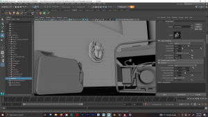
Creating Assets
Jerry Can: Modelling Research
I starting by researching and finding out as much as I could about Jerry Cans, how they looked from every angle, how they were made, additional functions they had, requirements they had when made, how their moving parts (the lid in this case) moved and why it did the way it did, as I would have to somewhat replicate that look.


Some information about Jerry Cans, the notable info includes they have simple construction via two press plates and the rest is basically welded on (i’ll have to recreate this look, most likely in texturing), they don’t corrode, and they float in water (meaning they’re completely airtight when closed).


Additional size/dimension information and images of someone holding one, for size reference (just to make sure that I dont screw up the size)
—
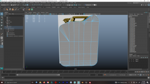
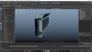
Jerry Can: Modelling


Different views of the Jerry Can. We can clearly see that the main body is a fairly simple shape with the top (specifically the lid) being the most complicated.

I started by importing and resizing the reference image to match a real-life Jerry Can’s dimensions, and using the side-view i marked out cuts of where I’d reshape the mesh, before then bevelling it to make the top and edges rounder.

After Cutting (and Appending) to create the top-of-the-body’s shape, I then Bevelled the Edges to make it smoother/rounder (adjusting the Fraction and Segments to what i felt look appropriately round)
Modelling the body of the Jerry Can turned out a bit harder than I initially expected, because I first had to create the main shape of the body and then Bevel all the edges around the body. Because the body’s main shape has lots of bends at the top it creates lots of ngons and vertices that need to be addressed (without compromising the polygons at the bottom of the object), and THEN bevel the edges around the entire body, which either didn’t work or just created a mess (depending on the different ways I cut the ngons to make them polygons.

I restarted and tried and different approach Bevelling the Edges of the entire body, before trying to create the shape of the Jerry Can. This approach seemed to work a lot better, the bottom of the Jerry Can looked great, and although the top was a mess (geometry-wise) the main shape was there and the faces could be fixed later.

Manually made all the EdgeLoops with the MultiCut Tool whilst trying to create a very consistent EdgeFlow (no weirdly positioned polygons or triangles).

JerryCans are two metal plates that’re pressed together (and then welded), so I made an edge loop around the Centre of the Body, Beveled it (to create more EdgeLoops), Scaled it inwards (with Pivot point in very centre of object), then Bevelled those edges so that the Geometry went inwards smoothly.


Next was the Lid and Handles; because of the complications on the geometry of the body I thought it would be best to have these and individual objects (as opposed to Extruding from the body), this just seemed like smarter use of resources and time.
The process of creating the Lid mainly involved meticulously matching the reference material, really studying it’s design and watching videos on how the lid opens (so my model looks somewhat believable).


This only difficulty with modelling the lid was how oddly shaped it was. I used a Cylinder for the Lid-Body/Nozzle (whatever it’s called), A rectangle with lots of extrusions, geometry manipulation, bevels etc for the Latch (bit you grab to open it). A Cyclinder for the Pivot Bar thing, that allows the Latch to Pivot open.

Another rectangle (with Bevels and manually moving Vertices to give the correct shape) for the actual ‘Lid’ that that covers the Nozzle.


Because the Latch was so weirdly shaped, I had to experiment with what edges I could/couldn’t Bevel as sometimes they created undesireable results. I spent I lot of time using the MultiCut tool removing unwanted edges and creating my own, this way I had a much better control of the EdgeFlow of the model.

The common phrase I hear when watching tutorials is usually, “avoid repeating the same work when possible” (roughly paraphrased). This is solid advice, so I worked on one side of the Lid > Duplicated it > Scale -1 (relative to appropriate axis) > Froze Transformations > Combined both halves > Merged the Middle Edges > voila, final result by working smart.

For the Handles, I used three Cylinders and bent their ends slightly to match the handles on a real jerry can. The big ‘Handle Block’ was odd to make and surprisingly required a bit of trial and error. It’s big and smooth, and is more curved that it looks. So for this I used the SoftSelection Tool (B) to moved vertices softly, keeping it smooth required quite a bit of geometry.
—
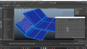
Jerry Can: UV Mapping


Before UV Mapping I deleted any unnecessary faces that would either make UV Mapping more difficult, or just weren’t needed/visible.
My UV Mapping technique was pretty much an extension from 1st Year Final Assignment, and there would only be one material attached to this object. I made sure transformations were frozen > planar mapped objects > unfolded > deleted history > used layout so they all had same texel density > added cuts where necessary; and repeated various pieces of this process whilst stitching together parts so there wouldn’t be a cut in texture in certain areas (e.g. the front edges of the jerry can)
All UV islands were on one UDIM because I didn’t think I needed to use more. The body UV island was big and took up most of the UDIM space, so it was retaining the best resolution of the texture, and all the other parts fitted in whilst retaining the same Texel Density.

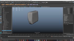
After UV Mapping, I duplicated and made High-Poly, Mid-Poly, and Low-Poly versions of the Jerry with Smooth (Division Level 1), and Reduce (50%).
__________
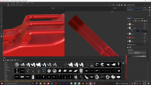
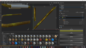
Jerry Can: Texturing Research
Because I wanted to everything in my scene to be a bit used, weathered and ‘damaged’, i decided to begin by researching ‘Rust’. I wanted to see what it looked like, it’s colours, it’s texture, how light reacted to it, how paint reacted to it etc. And how I thought I would recreate it.


We can see that Rust is an orangey/brown in colour is is quite Rough (not very reflective/ light doesn’t bounce off it well). It’s Texture is very Noisey and inconsistent with a range of shades and and saturation within this noise. It also has noisey/inconsistent Height information, it bubbles and chips at the paint around it, and can eat at the metal it’s attached to (or reveal another layer of metal below it). It can also appear to ‘drip’, like, the rain washes the Orangey Rust colour onto the paint below (and the rust can also spread that way).
Because Jerry Can’s are non-corrosive, it’ll just reveal the underlying layer of metal (which is more reflective than it).

I also took a look at how other artists had painte Rust onto their 3D models, and they all seem to generally follow the same points/principles that I noticed when researching Rust, which is good, cos it means my methodology of analysis is somewhat on the right-track. This research will also be useful for the other metallic objects I make that’ll have bit of rust on them.
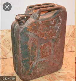
I also researched Damaged Jerry Cans, to see what the common occurences are when they age. The most common things seemed to be that the paint chips off around edges and places where wear will occur when being handled (lifted, set-down, falling, dragged, etc). The paint can also get faded (presumably due to sunlight exposure).


More reference images; paint has little reflectivity and the underlying rust/metal can range from brown-to-grey and have a higher roughness than the paint.


Another very important part for the look of the JerryCan was the ‘weld’ effect, cos it makes it feel like it was actually built put together. So I looked at the different types of Metal Welds there are, and also the welds on a Jerry Can, along with notes that other artists have made regarding recreating welding techniques.
Biggest takeaway is that some welds are very neat, and some welds look very messy. The ones on a Jerry Can are neat, so hopefully I can recreate it accurately.
—
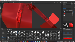
Jerry Can: Texturing
Starting into this i wasn’t over comfortable working in Substance Painter and creating my own textures. I understood the principles of art and creating the look of textures (ProCreate is what I usually used, and After Effects for Fractal Manipulation type of Textures), but I just wasn’t used to the names and workflows inside Substance (e.g. Black Masks, Generators), and how layers interacted with each other was a bit different than in AE and ProCreate.
So the first thing I did was spend time making a ‘Practice Texture’ on the Jerry Can, so I could explore how the different Tools/Layers/etc. and interacted with each other. I also used some basic tutorials to get used to the Substance interface as often I would know what I wanted to do, but wouldn’t know how to do it in substance/ some options wouldn’t be available and I wouldn’t know why (e.g. Dragging and Dropping Grunge Maps onto layers etc).
These were some of the tutorials I used to get my head around started to use the different Generators, different masks, using layers and folders together, and grunge map manipulation etc. along with the tutorial that Henry uploaded to Blackboard briefly showing how to use stuff like Anchor Points and Micro Height/ Details.
—
Jerry Can: Texture Test
I simply explored what I could do with Substance Painter whilst experimenting with the tools and how I could create a texture somewhat similar to the reference material, then refine it later.
I started by experimenting with different brushes with ‘Positive’ and varying Height information and varying opacities to try and create a ‘clean’ weld , but I couldn’t get anything to work as the closest Brush just overlapped itself and you could see the previous spot through it (image above). I needed to make a spot where you couldn’t see the previous mark through it, which is easier in other programmes, but I couldn’t figure it out here.
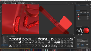
Fortunately I was able to a messier version of this brush to create a messier weld, which give it a more ‘homemade’ look, as opposed to a polished factory aesthetic.
I used this ‘weld’ effect to combine parts of the models and make it look moire seamless. To create the effect of the reference image I would’ve extruded parts of the models and bevelled the edges to make it look seamless, but I figured that paiunting the weld effect would’ve been a more effective use to time as it bypasses the topology and geometry issues I would’ve had to deal with.

I painted the design indentation my reducing the ‘height’ info on the paint brush. I’m aware that I could’ve created an Alpha stencil and imported it into substance and created the design that way, but I felt this wasn’t necessary as I could do do it pretty competently this way.


Next I had to figure out how to use blackmasks and generators via help with Youtube videos. I spent a while figuring out, practicing, and just trying out different techniques and combinations of things to see what different effects I could get using different height cominations with noise effects, grunge effects, different brush styles etc.

Experimentation with grunge effect, generators, and using the anchor points with microheight info (as per Henry’s tutorial) to create the rust effect on the painted height design on the side of the Jerry Can.

Experimented with painting areas that I would then use as a mask for grunge generators so it would only affect the areas I wanted. One thing I struggled with was organisation of the layers, how they interact with each other, and how utilising folders affects how they interact with each other. More practice needed really.
Seeing how models and textures looked in UE4.


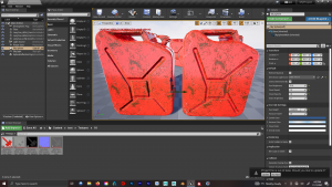
Alternative texture variant that’s dirtier and more ‘damaged’ (or used/weathered). Uses more noise and height info. I like this one. Less reflective as per references.
___
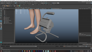
Floorlight: Modelling Research
When creating the proposed prop list I already came across the Model of Floor-Floodlight (I’ll call ‘Floorlight’) that I wanted to use as the main reference. So it was mostly a case of just finding the exact item and looking at it’s product information.


Shot of the Floorlight and production information and dimensions; the main difference would be that this models is made up of two metal bars (yellow) that are attached together with a and plastic thing and a screw that let’s them be adjustable. I decided that I wouldn’t include this cos I didn’t feel it was necessary relative to what I was using it for.
also watched some reviews on the product so I could see it from all angles and how it looked in-real world environments (as opposed to the display images).
—
Floorlight: Modelling


The biggest challenge for me would be creating the bends in the metal’s frame. I wasn’t sure the best way to do this as I had previously tried to use the ‘Bend/Deform’ tool in a previous project and really struggled with how to use it.
I started by making a cube using the reference dimensions, then tried making a Sweep Mesh using the Curve tool (so the mesh would follow the curve. The the problem with this merthod was that the bends would be inconsistent and I had limited control in making them equal.

So I changed my approach and tried to figure out how to use the ‘Bend’ tool. I watched videos youtube explaining it, and kept practicing until I got the hang of it and was able to have control over it and have the different bends look equal.


One problem I encountered was that as I started adding more bend deformers to the later parts of the model, it would affects other parts of it (right image) even though the history was deleted. To overcome this I detached the faces to create the new mesh, so when it was deformed it wouldn’t after the other mesh. After I created the correct shape for the frame I combined all the meshes and merged the corresponding edges so that it’d be one mesh again.


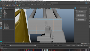
Creating the main shape for the back of the light, lots of extruding and deleting faces that wont be seen.


Creating the nuts/bolts that would be used so the parts would look like they’re connected in real life. Left is early stage in preparing geometry for the bevelled edges.


Used the bend deformer tool to create the bends in the rectanglular frame, and then attempting to round the edges by scaling edgeloops (this method was later scrapped as it cos problems for the bevelled edges, so I just left the edges as ractangular and then bevelled them).

Manually moved the vertices on the ‘cage’ at the front of the light to make it look like they were welded together as I didn’t think it would look good if I tried to do this as a texture.
Another view for the ‘weld’ cage bit

Bevelling edges as the model nears completion. When bevelling edges I found that setting the Segments to ‘2’ made the geometry subdivisions better as it divided everything into quads and it also made the smoothing a lot better as it appeared to reinforce the edges so they didn’t lose shape.

Shot of the edge of the metal frame, preparing to bevel the bolt edges
.


Bevelling the power converter thing at the back of the light. When Bevelling it created Geometry errors that I had to fix by a combination of merging Vertices, and using the Multi-Cut tool to create new geometry (coupled with deleting old geometry).


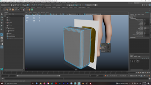
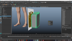
Model positioned with Content Browser human model for scale reference to make sure everything was as intended (size-wise)

More shots with human model


Cleanup tool identified errors that had to be fixed. I used combination of Multicut, Append, and smoothing to double-check that things were working.
—
Floorlight: UV Mapping


By this point I got pretty comfortable UV Mapping,, and stacking similar shells to save space on the UDIM. using layout and unfolding to make sure everything had the same texel density. Creating cuts/seams where you’d be lest likely to see it, orientating shells etc.

UV Mapping.

A method I had previously used was to attach different materials to the different faces that it would be easier to paint them in substance painter. In hindsight this was incorrect approach as Henry later uploaded a tutorial video regarding utilising UDIMs, but at the time this was the approach I used because it worked last time (i would later correct it on all models to the vastly superior approach recommended by henry).
—
Floorlight: Texture Research
I couldn’t find and images of rusted/damged floorlight so I looked at a variety of other artists and how they approached texturing for this type of model.None of them really made a damaged/weathered one so all their textures were fairly ‘clean’. One thing they did do was model the inside of the light, but I opted not to as I didn’t think it was necessary as I was planing to have it be reflective, and dirty with light coming out of it.
Their textures all appeared to looked like the source referece, little bit of roughness and metalness of the painted metal frame and then more roughness for the plastic parts.


Because the handle is made of foam, I had to research how that looks visually. Appears to have a dark grey as the main fill colour with lighter and darker shades of noise. Also looked at other artists who made similar textures and they appeared to have a similar approach.

Floor the glass a look at how dust looks on it, and it’s really just specs of noise with varying shades of white/light grey. Smudges can be used to creates fingerprint marks.

also looked at how fingerprints can affect plastic. oil from the fingers will make the surface shinier.
—
Floorlight: Texturing

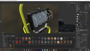
Starting by using using some techniques i learned when working with the Jerry Can, applying the base colours then applying paint to the areas I wanted to be chipped/weathered/rusted/damaged (that would be later used as a mask for grunge generators)


Creating the foam texture. Had to carefully adjust the roughness and height information of the white noise to avoid the foam looking like a hard plastic.


At this stage I was still struggling with understanding substance painter and struggling to have the rusty noise without affecting the paint layers.

More experimentation, the common problem i kept encountering was that I was making the paint rough(heightwise) and thhe rust smooth, which was the exact opposite of what I wanted. I was still struggling to understand the layers and the folders.


I partially gave up with the paint/rust issue, although it didn’t look ‘right’, i thought it still looked good.I also textured the silver cage (and bolts) at the front of the light in a similar way and thought it looked good. And for the black plastic I added a combination of dust and rough dirt, coupled with some shiny patches to reflect finger-grease on plastic.
—
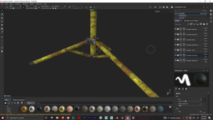
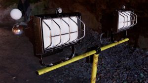
Worklight: Modelling Research
This worklight would include a lot of similar features as the floorlight, and for stylistic consistency, I decided to use the same “light” models for both.


I looked at a lot of different twin worklights and they all look roughly the same, following a lot of similar design shapes.


I decided to go with a model similar to this because of how the hinges at the bottom work (and how they connect to the legs), I figured it would the best one to make sue to cimplicity and still maintaining the same end result.
Because they’re almost all adjustable I looked at the dimension sizes for a variety of them and worked out an average, then based my models off that size (I would then extend to make it look like it’s currently-in-use, as opposed to place out-of-the-way).
—
Worklight: Modelling
This model was majoritively simple, with the only difficult bit be being the hinges/areas around the bottom. Top was existing light assets, and sweep mesh to create the cables that went into the power supply. Middle was multiple cylinders with extrustions to create the twist-grip thing that would hold the height in-place.


Oddly shaped and required positional precision, so it looked right, a lot of extruding, bevelling, appending
and multicutting.


Parts of geometry requiring fixed.


Size referencing and UV checking.


UV Mapping and adding materials (which would later be updated to using one material and correctly using UDIMs)


Final Model Shots.
—
Worklight: Texture Research
This modelling basically included all the same texture info as the floorlight.

Only real addition was that I research how rubber looks, which would be used for the feet and the cables.
—
Worklight: Texturing
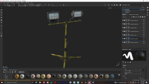

I created Smart Materials from the Floorlight and used them again for this. I altered some of the randomness perameters and flipped some of the maps to create variation so they wouldn’t be the same. But the same issue still persisted regarding the paint being bump and the rust being smooth.
—
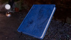
Notebook: Modelling Research
For this i wanted to use small notebooks (A5) and I used my own as references.

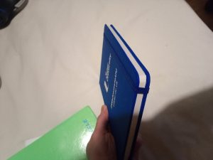
used this as the main shape/model reference.


researched the common dimensions on an A5 notebook


Also looked at how other artists modelled/ rendered 3D notebooks. Their models are simple enough, but a lot of their text just seem too smooth or glossy, like, they don’t look realistic.


I also wanted to create a ‘open’ variant, so I looked at how the spine of the pages/book react when it’s opened.
—
Notebook: Modelling

The inital ‘closed’ book was fairly straight-forward, just keeping it looking like the reference. The only issue i had was with the band that wraps around it to keep it closed, cos I would have to make it really thin to avoid clipping through things underneath, and would have to posiitions the book with a slight tilt, and the overall extrusion and keeping it tight around the edges of the book’s bevel was a pain. I ultimately decided to scrap it.
I spent a lot of time trying to create the opened book with the same dimensions as the closed book, and then use the Bend deformer to bend the pages.
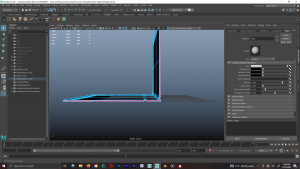

Continuing to try to get everything in the right shape/position


Contunuing the struggle, and then struggling with hole the edges of the pages lie ontop of each other in that slant.


After a lot of experiementation I decided to scrap this variant as the pages didn’t react with the spine in the same way that it does in the references, and getting the pages to sit correctly was becoming problematic.

trying to get the edges of the pages to sit correctly (have to use append and multicut tools)

UV Mapping was again fairly straight forward, using the ‘smooth’ tool created stretching, so I had to add additional edge loops to get rid of/ minimise it.


Final Model
—
Notebook: Texture Research


I looked at different types of notebook materials and ultimately opted for a leather-esque one. The ones in the references appear to be ‘puffier’ than mine. They appear to have a low diffusion of light, and an indented pattern on the the top that would be slightly rougher so light reflects less.
—
Notebook: Texturing

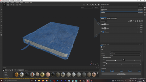
Two variants one cleaner than the other. Pages were made with multiple anosoptrpic noise layers stretched along X-axis, with varying shades of grey and height information (so it didn’t look completely smooth)
—
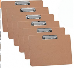
Clipboard: Model Research
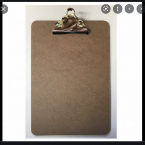

I looked at different types of clipboards. They basically come in standard sizes but varying materials, I decided to use the portrat variant with hardboard/mdf base.


I looked at the different types of clasps that they have, I decided to go with the thinner ‘line’ styled clasp because it’s simpler to make and picking it wouldn’t have any negative impact on the model or ‘story’ of the scene.
—
Clipboard: Modelling

Main base of clipboard was very simple, with was just the clasp that required more work. I used the Bend deformer on a cyclinder. I made half the clasp then duplicated it, scaled by -x, froze transforms, comined, merges vertices, deleted history.


Beside Human model for size reference.

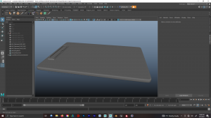

Final Model Shots
—
Clipboard: Texture Research
For researching textures I couldn’t find any damaged clips, so looked at damaged hardboard/chipboard/mdf and how water affects it as i planned to have water in my scene leaking from an open hole in the ceiling

Hardboard/mdf varaints (dry). The surfaces textures are inconsistent with different shades of neighbouring colours. So I planned to use a white noise generator with different shades of brown.


Different variations of water damage. although mine wouldn’t be to this extent, it’s interesting to see the common themes; namely the darkened colour and seemingly bloated and noisey appearance.
—
Clipboard: Texturing
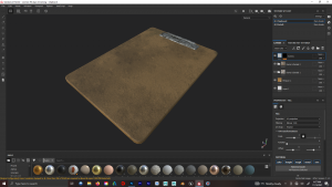

Two variants, one more damaged than the other. Darkened spots where they’re damaged with slightly increased height info. I used a roughened grunge generator on the metal clasp.
—
Trowel: Modelling Research

There are a lot of different trowels with different uses/purposes, so I had to research what’s the most commonly used Trowel for archaology


Mark I trowel.
—
Trowel: Modelling


I couldn’t find any exact size dimensions for this trowel, so I kept it beside the human model for reference so it looked proportionally correct.

Final model shot. Handle was cylinder with extrusions, then the bend tool leading towards the flat bit and then a very then cube for the flat bit. I planned to used the ‘weld’ effect when texturing so it would look more cohesive.
—
Trowel: Texture Research
The research was basically looking at dirty trowels, and how the dirt interacts with metal. The handle is like a treated wood, which gives it a bit of a shine, then theres two types of metal, one is noisey (where it bends) and the flat bit has like, anistrophic streaky lines.
—
Trowel: Texturing


Wood grain effect was different shades of anistrophic noise, and a low-opacity dark brown on the base brown fill to add variance. Noise with negative height info for the bent metal bit, and anisotrophic noise were used to create the metal streaks on the flat bit (I couldn’t get the streaks angle exactly like in the reference as it only let me choose between between two angles).
I tried adding a light bit of dirt with height info, and then I thought I’d add some white cement-like to show that they’ve been used in previously in other places.
—
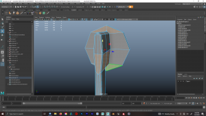
LED Torch: Model Research

I looked at a lot of different handheld LED Torches, and they all vary greatly in design and materials.

Because there’s no specific design, I wanted to be creative and create something original using this image and a base starting point.
—
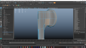
LED Torch: Modelling
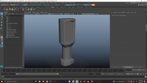
The model was fairly straight-forward, started with a cube, extruded parts inward, added extra vertical edgeloops and scaled them outwards slightly, then bevelled edges.
—
LED Torch: Texturing
For this model I wanted to to be made out of rubber, my reasoning for this would be that it’s better to grip and if it drops it won’t break. So using using the same methods from my previous rubber and glass material research I applied it to this.


I also took this time to experiment with stencils in Substance Painter, so I added and painted grids where the hands would grip it, and then added semi-hexagons in places that I thought accented the model’s design and looked good. I tried a few different techniques before settling on the final pattern.
Also added some negative height information with some brush strokes to some edges where it would’ve been slightly damaged had it been dropped.
—
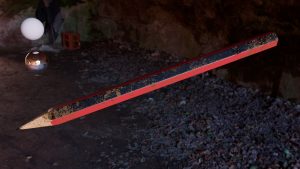
Pencil: Modelling Research


Researched dimensions.
—
Pencil: Modelling

The simplist model, exactly what it looks like.
—
Pencil: Texture Research

We all know what a pencil looks like, and there’s even lots of different variantions.
I also wanted a variant that had chew-marks on it, but surprisingly I couldn’t find any reference of pencils with teeth marks in them. My original thought was to sculpt the chew marks, but then I decided it would be best to just paint them in using a brush with negative height info.
—
Pencil: Texturing


Texturing technique was comparably straightforward on this one. Bit of anistrophic noise for the inconsistency on the wood.
—
Generator: Model Research

When researching generators, I found this generator and really liked how it looked.
https://www.ubuy.com.tr/en/product/S7O3D5OO-bohmer-ag-6500w-petrol-generator-3-4kva-8hp-with-uk-plugs
I looked for it on a variety of online sites and watched youtube review so I could see it from all angles.

Another view.
—
Generator: Modelling
This was by the most complex model because there were so many parts to it.

Using all techniques I accumulated over the previous models, I started by making a cube to match it’s size dimensions, then using bend deformer on cylinders to make the frame.


i then imported reference views so i could roughly block out the shapes, sizes, and where the inner parts were. Although not absolutelyperfect (due to the perspective on the image), it’s roughly correct.

I then started extruding out parts and manipuulating geometry. I took some creative liberties so it’s not 100% exactly like the reference material, but it’s strongly influenced by it.

blocking out some of the smaller parts with the reference view

refining block parts with extrusions and bevels


modelling some more of the intricate model parts, wires were made with curves and a sweep mesh, then extruding/manipulating the face geometry.
 |
|
UV mapping finished pieces, and begging to make a plug. struggled for a bit with this as i tried to make a curvey plug, but i couldn’t get it to work correctly so I finally opted for a blockier one.
Further refinement and cleanup tool highlighting geometry that needed fixed.
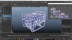

Uv Mapping and Final model. I didn’t keep the Texel Density the same for every part because I felt it wasnt needed and there were so many pieces varying in size and texture type.


More final model shots
—
Generator Texturing:

Texture was basically a combination of all the previous textures I had used throughout the other models. Painted metal, hard plastic, rough pastic, rubber, rust, dirt etc. For some of the smaller parts that were supposed to be light I made their texture slightly more metallic so it would at-least look like it should light up (or be different enough from the materials around it).
—
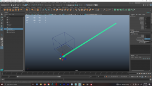
Rope:

I researched a lot of rope, how rope was made, how many twisted pieces are in it, and how other artists made it. This is the reference I used for how I wanted the final model to look.
I also looked at how other artists made rope;
—
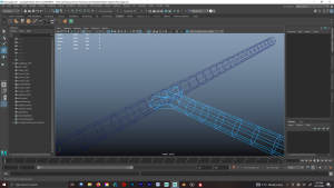
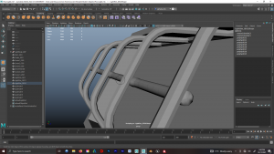
Rope Modelling:

The best best method for creation was to use curves and sweep mesh, then alter the properties to increase distribution (amount of cylinders) and increase the twist (so it look like a rope). Although this worked perfectly, the issue was that there were so many polygons being maniuplated that it slowed down the computers especially while trying to shape it into a curl (like the reference) and having to remesh it so that it would be smooth.
A solution i found to this was to make lots of shorter versions, and pile them together to make it look like a reel of rope. Although this worked, it got very tidious adjustings it position so it looked believable. I eventually scrapped this idea because I already how so many other models I felt that this additional model just wasn’t necessary.
**Sweep Mesh method is a fairly new addition to Maya, a lot of methods on youtube that other artists showcasing the older way of extruding a cylinder along a curve, but it’s more finicky and can have problems (like inverting itself). The sweep mesh method is the most efficient and best.
Blockout, Presentation & Feedback
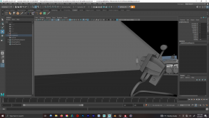
We had to create a presentation showing what we’ve done so far and showcase our blockouts/progress on what our final environment would look like. I was the only person in my group to showcase anything, and my blockouts were made in maya using a lot of unfinished models as my group hadn’t finished any of their models by this point.
I wanted to utilise a lot of low camera-angless to emphasise and highlight scale and the size of the environment (influenced by Greek temples). and have objects in the foreground beside the camera (out-of-focus) cos it’s a common technique in photography and cinematography that I think makes shots look a lot more interesting

lots of props and an ancient relic on the crate, background is out-of-focus to guide your eye

looking up the temple towards the sarcophegus, ladder is out-of-focus to guide your eye


looking at the scale of the temple columns and an altar of gold

looking at damaged ladder that was used to climb up to investigate the hard-to-reach parts of the temple
torch that would be lighting-up a wall of hieroglyphics

looking up at the scale of the temple, and at the broken open that would be letting in light and god rays.

lookng ‘down’ the temple of the giant sarchopegus towards the back of the temple

shot of the temple floor, with damaged ground where there would be a pool of water.

another angle looking up showcasing fire-bowl and the altar.

looking up to the sarcophegus at the top of the steps, with the generator out-of-focus to guide your eye
.
generator and jerry can out-of-focus to guide your eye towards the ancient relic.

some damaged jerry cans, one has been knocked over
—
also showcased my finished and textured props during the presentation. Henry and Michael pointed out refinements that they recommend i make with quite a few of the textures to improve their overall quality, named the paint being bumpy and the rust being smooth (when it should be the other way around). A good quote being, “it might look good, but it doesn’t look right”.
Refining the textures
as per the feedback, I made alterations and tweaks to my textures;

I made a designated rust texture, although this screenshot isn’t the traditional colour, I would change the base colour (lighter/darker/more red/more orange etc) depending on the model and the shades of coloured noise I already had on it

Made a new variant of the notebook as they cited that my last one was just a block. So I added a page hanging out, it’s bend was made by moving vertices with the soft-solection tool.


Also corrected some UV errors on the smoothed models that was caused by thee smoothing, the above images being an example of that.
—
Final props with refined textures

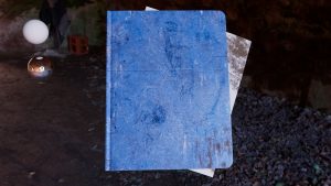
alternate books with dirty pages, dirt and scratches on book have been adjusted and the anistrophic noise on the block-pages has been altered with deeper height info so they look less like a block. I chose a yellow page just to add colour variance, I originally picked orange (complimentary colours) but it didn’t look right, but yellow seemed to work.

increase the roughness on these so they were less glossy, in hindsight i think i may have made the metal on the right one a bit too rough.


altered paint and rust properties, pain is smoother and rust is bumpier

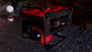
updated same properties, with one genreator being slightly dirtier than the other. granted some key dirt marks are the same.


made paint smoother and rust bumpier. also reduced the amount of chipped paint and rust


refined dirt to make it more noticeable, still subtle, but considerably more noticeable than it was.

refined dirt, scratches, roughness on the cover, anistrophic noise hieght info on the pages, and changed the ribbon colour to black.

Made dirt more noticeable, added positive height information, refined the chew marks by increasing roughness and making them less shiny.


refined dirt and added more height information on pieces, removed the ‘white’ dirt/dust texture and added some more subtle/smudged dirt


made paint smoother and rust bumpier, changed positioning of rust.


made paint smoother and rust bumpier, reduced the amount of rust and dirt to create a ‘cleaner’ variant.
Creating Scene in Unreal Engine 4
Blocking out in UE4
When I was blocking out my final scene in UE4 most of my group didn’t have final models or textures created, so I couldn’t use them. I tried looking online for other stuff i could use (since i wouldn’t be getting marked on it anyway) but most of the one’s i wanted required payment.
I took some textures from online that I would use to fill the gaps until my group completed their assets. I didn’t have much experience with UE4, so I encountered problems that i had to research online how to solve, a massive one was the lighting, understanding the fog & god rays, particles,
—
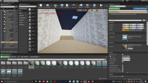

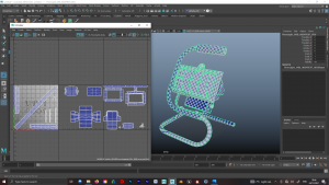
Blockouts of the temple. I recreated the temple from maya and made it narrower as i had less props than originally envisioned.


getting the hang of positing props, lighting, cameras etc. I was still having lighting problem with textures in the back that i couldn’t figure out. after quite a bit of research I learned that it was because I had the textures attached to planes, and if light hit a bit of them that was clipped outside the environment, it would light up the entire texture.
I used the floor texture from Quixel bridge.
Compositional/ Cinematic Influences and Research:
Since my work was majoritively props plsnned on using a lot close up shots of the props to help set the scene and tell the story of our world. Some research pieces that also influenced my cinematic included;
Spider-Man (PS4) Opening Cutscene:
Scene opens with clsoe camera pan across all the props in the room to really help give you a feel for the world andthe type of person who lives that room.
Uncharted 1 Teaser Trailer:
This uncharted teaser trailer shows shots of the environment from different panning camera angles to set the tone of the game. i would like to incorporate something smilar, even though they use characters for variation and dont use props.
uncharted 4 teaser trailer:
video using a long panning camera over a map, this gives a small insight into the nature of the game
trailer for uncharted 3 stars with a slow close-camera pan across a table full of props, very much setting the scene for the type of world we’re in. it then crossfades to a shot of the character walking across a desert environment and through a plane wreckage.
Dark Souls 1 Trailer: opens with title scenes cut with environment and character shots to set the scene of the world. This would be the style of trailer i’ll be making with my cinematic coupled with close panning prop shots and cuts of title sequences with particle effects in the background.
—
Shots from the final Cinematic

I wanted to showcase the detail of the light cage, and added bloom to make the light appear brighter. This shot was purely me being creative with the camera work, the next shot highlighting the Heiroglyphs is the important one for setting the scene, this shot is more of a slow panning ‘eye-candy’ shot showing off the model and textures in preparation for the next one.

Setting the scene and informing the viewer that this is egypt related. Hieroglyphs are the brightest part of the scene (draws your eye) and the position of the floorlight also guides you eye to the heiroglyphs.

Similar to the previous shot, this shot is a slow panning close-up showcasing the props to give you a feel of what the story is in this environment. But it’s main purpose is to serve as an interesting what to prepare the viewer to have their attention to the cyrpt at the back.

Worklight subtly comes into focus before to put the viewers attention on the crypt at the back, compositionally it’s unnerving and daunting. the framing of the worklight combined with the use of the focus switch completely sends the viewers attention to the crypt at the back.

Next are some panning shots (in varying directions) of the environment to keep it visually fresh, showing off the environment and textures. the cinematic examples i showed utilise this technique, and they also use characters aswell to keep it visually engaging, but i don’t have characters. Shots climax with a close up view of the crypt where we see more hieroglyphs close-up

Next shot is an eerie low-angle looking upwards as the camera travels through the environment, i changed the focal length whilst moving the camera forward to help create that unnerving depth effect.

Lastly we see the environment slowly reveal itself through the fog, where we can see the columns subtly break through the fog also highlighting the sense of scale before being abruptly cut off. in my head there was a dramatic/cinematic thud sound as the shot abruptly cuts.
—
I think Edited and Colour Graded the shots in Premiere Pro, and used After Effects to create the title sequences.
Reflection
Overall I really enjoyed this assignment, I started off with the intention of challenging myself and I feel I did that. I’ve noticed a massive jump in my Modelling, UV Mapping and Texturing skills in Maya and Substance Painter. Considering the workload I gave myself and the quality standard I expected of myself, I feel like I paced myself quite well. All the final textures may not be perfect, I still think the end product is quite good given I was at a much lower skill level a few months ago.
There were I few things I would’ve liked to do more of, such as experimenting more with Trim Sheets, implementing and experimenting with LODs, and utilising photogrammetry to create a model. As I was really looking forward to it when the assignment started, but as it progressed I found myself unable to justify using these techniques and I wouldn’t be making use of the result (I did prepare all of my models for LODs as I created 3 of each).
I struggled with UE4 at the start, but towards the very end I started to get the hang of working it, I thoroughly enjoy creating videos, composition and cinematics. So this project was an avenue where I was able to utilise this interest and skillset. I think I need more practice Colour Grading, I feel that although I understand a chunk of the concepts and principles, I’m not fully confident doing it.
Compositionally, I think my camera shots/angles/animations worked well using what they had, they correctly guided the Viewer’s eye and attention and were visually interesting, and the sequence of shots maintained interest. There’s nothing I would change, in that regard, if I were to do it again cos I feel that was my best. I’m aware they’re not perfect, such as the speed ramping and bumpiness when the camera changes angles; but considering it was basically my first time using UE4, I don’t think i did too bad.
If I were to do this assignment again I would probably choose to do less props, but then again, I specifically chose to do lots so I could improve those skills; so it’s difficult to say what I would do differently. I would’ve liked that the rest of my team had their props/assets finished in time so I could’ve used them as originally envisioned in the Blockouts, but I think I made the best with what I had.
Overall, I personally really enjoyed this assignment, and the pacing of it, but I can’t say I would do anything differently if I were to do it again. That was my best.