
Intro
For this project, we were asked to research words and create images (480px x 480px) which would consist of points, lines, and tones, to visualize words given to us. The project consists of three different parts: Wax on Wax off, Paint the fence and Pain the house.
pt 1. Wax on Wax off
For this project, we were asked to research words and create images (480px x 480px) which would consist of points, that would represent three of said words; Reflect, Multiply, Disperse, Proximity, Scale, and or Dominance.
I chose the words Dominance, Disperse, and Proximity since I felt like they were words I haven’t really explored in terms of design, or words I have used previously at all. It was a learning experience for me, to learn about new words and how to use them, as well in design and where to find inspiration from them all around us.
Dominance
Synonyms: Control, Domination, Influence, Power, Preminence, Rule, Sovereignty.
Researching the synonyms of Dominance gave me a much clearer picture of what to focus on and what I had to use to come up with ideas to portray the word.
Domination is a word with a wide variety of meanings and can appear in many different shapes and forms. By looking at nature alone it’s very common that Larger living beings or objects dominate smaller ones since larger is commonly understood as stronger and smaller would be weaker.
I looked onto images and ideas, scientific ones as well to get inspired. I figured that shapes that would either swallow or dominate another shape by size were something I chose to experiment with.
With my research in terms of the size difference, I began looking at Planets and Galaxies. Larger bodies, especially in terms of force have a stronger gravitational pull because of the mass, whilst smaller ones have a weaker one.
Whilst I was looking into this research I also found interesting images of planets such as Venus being in front of the sun, which showed the size domination of the sun compared to other planets in our solar system.

Seeing this image sparked quite a few ideas about what to do in this project, and I took a lot of inspiration from it.
Another form of Domination I chose to research was also the domination in terms of organisms feeding on other organisms. There are several games, like Spore and agar.io that gave me this inspiration. Whereas an organism feeds on smaller weaker organisms to grow stronger. In the games I mentioned, by growing stronger you eat the smaller, e.g. weaker one, and grow in size and strength. I decided to experiment with that using points that are being absorbed into slightly larger ones.

Going the opposite direction of the previous research I’ve done, I decided to look into numbers instead of size. In the animal kingdom, it’s very common for animals to hunt in larger numbers to take a larger animal down. This is an example where they would dominate the prey with combined strength from numbers and size being irrelevant. I thought that it would be a fascinating idea to work into the design to give it a little bit of a difference, not only having large and strong as the main source of inspiration. Since domination has a wide variety of meanings and ways to dominate.

Sketches & Digitalizing
Whenever I had done my research I began looking into sketching down my ideas and much more to get a general idea of what I wanted to do. I began on a blank page to sketch down ideas, but because of the lack of rulers I had, I quickly changed to the dotted book we were given and sketched down my ideas there.


From the ideas I had on the previously blank white page I sketched down the ones I found to be more interesting, even though there wasn’t much there.
I also used my research and my ideas to sketch down several other ideas that I had in mind. Whenever I was happy with my sketches I moved on to making them digital in the Adobe software Illustrator.


I used a 10×10 grid to help to make the designs look better and more structured.
Finished designs: Dominance.
 Disclaimer: I misunderstood the project slightly, but I chose to keep this design the way it is since it’s still relevant and represents dominance.
Disperse
Synonyms: Scatter, Spread, Spreading out, Dissolve, Disassemble
For my second 3×3 grid in this part of the project, I decided to use the word Disperse. Disperse is not a word that I’ve previously encountered so I had to translate it and once again I decided to use the synonyms to get a better understanding of how to visualize the words using points.
Disperse is not as wide as the previous word I researched and used; Dominance. Since it has an exact meaning. However, you can visualize it much easier than Dominance. It’s something we can visualize because of everyday occurrences, like seeing someone scatter bread for the birds, or a tree dropping seeds, a school of fish spreading out whenever you walk into the water. The possibilities are endless.

The synonyms for Disperse gave me a lot of ideas and inspirations. Looking at nature for my greatest inspirations. I wanted to visualize how objects scatter, spread, and disassemble naturally and using points to create them. As I previously mentioned, two of my inspirations are how plants are dropping seeds, as well as how animals scatter when feeling threatened, like a school of fish or a herd of sheep. There are of course other inspirations as well, like when two bodies collide in space and the collision causes a scatter of both of them.


Sketches & Digitalizing
Learning from my previous mistake I began to sketch it immediately in squares on dotted paper. I sketched as previously 12 squares to experiment on, only to chose 9 of the ones I found to be the better ones. I experimented a lot with different ways to use the points, making negative spaces using them, trying to get an effect to make it look like it has scattered and broken. I also tried to mimic the idea of a dandelion scattering its seeds as well as a school of fish avoiding a threat.

Whenever I moved on to making it digital I used a 10×10 grid as well as lines and circles to get the desired graphical element. I wanted it to look geometric as well as sophisticated and clean. The grid helped me a lot with keeping the dots in balance, and it also helped me with size not to make it look too chaotic.

Finished designs: Disperse

Proximity
Synonyms: Closeness, Nearness in space, time & or relationship.
For my third and final 3×3 grid in this part of the project, I chose the word proximity to experiment with, since it’s such an important element of graphic design, I took it as an opportunity to learn different ways how to use it using points and deep dive into research and how other designers have previously used it, to get a better understanding.
Proximity in design is something extremely important, especially when designing apps. It’s to help our brain to understand if certain objects are grouped or not.
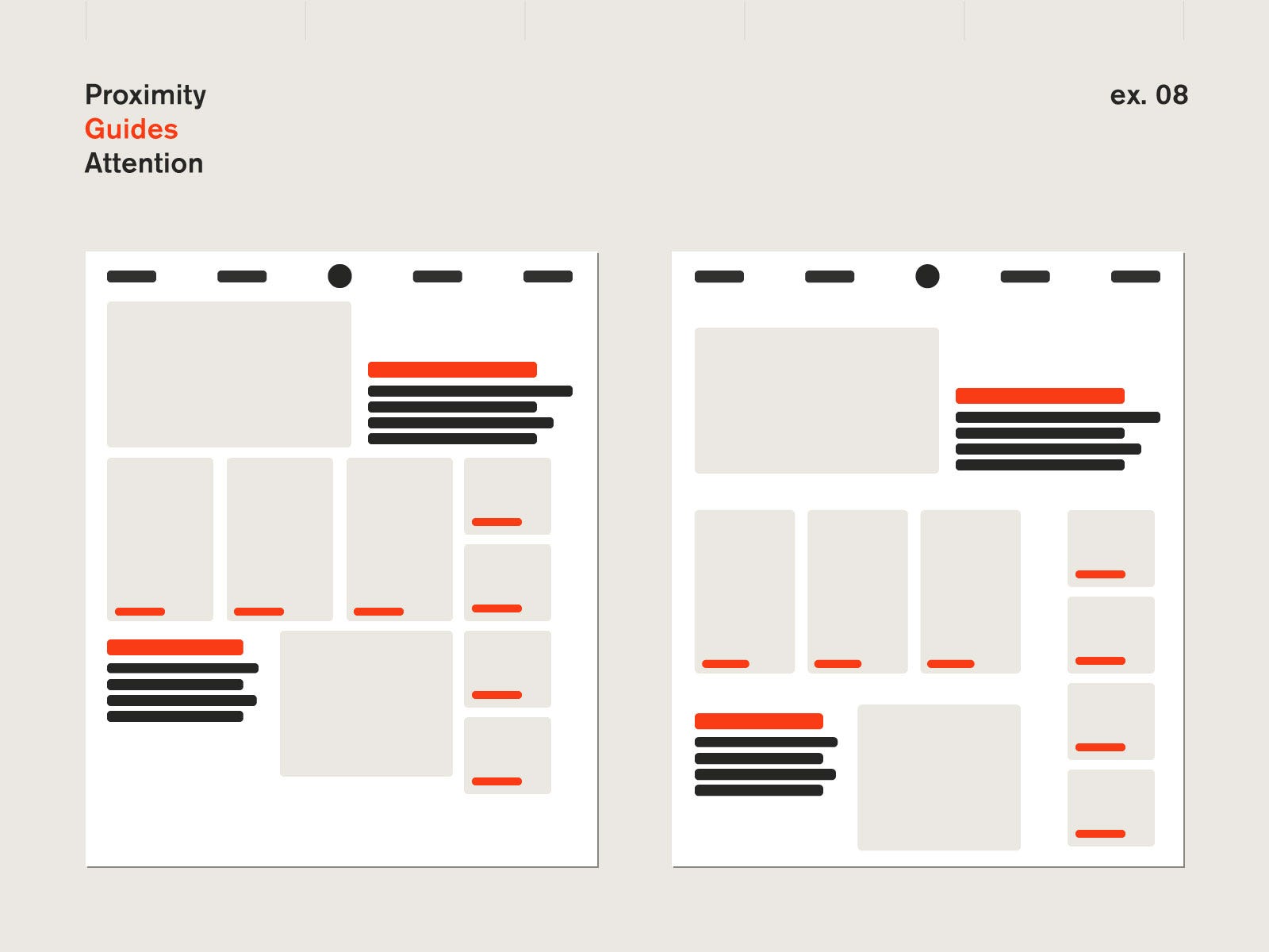 Source: The gestalt principle of proximity — in action
The simplicity with proximity and the brain is the distance, so using distance to group certain things to understand they’re in different groups, even when the points are in different colours, our brain registers how they’re grouped. To be able to distinguish groups from proximity is once again something that happens naturally and is a natural behavior of animals, as well as humans.
For the word proximity, instead of using the world around us as an inspiration, I began to look into the digital world. I looked into the design of apps and websites, to see how they have structured their design, using proximity to divide objects into different sections.

In the app Discord, for example, they’ve used proximity to group users, depending on what role they would have on a server, as well if they’re online or offline. They have also used it to divide messages, depending on when you sent them as well who sent it. So if you were to send several messages in a row, it wouldn’t have much of a distance between them, however, if you were to wait a certain amount of time, or if someone wrote in between your messages there is a distance between messages. See the image below as an example.

Whenever they give the messages space it’s easy to understand that they do not belong or if they do belong and are relevant to each other, two ways of proximity. Both time and space.
Sketches & Digitalizing
When I began to sketch down my ideas, as previously mentioned I took a lot of inspiration from graphic design elements to group the points into different sections, but at the same time, I chose to play around with the size, depth, perception, and distance between the objects. With these sorts of experiments, I found a lot of different and creative ways to visualize the word and had a lot of fun at the same time.

During the process of making 9 out of the 12 designs I came up with, I used a 10×10 grid once again. The 10×10 grid once again helped me to finalize a clean design that made sense. Even tho I had a Horizontal and Vertical grid to help me, I also took a lot of help from using diagonal lines for depth and more, to finalize the odd designs I chose to continue with. I also had to use maths to make one of the designs (Middle, right) for it to make sense, since the circles are stacked behind each other, I had to add 48px to each size to get a good and even size that could grow in size and still look well.

Finished designs: Proximity

pt 2. Paint the fence
for The next part of the project given to us, we had to use lines to visualize the words Asymmetry, symmetry, frequency, and Rhythm.
In the second part of this project given to us, we were given four words and three 3×3 grids. I made the decision to use all four of them, researching and making these designs in various ways using grids and precision.
Asymmetry/symmetry
Since we were given 4 words but only 3 grids to work with, I decided to mix Asymmetry and Symmetry in a few of my illustrations, using colours and perspective to my advantage.
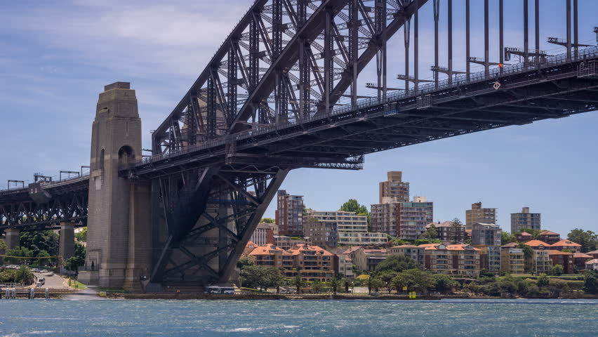
A lot of my previous work has been inspired and based on things that would occur naturally around us, may it be on earth, in nature, or in outer space. For this part of the project, where I’m going to visualize my ideas for Asymmetry and Symmetry, I chose to look into human-made structures, like weaving and architecture for example.
Architecture is something we see on a daily basis since it’s another person’s art but in the form of a house, a library, maybe a school. We’re surrounded by it and it’s something we need to live a comfortable life in today’s society. Two specific types of architecture that I took a lot of inspiration from are Brutalist Architecture as well as regular bridges.
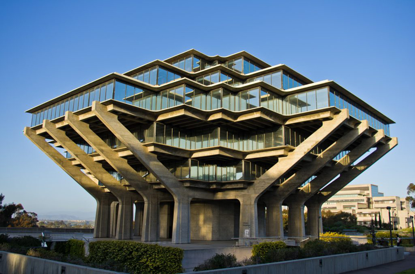
I found that the structure of a bridge when zoomed in looks aesthetically pleasing, at the same time it’s sturdy and functional, as well as symmetric. I began to play around with ideas on how I could work architectural ideas into my design and make it look both symmetrical and asymmetrical at the same time.
Another inspiration I had for an idea I got while sketching was geometric photography. Which plays with geometrical shapes and interesting colours to make a photo, with that idea I decided to experiment with having a symmetrical pattern, but making it asymmetrical using two tones.
Sketches & Digitalizing
For the sketches, I decided to use a lot of straight lines and geometry for them to look more interesting and minimalistic. What really helped me in this situation was the dotted book we were given, since it eased the process of making the lines look even and make sense.
For this part of the project, I chose to sort of divide each section into different designs. I also experimented a lot with thinner lines and making objects with that rather than thick solid ones.
This part of the project was possibly the more experimental one for me since I had so many ideas all over the place, hence why it looks a little bit over the place.

For these designs, I used instead of a 10×10 grid to help me, a 20×20 grid. I chose to go with a much more narrow grid to be able to add more interesting designs to it.
There was only one design I didn’t use the grid to create, and it is the one on the top right. It is a symmetrical design in terms of line size, the colour is just the opposite on each side, so there is a thought behind it.

Finished designs: Asymmetry/symmetry

Frequency
Frequency is something that we can find everywhere, the Light, the heat, electricity, ourselves. Finding something specific to explain frequency is a challenge and I wanted to challenge myself at the same time, push my boundaries and try something I’ve never tried before. I looked into different ways to portray frequency and at the same time things that had a well-documented frequency that I could use as an inspiration.
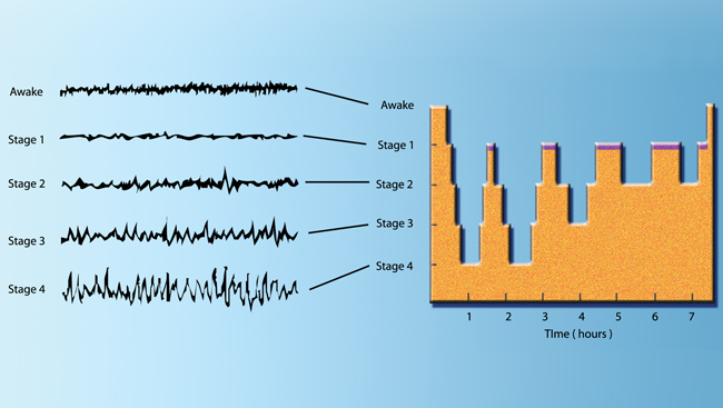
After looking around I made the decision to pick a few things I would find interesting to work with, so I began researching what frequencies our brain gives off depending on the situation. Looking at several charts, awake and asleep, and how different parts of our brain have different frequencies, depending on what we’re doing.

I also began to look for frequencies that you would find looking at bodies in space. I found really interesting readings from each of the bodies I decided to look into, which were the sun, the moon, and earth. All of them having different sorts of frequencies depending on how you looked at them.

Looking at this image I took quite a lot of Inspiration, finding the idea of three different frequencies in one image felt like a fun challenge, so I sketched that down, as well with the sun’s frequency and the gravitational impacts the moon has on certain radio frequencies depending on where it’s positioned.

Sketches & Digitalizing
I began looking over what I wanted to work with in terms of frequency. I wanted to illustrate different frequencies that I find fascinating but without bending a line. I took great inspiration from the IBM logo and decided to experiment using shorter but more lines. With that I would easily bend and create shapes with just lines, to get the desired design I wished to have.
At the same time, I began looking into what sort of connection in terms of design that my illustrations would have, and made the decision to go for a grid design once again. But this time, it would be different. Depending if the lines were horizontal or vertical, short or tall, I would have to change the size of the grid. Which is what I did.

Here are each individual panel of my 3×3 artboard, to show that every illustration has a grid that I followed.
Alpha Brainwaves

Theta Brainwaves

Beta Brainwaves

Earth frequencies

Delta

Full moon gravitational impact on radio frequency

The frequency of the Sun

Gamma Brainwaves

20hz

Finished Design: frequence

I’m very much pleased with the designs I made here, using techniques I’ve never tried before. The grid system really made it so much easier to accomplish a clean design.
Rhythm
As an avid music lover of many different genres, the rhythm was possibly the one I could explore the most. Rhythm is natural and has been around for generations, since the beginning of life with a beating heart. Rhythm is something we somehow always surround ourselves with, music as well as communication, and our organs.
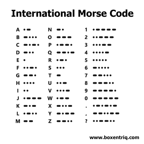
Morse code is something I decided to explore in this project. It’s something that has existed and we have used for almost 200 years, and until this day still use it, but not as regularly because of our current technology. Since we’re using lines in this project, it would be an interesting challenge as well as an interesting thing to experiment with morse code.
 A few other things I also looked into were BPM as well as our organs, how their natural beat looks like. The heartbeat, the rhythm of the lungs as well as the rhythm of our sleep pattern during the night, which is something we tend to forget when it comes to rhythm. Whilst BPM is well known and used all the time in music, we have our own rhythm inside of us.

Sketches & Digitalizing
For Rythm, I wanted to experiment with different thicknesses of lines instead of making the normal equalizer and images that really represent rhythm. I wanted to explore the idea of using lines to visualize the rhythm. For example, I had the idea of using lines for morse code which I sketched down, using the dots as the thinner lines and the longer dots making them slightly thicker, making space between the dots to create a word or an abbreviation. I sort of had the same idea with BPM, to make it more visually appealing. So I decided to take the metronome with a quarter rhythm into consideration, to keep the thick line that would appear every 4th beat.
Lastly, I had a human heartbeat, brain activity during sleep and irregular breathing, which I found to be three fascinating rhythms in a human. The reason why I chose to have the brain activity during sleep, is because of the sleep rhythm, and the rhythm the beat have to go through every time we sleep. Which I find deeply fascinating.

As for every other digital illustration I’ve made, I used a grid for this one as well, but many of them, since with a BPM as well as morse, it would be hard to get an even design. So I had to tailor a new grid to use for every 3(in a row) for it to have an even design.
Finished Design: frequence

pt 3. Paint the house
for The next part of the project given to us, we had to first use horizontal lines to create something, after that Horizontal and vertical lines, and lastly Toned squares. We were only aLLOWED TO USE 5 PLANES.
In the third part of this project we were asked to divide each square in a 3×3 grid into 5 planes, using first only lines, secondly Horizontal and Vertical lines, and lastly tones squares. Since we didn’t get any words to use with this part of the project, I used Mathematic sequences, inspired by the Fibonacci sequence we learned about in class.
Intro
Since we weren’t given a word for this part of the project only instructions, I decided to experiment with what we’ve been learning in class so far, but in a different way.
We have recently worked a lot with the golden ratio, the Fibonacci sequence. I wanted to see how I would be able to translate it into the design, not using the golden ratio, but the numbers. For this part, I also chose to experiment with other mathematic sequences.

My idea was to use a 10×10 grid for every 3×3 grid, except the first one, where I ended up using 20×20 to make the design well structured. With that I chose three different mathematic sequences, using 4 numbers to use to make each design unique, using the same number.
The sequences I chose to use were:
Pi: 3,141
Lucas Number’s: 2,1,3,4
Fibonacci seq: 1,618
Euler’s number(e): 2,718
Horizontal

I started off using lines, with the 20×20 grid since it said that we were only allowed to use horizontal lines. I decided to go with the 20×20 since the 10×10 would make the Euler’s number sequence impossible to work with, same with the Fibonacci sequence. I experimented by mirroring the designs and coming up with twists on a few of them to make it more interesting as well as to create a little bit of thought behind it.
Final design: Horizontal lines

Horizontal & Vertical

For the Horizontal and Vertical, I decided to go a little deeper with the sequence and add a little bit of a puzzle element to it. Being given a little more freedom I also changed the grid to 10×10, since the lines didn’t have to be horizontal only. It was a lot of trial and error trying to give each artboard a unique design.
I also ruled out the Fibonacci Sequence from the mathematic sequences and kept, Pi, Euler, and Lucas. Experimenting with numbers I haven’t really used prior to this.
Another thing to add to this, I chose to use 4 numbers in this project to leave a space blank to ease the process.
Final design: Horizontal & Vertical

Horizontal & Vertical – Toned
Finally for the Horizontal & Vertical, toned part. I did exactly the same as the Horizontal & Vertical but, with a lot of thinking and problem solving, trial and error, I came up with another 9 unique designs, but this time, every number that I used (1, 2, 3, 4, 7 & 8) was given colour each from the greyscale to achieve this toned design. I chose to reuse the colours to the numbers since the numbers are repeating, making it a puzzle as well as connecting all the artboards, with the tones as well as scale, still using the 10×10 grid.

Final design: Horizontal & Vertical

Final Thoughts & Comments
This project was definitely something different for me, but fun to experiment with. I did at the start misunderstand the project but thanks to some help I managed to get back on track to finish it in time.
Experimenting and researching a wide variety of elements that can be used as inspiration in design was something I haven’t really taken into consideration prior to this project, but it will definitely be something to use in the future. I also learnt the importance of grids and geometry in making digital design, since you have to use maths, even for the more simple things to make them appear nice and structured with the other objects you’re working with to create a nice balance as well as structure to your designs.
Sketching was probably the more important part of the project for me since it helped me brainstorm the ideas on paper, instead of stressing them on the computer, using the dotted book we were given on the first day in school. It helped me to sketch these designs that I ended up loving.
I learnt a lot during this project and the importance of the process from start to finish. It’s rewarding to take the long way to the final design. Don’t stress it, making more than one sketch and experimenting, use guides and don’t place things without a thought, it will give you a design that you’re more than happy with in the end, with a few extra steps.
My final thoughts for this project and my final designs; I’m very pleased with the final product of all of the designs that I made. Even though I was on thin ice the past few days since I misunderstood the assignment and had to re-do as well as do a lot more than I expected. I spent a lot of time and effort on everything that I made, from research to sketches and the final outcome to get the result that I wanted, and with the steps I took, it went much better than expected. It was a learning experience and by using techniques we’ve been taught from the few classes we’ve had so far, it went much better than I expected, and I was given a result I never thought I would be able to achieve.
Thank you.