Colour and Guidelines
Colour systems
One of the more important aspects when creating and designing are the colours. While colours are fun to play around with and are pretty, there are naturally more to add to it, such as the meaning of said colours in different cultures and how it affects people, as well as how the user/customer perceives the.
There are several different colour systems we use, such as:
-
-
-
- CMYK
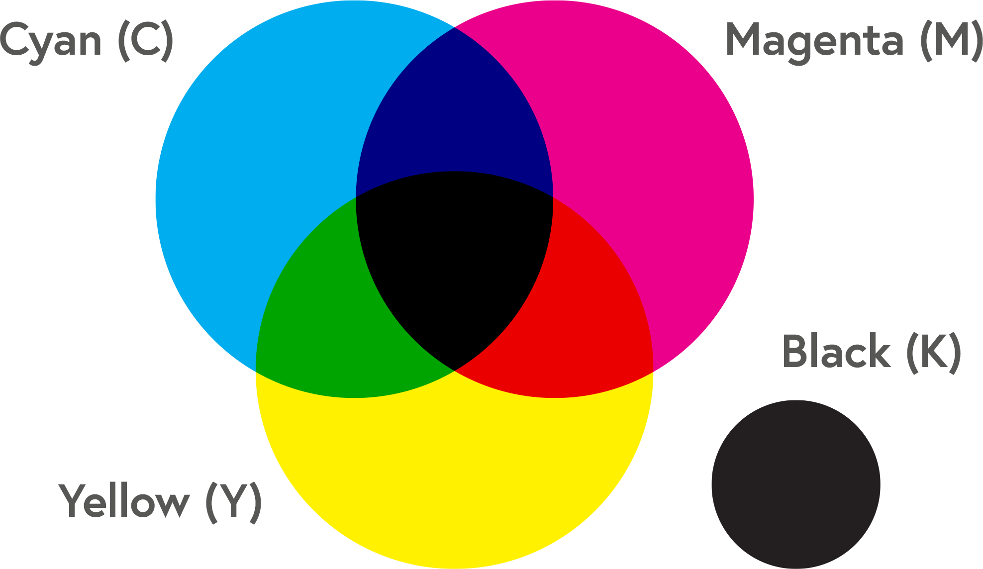
CMYK is Cyan, Magenta, Yellow & Black and is a 4 colour printing colour process. This Colour system is used a lot when designing only for it to later be printed, such as posters and artworks.
- CMYK
 RGB
RGB
RGB e.g. Red, Green & Blue; is used in screens and electronic displays, the colours we see on the screen is made using 3 colours with various intensity.
-
-
- RAL

RAL aka “Reichs-Ausschuß für Lieferbedingungen und Gütesicherung“, there is two different RAL colour systems, which is RAL DESIGN & RAL CLASSIC. RAL DESIGN is a colour system containing 1625 colours, and the colour codes have seven digits. RAL CLASSIC, on the other hand, was mainly formed due to industry requirements, and the colour code only has 4 digits. Please note that the RAL CLASSIC & RAL DESIGN colours are different and independent product lines. RAL is used to define colours for paint, coating and plastics, such as wall paint.
- RAL
-
- Pantone
Pantone is a colour system to help printers and designers specify and control colours for printing projects, it allows you to specify colours that cannot be mixed in the traditional CMYK.
- Pantone
-
Below is an example of how it’s used in the brand guidelines and how they can be presented in a booklet. This is the Colour palette from the company “The Body Shop” using Pantone Colours for their brand.

- Hexadecimal
Hexadecimal, or hex as people would usually refer to it as is a colour system displayed with 6 digits with an octothorp (#) at the very start of the colour code, for example, #333333, would be a darker grey.
#FFFFFF: White
#000000: BlackIt’s a colour system that is used in displaying web pages and can be used to specify colours in HTML and CSS.
Colour psychology
When designing, either a logo, choosing colours for a brand and or making a website, it’s important to keep in mind how colours work, relate to other colours, how it affects people and what the colours mean in relation to different cultures.
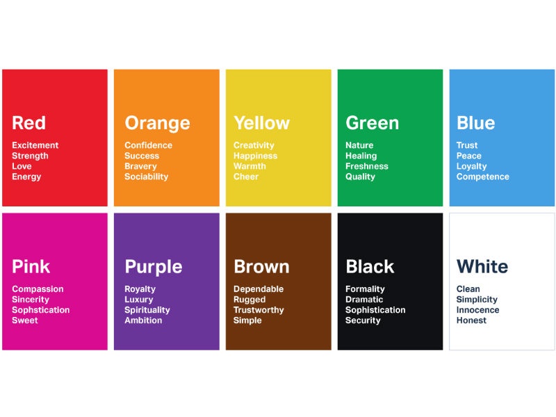
Colours have different meanings depending on where we are in the world, and it’s important to remember that depending on what you want to portray, white for example, in western countries means purity and peace, but on the other hand, white also represents death in Chinese culture.
See the infographic below to see the differences in perceiving colours can be seen from different cultures around the world.

It’s important to also be aware of how colours can potentially affect the customer/user as well since there are theories that colours affect the mood of people. A lot of people do, however, get affected by certain colours, since some colours make them feel sad, and some make them feel calm, or happy. Which plays a big role in choosing a colour for a design. If you want the viewer to feel happy, it’s important to choose brighter and more vibrant colours, like yellow or orange, and if you want them to feel calm, a blue would do well.
There is a lot of different perception of colours and how we see them.
Not only is it about culture, but also temperature and what each person perceives as something positive.
Sources:
https://neurofied.com/effects-of-color-on-behavior/
https://www.ncbi.nlm.nih.gov/pmc/articles/PMC4383146/
Research
To get a better understanding of how different companies have chosen the colours for their brand, I chose to do some research on a few companies’ colours scheme and how they use colour to communicate with their customers.
The Body shop
As I previously used in this post, I chose to look into the body shop’s brand colours since, as previously mentioned, my bank happens to have the same values as this company.
The body shop is a Nature, ethical, Vegan/vegetarian, Cruelty-free and constantly promotes sustainable products from sustainable ingredients. This is why they chose a green-based colour palette for their brand since it represents their core values.
“The bold and refreshing colours reflect eco-friendliness and naturally sourced ingredients. Black and white are occasionally incorporated into our colour palette to contrast against the green” – The body shop brand book page 34-35.
It’s evident that the colours chosen for their company are related to their core values since they’re different hues of green, which is understood by many to be related to nature. I chose to compare colours by taking an image of a forest and picking out the greens, to show the authenticity of their colour scheme.

The different shades of green that the body shop use for their branding are very similar if not identical to the greens we can find by looking at nature. The colour scheme that they chose to work with blends perfectly together and makes it look well, which suits their products and makes them blend in naturally with the store.

Lush
I also chose to look into the colour scheme that Lush use for their brand, since they’re also sharing a few of the same brand values as my brand.
What’s different about Lush and The Body Shop, even though they have similar brand values, Lush is aiming for a more colourful colour scheme for their brand.
When reading their brand book, they have four official colours, which are ‘Bright white’, ‘Jet Black’, yellow and green. As for their packaging, they mainly use black and white, which doesn’t necessarily reflect their core values, but they do in fact use yellow and green as details on their packaging, which makes it stand out.
 As stated in their brand book:
“The colours we use are very simple and clean. They are easily recognisable as being Lush through the green/yellow for the old logo and black/white for the new logo and brand design.
The packaging we use is black and white with a hint of green and yellow. We want our packaging to be all about the products.
Our brand, however, is a very colourful brand with its personality and so it can be said that a rainbow of colours can represent us. When you walk into our stores or look on our websites you are hit with colour with our products, and ultimately Lush is what our products make it.”

The packaging lush provides to its customers has a modern touch to it, with its black and white, creating a proportionate contrast between the background and type. It makes it very easy to make out what it says and it’s clear. But because Lush heavily relies on the colours of their products, choosing black and white as their labels is a smart design choice, since black and white works with any other colour.
 They state in their brand book as previously quoted, that every colour represents their brand, which can be seen looking at their products, they use a lot of clear product packaging where you can see the colour of their products,
The product on the left of this text for example is vivid red, and each of their products would have a different colour due to what it would contain.
Their brand is mainly their logo, typeface and how they package their products, but I would argue that black and white would be their branding colours since it’s so distinct and people know exactly what brand it is from it alone with the choice of packaging and typeface.
Beyond Meat
Beyond Meat is a plant-based food company, known for Beyond Burger, a plant-based burger that looks and tastes exactly like a normal burger. Their core values are the environment and reducing meat consumption in today’s society. The reason why I chose to research their brand was that it’s a brand I’ve known for a while and I have also tried their products. Their values are close to the ones I have in my bank brand. They’re actively trying to reduce the Co2 emission caused by the meat farms and factories. In this research, I decided to focus on their colour scheme to learn more about how this company use their choice

Beyond meat does not have a physical store so they heavily rely on their packaging and PR. The colour scheme used on their website is almost identical to the brand colours used by The Body Shop.

I took the time to sample the different hues of green that they had used on their website to get a general idea of what they have worked with. The colours they have chosen make perfect sense because of their values and the fact that their product is made out of plants.

Their packaging, on the other hand, does not follow the same colour scheme, except for the green that they use in their logo and highlighting on the packaging saying it’s plant-based. After doing a little bit more research about their packaging as well, I found out that their packaging, unlike their product isn’t as sustainable and contains a lot of plastic that’s non-recyclable.
Overall, the branding of this product, especially the colour scheme used makes sense and suits its core values and reflects the company well and what they stand for.
In my previous post, I made about the icons of my brand I had brought up the colour scheme I wanted to use for my brand, 


I wanted to essentially represent the colours of spring but made it neutral with a pattern, to not make it too feminine or masculine.
I began with sampling colours from google images of nature, around different seasons. I started off with this one image and wasn’t too happy with the result, since I only searched for nature and found a nice picture but it didn’t have the desired colours that I wanted to have for my app.

I felt like the colours were too dark and dull, and rather than spring it felt like the image represented late summer rather than spring itself.
I continued my search and began looking specifically for nature pictures from spring and found one that I could sample colours from.

The colours didn’t vary as much in this image and had the colour scheme that I was looking for, so I proceeded to use the sampled colours and modify them in adobe colours to get the desired colour scheme to work with. The colour palettes I came up with are the ones below, and I settled with the one furthest down.

After I had settled on the desired colour palette I kept two colours which were the main green and the bright yellow, but I needed something that would differentiate the greens. I used the #B7EB78 green and made a more vibrant and darker green which fit the other two colours really well.

In my brand, I mainly used yellow and light green, especially on the bank app as you can see in the images below.


The images shown here are the final design of my app for the bank, it’s only to showcase how I used the colours in my design.
Brand Guidelines
Brand Guidelines or, Brand Style Guides are essential for your brand because of the importance they hold in containing information about how the information and the design elements are used or should be used, sort of like a rulebook.
The Brand Guidelines/ Style Guides can consist of several different elements, such as:
- Mission/Story
- Tone of Voice
- Logo/Monogram/Visual Marque
- Typography
- Colour
- Layout/sizing/Structure
- Iconography
- Illustration
- Motion
- Photography/Image Guidelines
- Rules of how to use the Logo/Monogram/Visual Marque
- Products
- Pen Portraits/”Our Customer”/Pocket Profile
- Communication e.g. pr, social media, etc.
Brand Guidelines/Style Guides are important to have documented because it gives a clear insight into what rules are set out for the brand and how it’s supposed to be used, why it should be used a certain way and where.
Here is an example of a Brand Guidelines / Style Guide that I have stumbled upon during my research on previous brands that I admired.
The Body Shop
The Body Shop is a reoccurring brand that I chose to research, and it’s because they have very similar values to my brand as well as the colour scheme. Whenever I first chose to research their brand I stumbled across their brand guidelines booklet which can be found online.
The book is designed in great detail and it’s made in a way which it keeps everything relevant throughout. You can clearly see that it keeps the Brand Guidelines throughout in the way the book was designed.
Task 1 & 2
Task 1
Brand style guide
Uses the colour personality you are considering
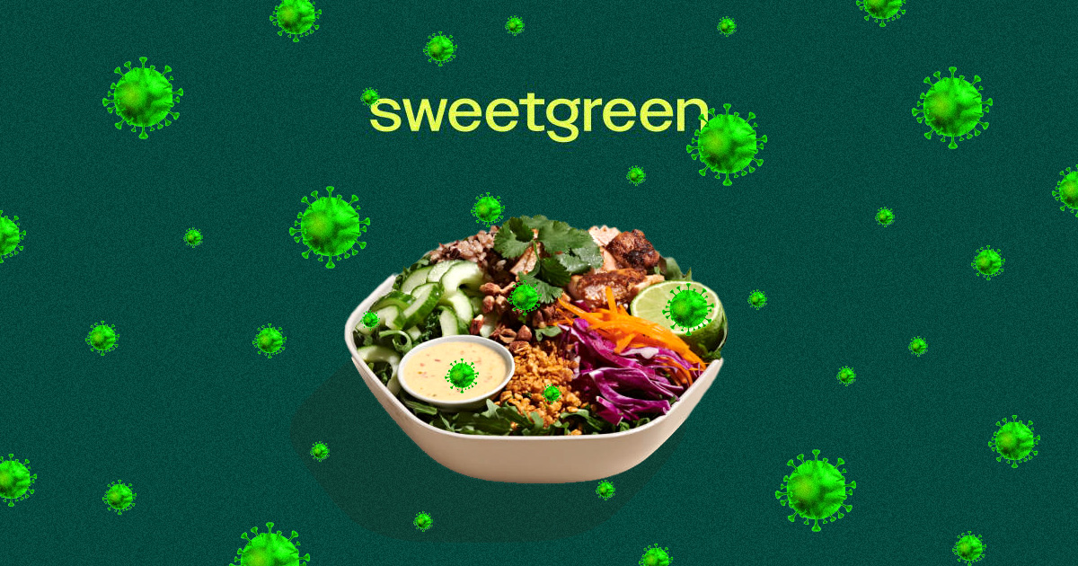
Sweetgreen is a fast-food restaurant chain that serves salads and bowls in the United States of America. Their Ingredients are sourced from local farmers, and with their ingredients, they calculate an accurate carbon footprint for each of their menu items, which is a unique way to portray food instead of the usual counting kcalories. Not only do they portray the carbon footprint on their food, but they also educate kids in public schools on healthy eating. They collaborate with chefs and celebrities, helping them with sales and raising the awareness they’re trying to portray.
It’s a very environmentally focused company, that is very resourceful and sustainable, especially when it comes to spreading awareness and trying to make the world a better place. Their brand identity recently went through a re-design with the help of the design company COLLINS.
Something that stood out immediately in their re-branding was the illustrative hand-made look of the illustrations that they use in their app, website and signage. It makes the brand feel more authentic and it really captures them handpicking their resources for ingredients that they use when making the food.
The colour scheme they use in their re-design is also on par with their values and what they stand for since they’re using a lot of naturally occurring colours, which also appear in their ingredients, such as beige, green and cream. There aren’t any colours that wouldn’t appear unnaturally. The two colours that stand out the most in their design are the vibrant colours they use for their wordmark and monogram, but those colours suit really well since they’re two very different shades of green, moss green and lime. That colour combination is also used on buttons and other places on their apps and website, as well on their staff uniform. With the re-branding, they also got their own typeface Sweet Sans, which is a Sans Serif typeface which is compared to other typefaces quite rounded and fun.
The re-branding that they got reflects the company very well and gave the company more of an organic look. Whenever you look at it you can tell that it’s a company that’s focusing on nature and they serve green food, I would argue that it’s a very successful brand design.
Sources:
New Logo and Identity for Sweetgreen by COLLINS and In-house
https://www.wearecollins.com/work/sweetgreen/
Is aimed specifically at your target user.
Established in 1976, by the activist Anita Roddick. With a vision to build an ethical brand, The first store opened in Brighton and only grew from there. The Body shop is known for its ethical products and its movement to make the world a better place in many ways. It currently has stores all over the world and you can even buy its products online!
The body shops’ brand has gone through 3 changes so far, the most recent one was in 2004. The colour scheme is a mix of different hues of green, as well as black and white, which reflects the company’s core values, which are “support community fair trade”, “activate self-esteem”, “defend human rights”, “against animal testing” and “protect the planet”. Their core values can also be seen reflected in their logo, as the illustration is “hugging” or “protecting” the name of the brand, and with a round shape with soft shapes which represents the earth, as well as the softness and the friendliness of the company.
The typeface they’re using is also a good choice, but it could be better. They’re using Sans Serif typefaces which feels very sterile, whilst other companies with similar values use a little bit more interesting typefaces, such as a Serif typeface, since they feel more organic and fun. Even though they use a Sans Serif typeface, it works, it’s not particularly bad but it’s not great either, but it makes their logo stand out from their selected typeface.
Overall, The Body shop hasn’t had a re-branding in 18 years, which shows how good it is, because it still works. I would argue that their design choice is great but there is always room for improvement.
Sources:
Is a direct competitor or in the financial sector

Skandia Banken was the first digital, online bank in Norway, originally owned and operated as a branch of Skandiabanken AB. It spun off as an independent company in 2015, and as a part of the restructuring, it had to change its name eventually. The re-branding for this bank was done by a Norweigan based design company called Bleed.
The old logotype was an extension of the logo Skandia Group had, and due to the separation, it had to go, in its own direction as an independent bank. The visual identity of this bank revolves around your sphere, with the focus on you, your family, your friends and the whole society as the customer. With the focus on the sphere, they added a circle representing just that to the logo, giving it a unique look. They also took into consideration adding this sphere into the typeface for the website and app, giving it a unique and recognizable sans serif font.
Their whole identity revolves around the sphere, and they made a very good job with that, giving the brand a very unique and recognizable look. They also chose to use a darker blue, white and very vivid mint green for their branding, making it stand out even more to the crowd, which is a bold move, but it suits their identity since they were the first digital bank in Norway. So it is only fair and understandable that they can do bold design choices.
Sources:
Share your brand values/mission

Tentree is a Canadian outdoor apparel brand that focuses on sustainable clothing and planting trees. The company was established in 2012, founded on the principle to plant 10 trees for every item purchased and its main mission is not to sell clothing but to plant 1 billion trees by 2030. In 2019 the company went through a re-brand with the help of the design agency Sid Lee.
There isn’t much information about the brand previous to the re-branding other than the logo itself with what we can assume is the previous style and colour scheme. They went from a white/blue logo with a very sterile look to it. The new design, on the other hand, has a very organic look to it. With a promo video they composed with the re-design they show how they took inspiration from the outdoors for their colour scheme, which suits the brand very well.
They simplified their logo as well, making it look less sterile and more organic, authentic and fun, and with their new typeface, they got for their brand, which is a Serif style typeface, that transformed the brand more than anything compared to the last typeface they used for their brand, and transformed their image to suit what their stand for and their values.
Overall, this re-branding is possibly one of the more successful ones compared to what they had previously and what they got afterwards. It transformed the company to suit its standards, its values and what they stand for. It’s done in a clever way that reflects the company and their principles, making it feel more organic and fun compared to what they had before, which felt sterile and boring.
Sources:
https://www.tentree.com/pages/about
New Logo and Identity for Tentree done In-house with Sid Lee
Is primarily screen-based
Facebook is the largest social media platform and has been for many years, it was established in 2004 and has been popular ever since with approximately 44.84 million users worldwide. Facebook is owned by the company Facebook inc, which recently changed its name to Meta and went through a re-branding. Facebook inc is the father company of Facebook, Instagram, WhatsApp and Oculus. The reasoning behind the name change is to push their new Metaverse platform, which has been talked about for a longer time.
When Meta was released, the re-branding caught a backlash because of Facebook incs’ past, a lot of the users taught that it was an attempt to make the new name disassociate from their past.
The re-branding on the other hand was a nice change, the typeface stayed the same as it had before and with their new logo, it feels fresh. The icon they have for meta is an interactive 3D logo, which is unique and interesting, it helps with their idea of the VR project Metaverse. The shape itself looks like an M which makes sense because of the M in Meta. The shape itself can be used and modified while still being recognizable, which is something you want in a logo, especially for such a large company with different branches.
Overall, there wasn’t a massive design change for this brand, what was interesting was the backlash because of the media and its user while the design wasn’t particularly bad. Unfortunately, it’s very hard for Meta to break away from its past due to the controversies it had.
Sources:
Uses a tone of voice that you admire
Duolingo is known for its tone of voice. While charming, encouraging and educational, helping users to learn new languages for free in today’s society, it’s fun and at the same time threatening.
It’s a tone the company set to the app to inspire their users to continue learning, in a manipulative way and it actually works!
Duolingo was established in 2012 and in 2022 has had 2 re-designs, the most recent one making the app more fun and friendly. Both of the re-designs had a focus on making the app more approachable, giving the design a more cartoony look. In 2012 they had the owl re-designed to look less robotic to a more cartoony version, and in 2019, it went even further, adding more cartoony graphics, animations, and even the typeface.
The owl Duolingo used for their brand was inspired to make the typeface and the new graphics, using the shape of its wing to give the graphics a nice and even design through. Whilst the whole app got a cartoony look, the colours became more vibrant and fun. Whenever you use the app, it’s very rare to see a dull colour.
With the re-brand in place, they used their marketing around the world to inspire people to learn more languages, and at the same time, they showed the positive impact it had on other people’s lives, and how positive it is to learn a new language.
Overall, the re-brand of Duolingo boosted its audience, making the app more fun, approachable and friendly. Proving that learning a language can still be fun and make you associate it less with the boring times at school when you were to learn a new language.
Sources:
https://www.johnsonbanks.co.uk/work/duolingohttps://www.underconsideration.com/brandnew/archives/new_wordmark_and_identity_for_duolingo_by_johnson_banks.php
Whenever I was going to make my own brand style guide, I began by listing all the things I wanted to include in the document to, later on, write it on post it notes and sort them, depending on where I wanted the content to be or not.

By following the set standards I had on my apps, I applied it into the style guide and wrote down all the relevant text that I needed.


Here is the finished product
Thank you