
After deciding what my brand name was and doing the research that would decide where I would head with this project I moved on to making a wordmark as we were directed to do. Since I wanted my branding to be focused on spring, e.g. renewal, growth, etc. I wanted to implement a leaf into the glyph of the letter Å in Vår bank. With the help of the book Designing Brand Identity, I got a better understanding of what it meant and researched a few examples of different examples of wordmarks from different products. I looked into examples of banks that I know that have wordmarks to get a general idea of what they usually look like.
Examples of banks with wordmark:
 Bank in northern Europe called Nordea.
 Danskebank, A Danish bank that operates in Europe as well as North America.
 Handelsbanken, a Swedish bank that operates in several countries around Europe.
 Skandinaviska Enskilda Banken, is a nordic bank that operates around Europe.
Here are a few examples of the bank branding I know of in Sweden. There are many many more banks that are operating there which can be found in the image below.
 I found a very common pattern in these wordmarks, which is the use of Sans Serif typefaces, except for the wordmark for Länsförsäkringar. I decided to deep diver into as to why they chose this typeface for their brand identity, and it says on their website that, quoted:
I felt inspired by using a Serif typeface since it wasn’t widely used in banking, which I’ve seen, and it was arguably more organic which is what I want to bring forward with my branding, due to its name and what it stands for.
I chose to look into wordmarks and logos for brands that have the same standpoint as my bank does.
One of the companies I looked into was the Alcohol store we have in Sweden, which the government has a monopoly on, e.g. The government has a monopoly on selling alcohol above a certain percent, we do not have any off-licenses and cannot go into a regular store and get liquor. Systembolaget, here is their website in English.
![]()
They have several standpoints for their brand, which are to educate, help, and promote a better lifestyle. They also work to reduce waste and to make the stores more environmentally friendly.
Unlike other liquor stores, Systembolaget is designed for the customers to spend less money and buy fewer products. A lot of the ads that they run on television focuses on how to reduce drinking and how they stand their ground to not sell more than what they need to. For example, there are boxes right at the checkout with a little sign saying that it’s okay to change your mind and to place the products there and staff will gladly put them back on the shelf.
The last recorded re-design or re-branding I could find was from the company Happy F&B which is a branding agency to help change the branding Systembolaget had into something different so that people wouldn’t oppose the store, which is being said in the report. Their rebranding made it look more modern and made people happier with the store.
https://happy.fb.se/project/systembolaget/
They focus on simplicity and don’t need more than what is expected from them, their wordmark fits them perfectly, with their own typeface in the wordmark, called monopoly, which means monopoly.

Another two brands I chose to look into in terms of shared brand values were lush and the body shop. Both are well known in terms of hygiene and skincare products, but their brand values are much like mine. Which is focused on the environment, sustainability as well as educating their customers, not only about the environment and sustainability but ethically sourced ingredients as well as problems certain communities face today. Both of these brands have wordmarks, one being a wordmark with an icon, and that is the body shop.
Lush educates their customers through their goods.

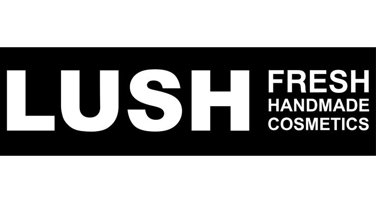
Lush on the other hand is just a wordmark of its name.
Both of these logos are in Sans Serif, just like the previous companies I’ve researched.
My Bank Wordmark
We were told to make a wordmark for our bank brand. Since my values focus a lot on growth and the environment, I chose to play around with that idea. Since the glyph in Å can easily be replaced with an illustration of some sort. I also chose to use a Serif typeface, since it felt more organic and alive compared to a Sans Serif typeface.
Here are my sketches of the wordmarks I made, with inspiration from fonts I found on Adobe Fonts.

Whenever I played around with what I could use instead of the glyph of the Å I got some feedback that adding a leaf would be too repetitive in the values of the brand. I also tried to use different shapes to replace the glyph itself, but I chose to keep it untouched in the end, too, later on, add something unique to make the bank stand out later on in another form.
I chose to proceed with the typeface Salome, since it had a very organic look and feeling to it, which fit my brand perfectly. As for the text beneath, which states “bank” I chose to go with a Sans Serif typeface to reflect on it is an online bank. Since a Sans Serif typeface feels very modern and computer made, rather than handmade. The typeface I chose for that was Acumin, which is available on Adobe Fonts and is also the secondary font used for my brand.

Here are my ideas using different fonts and ideas that I made in illustrator.
Here is the final version I chose to proceed with.

There was a lot of trial and error for the final product, But I’m happy with what I ended up with thanks to the help and advice from others.